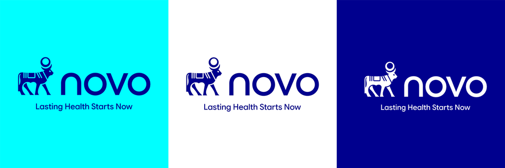
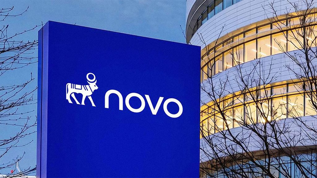
Danish pharmaceutical company Novo Nordisk announced a new brand identity on September 14, 2026. The everyday brand name was shortened to 'Novo,' and the logo, colors, and typeface were changed. The legal company name will remain Novo Nordisk A/S. This restructuring is centered around the message 'Lasting Health Starts Now.'.
The new message signifies that lasting health begins with today's practice. The company explained that people's ways of managing health and their expectations are changing. Accordingly, it presented a direction to build a brand that connects with people's daily lives while maintaining scientific expertise.
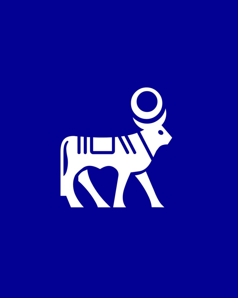
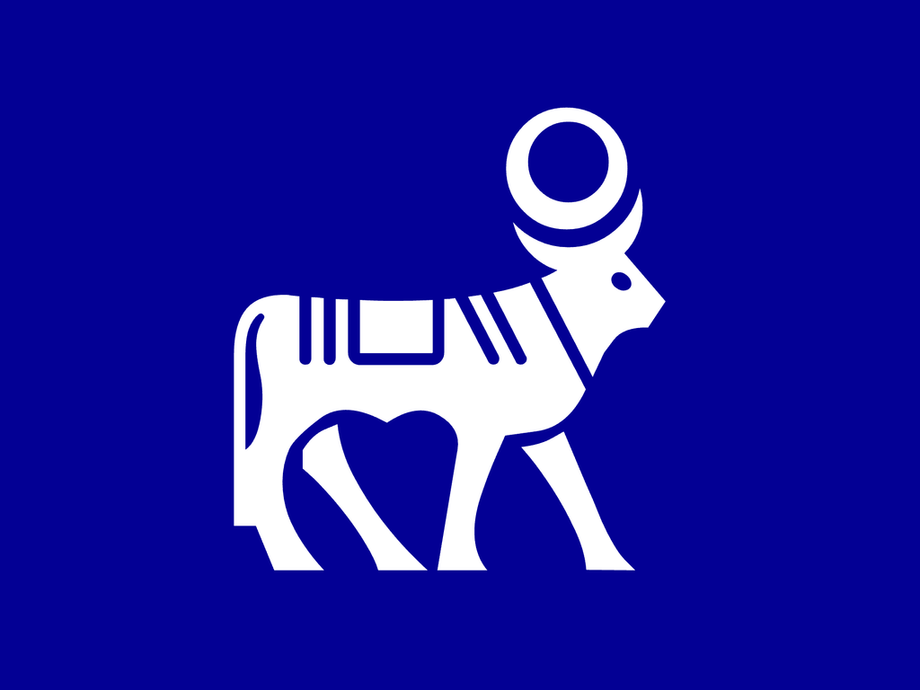
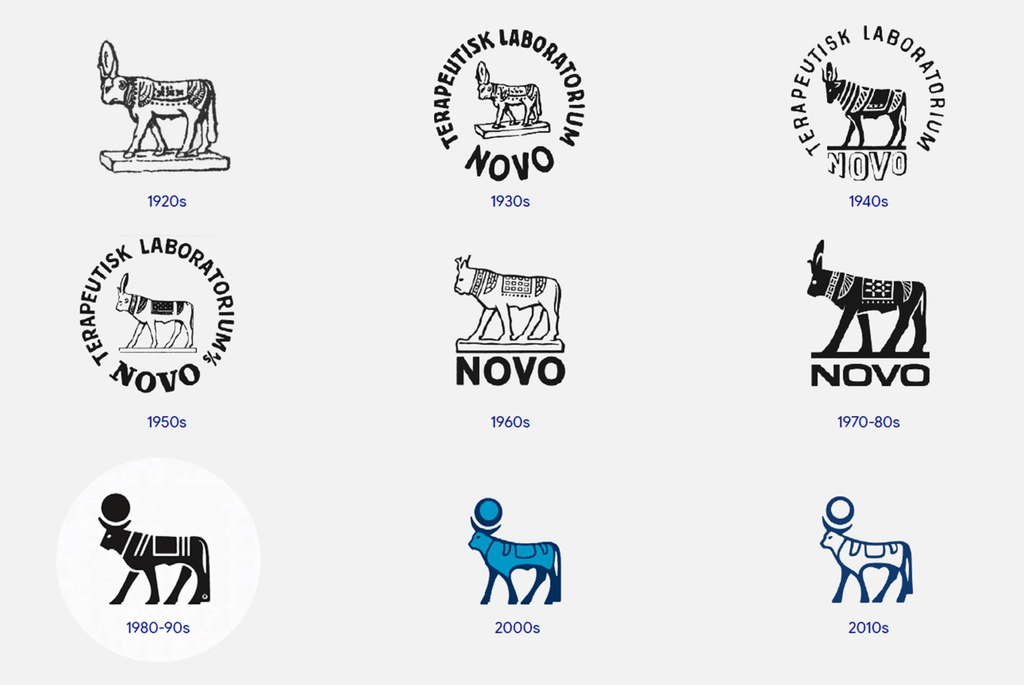
The logo retains the Apis bull that has been used since the 1920s. The bull, which previously looked to the left, has been changed to face to the right. In the name, 'Nordisk' has been removed and the lowercase 'novo' is used. This change adjusts the number of letters and the logo composition while continuing the long-standing symbol.
The color scheme has been organized around a more vivid blue, 'Lasting Blue.' 'Now Turquoise' has been added as an accent color. The new typeface is also named 'Novo.' Along with the shortened name, the colors and typeface have been unified into a single system to ensure a consistent appearance in communications around the world.
One aspect of the design to note is the way historical symbols are combined with the new name. The bull maintains the connection to the existing brand, while the shortened wordmark and new colors represent the changed expression. It is a composition that retains the elements that have identified the brand while shortening the name.
See more and sources
https://www.novonordisk.com/news-and-media/latest-news/lasting-health-starts-now.html