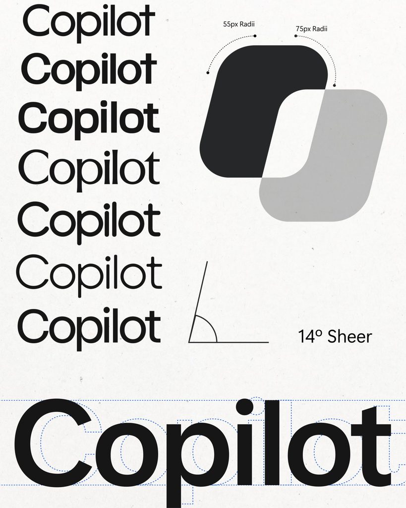
This is the Copilot identity design developed by Microsoft in collaboration with Collins and Koto. It was designed to add movement to product-recognizing icons, conveying the entire process of how the AI handles requests. On October 5, Microsoft revealed the process of refining the form and developing the motion on its official design channel.
The starting point was the icon, which looked slightly different across apps and devices. The icon remained static even between questions and answers. The design team unified the appearance across various environments while also assigning it the role of representing the Copilot's status during a conversation.
The basis of the form is the square, familiar from Microsoft's visual language. By adjusting the ratios, angles, and spacing between two squares, it was developed into two forms that form a single outline. Each form moves while maintaining a connected relationship with the others. The concept of different elements coming together was reflected in both the structure and movement of the icon.
Motion is divided into three states: thinking, planning, and gathering information. These represent situations where you process a request, organize the next steps, and find relevant information in files and tasks, respectively. The two forms share a common method of moving and then converging back into one, and the same visual language is used across Windows, Word, and PowerPoint.
During the development process, icons were printed to review their forms and adjust the thickness of the curves. Brand, product, and motion designers worked together for several months. This identity is described as a system that connects everything from product screens to global marketing and advertising. The core of the design lies in combining identification symbols with a function to indicate the status of the work.
See more and sources