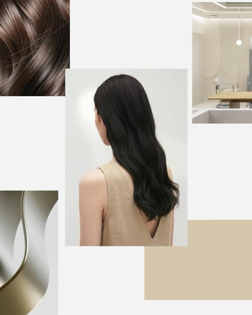

국내 최대 헤어 미용 브랜드 준오헤어가 글로벌 확장을 본격화하는 시점에 맞춰 새로운 브랜드 아이덴티티를 공개했습니다. 이번 리브랜딩은 브랜드 인지도와 위상을 국제 무대에 맞게 재정립하기 위한 전략적 시도로 평가됩니다. 프로젝트는 브랜딩 스튜디오 Studio fnt가 맡아 로고 타이포그래피 컬러 그래픽 모티프 전반을 전면적으로 재구성했습니다.
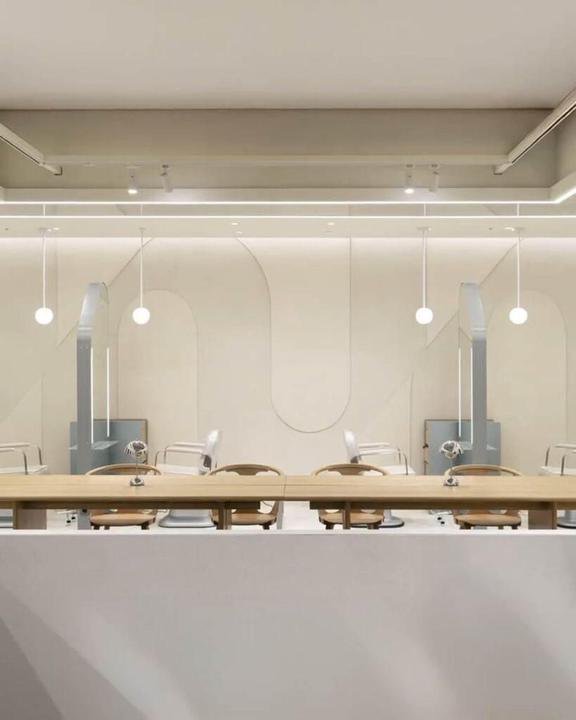
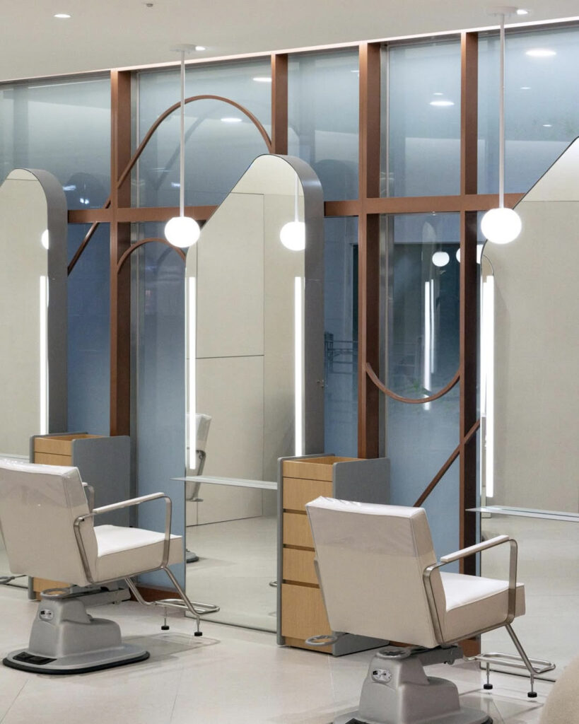
새로운 디자인 언어는 헤어 서비스의 본질인 질감과 손길이 만들어내는 유기적 흐름을 시각적으로 해석하는 데서 출발했습니다. 준오 아카데미를 중심으로 이어져 온 교육과 기술 연구 국내외 기관과의 교류를 통해 축적된 전문성은 영원한 혁신이라는 키워드로 정리됐습니다. 디자인 시스템 전반에는 부드럽게 이어지면서 안쪽으로 응집된 곡선 모티프가 적용돼 다양한 매체와 환경에서도 일관된 인상을 유지하도록 설계됐습니다.
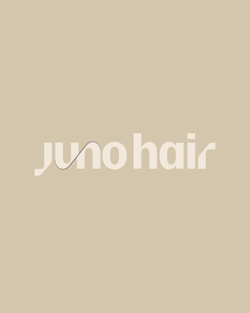
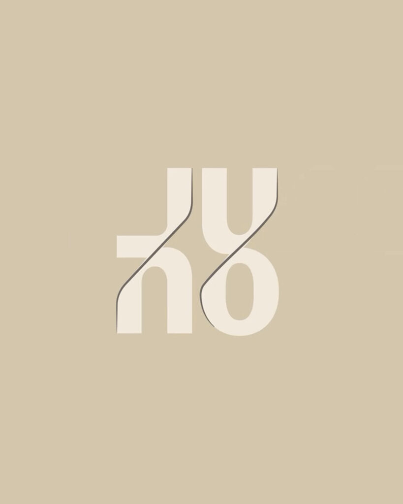
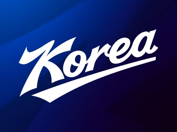
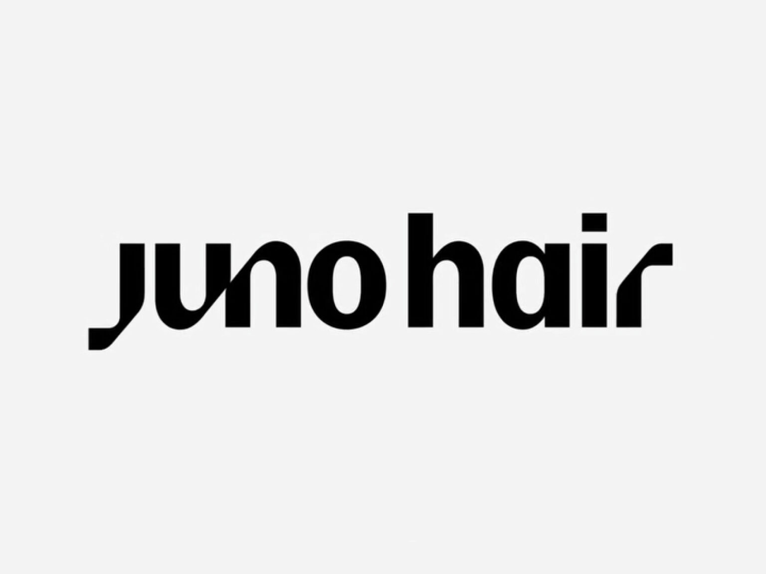
워드마크 디자인은 뷰티 업계에서 반복돼 온 미려함 중심의 표현에서 벗어나 보다 선언적이고 구조적인 방향을 택했습니다. 산세리프를 기반으로 한 단단한 형태 위에 J와 R의 수미쌍관 구조 U와 N이 만나는 지점의 곡선 디테일을 더해 유연함을 확보했습니다. 이를 통해 장기적으로 활용 가능한 로고 시스템 안에 브랜드의 내적 에너지와 성장 방향을 담아냈습니다.