
Since 2003, Nui Sonor has been a leading European music festival, showcasing electronic and indie music across the city. Over 100,000 people flock to Lyon each year to enjoy a cultural program of concerts, DJ sets, and more. The festival continues its tradition of inviting a different designer or studio each year to create a new identity. The only requirement is that the original logo be maintained. Everything else is open to interpretation.
Chamonix-based Dia Studio, tasked with the 2025 project, connected this challenge to their core practice. They proposed an approach that prioritized movement over static graphics as the foundation of their identity. Creative Director Mitch Paone explains that they began with a broad exploration of graphic and typographic sketches inspired by sound waves and modular synthesizers.
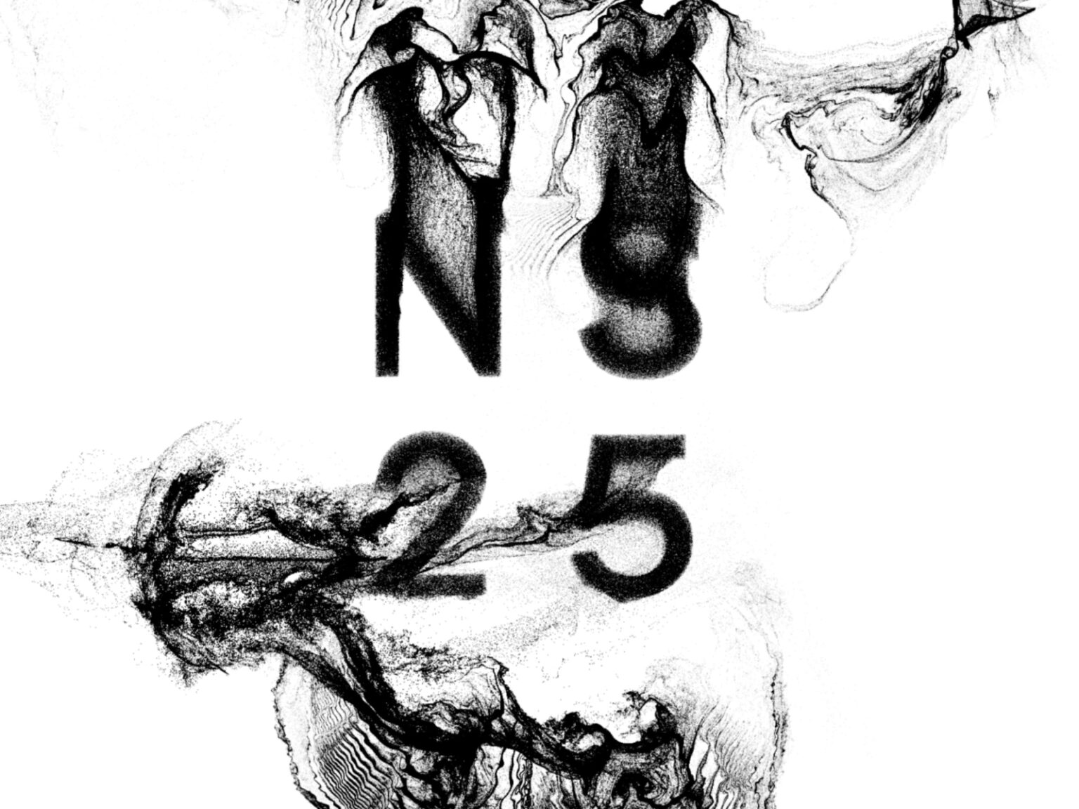
During the initial discussions, the organizers expressed another important need: a system that the festival team could operate directly and continuously produce. This demand led the project to focus on generative tools. The resulting work encompassed both moving images and interactive elements, as well as static graphics, while maintaining an efficiently scalable structure.
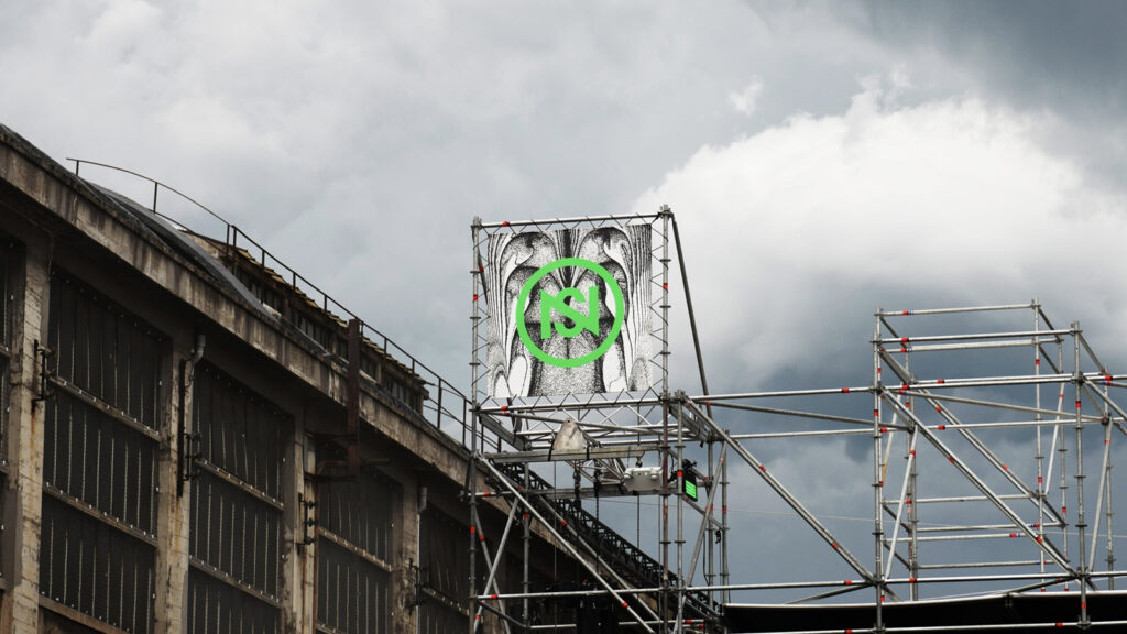
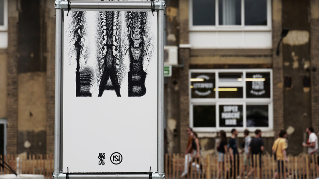
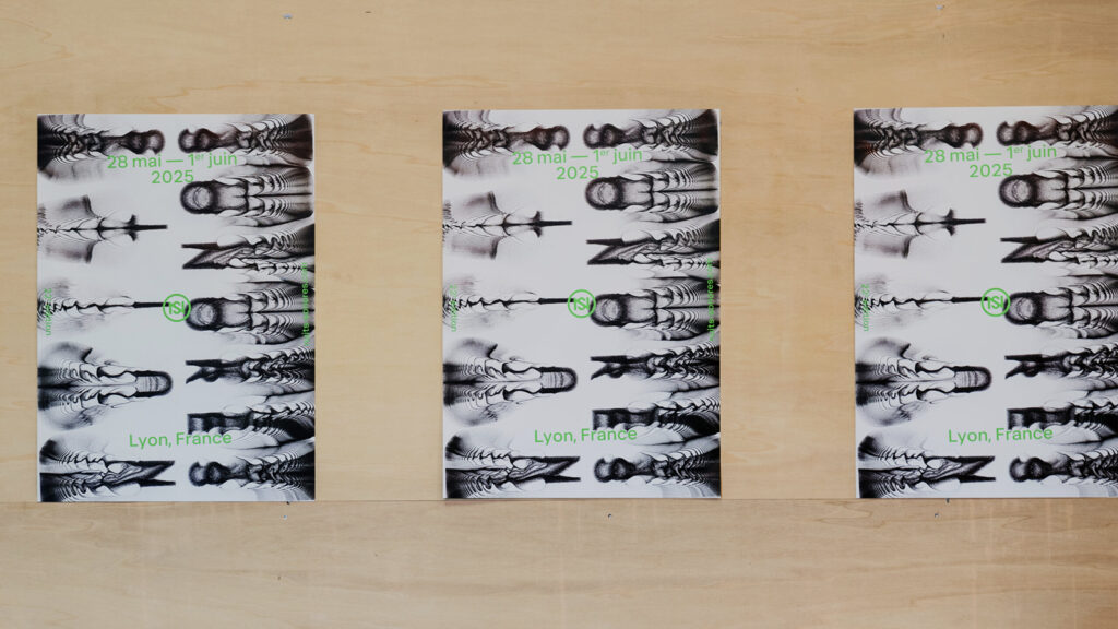
The final identity, rooted in European club and rave culture, visualizes the sensation of sound transmitting to the body. Letters and shapes vibrate, scatter, and reassemble like fragments of music, constantly changing. This system was applied across the entire stage visuals, from large signage to posters and digital screens.
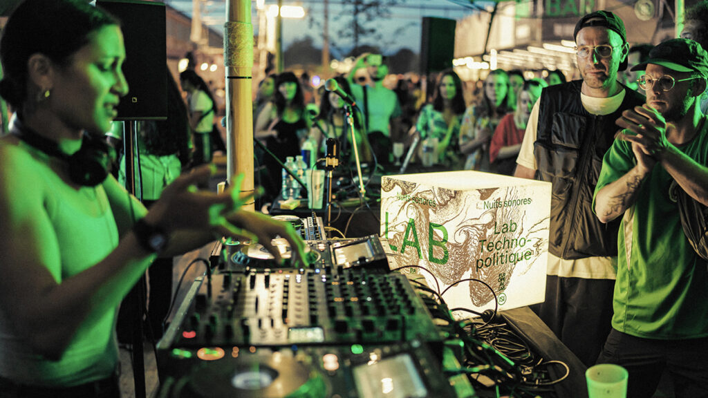
The on-site experience was further enhanced by the addition of neon green to the black-and-white visual language. Audience members actively utilized this color in their costumes, glow sticks, makeup, and even hair, embracing it as a symbol of participation. This color later expanded into lighting and laser projections, establishing itself as a visual device that permeates the entire festival.