
Zalando is undergoing a bold visual identity refresh. Starting out as an e-commerce pioneer, Zalando has grown into a global fashion platform. A befitting visual identity was needed, and the goal was clear: to move beyond simply selling merchandise to becoming a source of style confidence and inspiration. This evolution demanded a new brand system capable of delivering personalized content and memorable experiences.
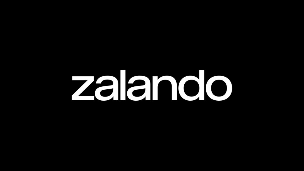
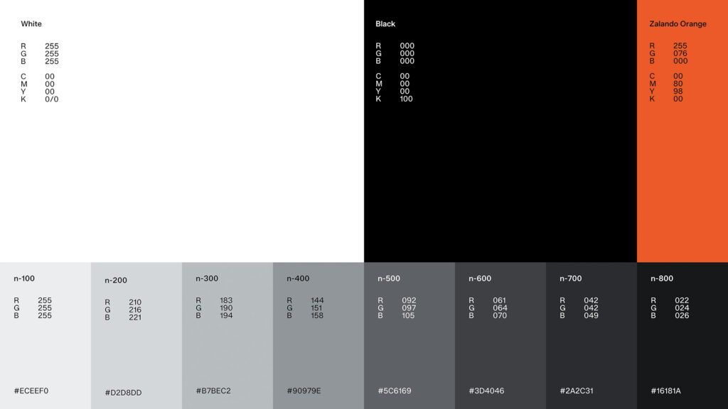
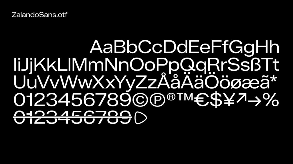
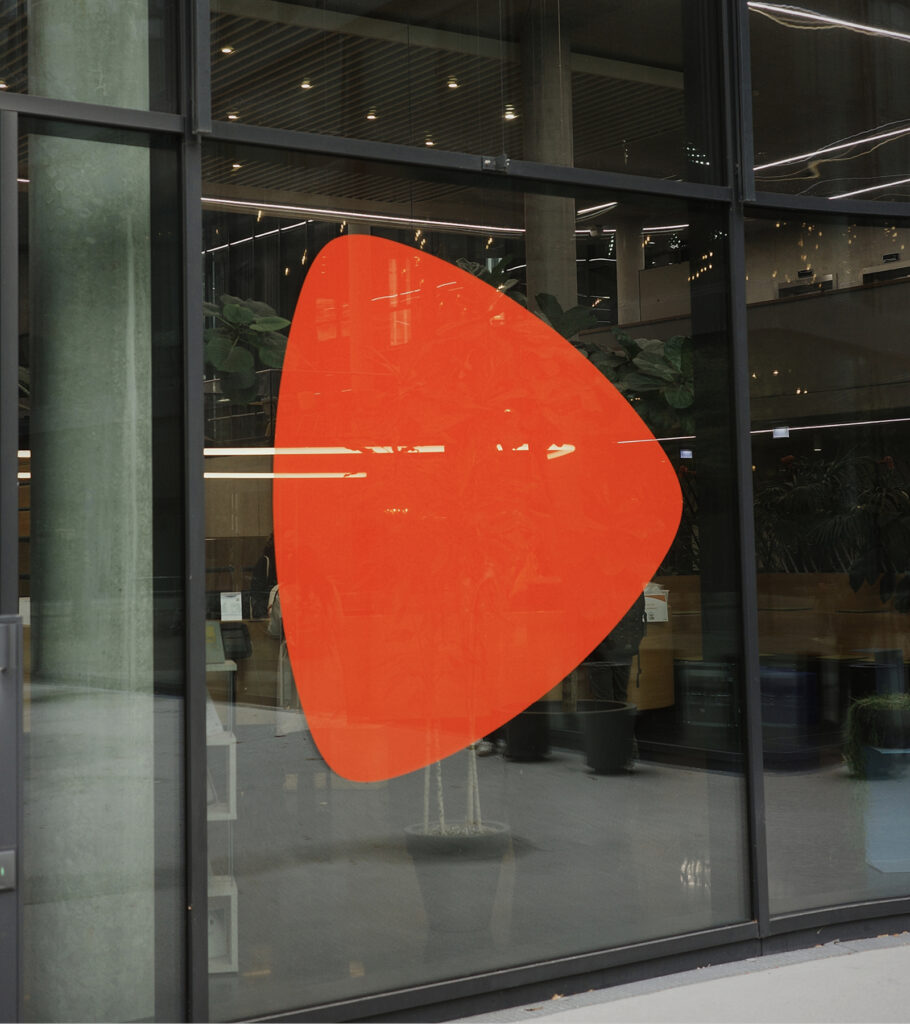
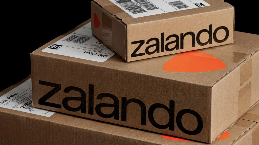
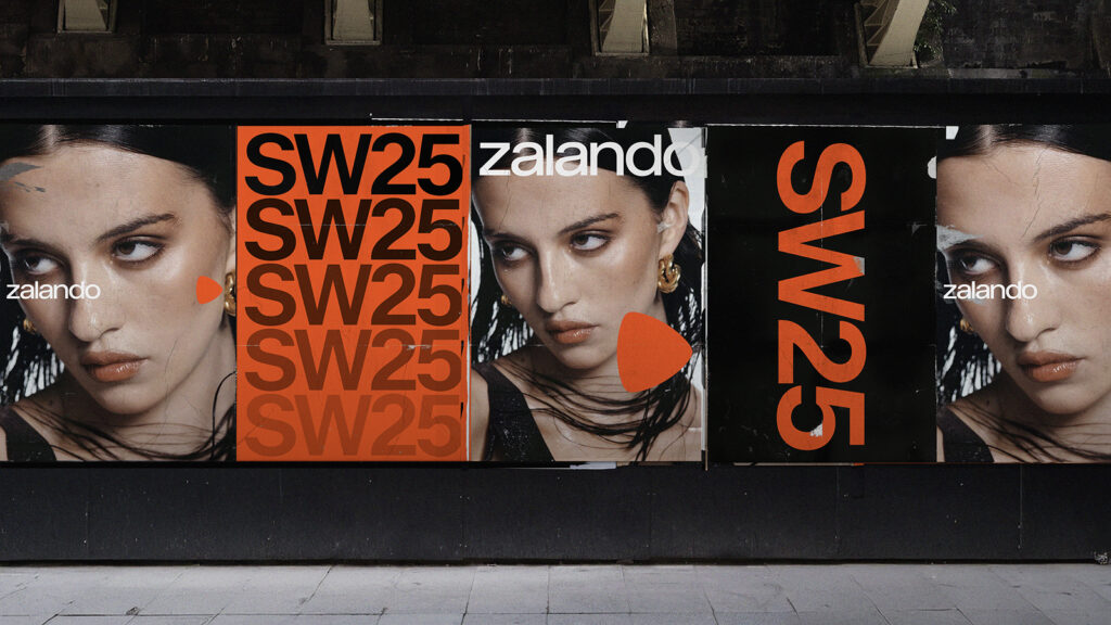
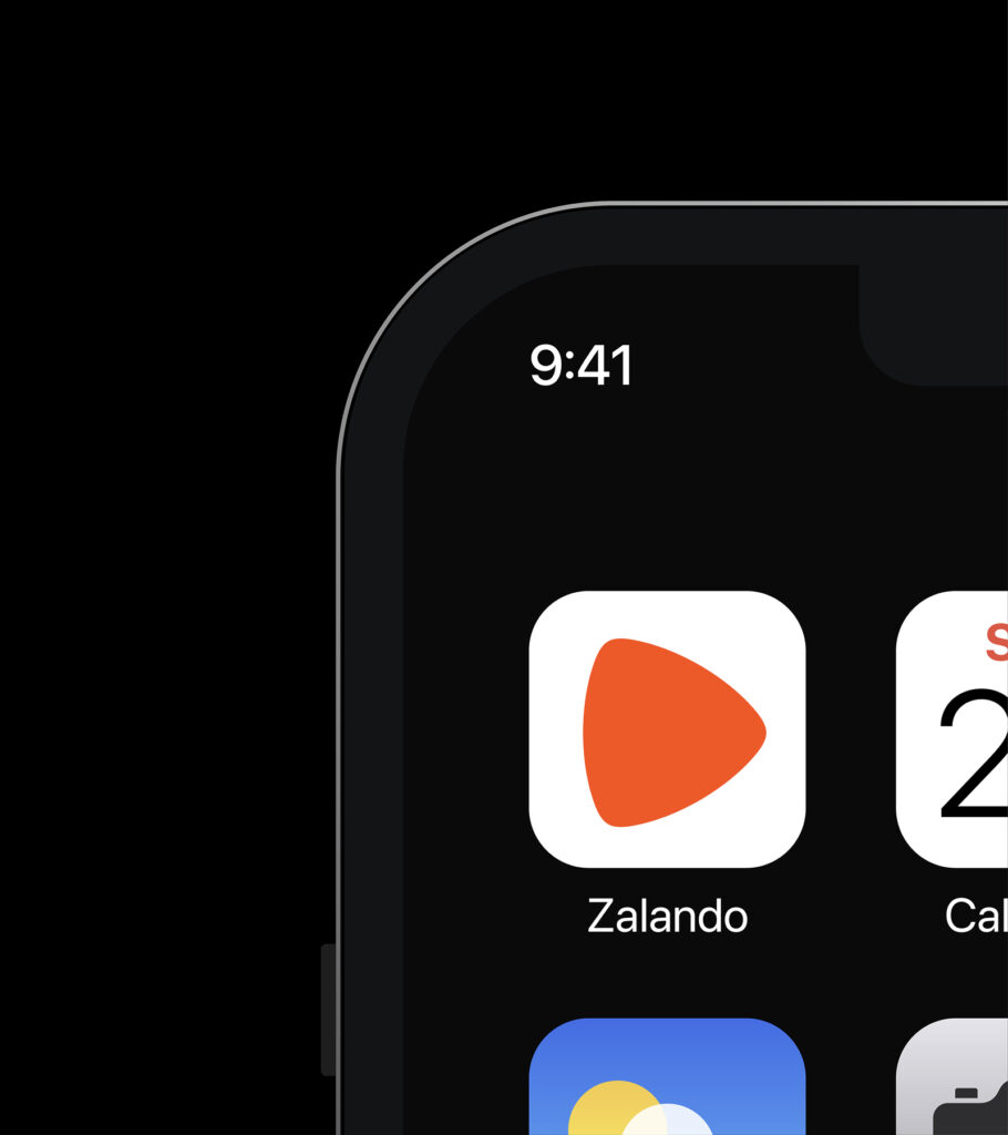
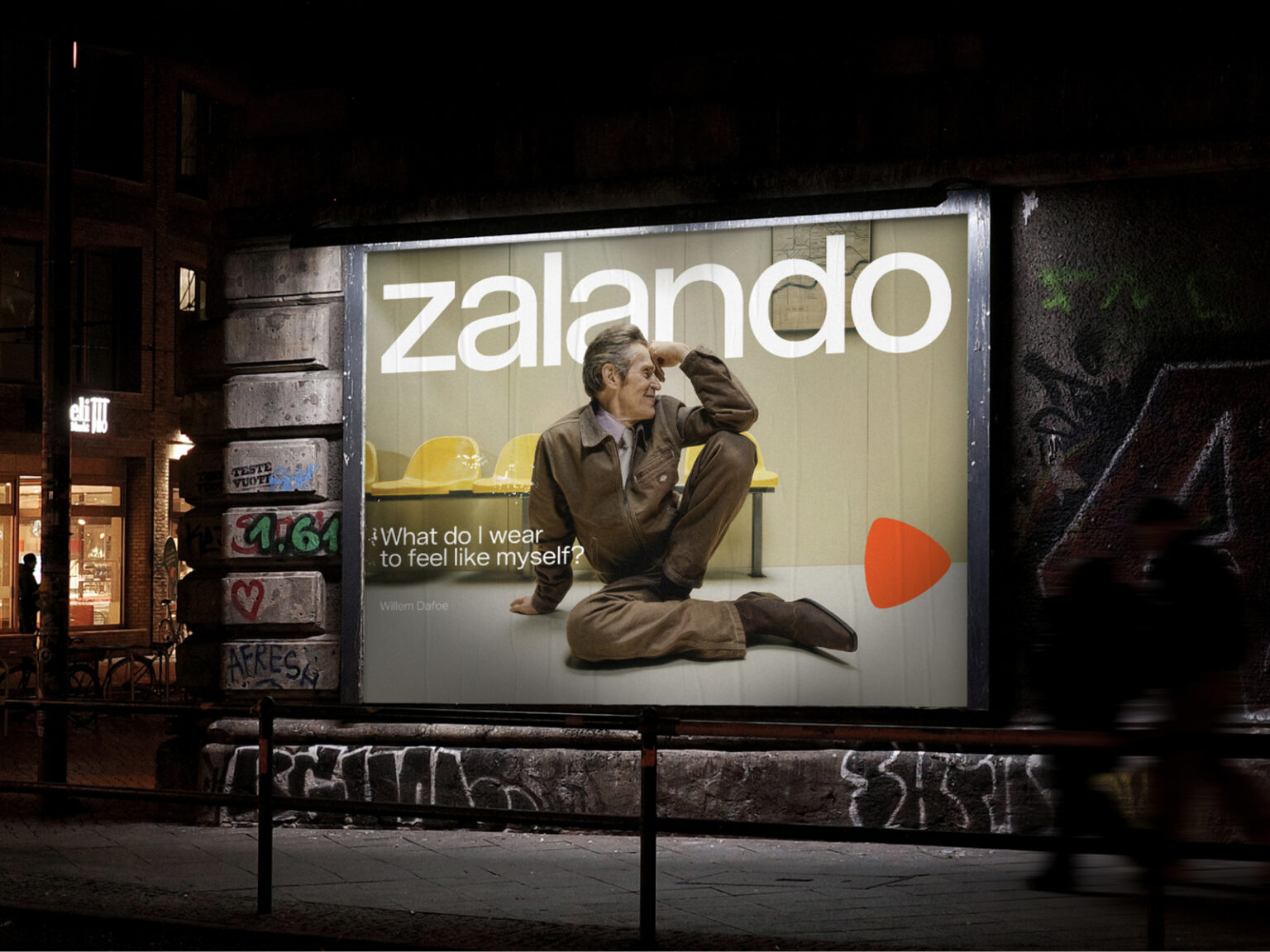
This project was handled by design studio Kurpakhosk. The new identity features an expanded typography system, a refined color palette centered on a more vibrant orange, and a refined logotype. The revitalized brand mark and new wordmark create instant recognition in the digital environment.
This brand system prioritizes flexibility. It's designed to accommodate diverse expressions across touchpoints and campaigns across over 25 countries. At the same time, it maintains clarity and simplicity to ensure Zalando remains recognizable as a single brand.
As a result, Zalando has achieved a simple yet powerful brand design. This refresh redefines Zalando as a destination where customers can discover high-quality fashion and confidently express their style. The shift from a store to a style partner has also become clear.