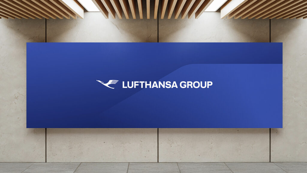
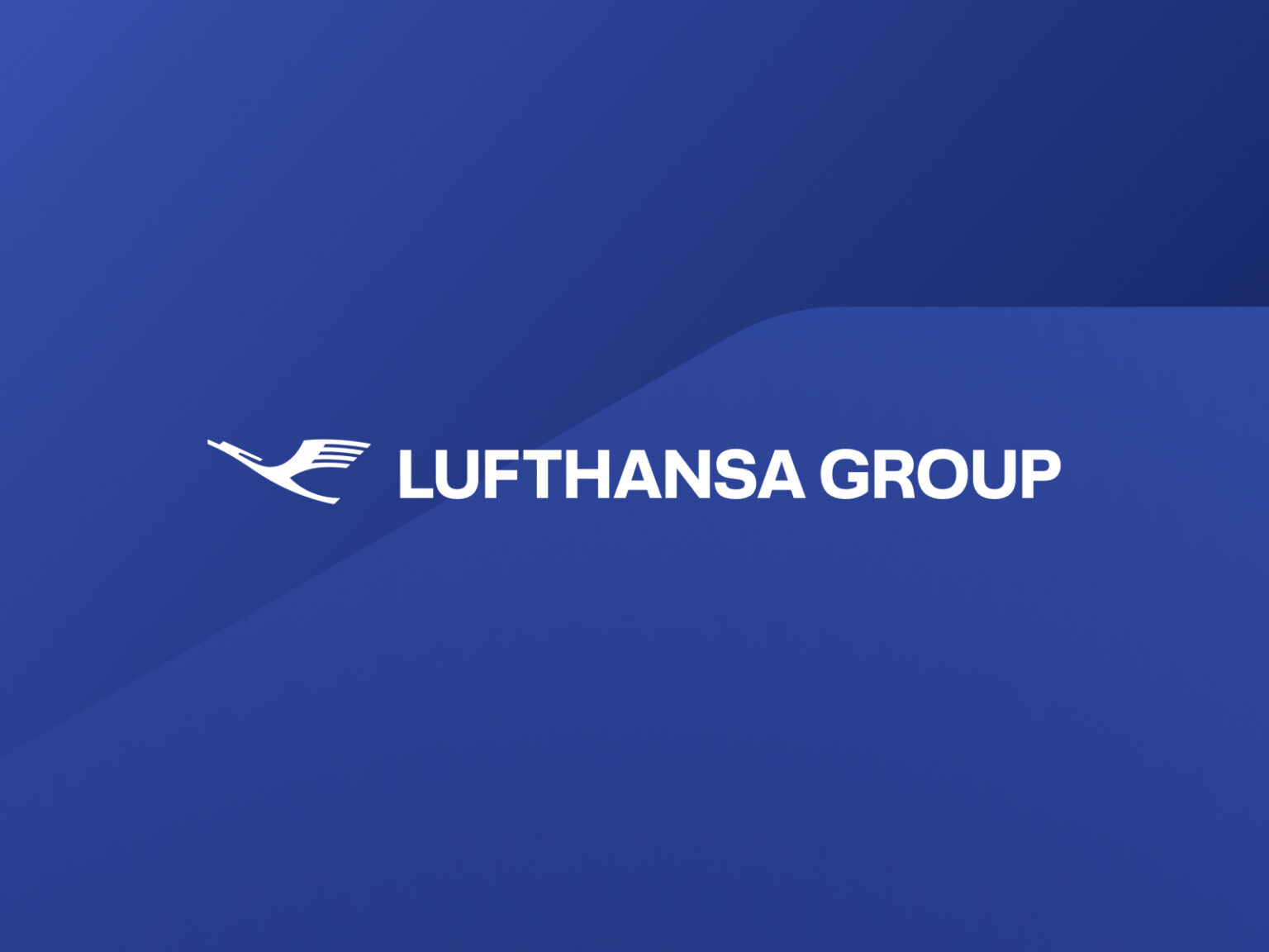
Ahead of its 100th anniversary (2026), Germany's Lufthansa Group has unveiled a new integrated brand identity (BI), redefining its visual identity. Key to this refresh is the elimination of the circular border surrounding the traditional crane logo and a focus on maximizing synergy across all of the group's affiliates.
'School' flying freely‘
The most significant visual change is the departure of Lufthansa's iconic crane logo from its circular frame. While the previous logo featured a crane enclosed within a circle, the new logo presents a simpler, more modern form, emphasizing the crane's free flight into the sky.
The group said, “This change visualizes Lufthansa Group’s determination to become a leading airline of the future based on digital innovation and flexibility,” and added that the new logo will provide a clearer and more consistent brand experience in digital environments such as mobile apps and websites.
Goal of group integration and synergy creation
This announcement of the integrated BI carries a strategic message that the Lufthansa Group's various airlines, including Swiss International Air Lines and Austrian Airlines, will be more tightly integrated under the powerful umbrella of the Lufthansa Group to provide consistent, high-quality services to customers.
“The new brand design is a promise to extend Lufthansa Group’s core values of quality, excellence and reliability into the future,” the Lufthansa Group CEO said at a press conference. “This marks the beginning of a new era, marking the 100th anniversary of our founding.”.
The new BI will be implemented sequentially across all customer touchpoints, starting with the online platform and extending to the liveries of over 160 aircraft, airport lounges, and in-flight merchandise, by 2026.
