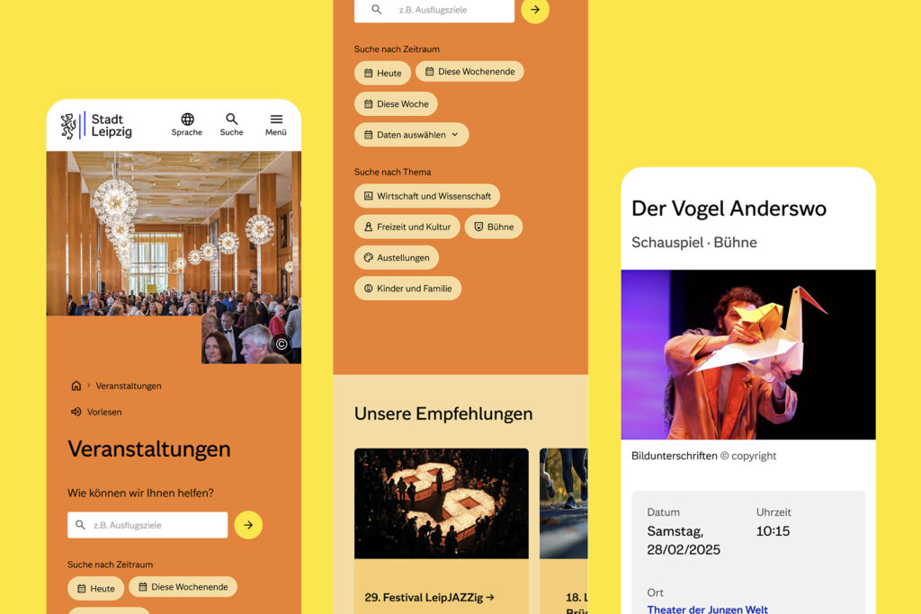

라이프치히가 디지털 도시로 도약하기 위해 새로운 정체성을 구축했습니다. 빠르게 성장하는 도시가 시민과 소통하고 공공 서비스를 더 잘 안내하기 위해 브랜드와 시민 포털을 동시에 재정비한 것입니다. 이번 프로젝트는 도시의 전략을 시각 언어로 옮기는 과정이었으며 접근성과 명확성 확장성을 핵심 기준으로 삼았습니다.
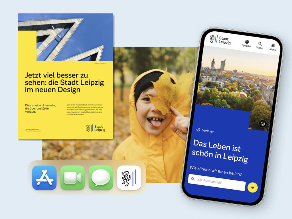
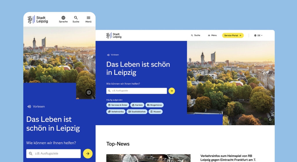
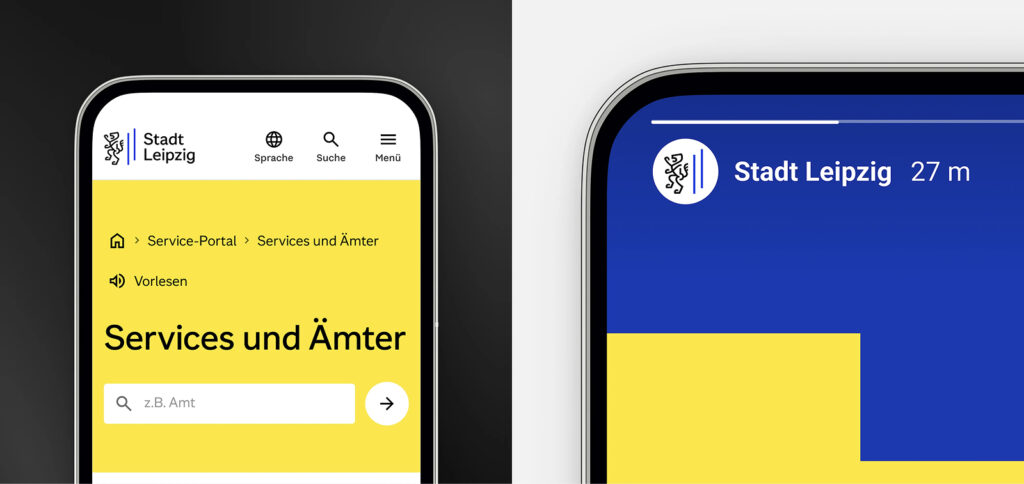
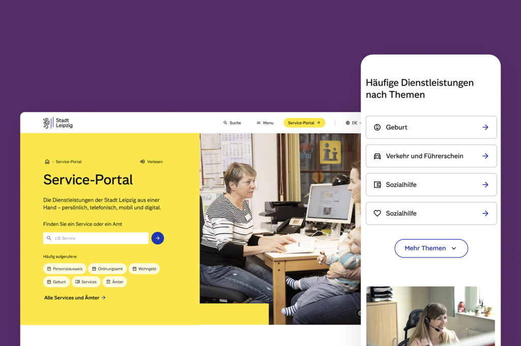
기존 Leipzig.de는 수년 동안 누적된 복잡한 구조로 인해 시민들이 원하는 서비스를 찾기 어려웠습니다. 이를 해결하기 위해 에덴스피커만은 디지털 기반의 새로운 도시 브랜드를 만들며 시민 포털을 처음부터 다시 설계했습니다. 사람들은 행정 조직이 아니라 주제 중심으로 사고한다는 점에 착안해 정보 구조를 주제별 탐색 중심으로 재편하고 강력한 검색 기능을 도입해 접근성을 높였습니다. 새로운 포털은 행정 서비스 제공 기능과 도시 소식과 행사 정보를 전달하는 플랫폼의 역할을 동시에 수행합니다.
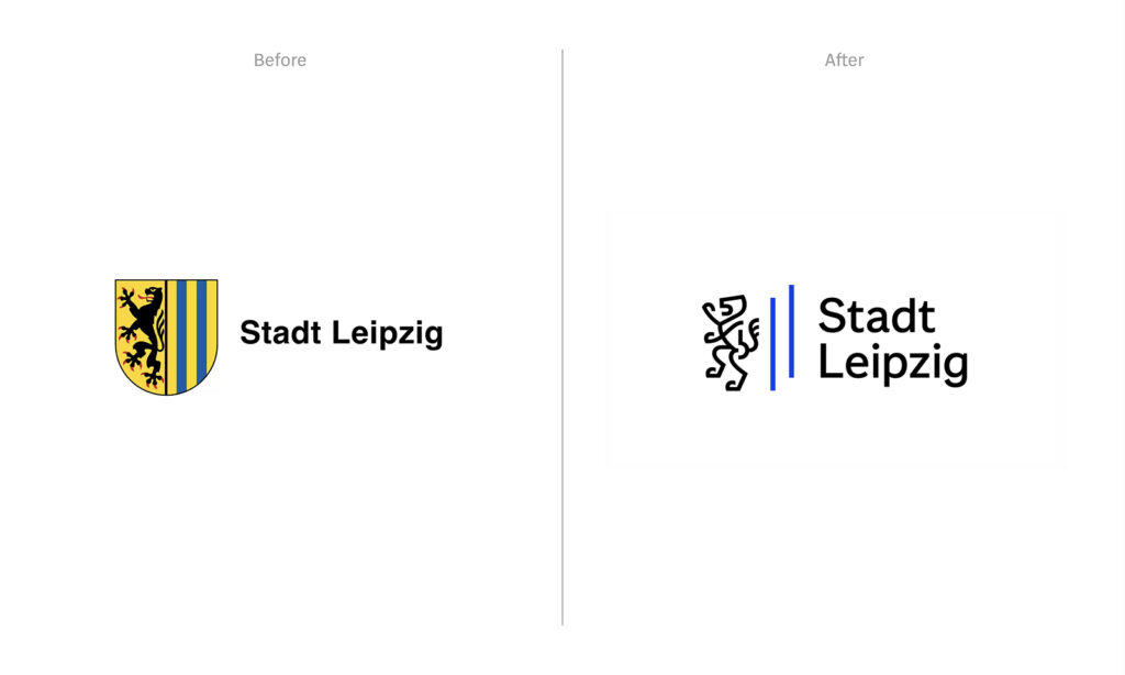
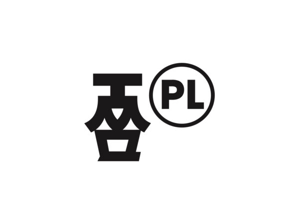
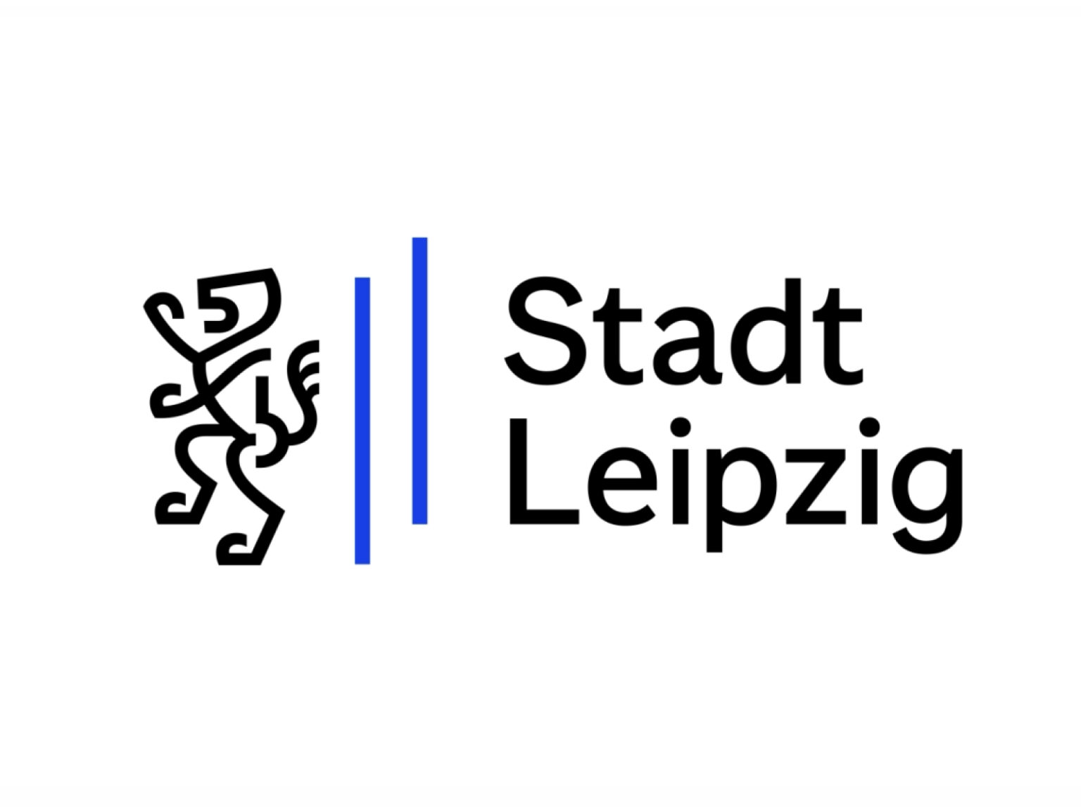
브랜드 디자인 또한 도시의 미래 전략을 바탕으로 구축되었습니다. 전통 문장에 사용되는 마이센 사자와 랜즈베르크 기둥을 현대적으로 재해석해 새로운 브랜드 마크를 만들었습니다.
역사적인 문장은 도시의 뿌리를 보여주는 중요한 상징입니다. 1240년에 처음 등장한 옛 베틴 가문의 문장에는 금박 바탕 위에 서 있는 사자가 묘사됩니다. 라이프치히는 14세기 초 이 사자를 시의 상징으로 채택했고 1475년경에는 현재와 유사한 좌우 분할 형태의 방패 디자인으로 발전했습니다. 왼쪽에는 마이센 사자가 오른쪽에는 금색 바탕의 파란 막대가 배치되는데 이 막대는 란츠베르크 막대라 불리며 베틴 가문의 또 다른 문양입니다. 두 가지 가문의 문양이 결합된 형태가 오늘날까지 이어지는 라이프치히 문장의 기원입니다. 17세기에는 사자가 어느 순간 방향을 돌렸다는 민담도 전해지며 동전에도 반대쪽을 향한 사자가 새겨진 사례가 나타납니다.
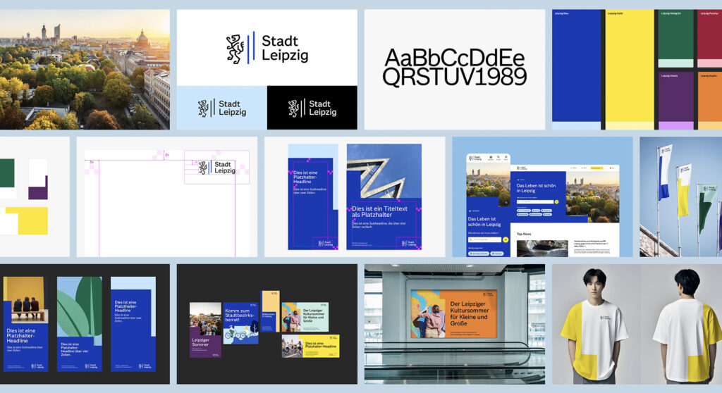
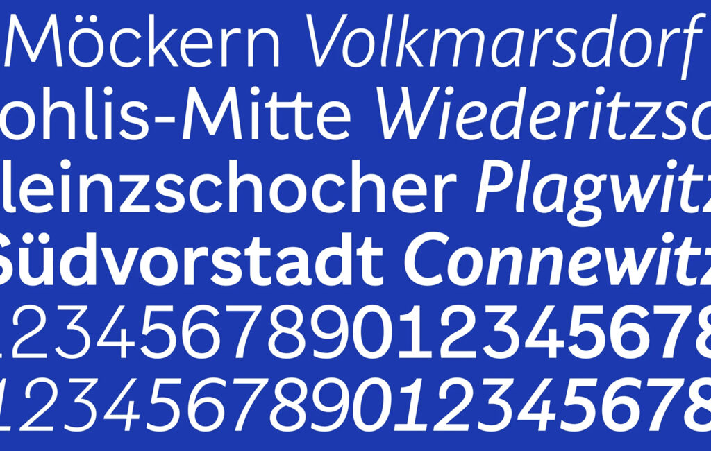
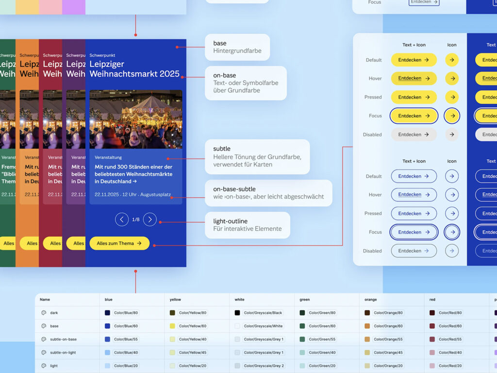
행정과 공공기관 전반에 통일된 이미지를 제공하기 위해 독점 서체를 개발하고 다양한 서식을 제작했습니다. 이는 약 9천 명의 직원이 장기적으로 안정적인 품질의 서체를 사용할 수 있도록 하기 위한 경제적 선택이기도 했습니다. 템플릿과 UI 키트 모션 가이드까지 포함한 종합 도구가 제공되면서 브랜드의 일관성이 실무 전반에 자리잡았습니다.