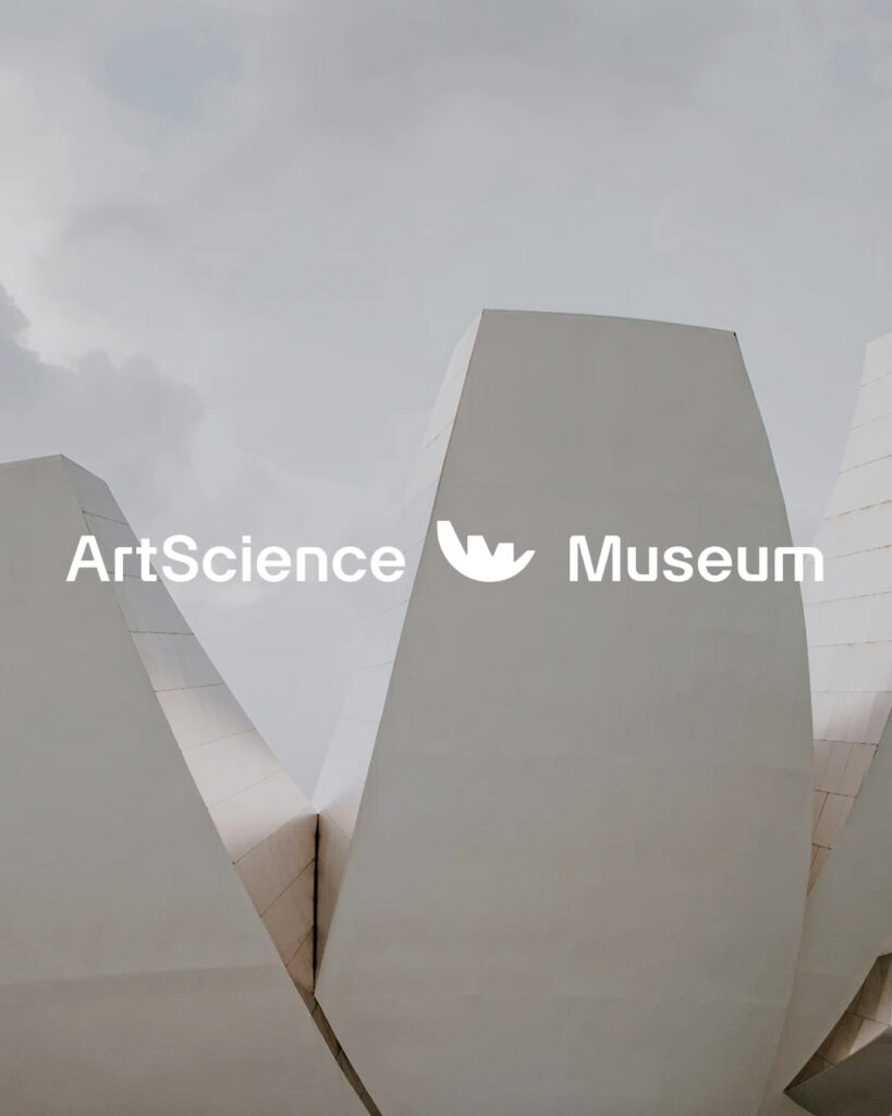

ArtScience Museum, Singapore's landmark art, science, and culture landmark, has unveiled a new identity ahead of its 15th anniversary. The rebranding, led by US-based agency Project3, embodies the museum's core philosophy of convergence across its visual language.
Since its opening, ArtScience Museum has built global recognition for its content that transcends the boundaries of art and science, from exhibitions of Leonardo da Vinci and Salvador Dalí to teamLab's immersive experiences. The new brand further clarifies this identity and embodies the museum's commitment to becoming a forward-thinking institution.
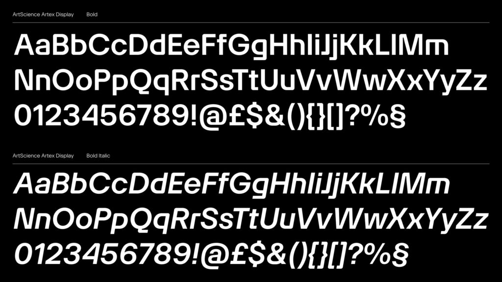
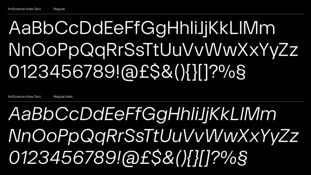
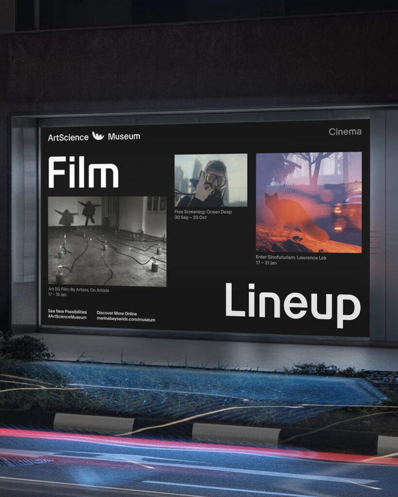
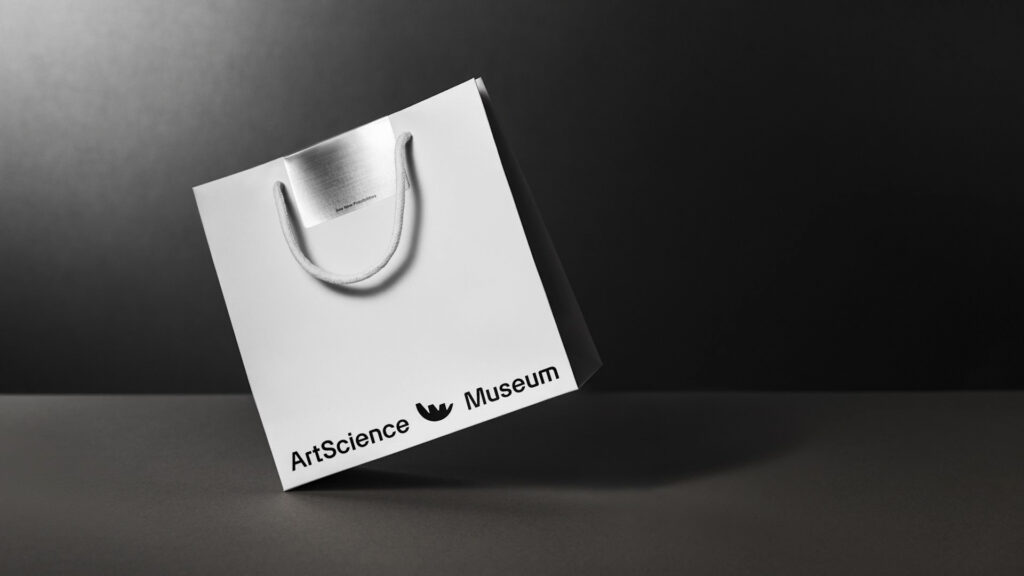
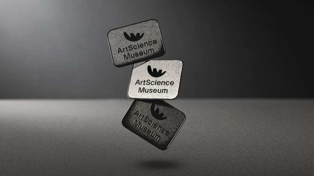
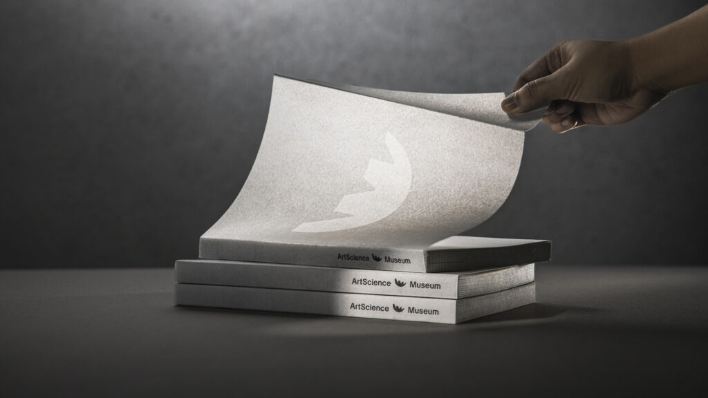
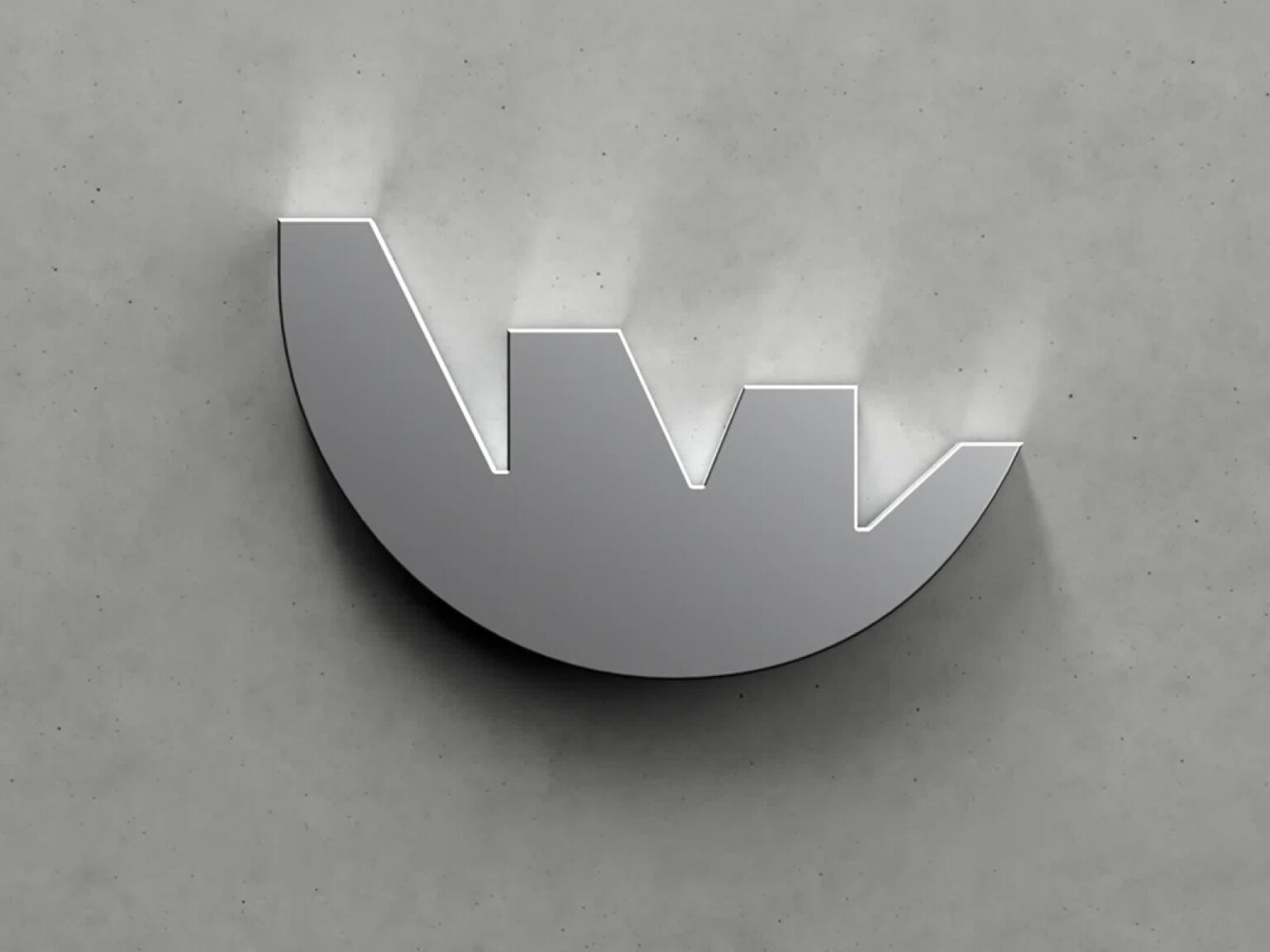
Project3 Agency defined the concept as fusion, focusing on the intersection of different fields and perspectives, where new ideas are born. This philosophy is naturally reflected in the logo, font colors, and graphic system. The custom typeface, based on the Atex typeface created by Optimo in Switzerland, is modified to resemble museum architecture with its combination of soft curves and solid cuts. The logo, featured on the front, reflects the lotus flower shape, achieving both sculptural beauty and symbolism.
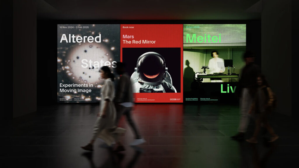
The color system, inspired by nature and science, spans a wide spectrum. Concentrations and tones are refined to harmonize with key exhibitions, maximizing usability. The entire brand guide, consisting of 300 pages, is designed to convey a consistent language throughout the exhibition, from the exhibit guides to the merchandise and signage system.