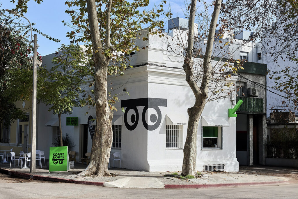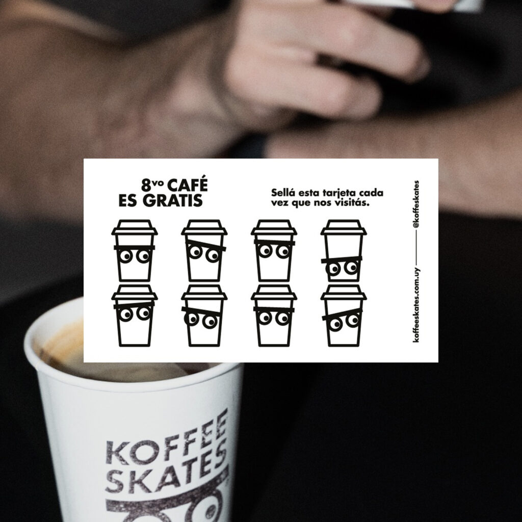

우루과이 몬테비데오의 ‘코피 스케이츠(Koffee Skates)’는 스케이트 문화와 커피 문화를 과감하게 결합한 브랜드로 주목받고 있습니다. 브랜드 아이덴티티는 어나더 먼데이 스튜디오의 디자이너 베르흐 코토기안과 후안 마누엘 바르베가 작업했으며, 일상과 거리의 감각을 동시에 담아냈습니다. 스케이트숍이자 카페인 이 공간은 도시의 새로운 만남의 장소로 자리 잡으며 스케이터와 예술가 그리고 커피 애호가들이 자연스럽게 섞이는 문화의 중심이 되었습니다.
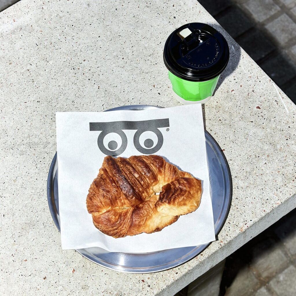
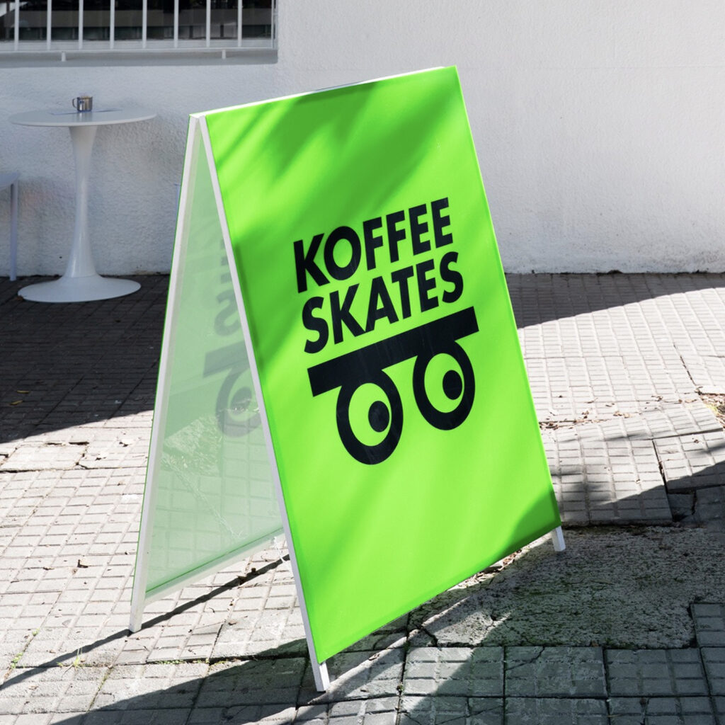
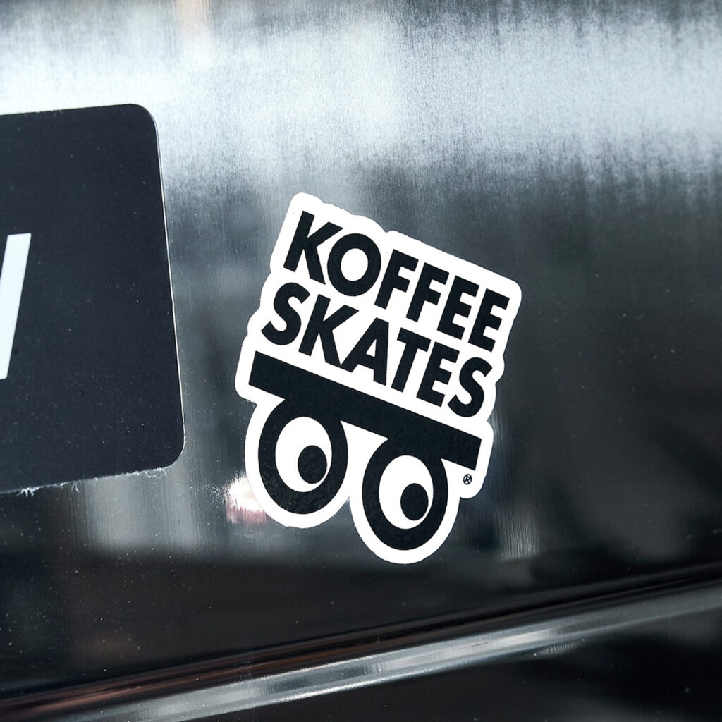
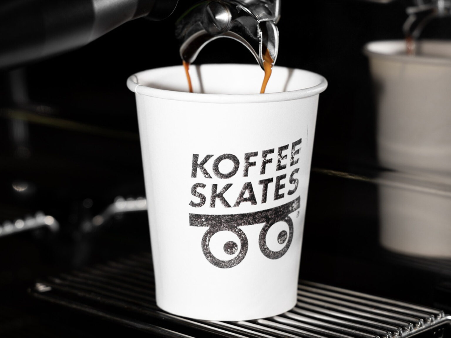
로고는 단순하지만 강렬한 인상을 남깁니다. 스케이트보드의 바퀴 자리에 커다란 눈을 배치해 커피의 각성과 스케이트의 집중을 시각적으로 연결했습니다. 고정되지 않고 상황에 따라 시선이 달라지는 이 눈은 거리 문화의 유동성과 즉흥성을 상징합니다.
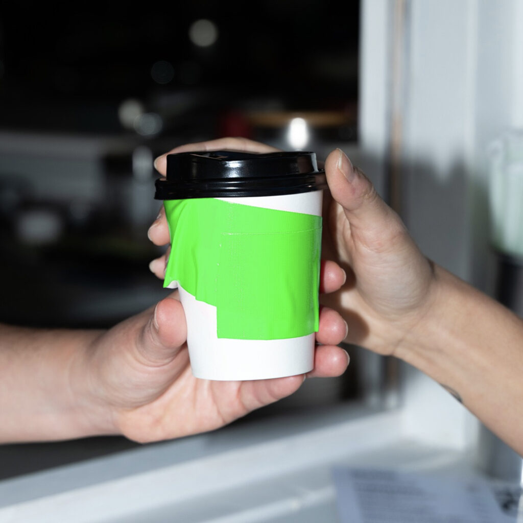
시각 언어의 핵심은 스케이트 문화의 상징적인 소재인 덕테이프입니다. 신발을 보강하기 위해 테이프를 붙이는 스케이터의 습관에서 출발한 아이디어로, 브랜드의 모든 터치포인트에 적용되었습니다. 포장 봉투는 테이프로 봉해지고 커피 컵 슬리브 또한 테이프로 감쌉니다. 이때 사용된 테이프는 단순한 회색이 아닌 네온 그린 컬러로 선택돼 흑백의 미니멀한 팔레트 속에서 강렬한 포인트를 만듭니다.
결과물은 거리의 감각과 실험정신을 그대로 담은 그래픽 아이덴티티입니다. 억지로 스케이트와 커피를 엮기보다는 두 문화가 공유하는 에너지를 관찰하고 그것을 시각적으로 번역했습니다. 간결하면서도 생동감 있는 이 시스템은 브랜드의 태도를 그대로 드러냅니다.