덴마크 여자축구 리그가 ‘리가포르분데(Ligaforbundet)’라는 새로운 이름과 함께 리브랜딩을 단행했습니다. 이번 변화를 통해 성별이 아닌 경기 그 자체에 집중하는 새로운 정체성을 구축하고, 리그의 위상을 높이려는 전략적 의지를 드러냈습니다.
이번 프로젝트는 스웨덴·덴마크 기반 디자인 스튜디오 NORD ID가 맡았으며, “A Game at Pitch Two can Play(누구나 함께 뛰는 경기)”라는 콘셉트 아래 시각 언어 전반을 재정립했습니다.
리그협회는 1981년 ‘Damedivisionsforeningen(여자 디비전 협회)’으로 설립되었고 이후 ‘Kvindedivisionsforeningen’으로 명칭을 바꿨습니다. 그러나 2025년 7월 20일, 성별 구분을 삭제하고 ‘리그협회(Ligaforbundet, 약칭 LF)’로 공식 변경했습니다.
NORD ID의 COO 프레데릭 소머는 “덴마크 여자축구 리그를 남자 리그의 파생 브랜드로 보이게 하고 싶지 않았습니다. 챔피언스리그와 여자 챔피언스리그처럼 분리된 구도가 아니라, 스스로 자립한 하나의 리그로 존재해야 한다는 철학을 담았습니다”라고 밝혔습니다.
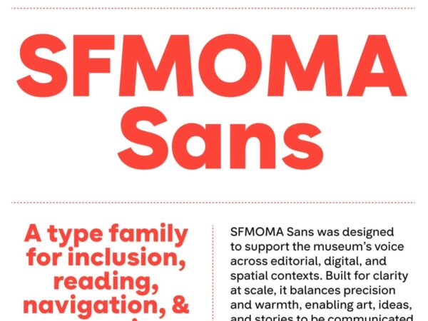
새로운 시각 정체성은 경기장의 선과 각도에서 영감을 받은 별표(asterisk) 심볼을 중심으로 구축되었습니다. 이 기호는 경기의 긴장감과 역동성을 표현하며, 단순하지만 강렬한 상징으로 기능합니다. NORD ID는 덴마크 서체 디자이너 트리네 라스크와 함께 A리그를 위한 전용 모노스페이스 서체도 개발했습니다. 이 서체는 웹사이트, 방송, SNS 등 모든 플랫폼에서 일관된 브랜드 경험을 제공합니다.