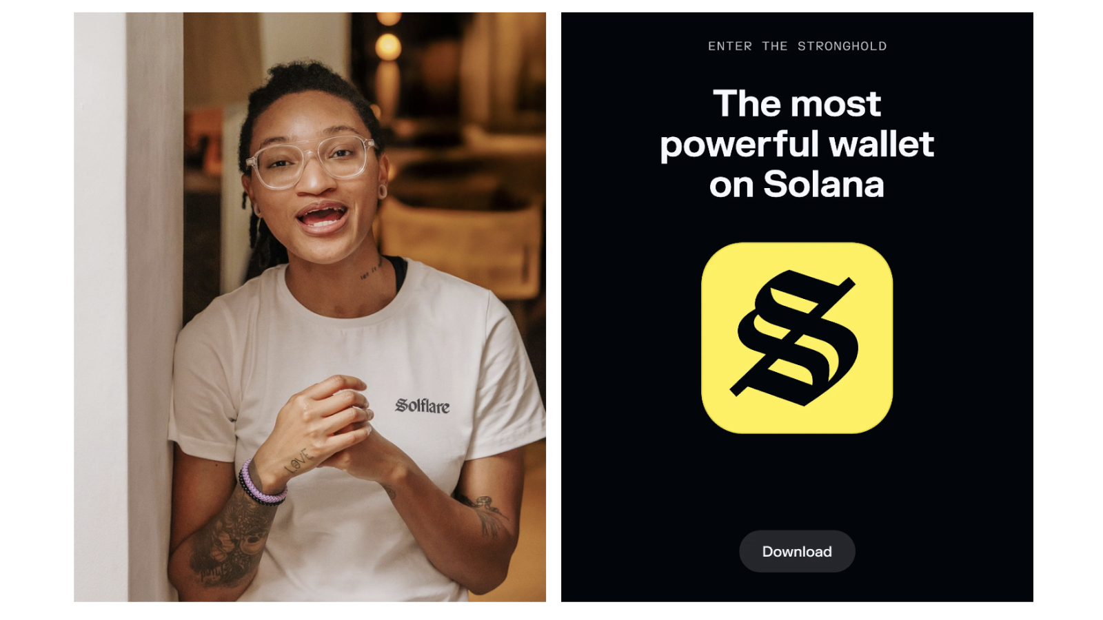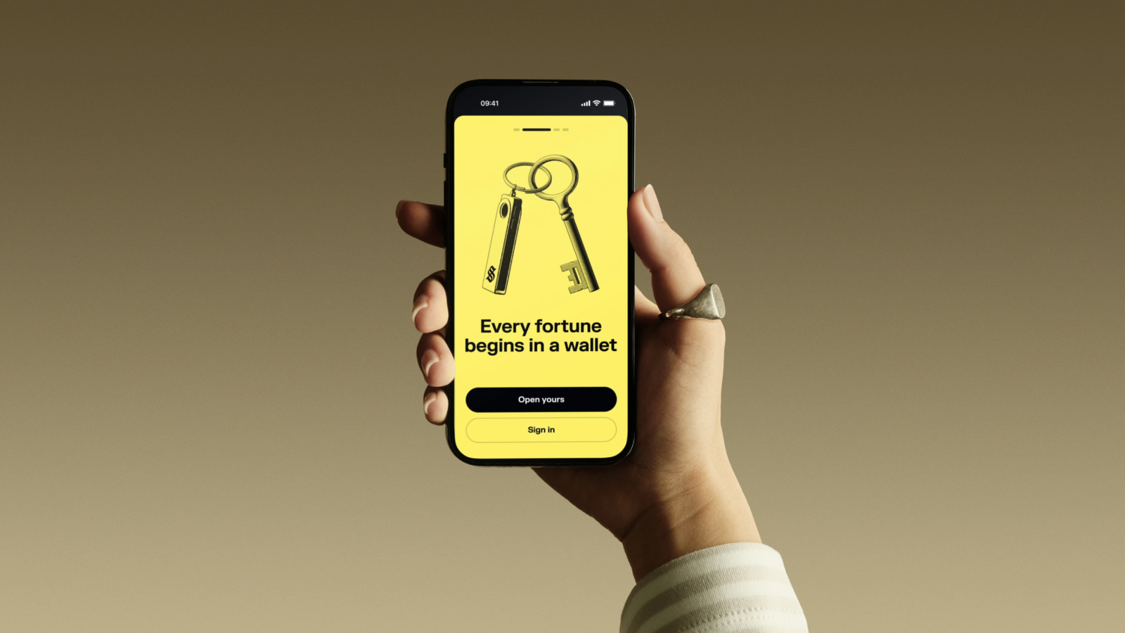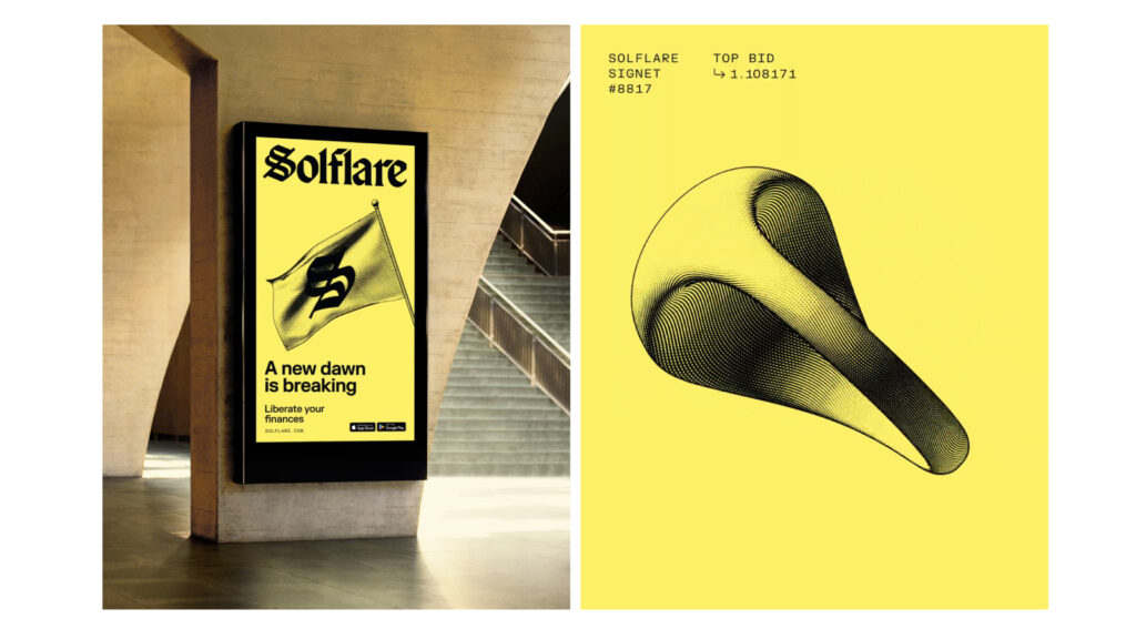

Founded in 2021 on the Solana blockchain, Solflare has rebranded, prioritizing security. This rebrand was achieved in collaboration with London-based branding agency Ragged Edge. They define Solflare as a "Stronghold of the Free," creating a space that provides users with stability and autonomy in a turbulent market.
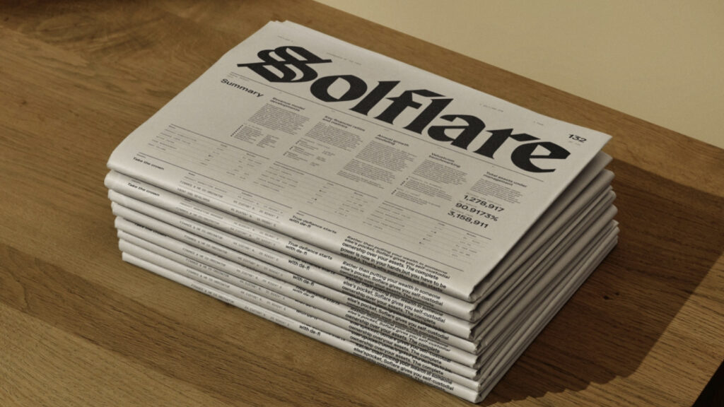
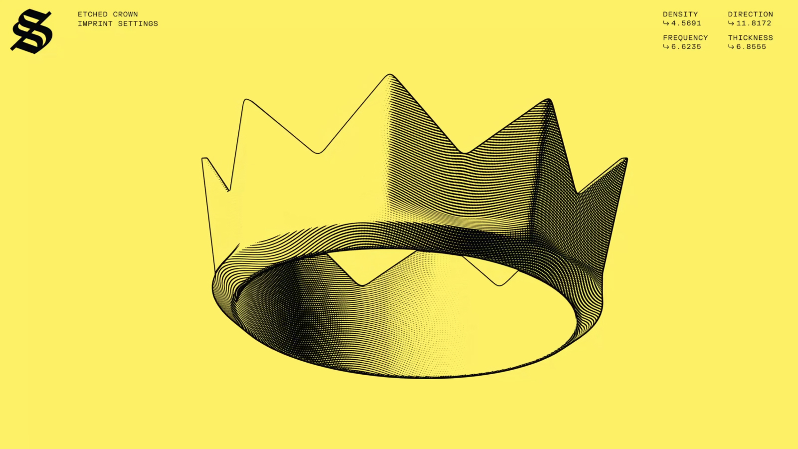
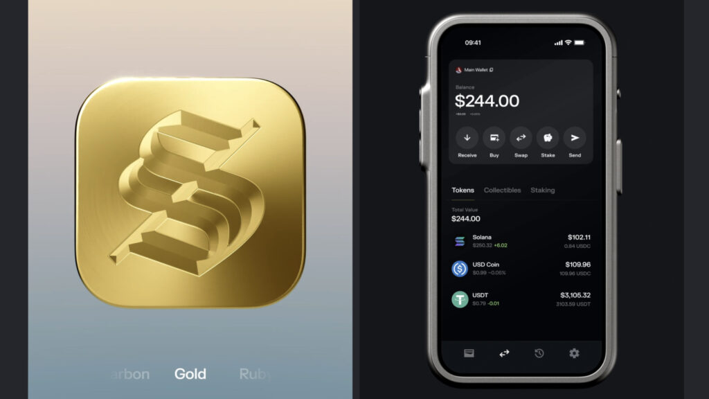
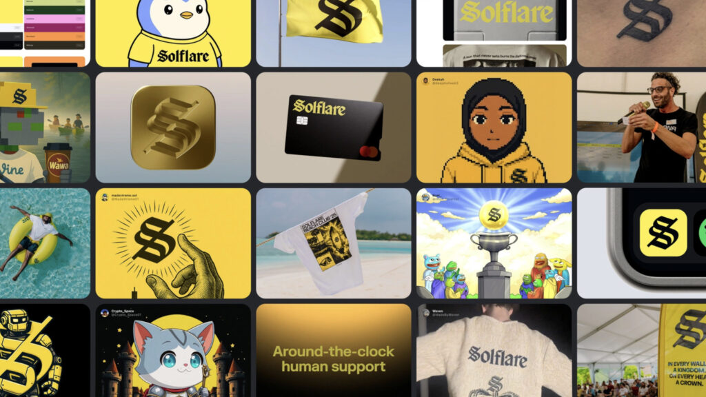
The new brand identity borrows from the codes of banking's past, when it was a symbol of trust and prestige, but reimagines them for a modern audience. The logotype draws inspiration from the typefaces of early banking charters, while the illustrations, featuring symbols like crowns, castles, shields, and locks, reimagine classic engraving techniques for the digital age. The vibrant yellow palette and gothic-style fonts evoke both sophistication and authority. “We've moved away from the clichéd cryptocurrency aesthetic and returned to the codes of trustworthy finance,” explains Luke Woodhouse, Senior Creative Director at Ragged Edge.
The brand's language has also evolved. While maintaining the freedom and optimism of cryptocurrency, it's complemented by a calm, assertive tone. Woodhouse defines this as "a voice that blends the philosophical wisdom of classical music with the lyricism of modern rap." Associate Creative Director Jessica Bongun explains, "We needed to create something that was welcoming to beginners while also being relevant to hardcore fans. That's how Stronghold was born."