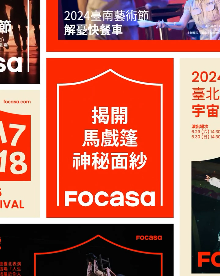

Taiwan's FOCASA Circus has undergone a complete transformation to celebrate its 15th anniversary. This rebranding, overseen by creative studio Bito, presents a dynamic identity that combines technology and performing arts. Like acrobats on stage, the new identity flexibly transforms and moves, coming to life across a variety of media and spaces.
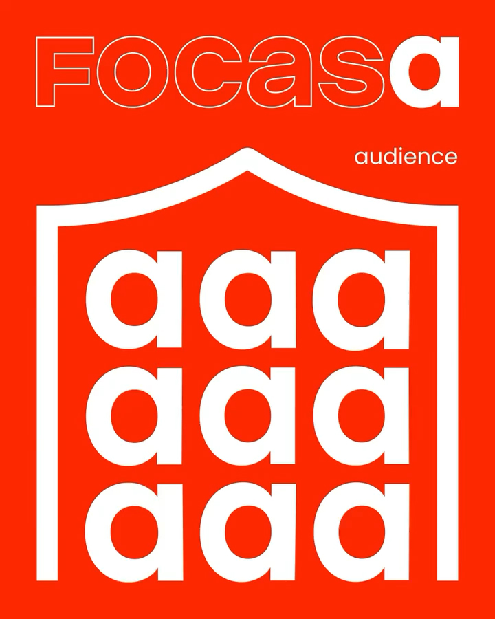
The essence of this transformation begins with the name. The expanded name, FOCASA, represents each letter representing a different circus troupe, while the two "a" shapes symbolize the moment when audience and artist meet and connect under one roof. This typography captures the joy of celebration and the warmth of community without the need for balloons or typical circus symbols.
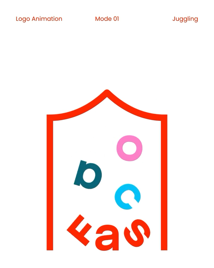
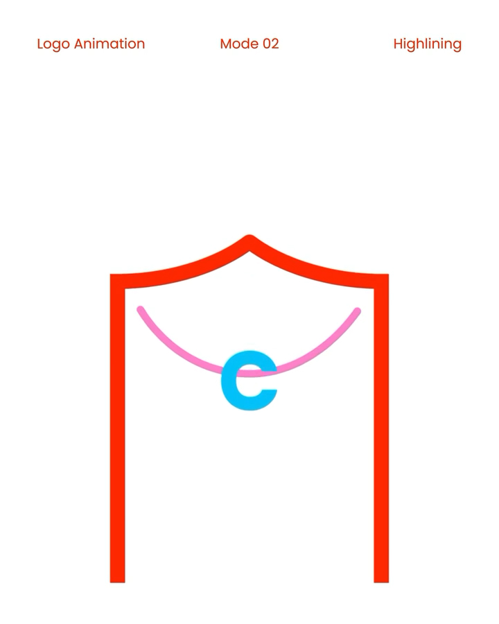
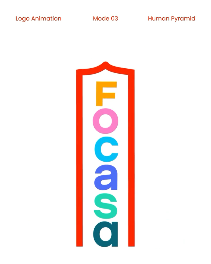
Vito incorporated familiar movements from circus performances, such as tightrope walking, juggling, and stacking, into his motion design system. When the letters are aligned, it looks like performers are preparing for a show on center stage, transforming the brand itself into a performance.
The most striking element is the interactive creation tool. When a user types a phrase, the letters appear within the circus tent, changing size and movement in response to sound. The louder the voice, the more intense the performance becomes, and it can be used in a variety of environments, from mobile screens to large-scale projections.
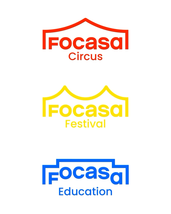
The three sub-brands each feature distinct visual language. "Circus" is inspired by a stage and curtain, "Festival" by a connected giant tent, and "Education" by stairs and platforms symbolizing growth and learning.