
Life 4 Cuts has rebranded. This change is intended to strengthen brand identity as it expands globally and to provide consistent brand experiences both online and offline. Life 4 Cuts has previously targeted women in their teens and twenties as its main customer base, but through this rebranding, it aims to transform into a brand that anyone can enjoy regardless of age or nationality.
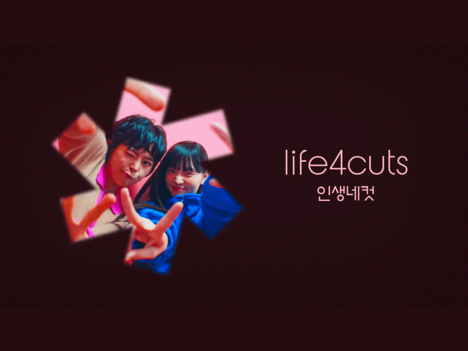
It has been changed to a thin hairline font without decoration. The existing 'Four' has been shortened to the number '4'. The brand symbol represents photography by symbolizing the movement of a camera shutter and aperture.
With this rebranding, we are introducing a new ‘Life 4 Cuts +’. We will provide customers with a richer photography experience by operating photo booths with various concepts in one store. The first Life 4 Cuts + store is scheduled to open in Ikseon-dong, Jongno-gu in mid-April.


