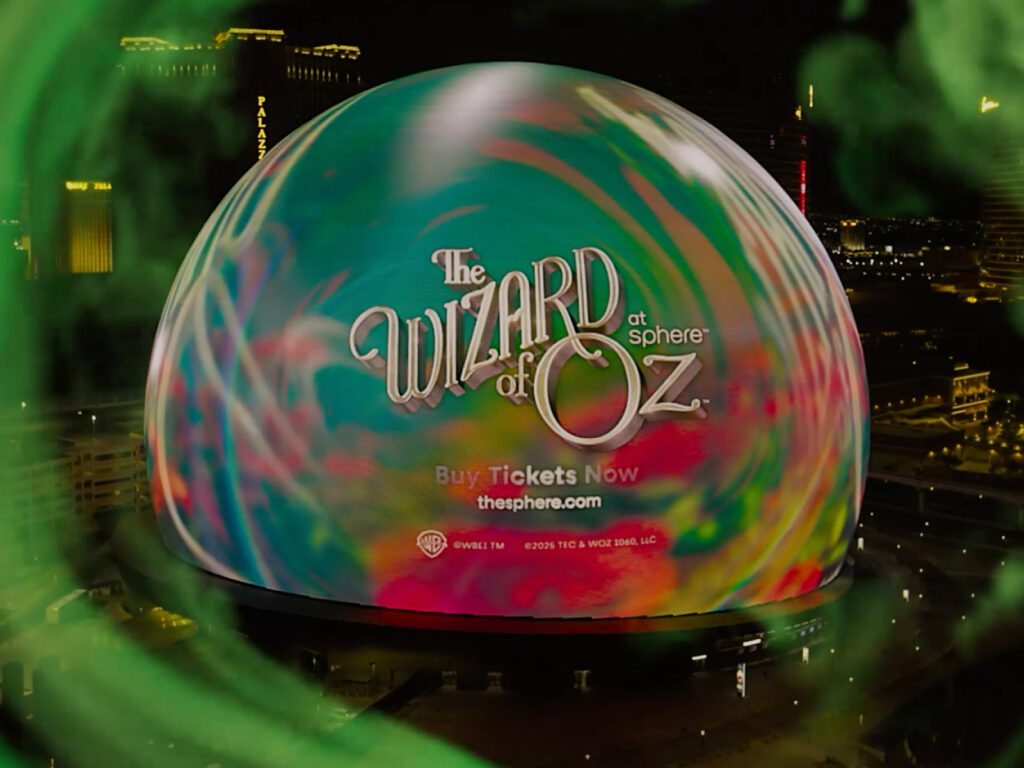
The Wizard of Oz is being reimagined at the Sphere, a massive theater in Las Vegas. This classic film will be brought to life through a 160,000-square-foot curved LED screen and 4D immersive technology, transporting audiences into the film's narrative. Beyond the screen, audiences will experience the film firsthand, feeling the wind and vibrations. This project took nearly two years and involved a team of over 2,000 people. Sphere CEO James […]
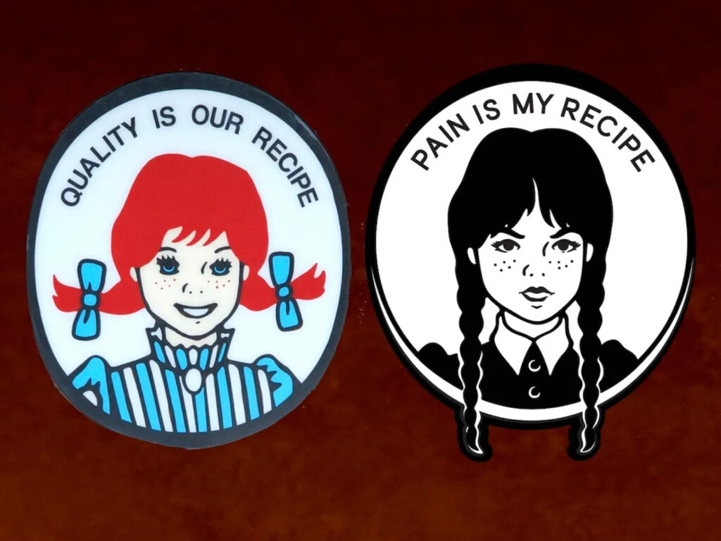
American fast food chain Wendy's has collaborated with the hit Netflix series "Wednesday" to launch a unique menu item. This limited-edition collaboration, titled "Unhappy Meal," will be available at all Wendy's locations and through the app in the U.S. starting August 4th, with availability in select markets, including Canada, starting August 11th. This collaboration captures the dark humor and dark comedy sensibility of the "Wednesday" series. The iconic Wendy's pigtails and Wednesday […]
American beverage brand Lemon Perfect collaborated with New York-based creative agency &Walsh to launch a new brand campaign embodying the message, "Drinking water isn't a chore, it's a necessary and enjoyable experience." &Walsh redefined Lemon Perfect from "boring water" to "flavorful pleasure," employing a visually stimulating strategy. The campaign utilized vibrant colors, refreshing textures, and a vibrant digital aesthetic. "When you see a lemon, your body […]
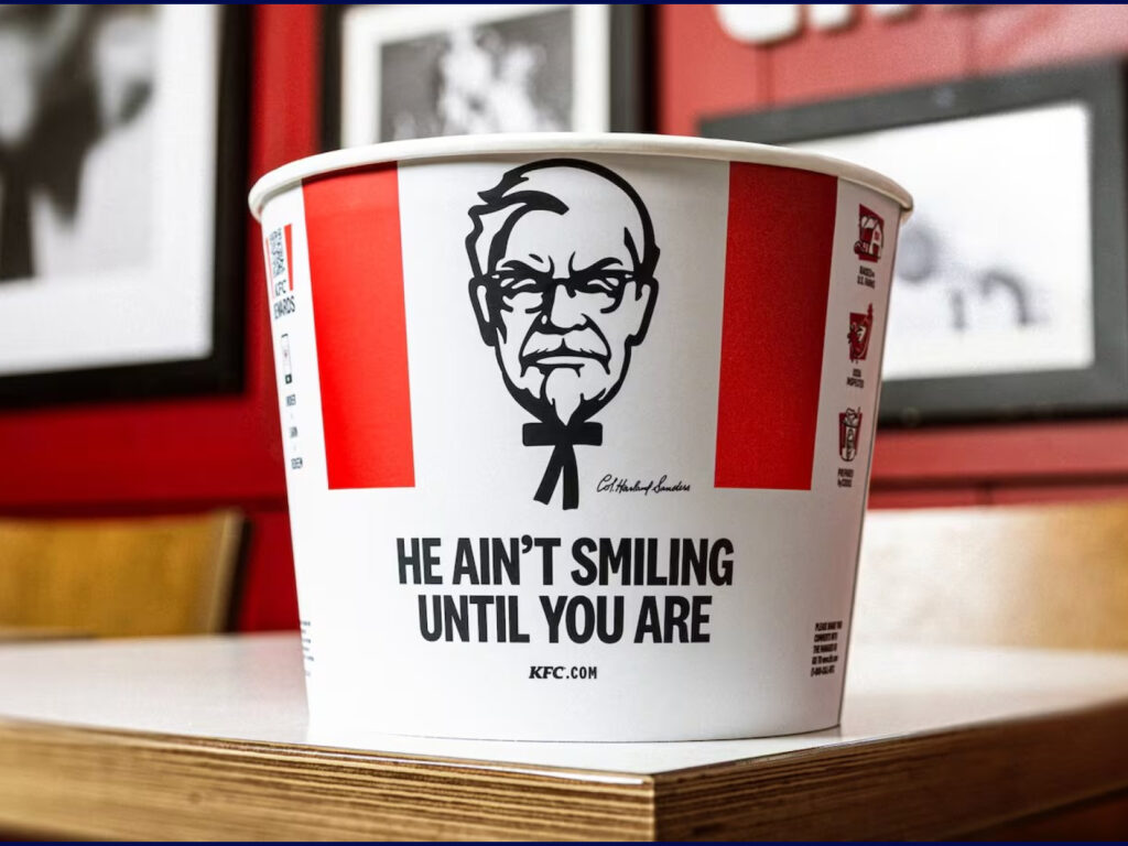
KFC has launched a new campaign featuring a smiling Colonel Sanders. By reimagining Sanders as a real-life figure who obsessively pursued "perfect chicken," KFC is strongly appealing to the brand's identity and raison d'être. Created by American creative agency HiDive, the 75-second spot highlights Sanders' uncompromising approach to the chicken cooking process. He doesn't throw away substandard gravy, […]
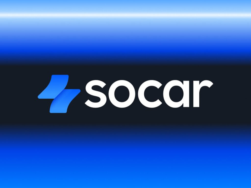
SOCAR has rebranded. Launched in 2011 as Korea's first car-sharing service, SOCAR has grown into a mobility platform with over 10 million users. Beyond car sharing, SOCAR offers a variety of transportation options and services, but its existing brand identity struggled to fully capture its expanded value. To address this, SOCAR has established a new identity that matches its evolving service spectrum and user expectations. The most significant change is its symbol. Previously, the symbol symbolized parking lines […]
This is the brand design for Yandex Go, a super app that integrates various everyday services launched by Yandex in 2020. Because Yandex Go began as a taxi app, users' perception of it remained limited to a "taxi app," and its other features were overlooked. Consequently, a major rebranding was undertaken in collaboration with design studio Magic Camp. The starting point for this new design strategy wasn't a simple UI overhaul, but rather a fundamental question: "What kind of experience does Yandex Go provide to users?" Among the numerous concepts […]
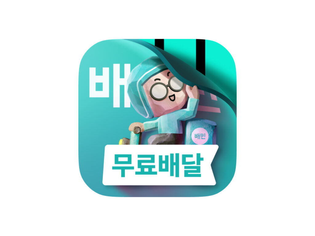
Baedal Minjok has embarked on a major rebranding to celebrate its 15th anniversary. Woowa Brothers, the company behind the rebranding, has dubbed it "Baemin 2.0" and is embarking on a comprehensive transformation, encompassing everything from its brand identity to its app design. This rebranding begins with a visual overhaul of the Baemin app. Following the unveiling of a new app icon on the 9th, new colors and fonts were introduced on the 22nd. A lighter mint color has been adopted, creating a palette that complements black with a lighter tone. The font has also been updated. […]
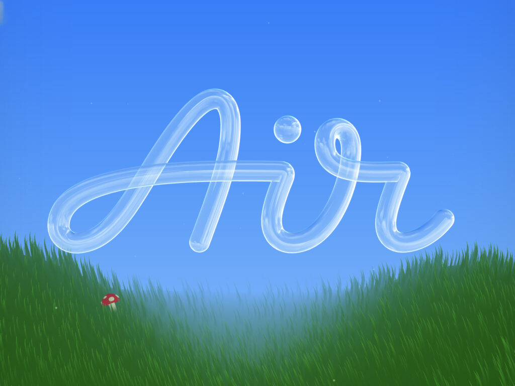
This brand design collaboration between Richard Tully and Air, a cloud-based digital asset platform for creators. The project broke the mold of flashy brand renewals, focusing on essence and creating "space to breathe" through a restrained design. Tully's team explored the direction by drawing hundreds of "A's" on various materials. Their conclusion: "The best rebranding is the one that doesn't rebrand at all." […]
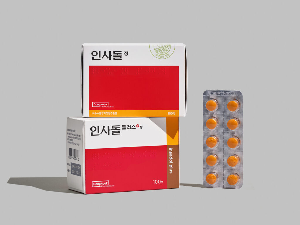
Insadol, a synonym for gum care, has collaborated with design studio Double D to revamp its brand. First introduced by Dongkook Pharmaceutical in 1978, Insadol has been a leader in the gum care category for nearly half a century, earning consumer trust. In 2014, the company expanded its product line with the launch of "Insadol Plus," which incorporates a combination of herbal ingredients, further solidifying its position as a leading brand among older consumers. However, as middle-aged and older consumers become increasingly more conscious and sophisticated in their consumption habits, the Insadol brand needed a more contemporary approach. The original Insadol logo […]
Lyft, a well-known ride-sharing service, has collaborated with design studio Koto to revamp its brand. Since its founding, Lyft has positioned itself as a brand that prioritizes fun, challenging the dull ride-sharing market. However, after more than a decade, Lyft wanted to re-align its brand with a more mature and redefined brand strategy. To achieve this, Lyft collaborated with various departments, including creative, product, and marketing, to develop a new creative platform and […]
For the first time in its history, Range Rover is unveiling its own emblem. This is part of JLR's "House of Brands" strategy, which aims to operate its four strategic brands—Jaguar, Defender, Discovery, and Range Rover—independently. The newly unveiled logo features two vertically aligned Rs, with the lower R inverted. It does not replace the existing "RANGE ROVER" wordmark affixed to the front or rear of Range Rover vehicles. Instead, it serves as a supplementary design element for labels, patterns, and event venues with limited space.
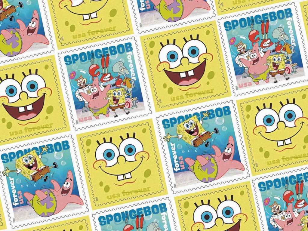
The United States Postal Service will be issuing a commemorative stamp set featuring the popular animated character SpongeBob SquarePants, starting August 1st. The four limited-edition Forever Stamps will be released in conjunction with a public event in New York City's Times Square and will be available for purchase at all post offices and online. The Forever Stamps are currently worth the equivalent of one ounce of regular postage and will be available for purchase at no additional charge, even if postage rates increase in the future. This […]