This brand design is a collaboration between Eternal Research and creative agency Cotton. This renewal begins with the fundamental question, "How do we see and hear sound?" and seeks to redefine the boundaries between sight and hearing. The design draws on the intricacies of Victorian decorative aesthetics while being realized using cutting-edge generative code. Simultaneously sophisticated and experimental, the new identity embodies a balance of classic elegance and modern innovation. Eternal Research defines music production as a meticulous and exploratory act, and this philosophy […]
Musinsa has unveiled a new store logo and brand identity (BI) system for the first time in seven years. This renewal marks a shift in its global expansion strategy, separating Musinsa as a company from Musinsa Stores as a service. The new BI is based on the existing capitalized English "MUSINSA," but has been redesigned with a bolder, more robust form. It visually embodies Musinsa's commitment to expanding beyond its fashion platform into the global market and offline spaces. This logo will be used for the online store as well as […]
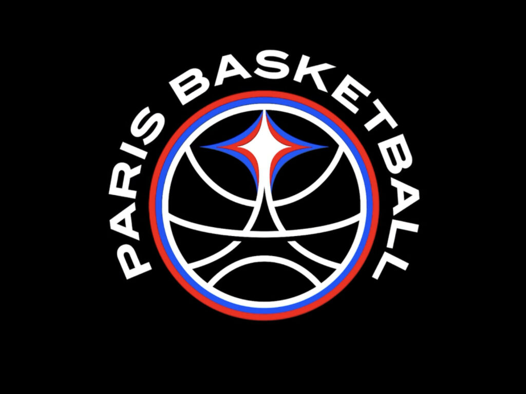
Paris Basketball, the professional basketball team in Paris, has unveiled a new visual identity. Led by French agency Yard, the rebranding visually combines the symbolism of Paris with the legacy of basketball culture, centered around the theme of "light." Inspired by Paris's nickname, "City of Light," light is defined as a symbol of pride and a metaphor for the potential and talent of its rising players. The new emblem combines the silhouette of the Eiffel Tower with the shape of a basketball, capturing both the symbolism of the city and the energy of sports. Initially […]
Barcelona City Hall has unveiled a new visual identity. Overseen by design studio Principi, the project was completed with the motto "City and Coat of Arms, in that order," placing the city itself at the center of the brand. The new identity is integrated across all City Hall's communication channels, establishing a flexible yet clearly recognizable visual language. The core objective was to visually embody a communication structure that centers the city and its citizens. Through this change, the city aims to […]
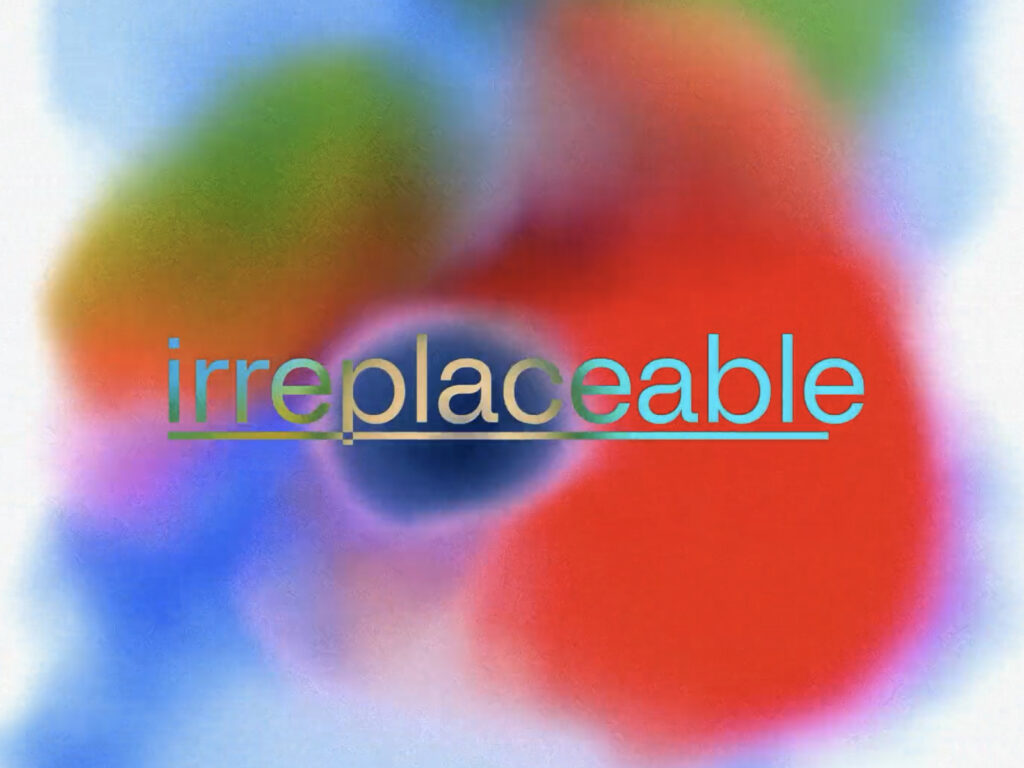
Dutch design studio Verve, seeking a way to visually express its brand's "irreplaceability," has unveiled a new visual system called "Brand Auras." Combining the texture of analog watercolors with AI-driven motion algorithms, the rebranding captures a sense of both human and digital. "The most important thing in creating our new identity was to visualize the essence of the brand," explains Verve's Creative Director, Valeiwin de Boer. "It's a blurry, out-of-focus, yet emotionally charged […]
This is a brand design collaboration between Kunsthalle Basel, Switzerland's oldest contemporary art institution, and Porto Rocha. Kunsthalle Basel has been the first to introduce unknown artists, embrace new media, and open its doors to the public when contemporary art museums remained the preserve of the elite. Without a permanent collection, Kunsthalle has always prioritized the "now" and the "next," providing an early stage for artists who shaped their eras, from Marcel Duchamp to Anne Imhoff. A new visual […]
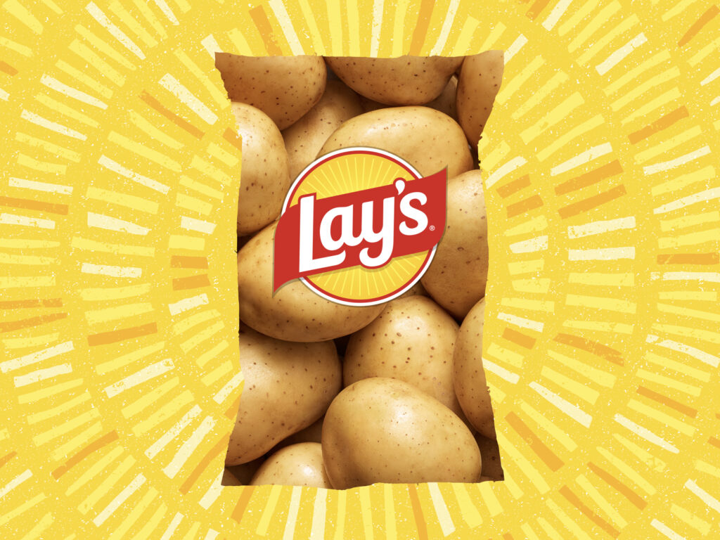
PepsiCo's potato chip brand Lay's has launched the largest rebranding in its nearly 100-year history. The company announced plans to eliminate artificial flavors and colors from its core US products by the end of 2025 and improve manufacturing methods with healthier oils. "Lay's Baked" chips use olive oil to reduce fat by 501 tbsp./300g compared to regular chips, while "Lay's Kettle Cooked Reduced Fat Original Sea Salt" uses avocado oil to reduce fat by 401 tbsp./300g. The new […]
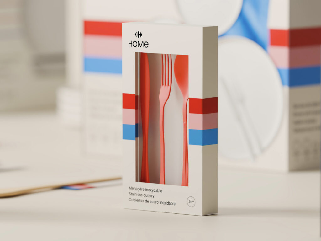
Carrefour Home, a private label brand operated by French retailer Carrefour, centers around the "Home Universe," a core part of the Carrefour shopping experience and an increasingly strategic presence in the global private label market. Led by brand strategy studio Tátil, the rebrand visually embodies Carrefour's new vision: transforming "home" from a simple category into a "destination" through emotional appeal, clear language, and a connection to modern lifestyles. The project is a large-scale retail […]
Bucketplace, the operator of Today's House, has launched a rebranding initiative that reflects a new brand vision. The core of this transformation is its evolution into an "integrated life event solution" that provides a seamless experience from purchase to construction, under the motto "Easy Home Change." Launched in 2014, Today's House has grown into a leading domestic living platform, leading the previously offline-centric living industry to online adoption through its 3C flywheel of content, community, and commerce. In 2019, it introduced an interior construction service, standardizing construction […]
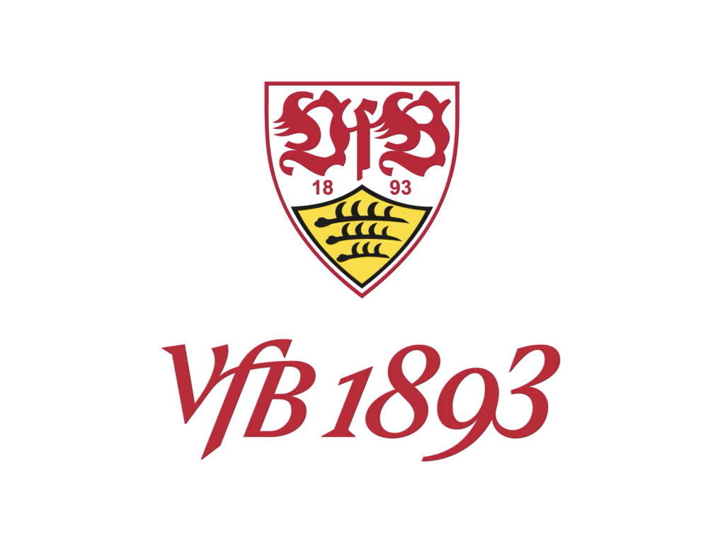
VfB Stuttgart has unveiled a new brand identity. As its original name, "Verein für Bewegungsspiele" (Association of Movement), suggests, the rebranding is centered around "movement." It captures 132 years of history, identity, and emotions. This project was completed in collaboration with Societas, a design studio specializing in sports brands. The original emblem, red and white club colors, and the red stripe across the chest remain. A new addition is the "VfB 1893" […]
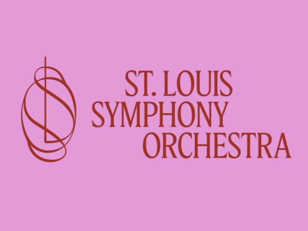
Eddie Opara of design studio Pentagram and NJen Works have unveiled a new brand identity for the Saint Louis Symphony Orchestra (SLSO). Ahead of its 146th season, this rebranding marks a historic turning point for the orchestra and heralds a new era for Powell Hall, which has reopened following a major renovation. This renovation, centered around the construction of the Jack C. Taylor Music Center, designed by Snøhetta, cost $140 million […]
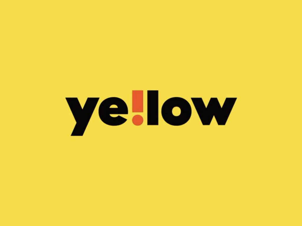
E-Mart 24 will launch its new private label brand "Ye!low" on the 1st of next month, strengthening the competitiveness of its private label products. With a growing number of customers valuing reasonable consumption in an era of high prices, the company is committed to pursuing a differentiated product strategy based on quality and concept, rather than simply competing on price. "Ye!low" embodies the motto, "Quality is Ye! Prices are Low," and also symbolizes E-Mart 24's signature color, yellow. The brand's slogans include "Amazing Price," "New Trend," and "Healthy" […]