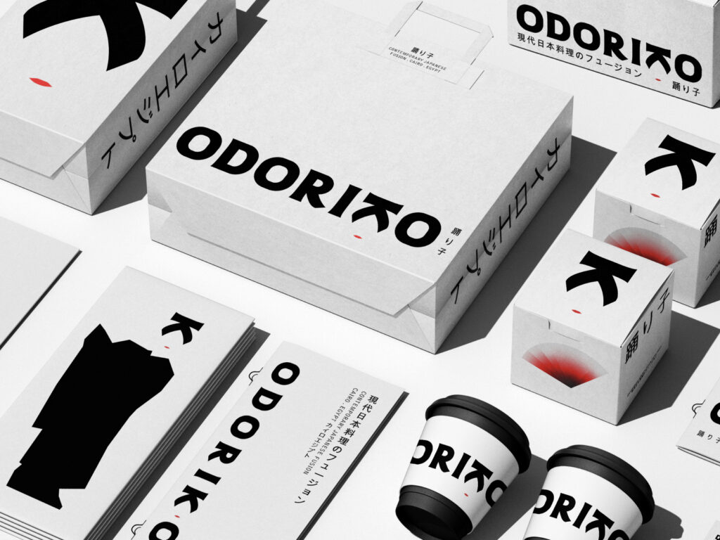
Odoriko, whose name means "dancer" in Japanese, is a modern Japanese fusion restaurant located in Cairo, Egypt. The brand, which values the harmony between tradition and modernity, delicately expresses this balance in its logo design. The typography, which depicts the letter "k" as the face of a traditional dancer, captures the elegance and refinement of Japanese aesthetics while also revealing a restrained, modern sensibility. Clean lines and simple forms demonstrate a respect for tradition while simultaneously creating an expressive […]
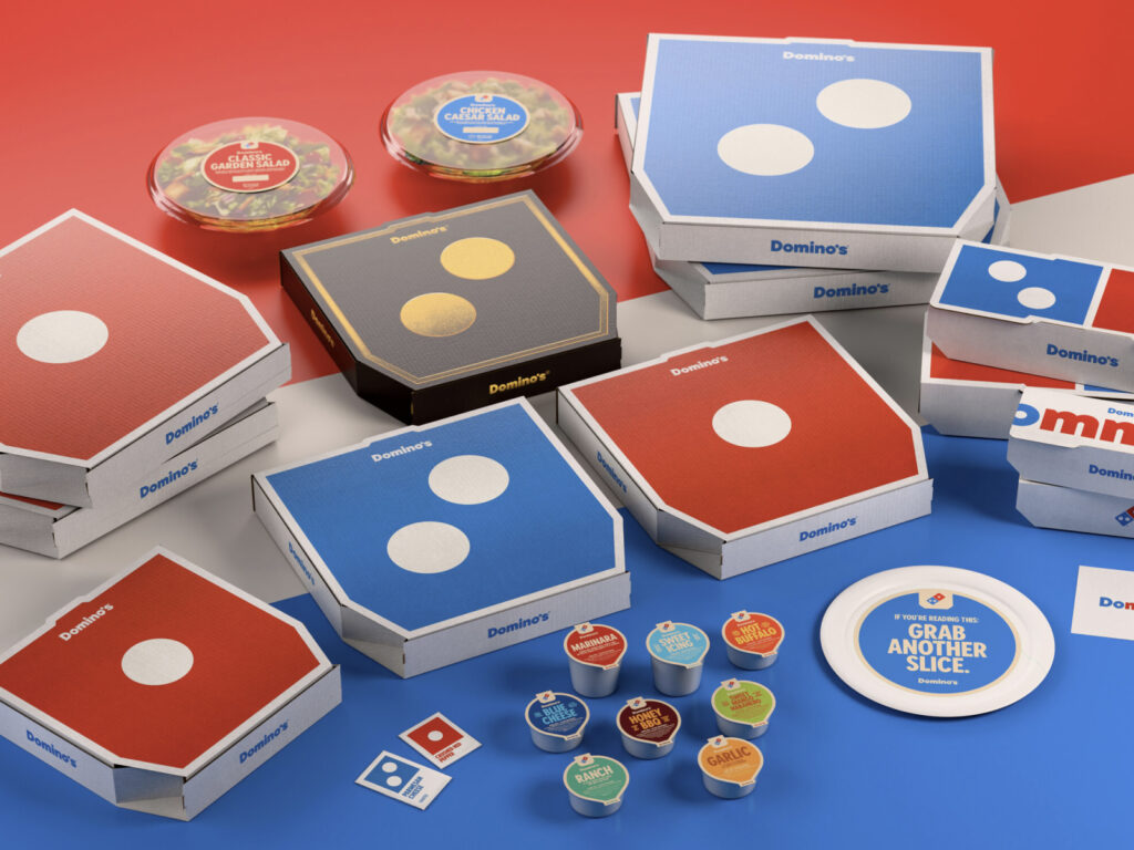
Domino's Pizza has completely revamped its brand after 13 years. Under its "Hungry for More" strategy, the world's largest pizza chain aims to reach a new generation of consumers with bolder, more modern visuals and sounds. The new identity features a more vibrant red and blue palette, a bold, rounded font called "Domino's Sans," and a consistent design across packaging, store signage, employee uniforms, and even the app.
BLACKPINK's Jennie has unveiled a Korean font, 'ZEN SERIF', which modernly inherits the meaning of King Sejong the Great in celebration of Hangeul Day. Jennie participated in the planning of this project, and her agency, OA Entertainment (ODD ATELIER), distributed the font for free through the official website on October 8. Jennie had previously class Following the spread of Korean aesthetics to the world through , this time, the artistry and formative beauty of Hangul are being showcased on the global stage, ‘the most Korean yet global […]
Swedish fashion brand & Other Stories has unveiled a new brand identity, ditching its signature handwritten logo. The H&M Group-owned brand, known for its edgy high street style, recently unveiled its Fall/Winter 2025 collection alongside a new logo, signaling a major shift. Led by & Other Stories' Creative Director Jonathan Saunders, the rebrand focuses on "everyday, playful pieces." […]
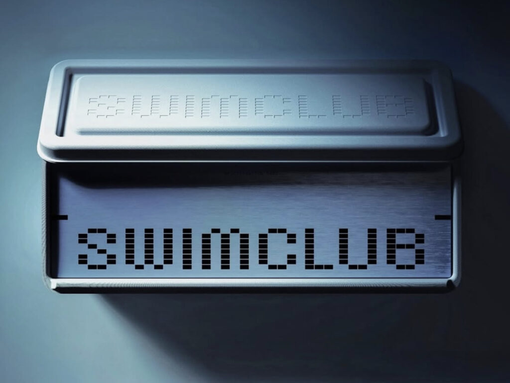
This is the SwimClub brand design, a collaboration between SwimClub and Design Studio Center. SwimClub is the first men's health supplement brand specializing in improving sperm performance. Dr. Michael Eisenberg, director of the Stanford University Center for Male Reproductive Medicine, served as Chief Scientific Officer. Based on research into male reproductive health, he developed the Spermatogen Complex, a combination of 12 clinically proven ingredients. The founders' personal experiences are behind SwimClub's creation. Co-founder Osman Khan experienced pregnancy […]
Microsoft has announced a major shift in its design language with a complete overhaul of its Office icons. This is the first major overhaul in seven years, since 2018, and visually reflects a new UX paradigm, represented by Copilot. "Icons are small, yet symbolic, intuitive gateways that make technology more accessible," said John Friedman, Vice President of Microsoft 365 Design and Research, who oversaw the design. "This icon overhaul is about connecting technology with users, not just formality, but also 'intention.'"
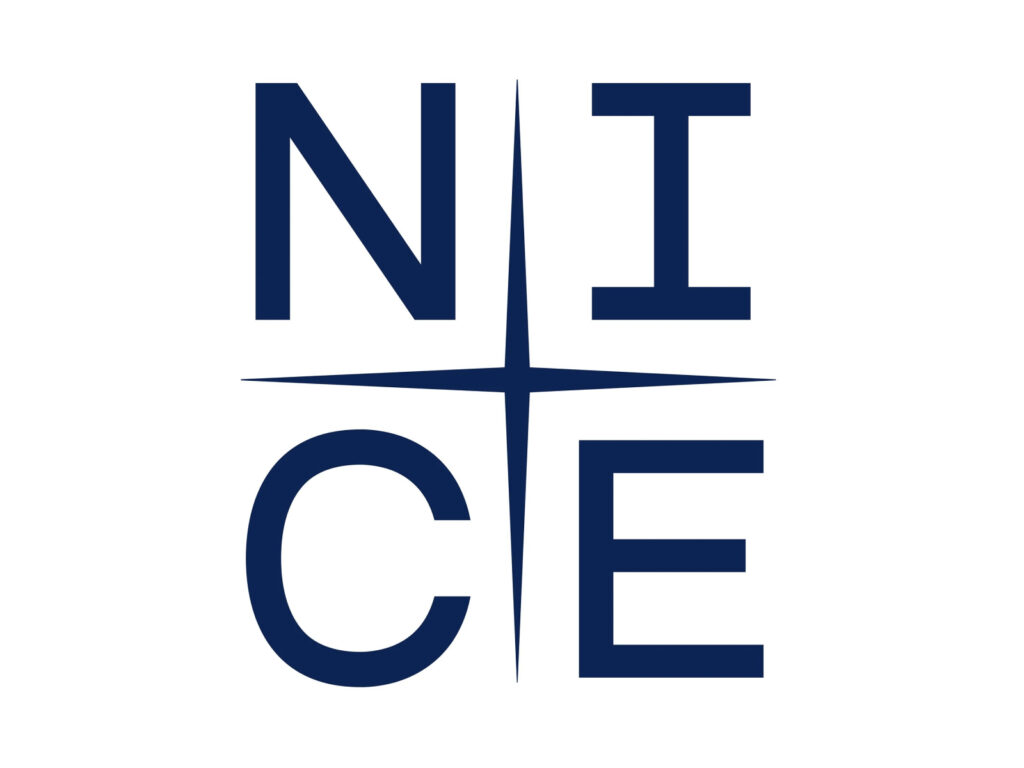
This is the brand design for NICE Group, South Korea's leading credit rating and data intelligence company. This renewal is considered a comprehensive transformation that goes beyond simple visual elements and fundamentally redefines the brand philosophy and strategy. Since its founding in 1986, NICE Group has been a leader in the domestic credit information industry, and through this renewal, the company focused on establishing a brand identity that resonates with the global market. Named, a branding firm, spent one year and six months developing NICE Group's core […]
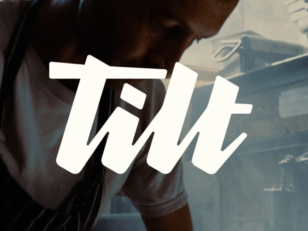
Empower, a fintech company founded in 2016, has partnered with London-based studio Ragged Edge to launch a major rebrand, dubbed "Tilt." This is part of a strategy to address the unfair credit system that affects over 100 million working Americans. Their goal is not simply to provide livelihood support, but to become partners in climbing the economic ladder. Millions of Americans still struggle with poor credit scores today […]
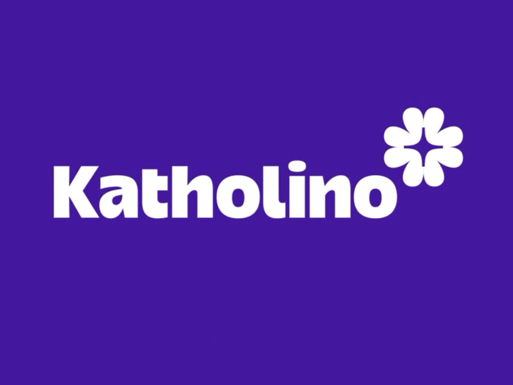
This is a new branding system developed by German design studio EIGA for the religious kindergarten network "Katholino." It's based on the philosophy of "helping each child express their individuality within a single framework." The core of the system is the logo motif of four hearts arranged in a cross shape, which simultaneously embodies emotional meaning and religious symbolism. EIGA developed over 500 logo variations based on this motif, each […]
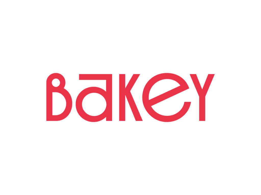
Mobile font platform "Sandol Cloud" is launching anew as "Bakey." Sandol, a content creator platform company, announced on the 26th that it will rebrand Sandol Cloud to "Bakey" and begin its global expansion, starting with the Asian market. This rebranding is interpreted as a strategic move to address the rapidly expanding use of entertainment fonts in mobile environments and to expand into the global market. The new name "Bakey" is inspired by a bakery brimming with desserts, embodying the unique flavors of […]
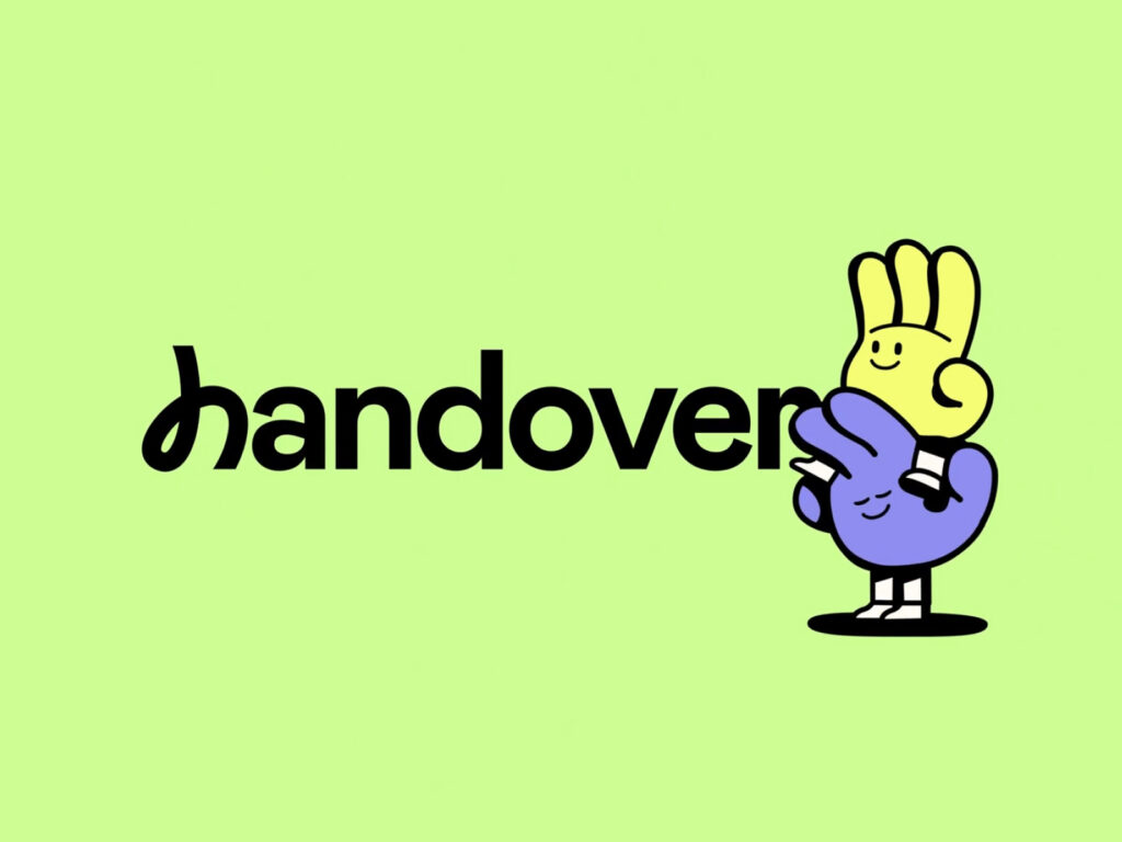
Handover has always been a burdensome task for employees. Documents hastily drafted just before leaving a company often become unfriendly and confusing for new hires. Handover, a startup that has reimagined this chronic problem with AI technology, is gaining attention. The brand design was done in collaboration with Made Together. Handover presents a vision to reimagine handover as a single experience. Instead of monotonous text documents, it combines video, integration with business tools, and AI summaries to create a rich and interactive experience. […]
Suzuki Motor Company has announced a shift in its brand identity by renewing its product emblem for the first time in 22 years. The new emblem, featuring a flat, high-gloss silver paint, replaces the previous three-dimensional, chrome-plated logo, presenting a new brand image suited to the digital age. This change visually embodies Suzuki's newly established corporate slogan, "By Your Side." The company has long emphasized customer-centric values, and the new emblem […]