Fintech company Stripe has unveiled a new logo. Replacing its previous slanted "S" icon, the new logo features a single white diagonal line on a blue square background, a geometric motif derived from the dot above the "i" in Stripe's English logo. Focusing on simplicity and scalability, the redesign applies across Stripe's diverse product lines, including its payment solution "Checkout" and its fraud prevention service "Radar." Stripe already had its current […]
This is the brand design for the wine brand OTHER. Emphasizing "difference," the brand introduces the stories of lesser-known regions and independent winemakers, encouraging consumers to enjoy wine with curiosity and an open mind. The brand's visual identity was designed by London-based studio Cache & Carey Studio. The central logo is characterized by organic flow and subtle movement. It captures both the natural flow of wine and the narrative, while also incorporating intentional imperfection […]
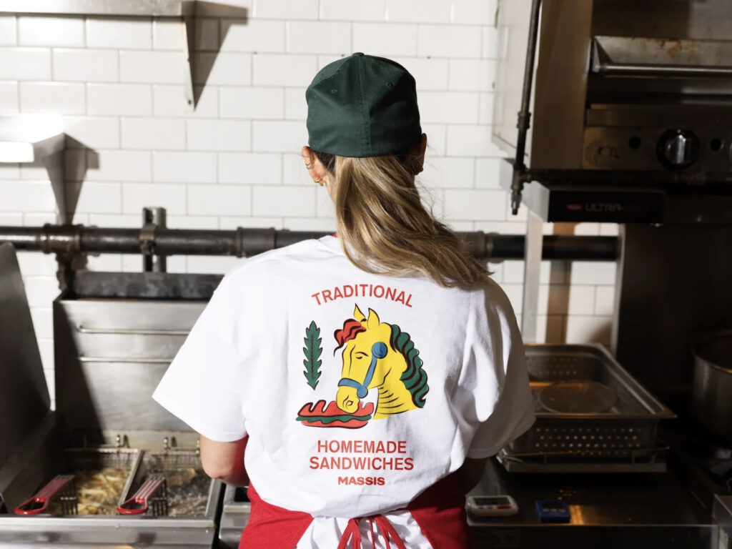
Brand design for Italian deli Massi's, in collaboration with branding studio Saint-Urbain. The project began with a fuzzy childhood memory for designer and creative director Ostroff. Inspired by a local Italian restaurant he frequented around the age of five, he says he "held onto a very blurry image and reconstructed it, as if describing a dream." At the center of that memory were yellow characters, which were not just graffiti, but a traditional Italian [...]
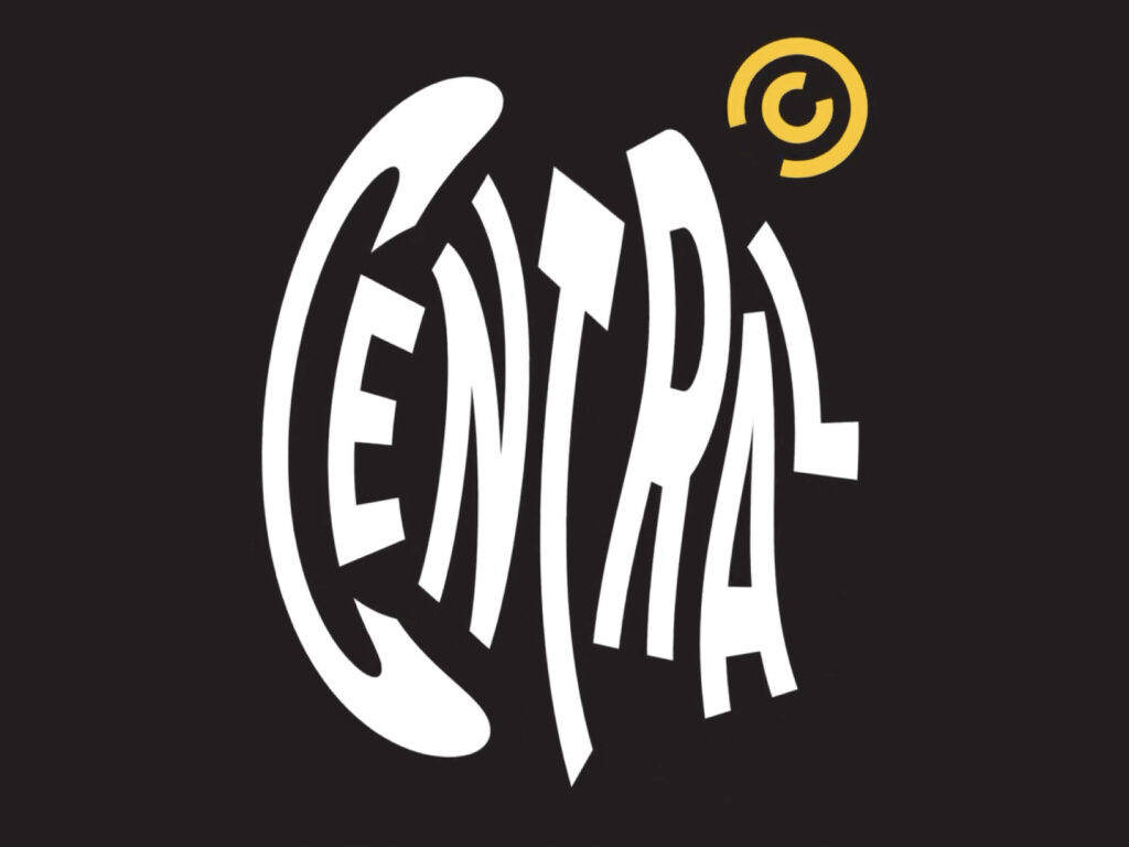
This is the new brand identity for Comedy Central, the global comedy channel that has been making the world funnier since 1991. Dutch design studio Studio Dumba/DEPT® reimagined the channel's signature clips in a more dynamic and playful direction, while maintaining the existing bold, global brand identity. At the heart of the rebrand is a "super graphic, super playful" approach. The logo itself moves, bounces, transforms, and seems to take on a life of its own - a physics-based [...]
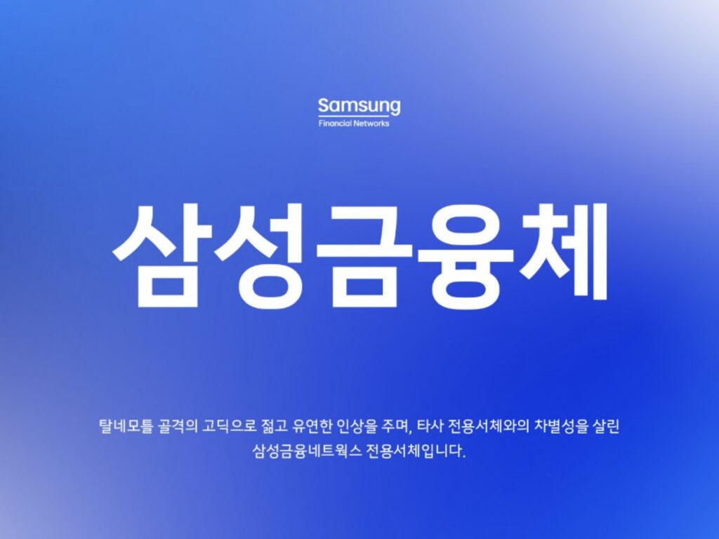
'Samsung Financial' was developed as the exclusive typeface for Samsung Financial Networks. Samsung Financial Networks, a joint brand of Samsung's financial companies including Samsung Life Insurance, Samsung Fire & Marine, Samsung Card, and Samsung Securities, was launched in 2022. Samsung Financial Che is based on Samsung's exclusive typeface, Samsung Che, but emphasizes more rounded and geometric shapes. The lowercase letters are adopted as the base, reflecting the soft and open attitude of the brand. The core consonant 'ㅅ' reflects the identity of flexibility, and is designed to naturally transform in space in the combination of 'ㅅ+a' and 'ㅅ+a', which is [...]
In the midst of a combined crisis of high prices and increased competition, Delivery.io declared 'Bae Min 2.0' and launched a comprehensive rebranding and service expansion strategy. As its market share declined due to the rapid catch-up of late entrants such as Coupangit, the company is looking for new growth engines by expanding its platform beyond its delivery-centered business model to membership, commerce, and grocery shopping. The brand colors, fonts, and app icons are being applied in stages. It has introduced '2.0 Mint', which is brighter than the existing mint color, and a new [...]
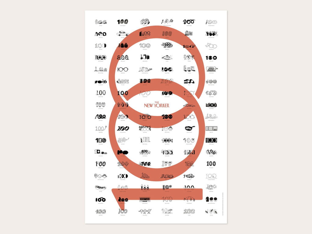
The New Yorker, America's leading current affairs and culture magazine, is celebrating its 100th anniversary in a special way. On September 22, The New Yorker will officially release its Centennial Spot Art Poster. Priced at $39, it will be available for purchase through the New Yorker store. The poster is a collection of illustrations by 100 artists, each with their own interpretation of the number "100". One hundred perspectives within a single number, reflecting the trajectory of The New Yorker's journalism and the [...]
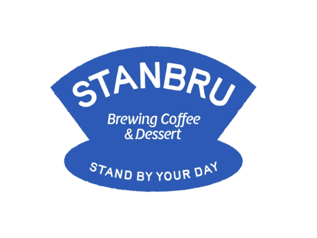
Introducing Stanbrew, a new coffee brand designed by Studio Fullpool. Collaborating with Lotte and centered on the core value of 'making brewed coffee everyday', Stanbrew is designed to bring fresh, hand-drip coffee into everyday life at an affordable price. The visual identity starts with the dripper, a symbol of brewed coffee. The logo doesn't just borrow the dripper's shape as an icon, but develops it into a visualization of the rhythmic and circular flow of a drop of coffee repeatedly dripping. [...]
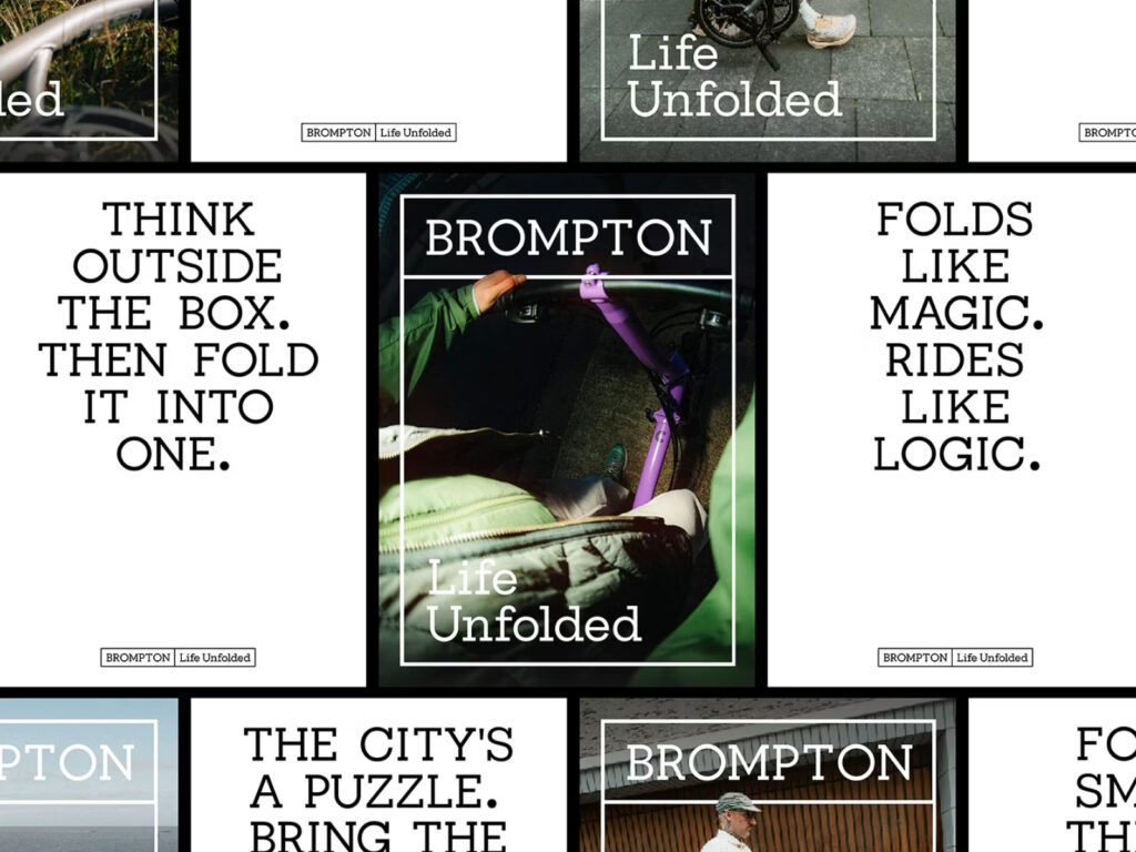
British folding bike brand Brompton has launched a global brand renewal to mark its 50th anniversary. Developed in collaboration with London-based design studio Studio Blackburn under the theme "Life Unfolded," the new brand identity reflects Brompton's heritage while establishing a visual language for global expansion. The brand renewal is based on a motion-centric system inspired by the folding mechanism of a bicycle, and encompasses digital, retail, and video […]
BMW has begun implementing a new logo on its vehicles. The flat logo, unveiled in 2020, has been used only in advertising and digital content, but the 2026 iX3 is the first to feature it on the exterior of a vehicle. While the new logo looks similar to the previous one, some details have been updated. The black outer border and the inner sky blue and white quadrants remain, but the silver dividing line and inner chrome ring have been removed. Instead, the outer and inner graphics are seamlessly integrated, creating a simple […]
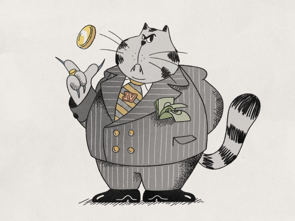
This character animation, a collaboration between Afterpay and Buck, delivers the brand message through meticulous direction and unique animation. The work began with sketches and poses exploring the character's various expressions. The team visually explored all the possibilities of how a cat might smile, walk, or quietly make decisions, establishing the character's basic personality. Once the rough sketch was approved and the timing confirmed, the team began the cleanup process, adding color, texture, and detailed finishing touches to bring the character to life.
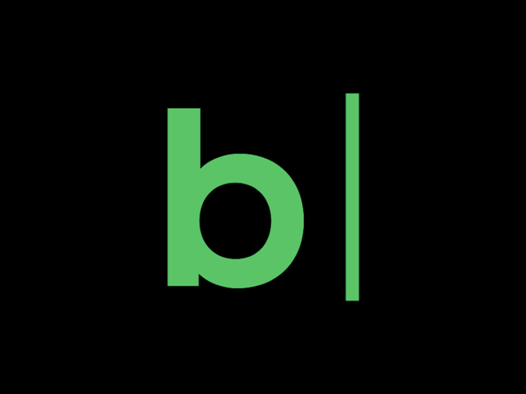
Naver Blog, celebrating its 22nd anniversary, has undergone a major overhaul, spanning its brand identity and services. This change symbolizes its transformation from a mere personal journaling space to a "blog for everyone," one that fosters discovery, exploration, and the expansion of relationships. The new slogan is "Discovering Records, Enjoyable Connections." To reflect this, the existing speech bubble icon logo has been transformed into a blinking cursor. This visual device symbolizes the starting point of a blog's history and the fact that the blog is still "in progress."