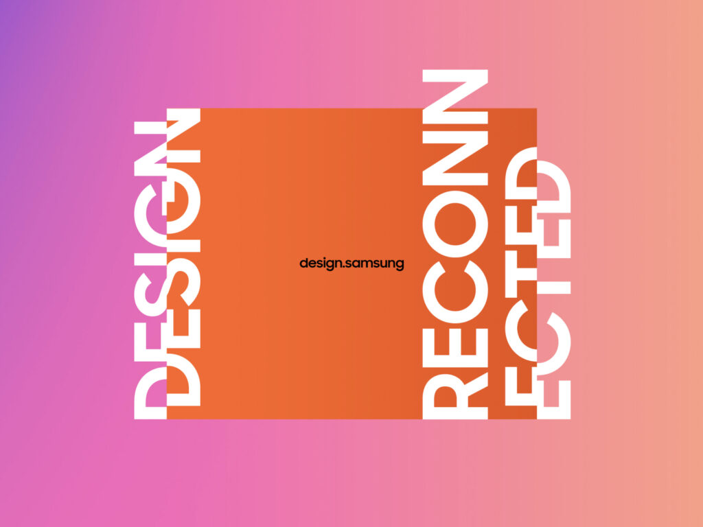
Samsung Electronics has unveiled a revamped Samsung Design website and official Instagram account, reshaping its design organization in December 2025. The Samsung Design Instagram account has been rebranded as design.samsung. Through this new platform, Samsung plans to focus on showcasing the product creation process and the perspectives of the designers at the heart of it. The key elements are the mindset and emotions of designers who imagine, develop, and complete products, as well as the social and technological changes they observe.

The Branch Design Museum in Richmond, Virginia, has unveiled a new visual identity. This contemporary reinterpretation of the original 1919 Tudor Revival mansion blueprint, commissioned by Mullenlow Design Studio, visually formalizes the museum's shift in direction. The Branch Design Museum has expanded its scope, changing its name from the Museum of Architecture and Design to the Design Museum. The John Russell Pope-designed building has long been a symbol of architectural heritage.
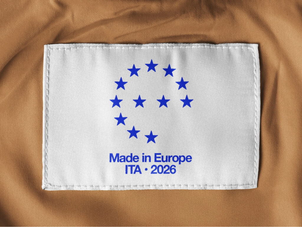
Europe is preparing a new, integrated certification system encompassing everything from manufacturing to digital services. The "Made in Europe" blueprint, released by the 21st Europe think tank and the Dada Project, presents a direction for the European economy amidst supply chain instability and growing dependence on digital platforms. The key is trust. The goal is a trust certification system based on a digital passport that transparently links production processes and sustainability information, moving beyond simple country of origin labeling. […]

Kellogg's has unveiled a limited-edition Kelpo cereal that brings fictional food from the animated series SpongeBob SquarePants to life. These real-life versions of the seaweed-based breakfast items featured in SpongeBob's film are now available at Walmart and Kroger stores in the United States. This launch is part of a global promotion tied to the upcoming SpongeBob Movie: Finding SquarePants, which is slated for release next month. The actual product packaging is a near-identical replica of the yellow box design from the original series. […]
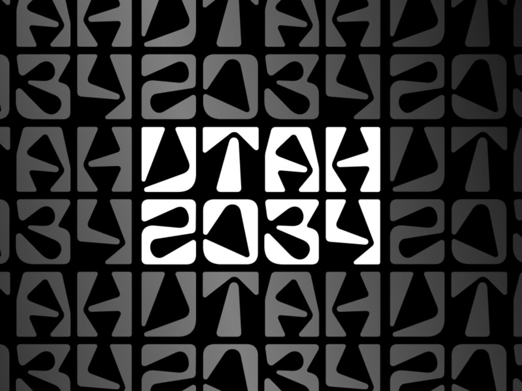
On the 24th, 3,000 days before the 2034 Winter Olympics, Utah unveiled its new name and transition logo. The shorter official name, "Utah 2034," was chosen over the "Salt Lake City–Utah 2034" name used during the International Olympic Committee (IOC) bid process. Organizing Committee CEO Brad Wilson emphasized the 13 venues across five Utah counties, explaining, "Whether you live in Vernal or downtown Salt Lake City, everyone should be a part of Team 2034." […]

This is a brand identity collaboration between Cursor and Chimera. Cursor sought to capture both the brand's sophistication and human warmth by optimizing the existing logo for screen-friendliness without drastically revising it. At the heart of the refresh is Cursor Gothic, based on Chimera's retail typeface, Waldenburg. Cursor, a fan of the typeface's form, sought to maintain its basic structure while enhancing its functional perfection. The logo and various product icons were also created within this typeface framework. Waldenburg […]
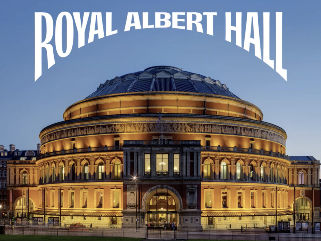
The Royal Albert Hall, a cultural icon of Britain, has revamped its brand identity to usher in a new era. Global consulting firm BrandFi, once again handling the project since 2014, refined the logo, typography, and signature colors to capture both the hall's history and a contemporary sensibility. The Royal Albert Hall is a rare venue where an orchestra and a rock band share the stage. However, over the years, the visual system has been fragmented and distorted, leading to a lack of consistency. […]

As part of Baedal Minjok's large-scale rebranding, "Baemin 2.0," a new app icon has been implemented. Rolled out sequentially since the 18th, the icon replaces the existing "Baedal" character with a "bae," which intuitively symbolizes the service's name. Designed to resemble a road seen from above, the icon clearly identifies the delivery platform. The new icon features five thick vertical lines on a bright mint-colored background, reminiscent of visual lanes while also […]

Korean fashion company Hanssem opened Time Seoul, the first flagship store of its brand, in Cheongdam-dong. Hanssem, responsible for brand strategy planning, and design studio CFC jointly developed a new brand identity (BI) design and store visual system for this opening. Through this project, Time reinterpreted its brand identity in a more contemporary way and enhanced the overall spatial experience. The newly unveiled BI incorporates the spatial design concept "Timeless Nature" and the slogan "Poetic Synth" […]
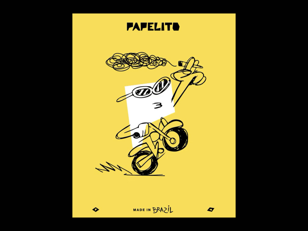
Papelito, a long-loved rolling paper brand in Brazil, has embraced free self-expression and a sense of humor as its core identity. Naturally capturing the daily lives and sensibilities of the younger generation, the brand has transcended mere smoking paper and become a cultural symbol. Papelito has consistently communicated with consumers with a direct tone and candid demeanor, forging a uniquely Brazilian identity. Papelito has unwaveringly challenged the stereotypes and stigmas the world attempts to impose on its consumers. […]
French pet specialty company La Compagnie des Animo has unveiled a new visual identity. It's considered a visual fulfillment of its founding mission of making veterinary knowledge accessible to everyone. Branding studio Graphane was in charge of this project, focusing on adding a modern sensibility to a brand that hasn't undergone significant changes since its original logo was first introduced 15 years ago. La Compagnie des Animo […]
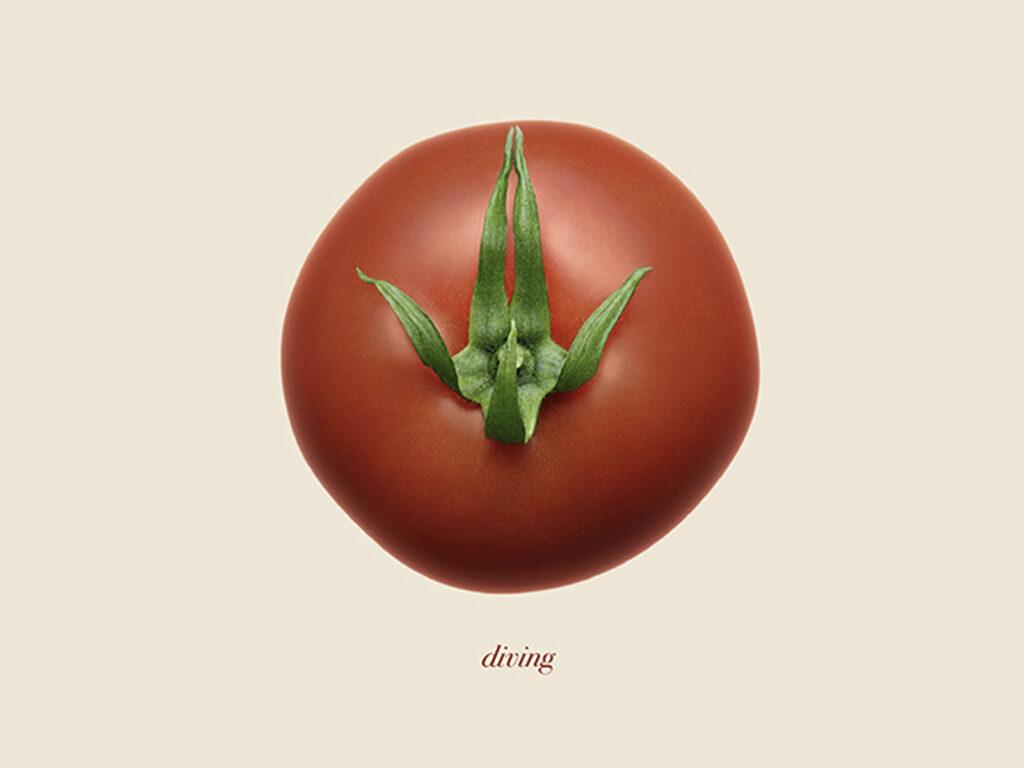
Heinz's ingenious tomato campaign, launched in celebration of the 15th National Sports Games, is garnering significant attention across China. Known for its ketchup, Heinz captured the hearts of local consumers with a unique visual that utilized tomato leaves to capture the spirit of sports. Although not an official sponsor of the event, which took place across Guangdong, Hong Kong, and Macau, Heinz captured the cultural moment and reinterpreted its unique brand equity. Created in collaboration with creative agency Heaven & Hell Shanghai, […]