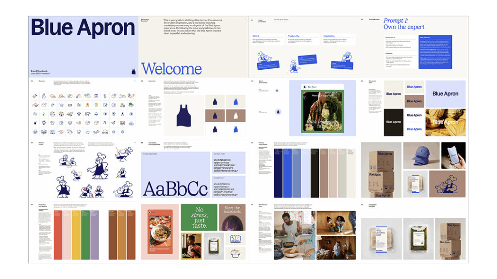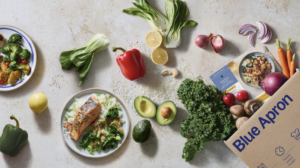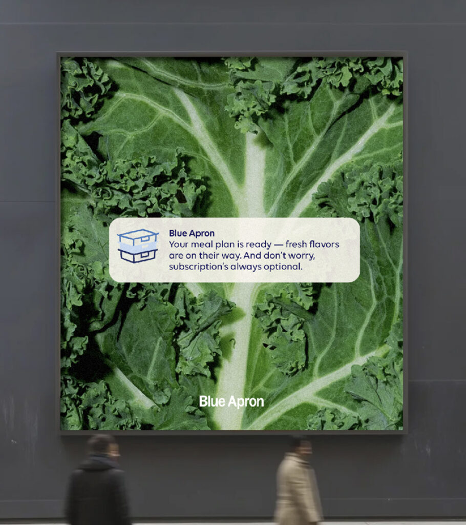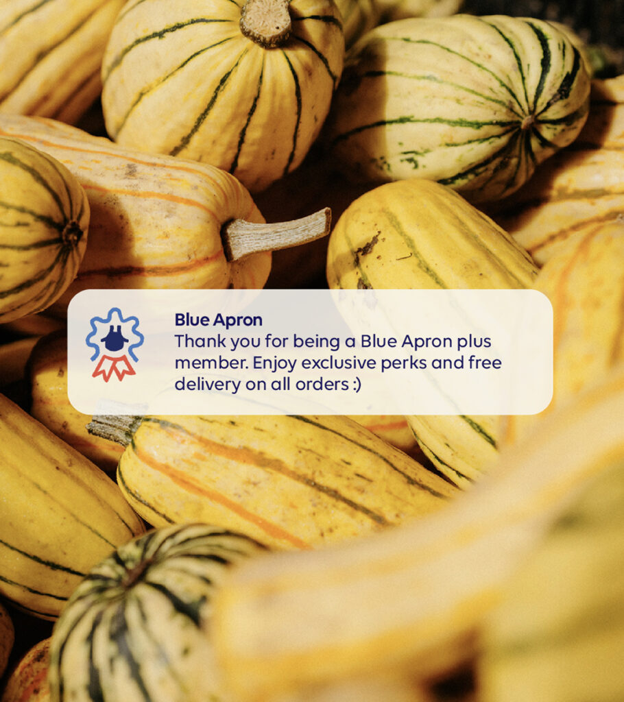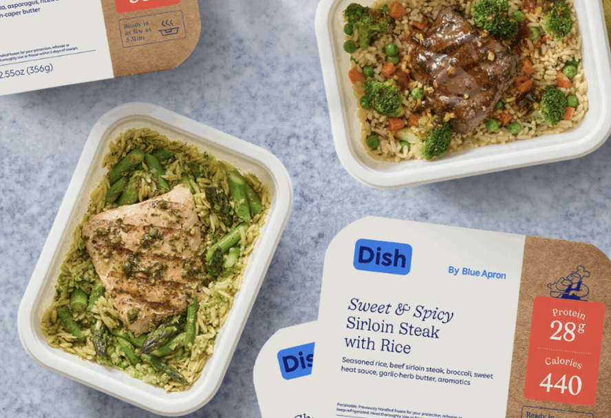
This is the brand design for Blue Apron. Blue Apron was known as a pioneer that opened the meal kit market, but its growth strategy wavered as competition intensified in grocery delivery and takeout. The company refined its identity to reduce the perception of being solely a subscription-based service and to appear as a more flexible food brand.
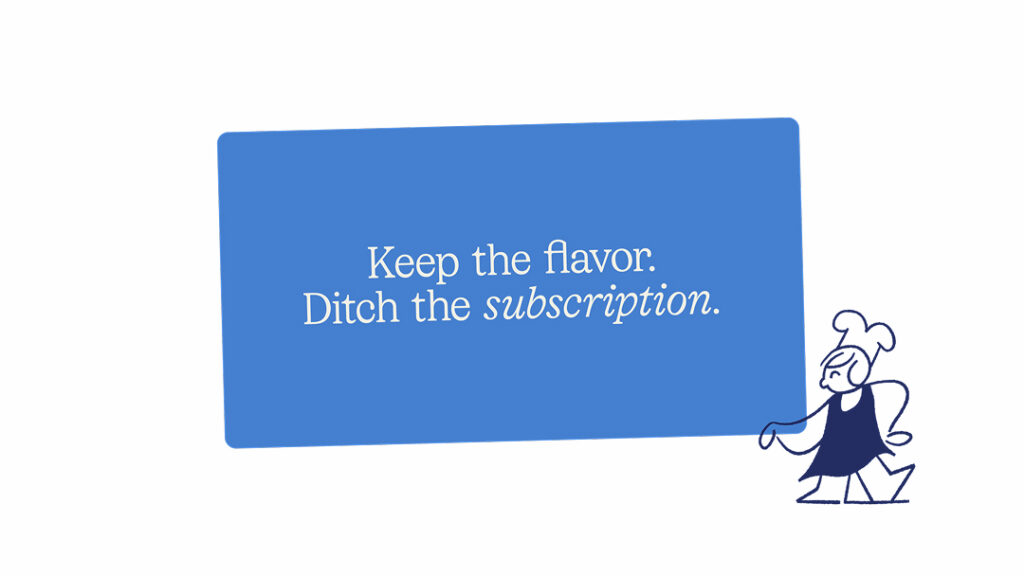
The keywords for this renewal are flexibility of choice and clarification of experience. Blue Apron revamped its shopping structure to allow for single-item orders without a subscription and expanded its product lineup. At the same time, the company explained that it redesigned the entire web and app experience. In other words, the branding was not merely a matter of changing the logo, but rather a comprehensive design system encompassing purchasing methods and menu navigation flow.
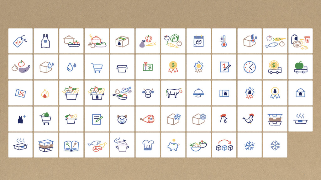
The visual language has become more concise. External design press releases captured the change in which the prominence of blue has been reduced. This is interpreted as a composition realigned with tones suited to diverse dining situations and menu expansion, rather than relying on the existing symbolic color. It can be read as an adjustment of color and graphics aimed at breaking away from the fixed image of meal kits.
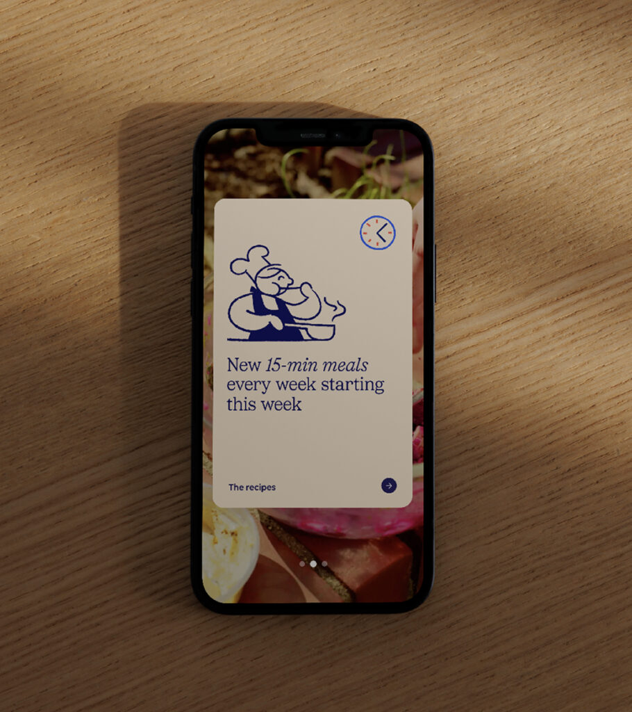
A brand character has also made its appearance. Fast Company reported that Blue Apron has introduced a mascot along with its new logo. Named "Sous," meaning sous chef, it is presented in various versions, including a boy, a girl, and a child. It serves as a visual device that encapsulates the message that the brand is a supportive presence in the kitchen. It is also a design interpretation that connects the recipe learning experience provided by the service with today's need for a quick dinner.
The brand message has been organized under the perspective of "Deliver Delicious." ABD explained that it redefined every touchpoint, including packaging and app notifications, as moments that create surprise and satisfaction. The company claims to have refined its language and visuals by removing complex instructions and transaction-centric language, instead striking a balance of warmth and confidence. Given that this is an attempt by Blue Apron to regain its cultural presence, this design is regarded as a platform refresh that goes beyond a mere re-logo.