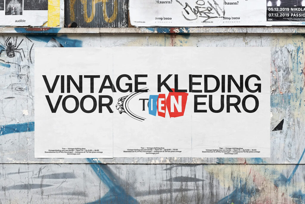
TIEN, a vintage store operating in Groningen, Netherlands, has embedded the concept of reuse into its very identity through rebranding. This project was carried out by the graphic studio FCKLCK, which constructed the brand name by rewriting existing brand logo fragments instead of redrawing the logo. TIEN's operational method is simple: all clothing in the store is priced at 10 euros. By focusing on casual and sportswear from the 1960s to the early 2000s, the store reduces the hesitation associated with calculating prices. Customers are encouraged to make choices based on their taste rather than weighing price against desire.
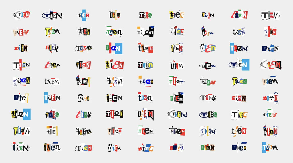
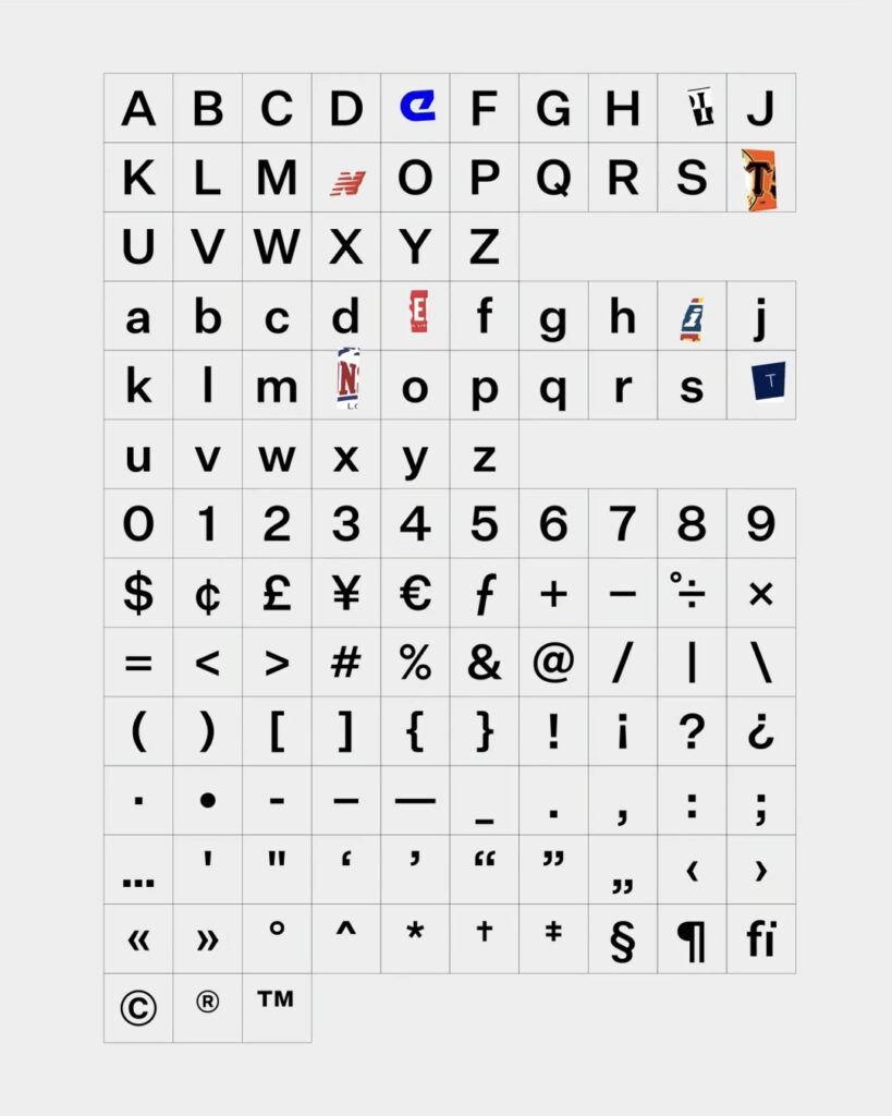
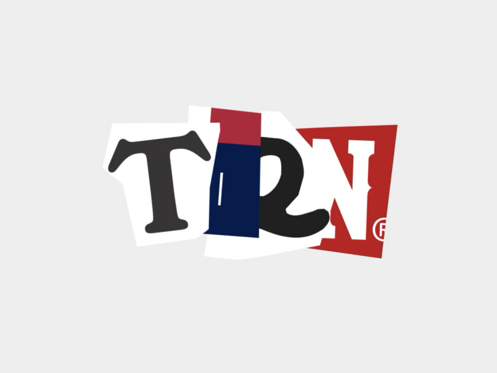
The previous logo used a vintage typeface in yellow and pink, but it failed to strongly convey the circularity and sense of openness symbolized by TIEN. The new system is more direct. The designers opened Illustrator and collected logos commonly found in casual vintage items such as T-shirts and track jackets. They created the word by finding logos containing the four letters TIEN, cutting them out, and pasting them. The combination created spontaneously on the first night actually displayed the strongest energy, maintaining that rough and chaotic texture throughout.
Ultimately, 71 logos were entered into the system. This includes casual brands, sportswear, band merchandise, and sports clubs. The letter fragments consist of 43 T's, 38 I's, 51 E's, and 39 N's. If each letter is selected individually, theoretically over 3.2 million TIEN wordmarks are generated. It is an identity that avoids the repetition of the same logo combinations. Finding vectors and SVGs instead of low-resolution PNGs for large-format printing, such as posters, also became an important production requirement.
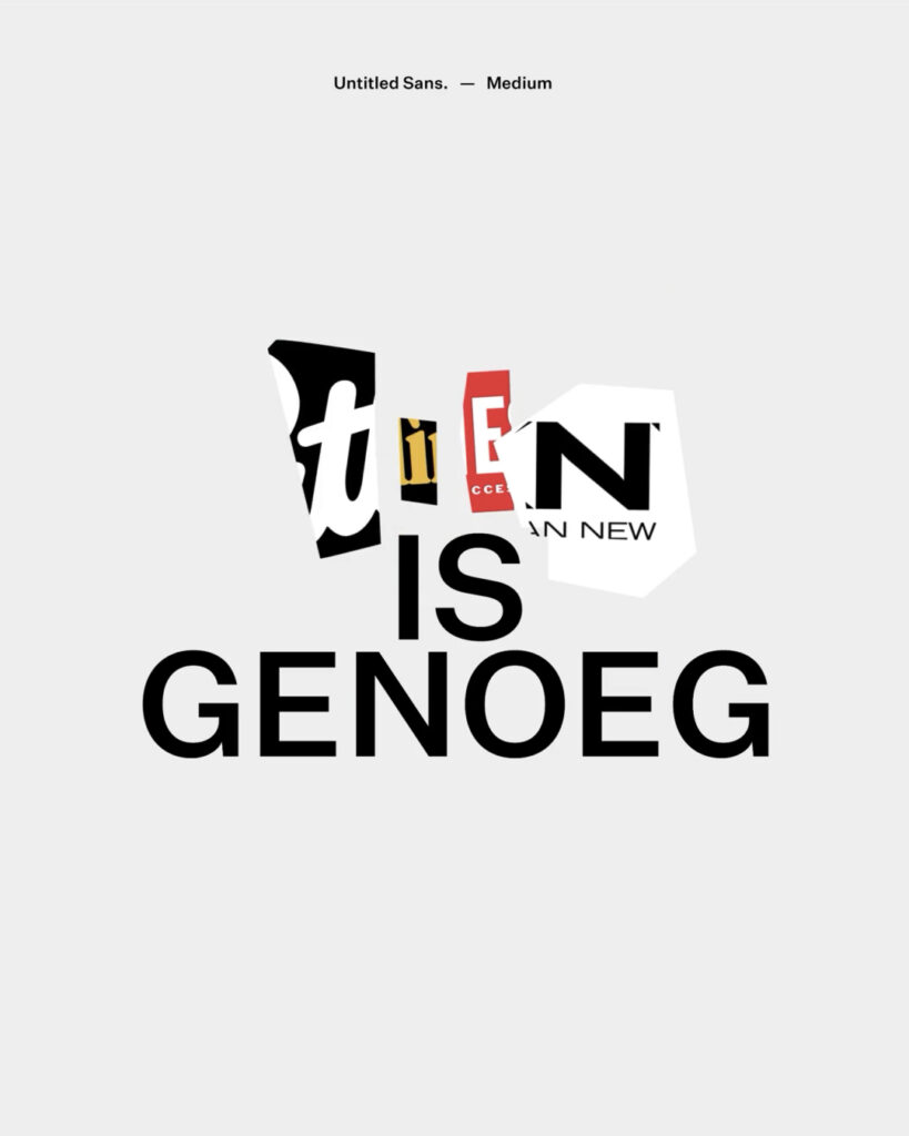
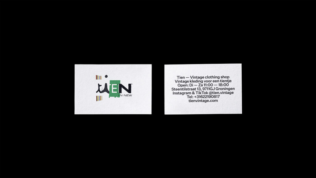
Just as the logo is bold, the surrounding elements were kept restrained. Klim Type Foundry's Untitled Sans Medium was selected as the secondary typeface because its neutral and functional impression makes the presence of the logo collage more distinct. A single weight was used to unify the headline and body text, and the color scheme was limited to black, white, and a light gray background. Information hierarchy was prioritized by omitting decorations and additional colors.
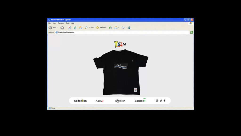
The store signage also reflects the philosophy of reuse. Four modular LED screens were installed, but some of them were defective pixels, making commercial rental and sale difficult. However, they were fully functional, and the defects actually reinforced the message of reuse. Logo combinations flow across the screens in motion, demonstrating in the space the attitude that things can be used even if they are not new.
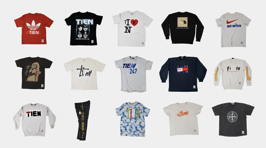
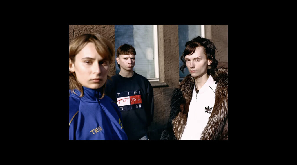
The 'Tien'ed' series, which expands the concept onto clothing, is also noteworthy. Existing text on vintage clothing was adopted as is if it felt natural and full of humor when simply replacing the brand name with 'TIEN'. Through collaborations in printing and embroidery, maximum recognition was achieved with minimal intervention. Consequently, TIEN's rebranding does not preach sustainability. Starting from the premise that the clothes, logo, and screen already exist, it was completed by organizing and rearranging what remains to make the brand's promise clearer.