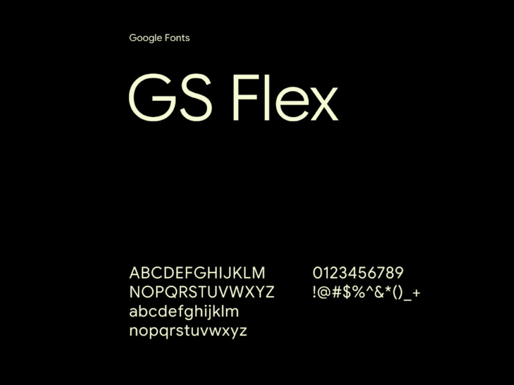
Google has released its flagship font, Google Sans Flex, completely free to the public. This new addition to Google Fonts has immediately garnered significant attention from designers and typography enthusiasts worldwide. Google has been using this font on its Pixel devices and major service screens for years, and now anyone can download it and use it for a variety of purposes, including commercial projects. The license […]
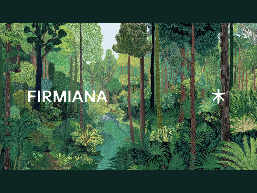
Chinese art collective Permiana has unveiled a new visual identity, embodying its vision of finding roots in nature and growing through art. Permiana supports the growth of art and culture and supports creators who reimagine the relationship between humans and the environment, exploring the intersection of nature and art. This visual identity is built around the value of growth, inspired by the Permiana simplex, a paulownia tree considered a symbol of elegance and creative prosperity in Chinese culture. The logo […]
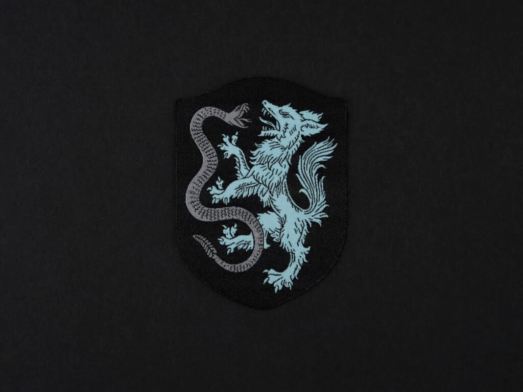
The legend of wolves and snakes from the Texas prairies has inspired the birth of a new soccer club. Launching in 2027, Atlético Dallas aims to unite soccer fans in the heart of Dallas as they join the USL Championship. Built on the belief that greatness is born on the pitch, where true passion resides, the club has unveiled a brand identity that reimagines the region's history and spirit for a modern audience. Atlético Dallas' identity stems from the natural beauty and legends of North Texas. By the 1940s, they were the top […]
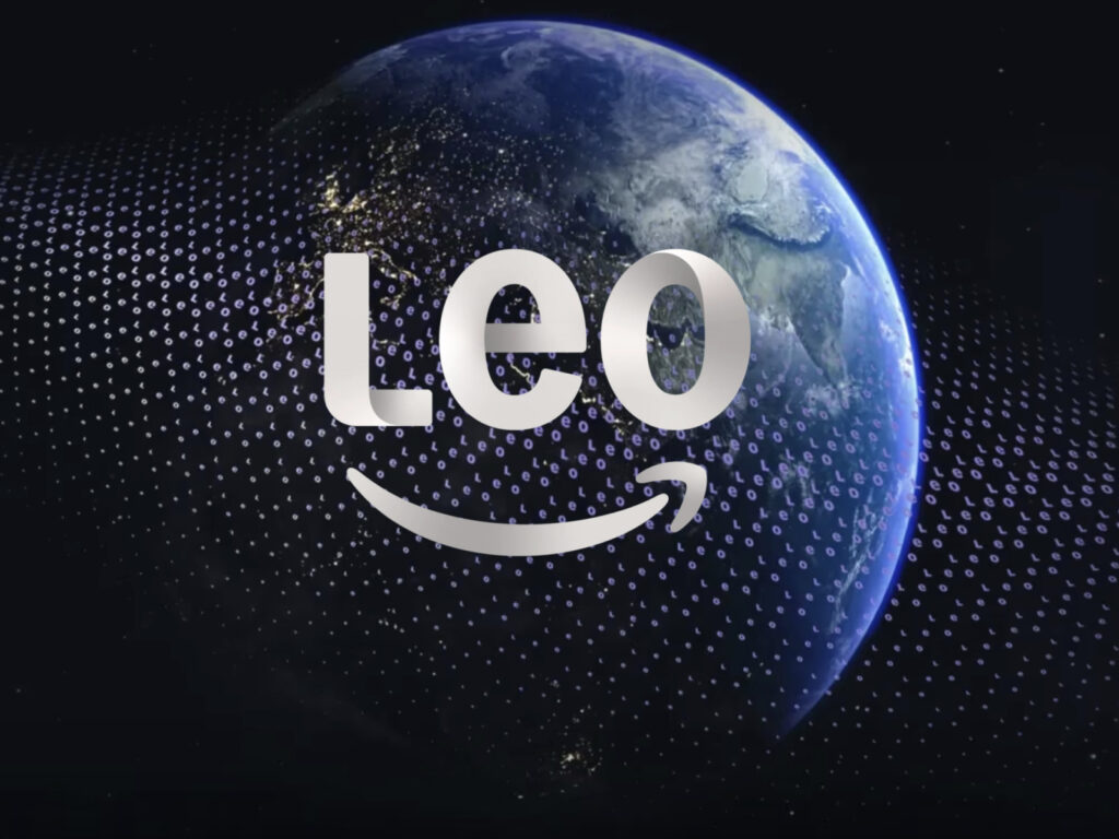
Amazon has changed the name of its satellite internet project from "Project Kuiper" to "Amazon Leo." This rebranding appears to be a strategy to clearly define the identity of the low-Earth orbit satellite-based network. Leo, derived from LEO, meaning low-Earth orbit satellite, is a more intuitive name for both consumers and businesses. Since 2018, Amazon has been building low-Earth orbit satellite internet infrastructure with the goal of bridging the global internet gap. Initially, it was internally codenamed "Project […]
Leipzig has established a new identity to accelerate its digital transformation. The rapidly growing city has simultaneously redesigned its brand and citizen portal to better connect with citizens and navigate public services. This project translating the city's strategy into a visual language focused on accessibility, clarity, and scalability. The existing Leipzig.de system, with its complex structure built up over the years, made it difficult for citizens to find the services they needed. To address this, […]
ArtScience Museum, Singapore's landmark art, science, and culture landmark, has unveiled a new identity ahead of its 15th anniversary. The rebrand, led by the US-based agency Project3, embodies the museum's core philosophy of convergence throughout its visual language. Since its opening, ArtScience Museum has built global recognition for its content that transcends the boundaries of art and science, from exhibitions of Leonardo da Vinci and Salvador Dalí to immersive experiences by teamLab. The new brand further clarifies this identity and presents a forward-looking […]
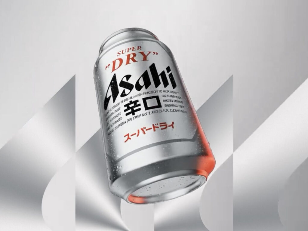
Asahi Super Dry has launched a global brand platform, titled "Seek What Is Unique." This platform, co-produced by Havas London and the Havas Creative Network across Asia, Australia, and North America, highlights Asahi Super Dry's signature refreshing "Karakuchi" flavor and unique brewing process. At the heart of the campaign is a 90-second cinematic film shot in Tokyo. Directed by award-winning directorial duo Alaska, it follows two friends as they explore a neon-lit […]
This is a brand design collaboration between American healthcare brand Trellis and design studio How & How. The American healthcare system can often feel like a complex maze, especially for mothers caring for children. Faced with having to manage hospital appointments, medical records, and family health information in disparate apps and documents, nine out of ten American women rely on simple note-taking apps to keep track of their family's health. […]
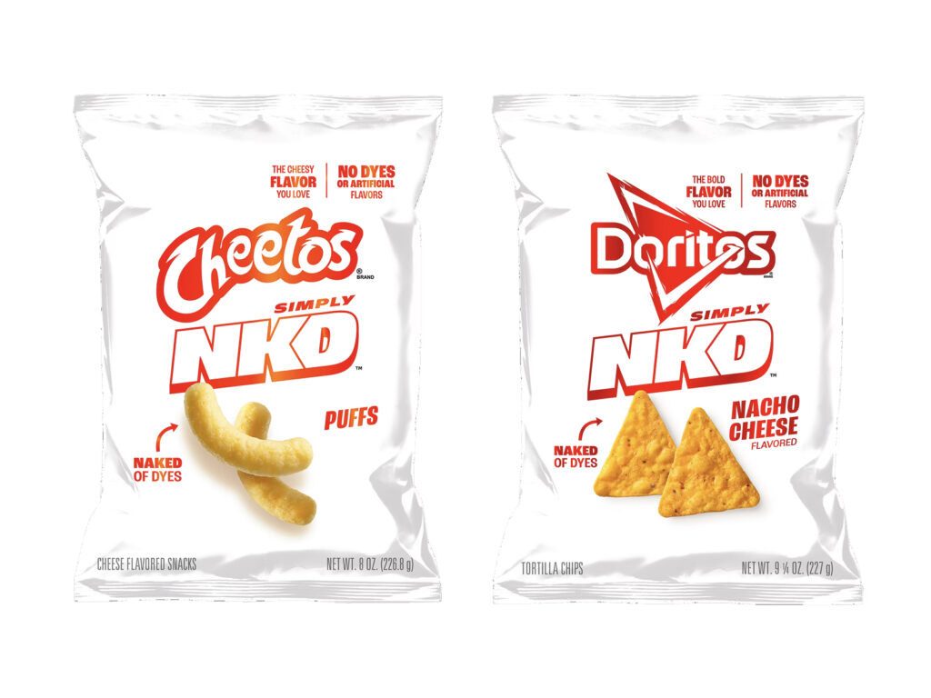
Frito-Lay, a PepsiCo subsidiary responsible for snacks, has launched its "Simply NKD" line, targeting health-conscious consumers for this holiday season. The line eliminates artificial colors and flavors from its signature Doritos and Cheetos products. The new line includes four flavors: Doritos Nacho Cheese, Cool Ranch, Cheetos Puffs, and Flamin' Hot Cheetos. All products are made with natural ingredients, excluding synthetic colors like Red 40, Yellow 5, and Yellow 6. […]
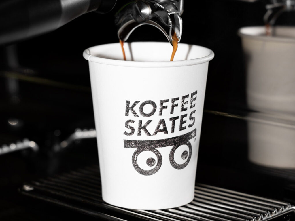
Koffee Skates, a brand from Montevideo, Uruguay, is gaining attention for its bold blend of skate and coffee culture. The brand identity, created by designers Berg Kotogian and Juan Manuel Barbe of Another Monday Studio, captures a sense of both everyday life and street style. This skate shop and café has become a new meeting place in the city, a cultural hub where skaters, artists, and coffee lovers seamlessly mingle. The logo is simple yet striking.
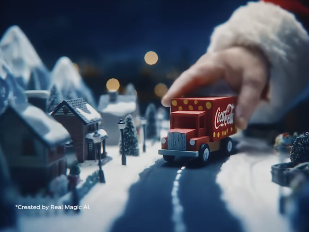
Coca-Cola has released another AI-generated Christmas ad this year, titled "Holidays Are Coming." However, the result is once again disappointing. Following last year's AI ad, which was criticized for its unnatural faces and slippery wheels, this year's ad features animal characters instead of humans, but critics say the quality is actually lacking. The ad features polar bears, pandas, and sloths, but the styles are mixed up from shot to shot. Some shots appear realistic, while others become cartoonish […]
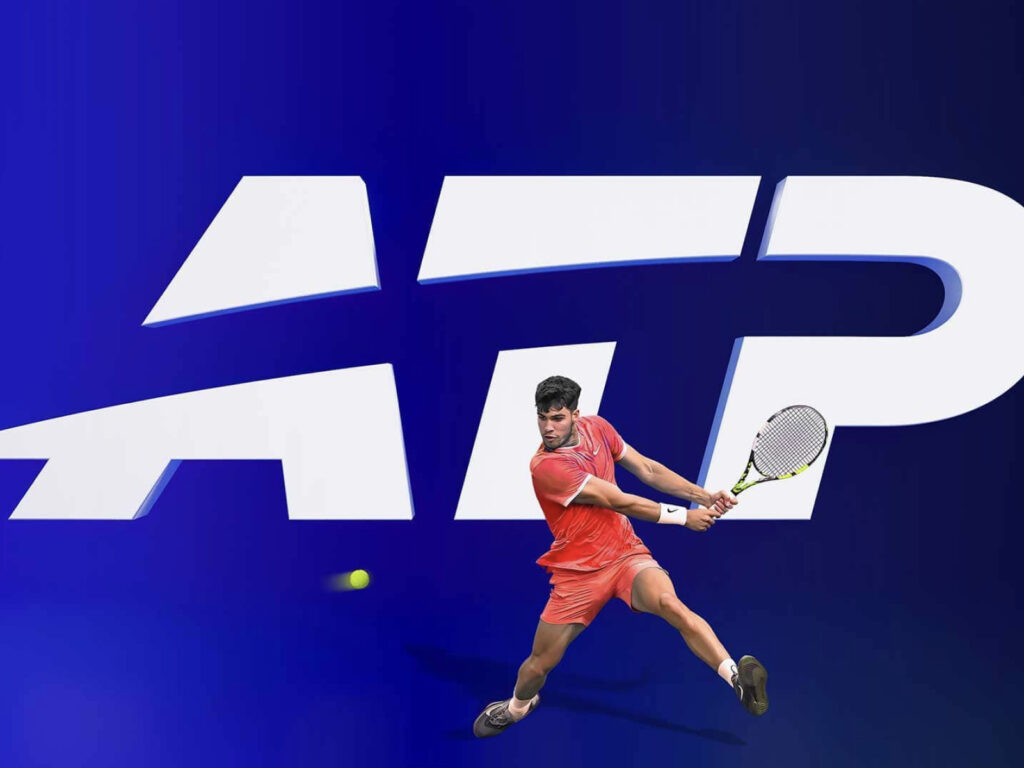
The ATP has unveiled a new logo and brand identity ahead of the 2026 season. This is the sixth redesign since its founding in 1972. Studio Chermayeff & Geismar & Haviv was responsible for unifying the overall brand language and establishing a modern visual framework. The new logo is centered around a curved shape reminiscent of the trajectory of a ball, visually expressing the speed and energy of tennis. The silhouette of a tennis player, previously included in the logo, […]