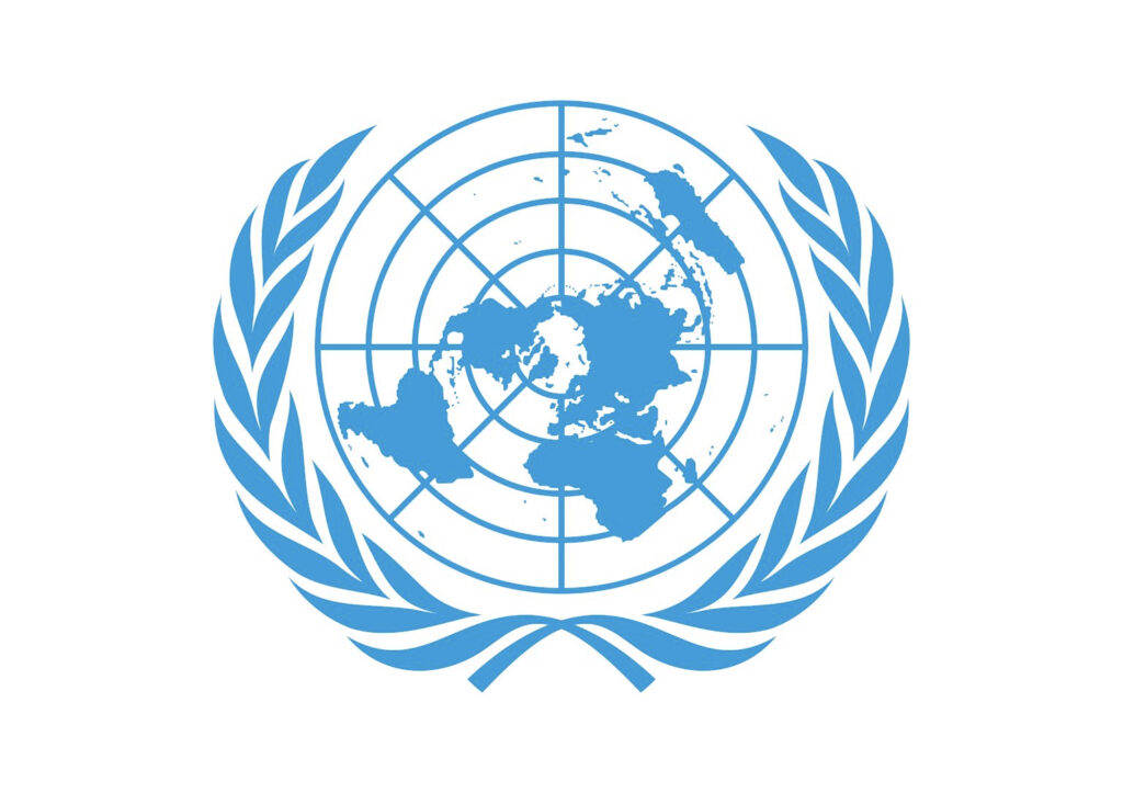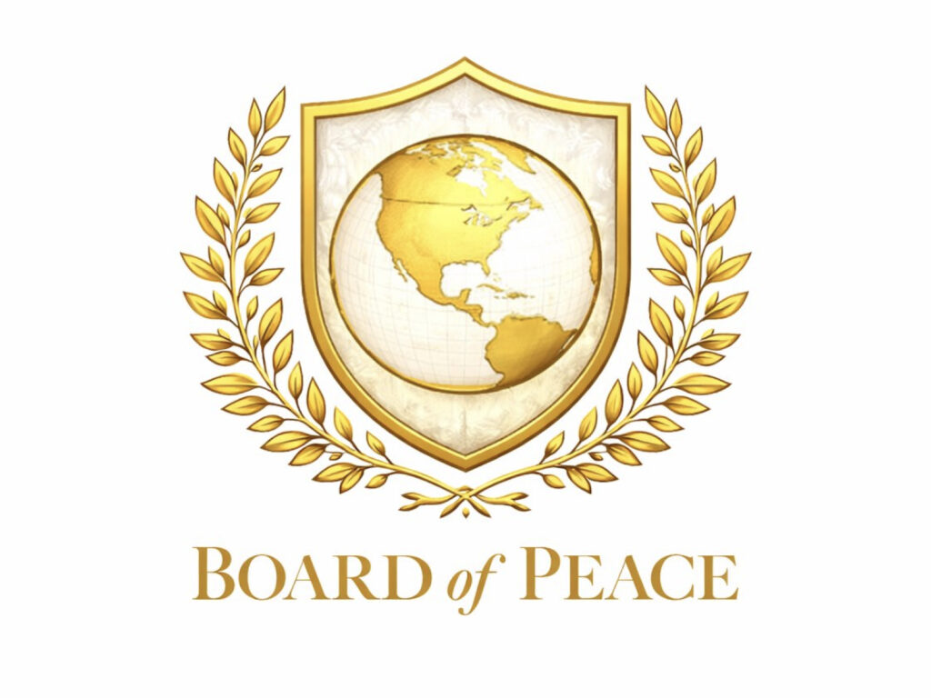
The Trump Peace Commission logo unveiled at Davos is increasingly being criticized for its resemblance to the UN emblem. At the World Economic Forum in Davos, Switzerland, US President Trump launched the Peace Commission, a body for international conflict resolution, and unveiled its gold logo. The logo, featuring an olive branch encircling the globe, has been praised for its resemblance to the UN emblem.
However, unlike the UN, which features a map of the entire world, the Peace Committee logo features only parts of North and South America. Online, criticism arose that the global symbol was being reconfigured around the United States, and the all-gold color scheme was seen as ostentatious. Design media outlets commented that the UN logo looked as if it were dipped in gold.
The organization initially began as a concept to mediate a ceasefire in Gaza and address post-war issues, but President Trump signaled his intention to expand its scope to include conflicts worldwide and announced his intention to chair it himself. While Trump has stated his intention to work with the UN, some European countries have drawn the line at participating, citing concerns that it could be perceived as an attempt to bypass or replace the UN.
The operating method has also sparked controversy. The AP reported that the conditions for participation are unique, including a $1 billion contribution for permanent membership. The released charter also includes a clause granting the chairman the authority to create, modify, or dissolve subordinate organizations.
Meanwhile, the UN explains in its history of emblems and flags that the design team created the symbol in 1945, expressing peace and universality through the olive branch and azimuth equidistant map projection. This controversy is seen as an example of how the authority and legitimacy of a symbol can be put to the test even with a single logo.