Reactor, AI World Model Service

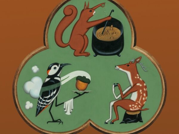
Reactor, an AI world model infrastructure company, has unveiled a new brand strategy and visual identity. Led by Lovework Studio, the project focused on branding Reactor's technology and vision, which enable creators to build new experiences using real-time interactive video. Reactor is a company that builds the infrastructure layer for AI world models. The team, composed of game developers, former Apple VR experts, and coders, [… ]

Tinder Rebranding, Dating with Added Perspective

Tinder has unveiled its first major rebranding in about 10 years. The project was undertaken by design studio Porto Rocha and focused on presenting Tinder once again as an attractive dating platform to a new generation. The core of the new brand is 'voice.' Porto Rocha established Tinder's language as that of a trusted dating columnist. It is a style that handles the complex emotions of dating by oscillating between humor and candidness, wit and empathy. To achieve this, a virtual persona [… ]

RUGIET, a bold men's health brand

Rugiet, a men's health and performance medicine brand, has unveiled a new brand strategy and visual identity. The project was undertaken by Pentagram and focused on making Rugiet's perspective and presence more distinct within the rapidly growing men's health market. Rugiet is a brand that provides personalized, clinical-based care to improve men's health, vitality, confidence, and long-term well-being. This rebranding maintains this medical credibility while being more direct and [… ]

7-Eleven Korea, 7 Visual Identity

7-Eleven has unveiled a new visual identity for its stores in Korea. Designed by Seoul-based branding studio MHTL, this rebranding is characterized by a new expansion of the brand system centered around 7-Eleven's iconic number '7'. The new identity is based on the diagonal structure and green, orange, and red color palette, which are core elements of the existing logo. MHTL [applied] these elements not merely as logo decorations, but as a modular [… ] that can be utilized at various touchpoints.

Granola, AI Note Branding That Isn't AI-like

An in-depth case study covering the rebranding project of the AI note app Granola has been released. This project focused on expanding the AI note tool, beloved by Silicon Valley executives, into a brand for a broader knowledge workforce. Granola is known as an AI notepad for organizing meeting content and recording work context. While it previously enjoyed strong support among core users in the tech industry, at the brand level, it aimed to reach more users [… ]

Hot Six Undergoes Complete Package Renewal for the First Time in 3 Years… Capturing the 'Hottest Flame'

Lotte Chilsung Beverage has completely revamped the packaging design of HOT6, Korea's leading energy drink brand, for the first time in three years. This renewal focused on conveying intense energy and a spirit of challenge more intuitively while maintaining the brand's heritage. The existing phoenix image was reinterpreted by simplifying it into curved wing-shaped graphics, and a blue color symbolizing the hottest burning flame was applied to the front. In addition, the product name was placed prominently in the center of the package to enhance visibility, and as an energy brand [… ]

Rebranding 'Green, Green Mountains' as a single design system from 42 years of heritage

Yuhan-Kimberly has completely revamped the visual identity of its flagship environmental campaign, 'Keep Our Mountains and Rivers Green.' Marking the 42nd anniversary of the campaign, which began in 1984, the company has established a single integrated design system by simultaneously renewing its BI, dedicated typeface, and character for the first time. The core of this initiative goes beyond simply modernizing the old logo; it involves redesigning the brand structure to provide a consistent experience across various digital environments. The most notable change is the new [… ]

The New York Times, New Motion Identity for 2026 Annual Conference

The New York Times has unveiled a new motion identity for its 2026 annual conference. This project features a "galaxy-style motion system" centered on subtly flowing typography and space-inspired gradients. The text and flow of light, which appear to float across the screen, focused on making movement itself the brand experience rather than a single static logo. The project was carried out in collaboration with the team led by The New York Times Creative Director Jessi Brattengeier, and [… ]

Gangnam Unnie Rebranding, Confidence in My Choice

Gangnam Unnie has unveiled a new brand identity. This rebranding focused on integrating the brand experience used in Korea and the overseas service experience into a single brand system. This change aims to more clearly convey the identity of the service, which has grown into a medical tourism and aesthetic medical platform. The new brand has revamped its overall design system, including the logo, symbol, colors, typography, and illustrations. While maintaining the existing friendly image, a concise [… ] suitable for a global service

xAI Changes Name to 'SpaceXAI' After Merging with SpaceX

Elon Musk's AI company, xAI, has completed its transition to the new brand 'SpaceXAI' and unveiled a new logo. The official X account released a video showing the existing xAI logo transforming into the new SpaceXAI logo, announcing, ‘We are now @SpaceXAI.“ Accordingly, both the account name and brand identity have been changed to SpaceXAI. This change marks the final stage of the integration process that has been underway since xAI was incorporated into SpaceX last February. Last May, Elon Musk [… ]

Paik's Coffee and Paik's Boy Pizza File New Logo Applications

The Born Korea is accelerating the restructuring of its brand system by successively filing trademark applications for new logos for its major brands, including Paik's Coffee and Paikboy Pizza. A common feature is the reduction or exclusion of the caricature of CEO Baek Jong-won previously used in the logos, replaced by designs centered on the brand name and product. Recently, The Born Korea filed trademark applications for two additional new logos for Paik's Coffee. Compared to the existing logos, [… ] placing the brand name front and center instead of CEO Baek Jong-won's face.

Controversy over the world's oldest football club logo

Sheffield FC, known as the world's oldest football club, has unveiled a new logo. Founded in 1857, Sheffield FC is the oldest football club recognized by FIFA and is one of the few clubs to have received the FIFA Centennial Order of Merit. The new logo has largely removed the shield shape, player illustrations on either side, and various decorative elements from the previous emblem. Instead, inside a circular badge, it features 'SFC', the founding year [… ]

Design for Business