Replit, a motion identity that reduces the distance between intent and execution
The Replit rebranding has expanded the visual identity of the AI development platform into video and motion systems. Replit is a development environment that allows users to write, execute, and deploy code directly in a browser. The recent brand overhaul focuses on visually illustrating the evolution of code writing, which has become closer to human language since AI was introduced into the development process.
At the heart of Replit's brand design are pixels, text, code, and prompts. Pixels are the smallest units that make up a screen. Text is the fundamental unit that constitutes code. Replit has taken these two elements as the starting point of its visual identity. Therefore, the new brand utilizes pixelated graphics and hand-crafted typography rather than sleek technical imagery. This is a way of showcasing the act of creation itself, rather than the functionality of development tools.
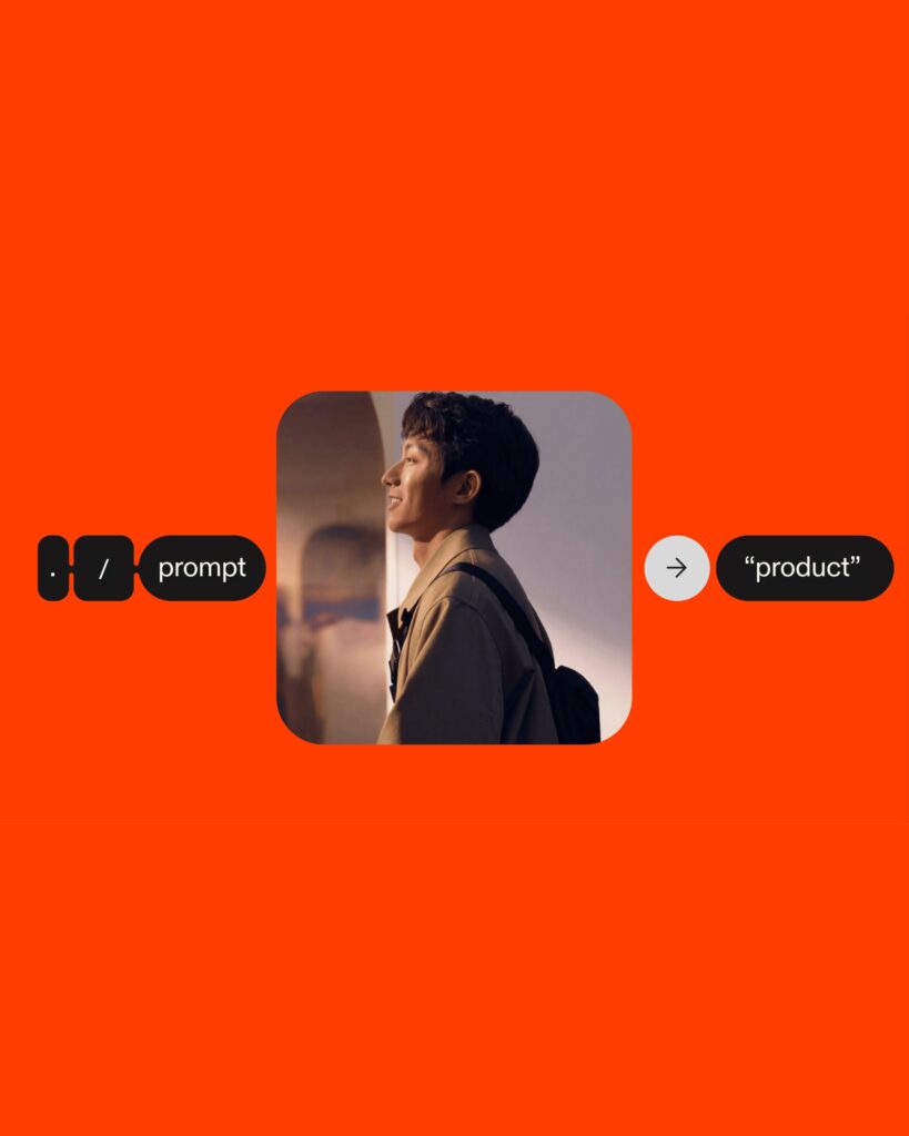
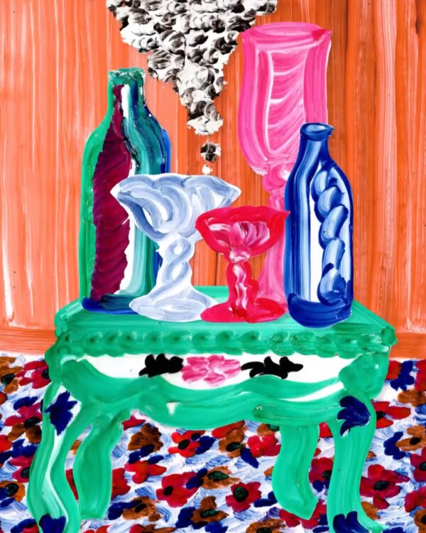
Oddfellows' brand film translates this structure into moving images. The screen is composed of an interplay of code, interfaces, scenes of a builder at work, and generative images. Rather than a static logo or color scheme, it is closer to showing the process of ideas being input and executed. It is a process of visually reducing the “distance between intention and execution” as described by Replit.
Replit's existing prompt logo is also reinterpreted within this flow. The three-dot symbol originated from the point where users enter commands in consoles and shells. In the new visual identity, this symbol collectively represents the starting point of the conversation between AI and the user, code execution, and creation. The Replit rebranding demonstrates how a developer tool brand explains its products in the age of AI.
From freelancer to head of design at a unicorn startup, I've been creating impact through brand and product design for over 18 years. Currently, as CEO and editor-in-chief of Design Compass, I research design that drives business impact.