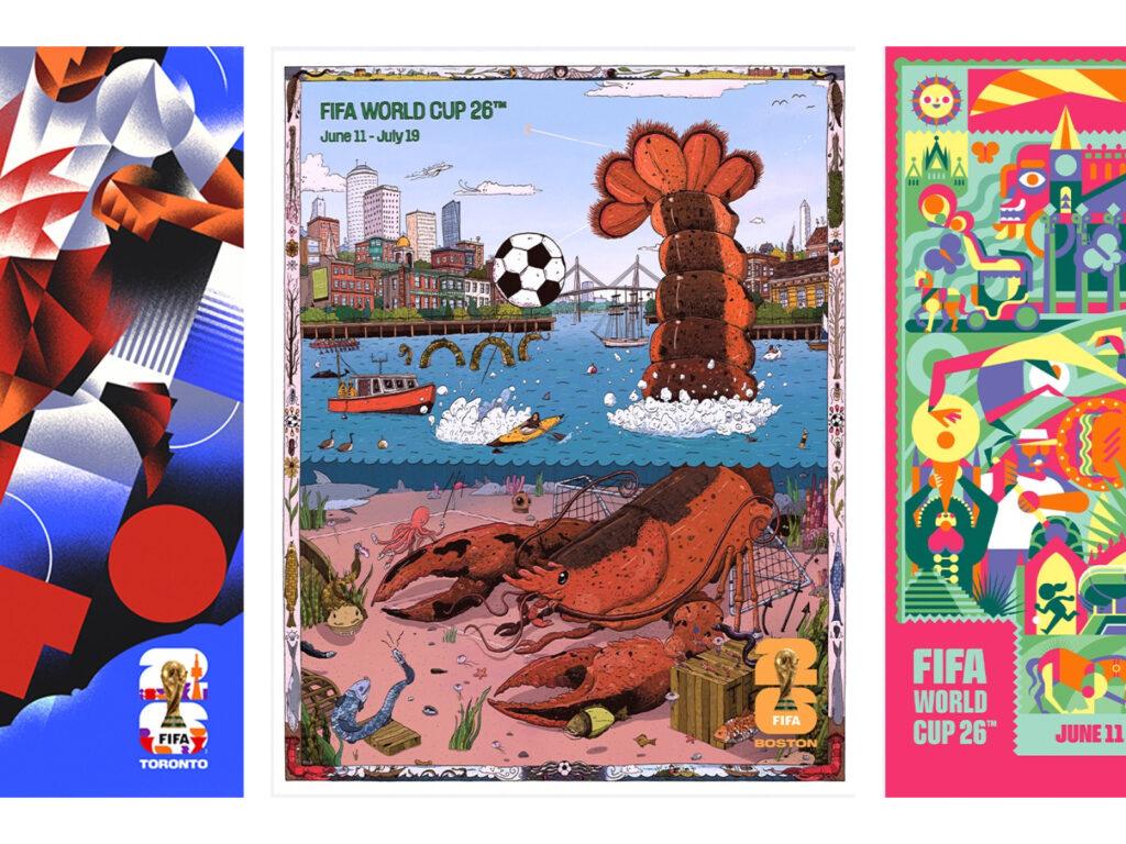
The official city poster set for the 2026 FIFA World Cup has been unveiled. This World Cup 26 will be the first World Cup to be held simultaneously in three countries: Canada, Mexico, and the United States. Forty-eight teams will participate in 16 host cities. This official poster project is the first in the FIFA World Cup Official City Poster series, visually expressing the beautiful love of football in each host city. The Seattle poster features a killer whale swimming in the ocean, and the designer […]
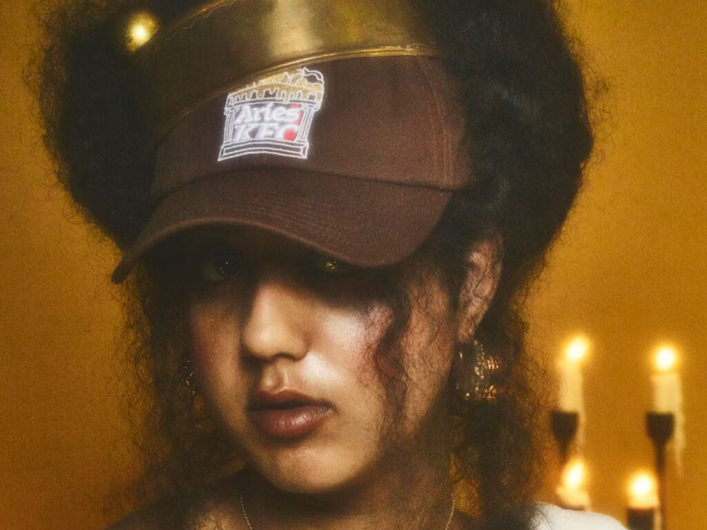
KFC and luxury streetwear brand Aries have teamed up for a groundbreaking fashion collaboration. The capsule collection, called “Gravy Drip,” features 10 apparel, accessories, and lifestyle products themed around KFC’s signature side dish, “gravy sauce.” “This collection is a love letter to our ‘liquid gold,’” says KFC Brand Manager Phoebe Sims, adding that the word “drip” connotes cool style while also actually […]
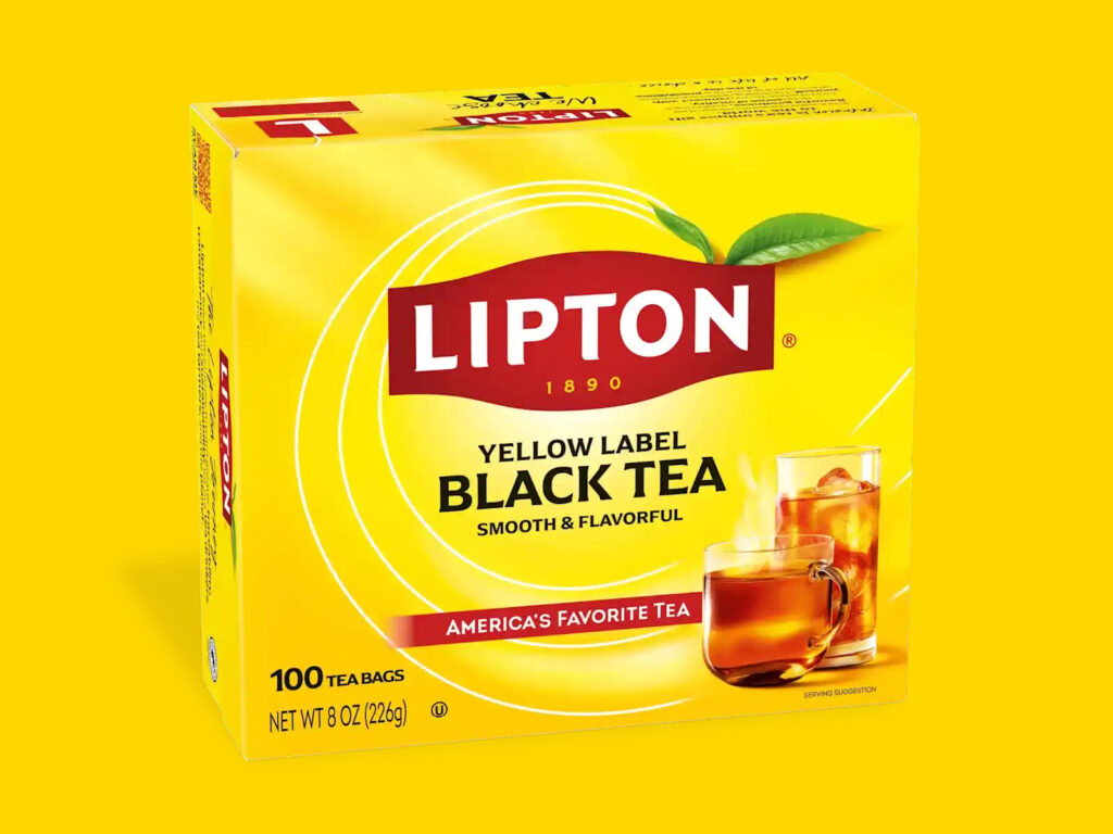
Lipton, a global tea brand with 135 years of history, launched a brand refresh on May 21st to mark International Tea Day. The rebranding featured a modernized visual identity, a new packaging design, and an expanded product lineup. Lipton retained its traditional yellow color scheme and red badge, while introducing a new slogan: "We Choose Tea." As part of this refresh, Lipton also introduced new versions of its British blends, "English Breakfast" and "Earl Grey."
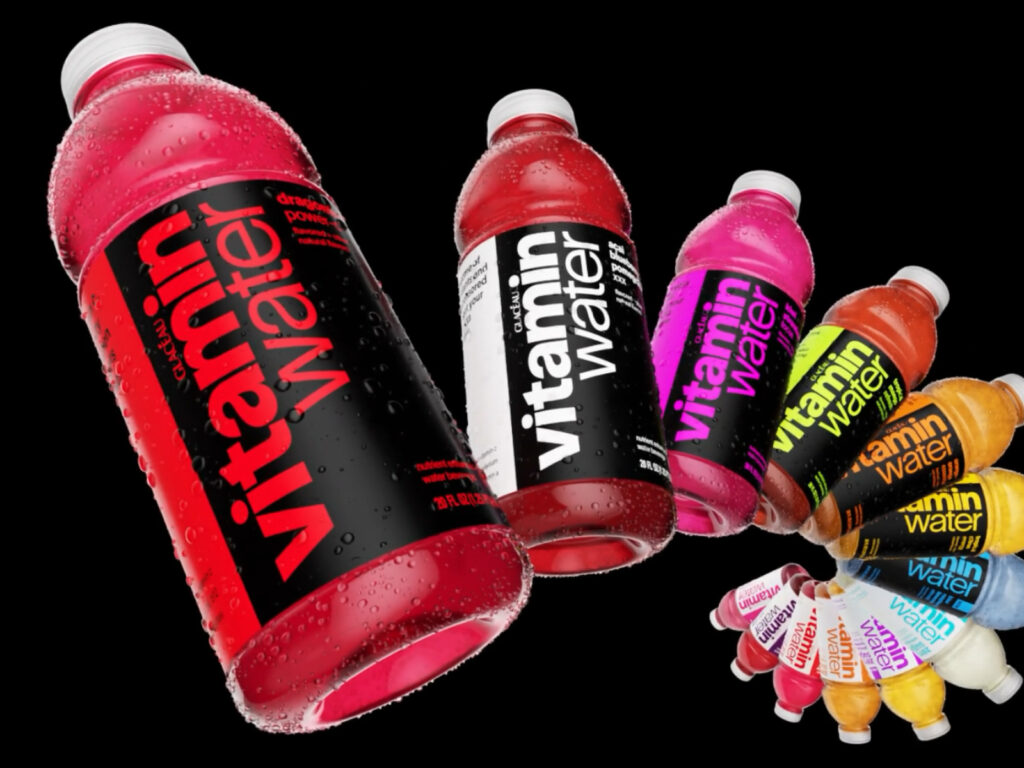
Vitaminwater, in collaboration with forpeople, unveiled its first new brand identity in 25 years. The new Vitaminwater packaging eliminates the horizontal grid and distinguishes products by color across the entire bottle. The two-tone system distinguishes products with sugar, with black labels indicating sugar-containing products and white labels indicating zero-sugar products. This contrasts with the prevailing trend of using black for zero. The logo replaces Helvetica with TWK Lausanne. The "a" is shaped like a droplet, and the dot on the "i" is elongated, reminiscent of a vitamin pill. […]
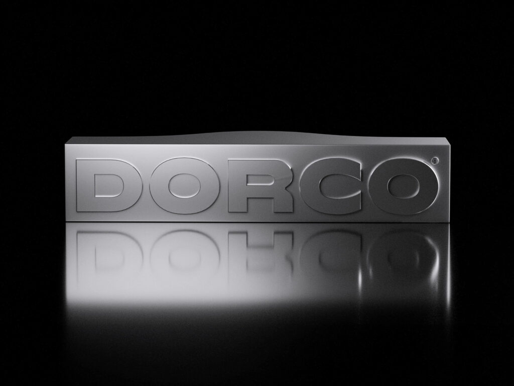
Dorco, Korea's leading razor brand, celebrated its 70th anniversary by collaborating with design agency Plus X to launch a brand refresh. This rebranding aims to strengthen its global identity, emphasizing technological prowess and precision, centered around a new brand core concept called "Leading Edge." Since its founding in Seoul in 1955, Dorco has consistently pioneered technological innovation in the razor market. In 2014, it created a significant stir in the industry by developing the world's first seven-blade razor. Currently […]
Google has begun changing its logo design. A gradient-style G logo, with each color seamlessly flowing, has recently appeared in the Google apps for Android and iOS. However, this change has been quietly implemented, and the original design remains in official images and other services. The original logo, introduced during Google's major rebranding in 2015, featured distinct blocks of blue, red, yellow, and green. […]
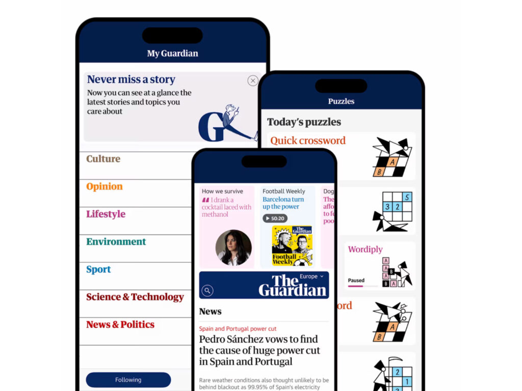
The Guardian, a leading British media outlet, has completely revamped its website and mobile app. This revamp marks a departure from the responsive web-based architecture it has maintained for the past decade, combining a mobile-centric user experience with a visual design inspired by print newspapers. This transformation, which took over a year of design, development, and testing, was hailed by Guardian Media Group Creative Director Alex Broyer as "a turning point in digital design." He specifically […]
Chong Kun Dang, a pharmaceutical company, unveiled a new corporate identity (CI) for the first time in 50 years to mark its 84th anniversary. The new CI expands Chong Kun Dang's iconic bell symbol and enlarges the font of its slogan. While maintaining the "bell" symbol, which has been used since the 1960s, the new symbol departs from the existing hexagonal and cross structures, expanding the diameter of the circular border and enhancing the readability of the text within. One of the most striking changes in the CI is the font. Chong Kun Dang adopted "Chong Kun Dang Miraeche," its own development […]
Adobe has overhauled its global brand system. Working with design studio Mother Design, the effort focused on unifying disparate brand elements and providing a consistent visual language across the global user experience. A key focus was the redefinition of Adobe's iconic wordmark. Inspired by the logo originally created in 1982 by Marva Warnock, the designer and wife of co-founder John Warnock, the new logo retains its spirit while adding a modern sensibility.
The brand identity has been revealed ahead of the 2025 Eurovision Song Contest, which will be held in Basel, Switzerland in May. The design was created by London-based advertising agency NOT Wieden+Kennedy and reflects the essence of Swiss design. The core of the design is the grid. Inspired by the Swiss graphic design style that emphasizes structure and order, the team developed an ingenious grid system in the shape of a heart. The heart has become a key element of the Eurovision brand, and […]
The beloved duo "okdal," known for their music that fills everyday life with sweetness, collaborated with Sparks Edition to create a new brand identity. Just like their music, which conveys soothing melodies and affectionate messages, their visual language also captures a warm sentiment. This renewal begins with the concept of "dancing dots and lines." When the alphabet "okdal" is interpreted sculpturally, three dots (circles) and three lines (straight lines) are revealed. Combining these elements creates three "notes," the fundamental unit of music. […]
Amazon undertook a massive brand renewal project spanning 15 global markets and over 50 sub-brands over the course of 18 months. During its rapid expansion, Amazon's brand system became fragmented and inconsistent across teams and regions. To address this, the company partnered with design studio Koto to develop a new brand system. The core of this renewal was a modern reimagining of Amazon's iconic assets. The logo was revamped for the first time in 20 years. From the A of the previous logo, […]