TJ Media, Korea's leading karaoke company, has completely redesigned its corporate identity (CI) for the first time in 20 years to celebrate its 34th anniversary. The new CI is inspired by the musical symbol of the eighth note, visually expressing the company's "desire for upward growth toward its goals." The new brand color, "Sky Blue," unveiled alongside the new logo, symbolizes TJ, which, like the ever-changing sky, exists in each individual's space and emotions wherever music takes them. Through this renewal, TJ Media aims to consistently convey its corporate identity […]
The Busan Museum of Modern Art has rebranded. This project is a project to reorganize the identity and design of the museum, and a new brand image was established through citizen participation and collaboration with designers. The project, which began in 2023 to celebrate the museum's 5th anniversary, was carried out through a public contest, exhibition, and citizen voting, rather than the existing bidding method. The graphic designer duo 'Formless Twins' was finally selected and worked with the museum's dedicated organization for 5 months to complete the new MI (Museum Identity). The new MI is a […]
Microsoft is reportedly testing a new 3D design for its Office app icons, sparking heated debate. The new icons, the first such attempt since 2018, were revealed publicly in an email survey sent to some users in early April. The new icons emphasize three-dimensional shapes and hierarchical structure, reflecting the Fluent 2 design language, which also features the 3D emoji style introduced in Windows 11. They feature a more colorful […]
HiteJinro has released 'Filait Clear'. This new product is the 9th product in the Filait series that was first introduced in 2017, and was developed with the core concept of 'clean and neat taste' that consumers recently prefer. The package uses blue as the accent color on a silver background. The elephant character 'Pili' that was seen in the existing Filait products was replaced with the 'raw' notation. Some netizens were surprised by the similarity of the design to a certain Japanese beer brand. Filait Clear is HiteJinro's own […]
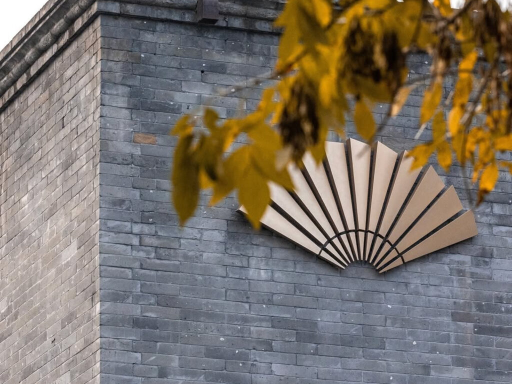
Mandarin Oriental Hotel Group, a symbol of luxury hospitality, has unveiled a new visual identity, a contemporary reinterpretation of its brand identity. The iconic fan logo, used since 1985, has been reimagined with a simple and sophisticated form. Originally a symbol of the union of the two hotels—The Mandarin in Hong Kong and The Oriental in Bangkok—the fan has become a symbol of the brand's exquisite hospitality and craftsmanship. The accompanying font, "MO Exceptional," draws inspiration from the geometric structure of the fan […]
Australian design studio Universal Favorite has rebranded hygiene brand FOHM as "Saintly." This project, which reimagined everything from the name to the tone and manner, product design, and visual identity, shed the functional image of existing hygiene products and embraced a youthful, creative sensibility. Ali Ozden, Creative Director of Universal Favorite, explains, "We wanted to go beyond the functional message of 'better wiping' to convey the confidence and freshness that cleanliness brings." Accordingly, the brand drew inspiration from Renaissance art and […]
Notion celebrated its first offline conference, "Make with Notion," unveiling a new visual language, design system, and guidelines. The project was led by design studio Order and collaborated with Design, Bitches, Seen Design, and Notion's in-house design team. "Make with Notion" was Notion's first in-person event, held at Pier 27 in San Francisco, and celebrated the company's new product vision and its passionate user community. The event included […]
Streaming platform HBO Max has changed its logo. Two years ago, HBO Max rebranded itself as a blue “Max” instead of “HBO.” This time, it switched to a metallic black and white color scheme that feels luxurious and serious. The new logo continues HBO’s identity through the circle inside the “a,” and the letterforms have been adjusted to have a curvature and angle. The previous blue branding was a strategy to increase accessibility for children and families, but it seems to be returning to the adult-oriented HBO image. HBO […]
Uniqode has collaborated with design studio koto for a rebranding. The surge in demand for contactless solutions following the pandemic, coupled with the advancement of QR code technology itself, has transformed QR codes from a simple means of information transmission into a core tool for business operations. Within this dynamic, Uniqode (formerly Beaconstac) has rapidly grown into an enterprise-grade QR code platform, reaching a new turning point. This rebranding represents a comprehensive overhaul, encompassing everything from brand strategy to identity system. […]
"Design Compass" will now be known as "Martial Arts Compass." While previously delivering design news and insights, our channel no longer focuses solely on design. We've realized that the fastest and most reliable way to spread good design is through overwhelming force. Now, we'll cover techniques for knocking out opponents with design, challenges to defeat the terrifying villain Dark Pattern, and Muay Thai matches between emotional and data designers. Our first content is a "Figma Low Kick" tutorial. […]
Sulbing has unveiled its new logo and brand concept. The new slogan is 'HAPPINESS TASTES SWEET'. It is a slogan that goes beyond simple sweetness and expresses the value of happiness that permeates customers' daily lives. The new brand concept consists of three axes. 'Guest happiness', which reinterprets familiar ingredients into special flavors, 'visual happiness', which provides visual pleasure through the harmony of various ingredients, and 'experiential happiness', where the process of eating dessert itself becomes a story. English watermark […]
Twix has rebranded in collaboration with design studio JKR. The new logo retains the signature elements of the original logo while adding a modern touch. The rounded "T" shape, used from 1979 to 2010, evokes a retro feel. The removal of the "pause" icon from the "i" in the original logo disappointed some fans. Along with its new brand identity, Twix has launched a global campaign, "Two is more than one." Previously, the logo featured a left-right bar for selecting […]