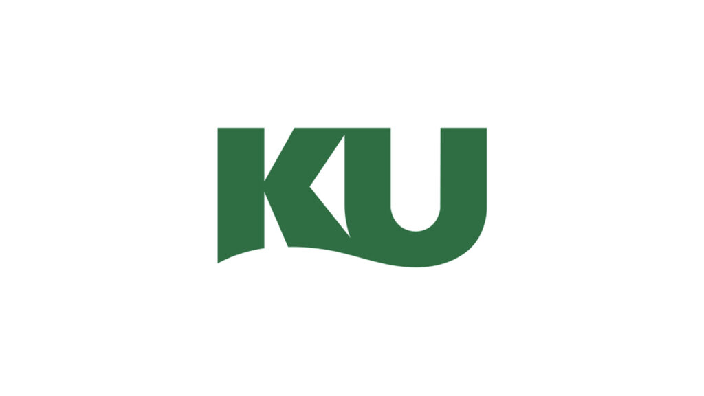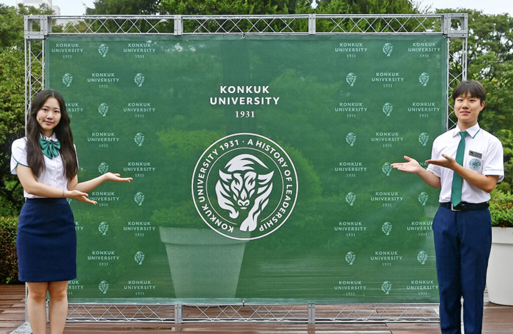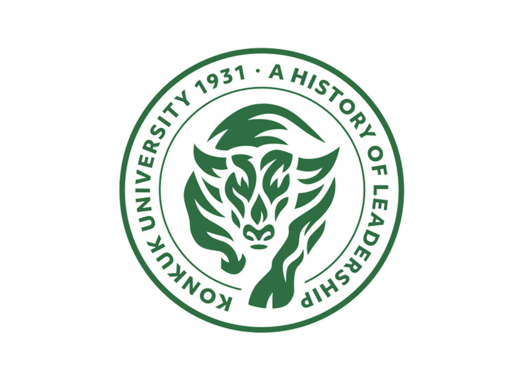
Konkuk University has unveiled a new symbol system UI (University Identity) that captures the university's philosophy and identity ahead of its 100th anniversary in 2031. The newly unveiled symbols are the initial wordmark and emblem, and a new color system has also been established.
The initial wordmark symbolizes the harmony of principle and practice as a bridge between Konkuk University's past and future. In the future, the wordmark will be utilized across all internal and external communications.
The emblem is based on the school's iconic animal, the bull, and reflects the leadership of the founding fathers, whose intellect, passion, and challenging spirit are the foundation of the school. The dynamic image of the bull symbolizes students who think for themselves and take on the world with strength, and we wanted to express KU's vision for the future.
The color system was also redefined, with Heritage Green representing the history and traditions of the founding generation and Possibility White symbolizing the infinite possibilities. These two colors will be the primary colors, with Spirit Blue, Creative Purple, and Insight Orange as secondary colors. This color scheme is also reflected in the existing communication marks, creating a unified design direction.
Konkuk University plans to clarify its brand identity and systematically manage its visual assets through the introduction of the symbol system. In the future, the university plans to build a UI manual, designated typeface, and various use cases to actively utilize it for internal and external promotion and communication.