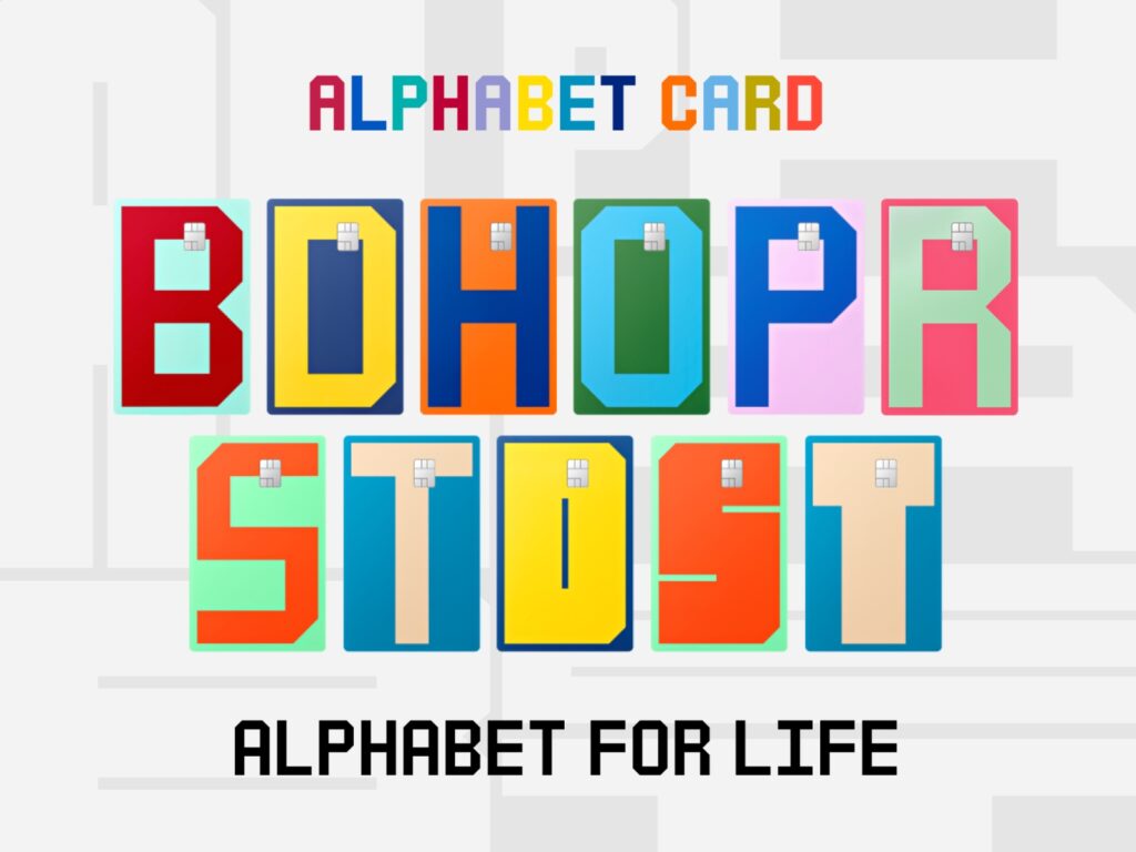
Hyundai Card has officially launched 'Alphabet Card' as an independent brand.
Alphabet Card is Hyundai Card's flagship product system that began with M Card in 2003. The core of this reorganization is the integration of individual card products under a single brand and the restructuring of the brand experience centered around Alphabet.
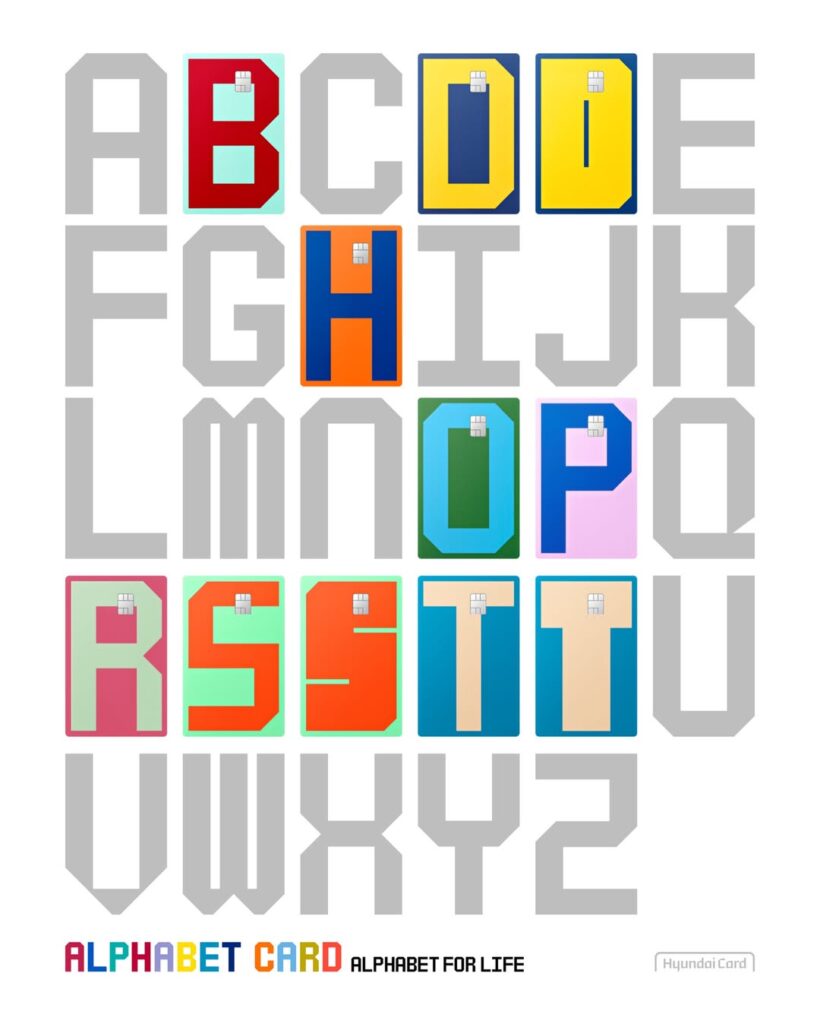
The brand slogan is 'Alphabet for Life.' It represents a user's consumption patterns and lifestyle with a single letter. B stands for Beauty, P for Pay, and R for Repeat, while the BOLD line consists of D, S, and T. The design aims to convey criteria for selecting a card centered on lifestyle rather than benefits.
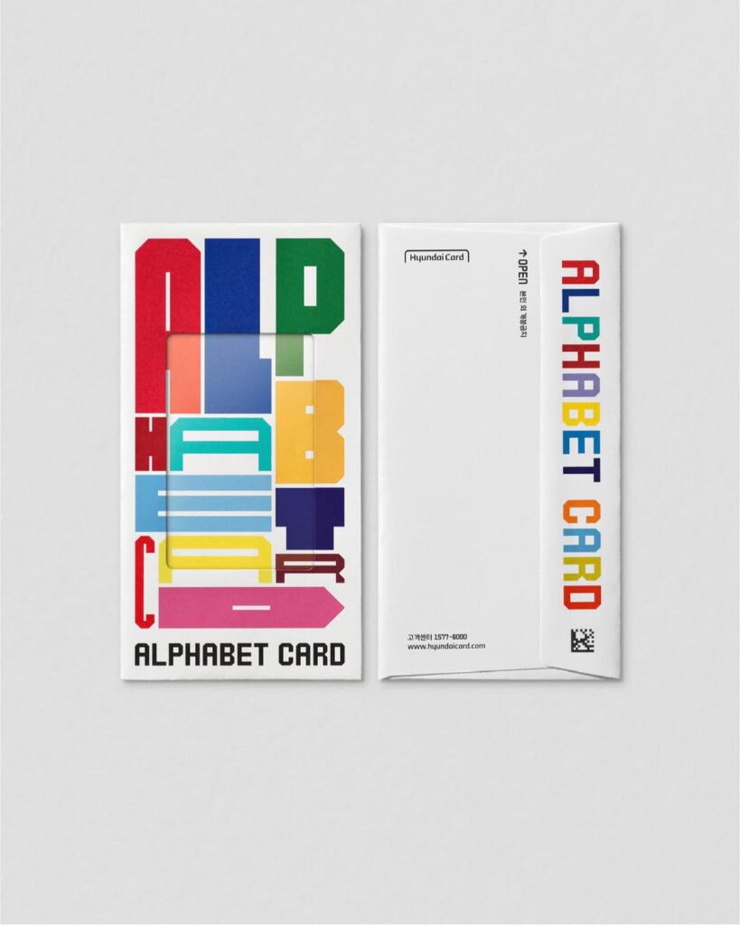
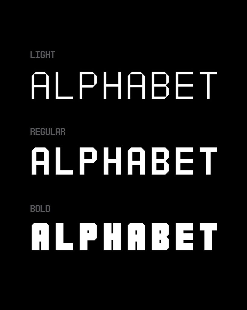
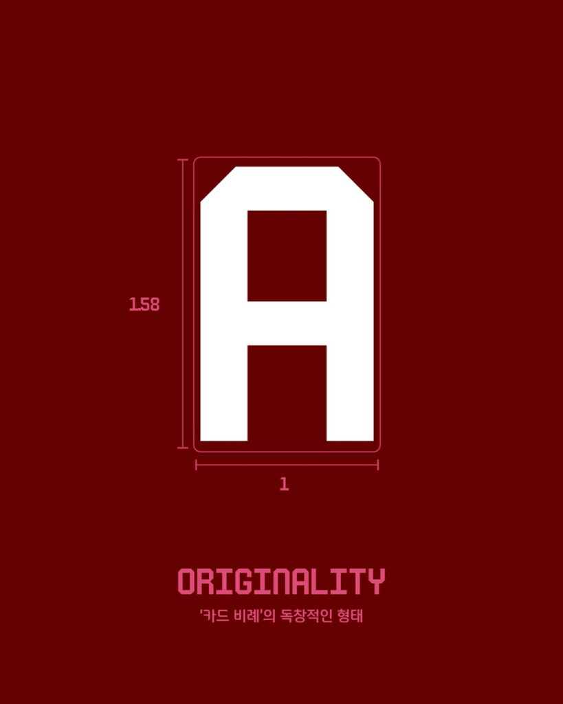
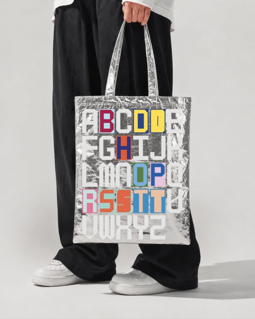
We have also revamped the brand design. The card plates and packaging have been completely renewed, and the alphabet has been utilized as the brand's core visual element. In particular, we developed a new exclusive typeface, 'Alphabet Sans,' specifically for the Alphabet Card. This typeface is designed to express straight and curved lines simply yet strongly, ensuring that each letter is recognized as a distinct brand symbol. By applying the same typeface across card design, packaging, advertising, digital services, and offline spaces, we have enhanced the consistency of the brand experience.
Hyundai Card has integrated the identities scattered across its products into a single language through an exclusive typeface and brand system. Users can now remember and select cards by the alphabet itself rather than the name, and the brand has been able to accumulate consistent design assets over the long term.

More and Sources