
Tokyo Dome City has been rebranded. Studio &Form and typeface designer Toshi Omagari worked together to transform the visual identity for 2023-2024.
Tokyo Dome City, previously called Big Egg City before January 1, 2000, is an entertainment complex in Tokyo that gathers various facilities such as Tokyo Dome, an amusement park, spas, hotels, and theaters. The original design was expressed in a way that can go back and forth between analog and digital. We developed an 'Adaptive Identity System' that adapts to various environments so that it can be recognized as a single system in any environment.
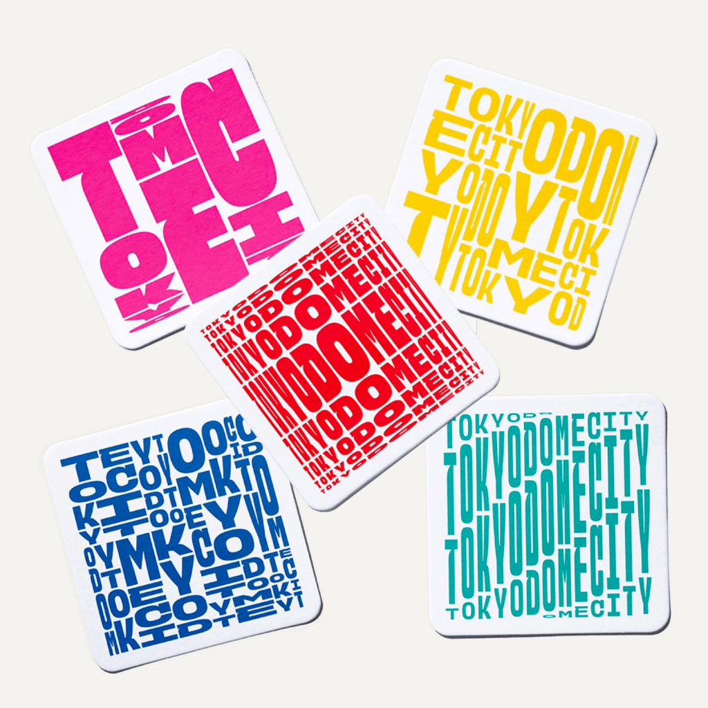
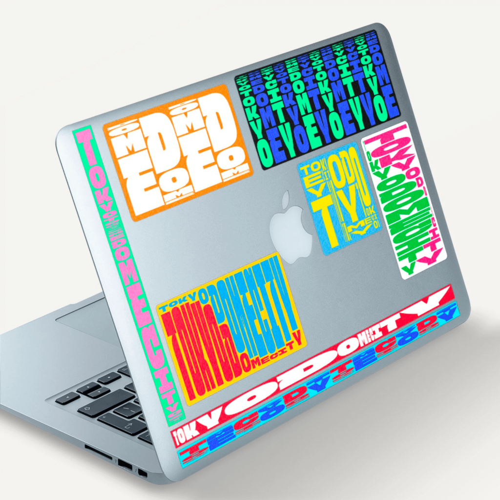
It expressed an expandable form while strengthening the sense of unity that was lacking as a city. We have developed a graphic system that can be applied to everything from ever-changing digital signs to posters. Use typographic patterns that fit your content rather than sticking to a fixed shape or single color.

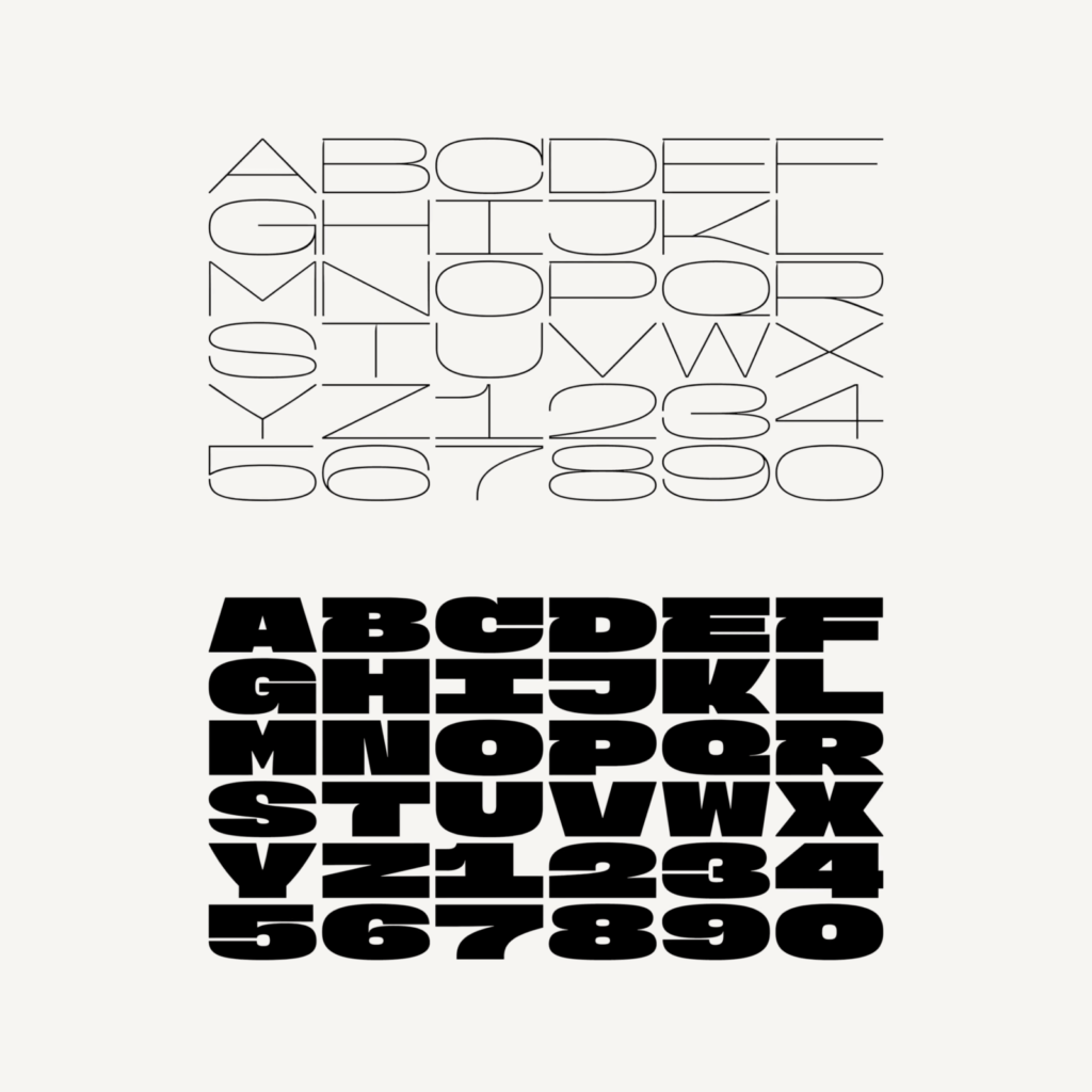
The shape of the letters with slightly dug grooves is unique. Although it is a sans serif typeface, its small characteristics give the impression of an ornamented serif typeface. Instead of using separate iconic shapes, instead use bold, neat fonts like patterns.
The limits of typeface variability have been expressed. Letters are either flattened horizontally or elongated vertically. Not only do letters change in real time in a video, but fonts are combined in various forms even in stationary situations. Flat horizontal letters and tall letters vertically are also placed at the same time. We even developed our own software to express variable grids.


There have been many changes to bring joy to the typeface, but it is interesting that the variability of the typeface itself became its identity. If variability had been given to a sans-serif font that does not have a strong individuality, the subtle individuality of the font would not have been recognized and the font would not have been recognized as unique to Tokyo Dome. If you had started with a serif font, it would have felt complicated because of the size changes and decorations. It's a refreshing attempt in many ways.

