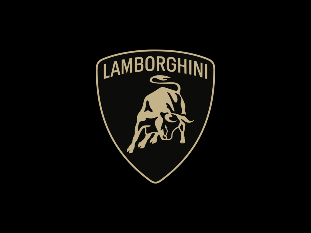
Lamborghini has refreshed its visual identity after more than 20 years. The change is to reflect its decarbonization strategy for sustainability, called Direzione Cor Tauri (Towards the Heart of the Taurus), which aims for electrification. While maintaining Lamborghini’s DNA that captures the authentic feeling of courage and unpredictability, the company plans to launch a purely electric car in the second half of 2020. The overall silhouette of the bull, which has been used since the 1960s, has been changed to a minimalist expression. The thickness has not completely disappeared, but it has been expressed as if it is slightly protruding. […]
Decathlon has rebranded in collaboration with brand consulting firm Wolff Olins. Decathlon is a French sports retailer with over 2,000 branches and is sometimes called the IKEA of the outdoor world. Since our founding in 1976, we have been making sports equipment for beginners and experts for 48 years. In keeping with its massive size as the world's third largest brand, we have created a new brand identity to increase our influence on sports culture and new customer bases. Decathlon is something that anyone can experience rather than the victory of the elite […] ]
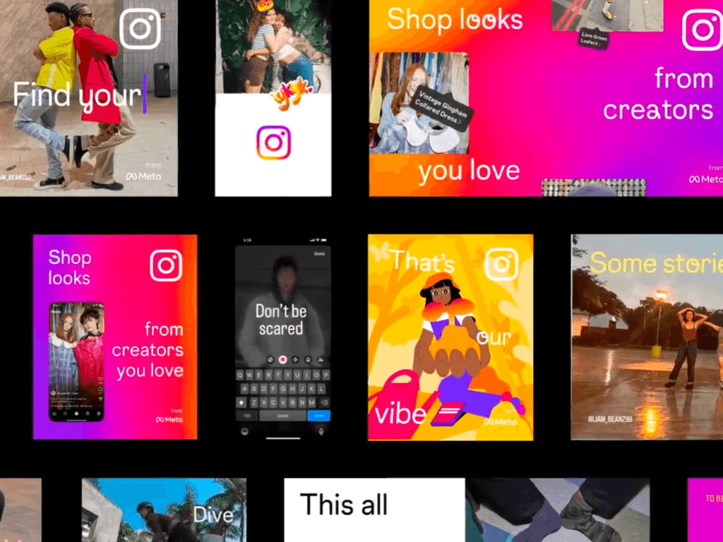
Instagram collaborated with studio DUMBAR/DEPT to create a motion system. A move was needed to create a unique rhythm for Instagram while maintaining the existing brand identity and Colophon's custom font, which was redesigned by 2×4, which was an unconventional rebrand about two years ago. DUMBAR/DEPT aimed to be a motion system that would inspire the creator community. It started with the way Instagram users interact with stories or apps created with the creator tool. And to set the rules, we defined the physics, the fundamental principles of movement. […] ]
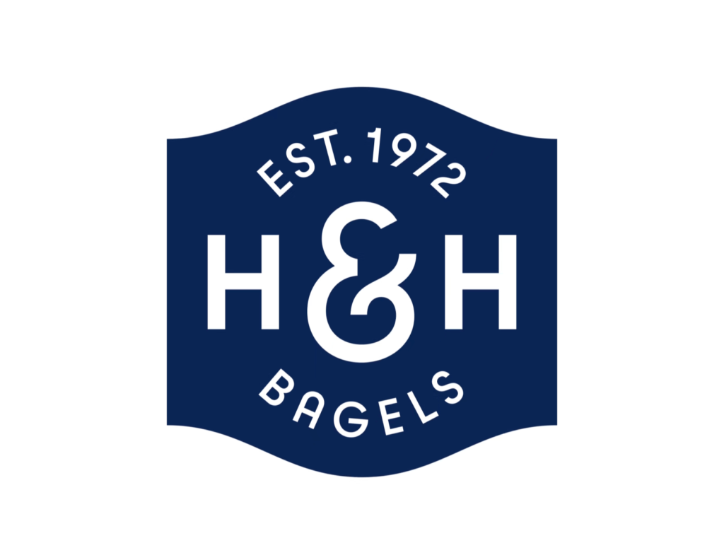
H&H Bagels has been rebranded in collaboration with New York-based creative studio High Tide. H&H, known as New York's top three bagels, has been on the Upper West Side since 1972. As we prepare for national expansion, we need to stay true to our New York roots and spread the word to more people. The modern reinterpreted elements are good, but the script typeface that emphasizes the human aspect is especially noticeable. We reorganized the visual identity of all contact points with customers both online and offline, from packaging to website. […] ]
The 2024 Paris Olympics poster was unveiled at the Musee d'Orche. Created together with French illustrator Ugo Gatoni. The slogan “Games wide open” uniquely expresses the unity of the entire city through sports. It is indeed a city of art that the unity of humanity can be expressed in such a joyful way through sports. This is the first double-sided poster for the Olympics, combining two posters representing the Olympics and Paralympics into one poster. Illustrator Ugo Gatoni created this stunning […] ]
Lyle's new design for Golden Syrup was a big controversy. Golden Syrup has been loved by British people for over 150 years with its surreal illustrations and beautiful Victorian-style decorations. Designed in 1883, the logo holds the Guinness World Record for the longest-standing packaging that has remained unchanged. Founder Lyle was a devout believer and took inspiration from religion to design the packaging. Golden Syrup contains Samson's […] ]
Beauty platform ‘Hwahwae’ has been rebranded. This is a major change 11 years after the service was launched in 2013. Hwahae is a service that solves the problem of not knowing what ingredients were included when purchasing cosmetics. It is a service that has revolutionized the market by making it easy to find cosmetics information that was previously difficult to collect in one place. Bird View, the operator of Hwahae, has unveiled a new brand identity along with the ‘Hwahwa 2.0’ mission to take a leap toward the future. new [… ]
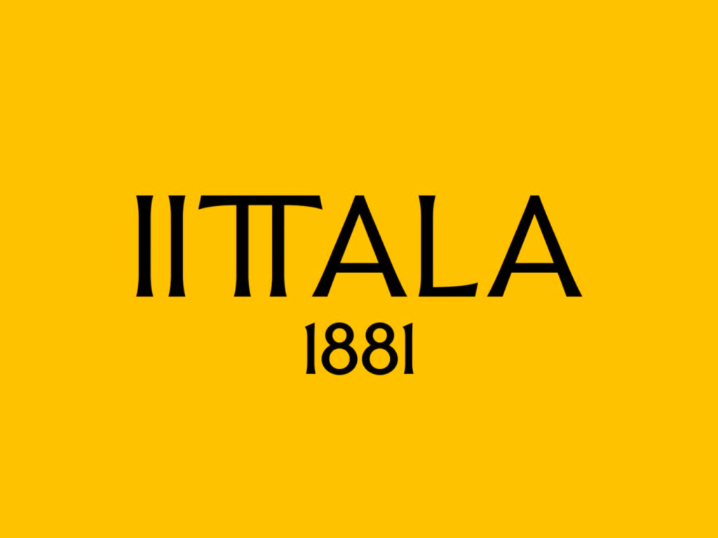
In early February, Finnish lifestyle brand Iittala unveiled its new brand identity at Stockholm Design Week. The logo and collection pay homage to the legacy of architects Alvar and Aino, who designed many of Iittala's iconic products. The new visual identity completely contradicts the original brand impression. Iittala, Finland's leading lifestyle brand, is a company with a 143-year history that started in 1881 in a glass factory in the village of Iittala. Architect Alvar Aalto and […] ]
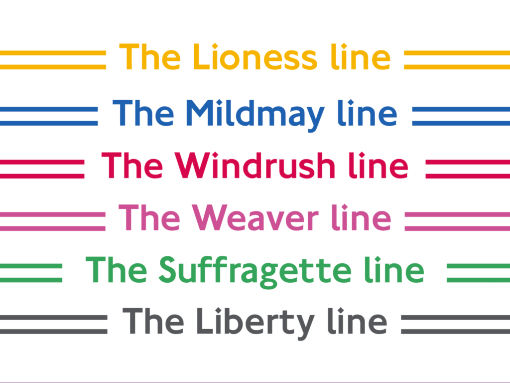
London has changed its subway map through collaboration with creative studio DNCO. We've branded each line to make it easier to distinguish from the complex subway map and celebrate London's history and culture. The six underground subway lines, which were uniformly marked in orange, were changed to names and colors at each station that reflect the history and culture of the region. The name contains a story about the community that is difficult to understand unless you are a citizen living in Run Run. Celebrating the meaningful history representing each region […] ]
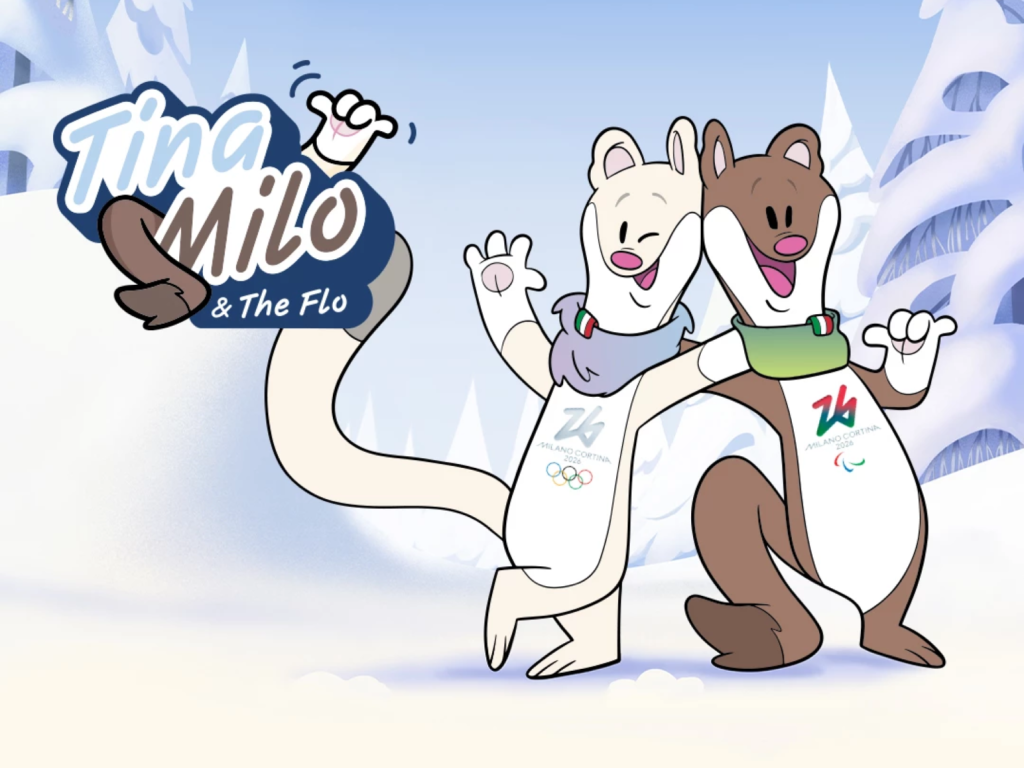
The official mascots for the 2026 Milan-Cortina Winter Olympics and Paralympic Games have been revealed. Among the 1,600 submitted entries, the northern weasels 'Tina' and 'Milo' became the mascots through public voting. The cheerful expression and elongated body are cute. The snow-like sky blue and soft brown look like marshmallow cocoa. The character emblems are familiar, like animation titles. The name ‘Tina’ comes from Cortina and ‘Milo’ comes from Milan. Tina has a creative and down-to-earth personality and enjoys going to concert halls […] ]
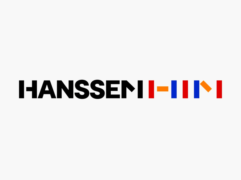
Hanssem collaborated with design studio CFC to rebrand for the first time in 32 years. We maintained a visual identity worthy of the name ‘Hanssem,’ which symbolizes endless growth. We combined 'Creative Block', a geometric shape faithful to the basic elements of design, with Hanssem's English name 'HANSSEM'. The simple yet powerful block shape of vertical, horizontal, and diagonal lines was even applied to the word mark. The 'three primary colors', another basic element of design, have become darker and clearer. The ‘H’ and ‘M’ in ‘HANSSEM’ refer to the visual characteristics of the block […] ]
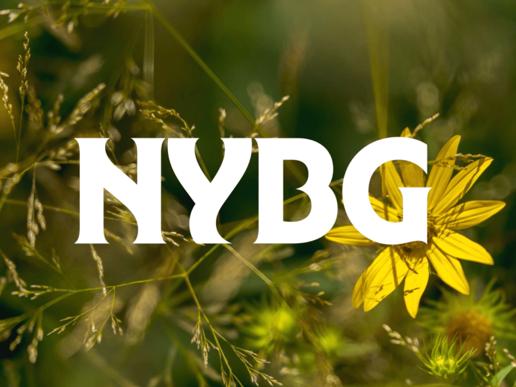
The New York Botanical Garden has collaborated with Wolff Olins for a rebrand. The New York Botanical Garden (NYBG) is a garden in Bronx Park in New York City that was founded in 1891. The rebrand aims to reflect the NYBG’s role as a place to study and protect nature, as well as a place for visitors to learn about and enjoy nature. “We wanted to capture what it is as a place of service to the Bronx community,” explains Jane Boynton, Wolff Olins’ Senior Creative Director. Handcrafted […]