Wolff Olins has rebranded.
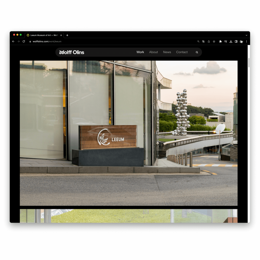
It was founded in London in 1965 by designer Michael Wolff and advertising executive Wally Olins. He has contributed to the design of iconic brands such as the Beatles' historically significant Apple Records, Johnson & Johnson, Google, and Airbnb, and has recently designed brands for Leeum Museum, LG, Instacart, and Uber.
Wolf Olins is trying something new by opening a new location in Los Angeles and expanding to the West Coast. In line with the challenge, we introduced a new visual identity, wordmark, and website to ensure that new values are well communicated.
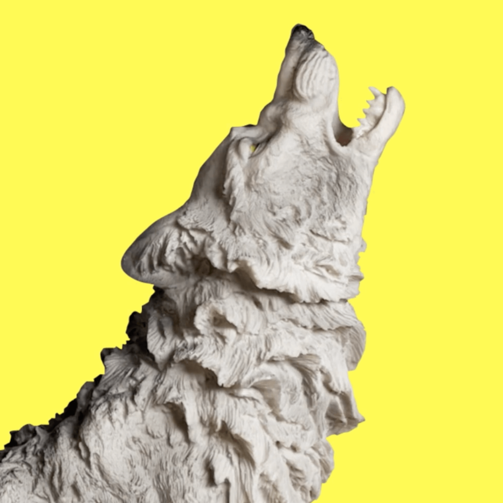
There has been a lot of rebranding of technology companies recently, switching to sans serif wordmarks that give a neat and tidy look. It was a similar phenomenon to when fashion companies all changed their wordmarks to similar shapes. A creative company that brings joy to people's hearts shouldn't get bored. Wolf Olins strikes a balance in a simple yet elegant way.
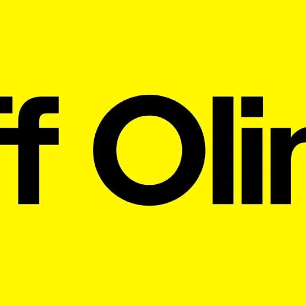
The biggest change is the wordmark. Due to the nature of an agency that is not limited to a specific field, creativity must be expressed without revealing too much individuality. Wolf Olins uses a narrow, tall, single font to convey a professional and neutral feel.
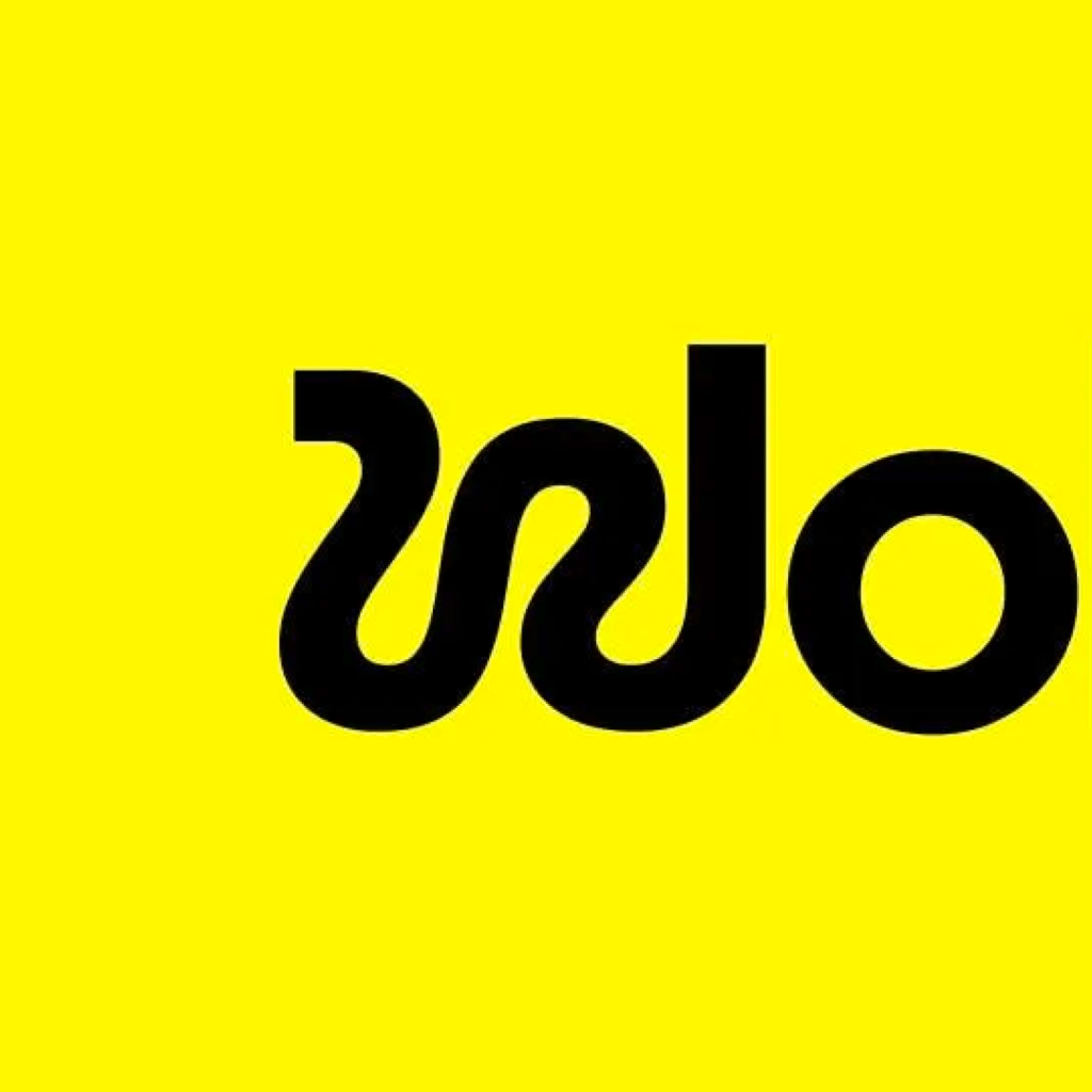
Wolff Olins said that the first letters of Wolff Olins, W and O, represent the company's magic and mathematics. W represents joy and a non-linear journey, while O represents strategic rigor and precision.
W is shaped like a snake. The curves and angles are non-geometric, making it look more free. However, it is not as unpredictable as if it were drawn by hand. By standing the right pillar of W vertically, it blends naturally into the rest of the word.


Personally, I like designs that achieve the desired effect without using as many visual techniques as possible. It feels like persuading the other person without having to speak at length. It is attractive that it expresses its identity as an agency without overly revealing colors or symbols. The seamless blending of conflicting expressions in typefaces is also cool. I've seen many techniques for changing from serif to sans-serif, but the seams are particularly clean.
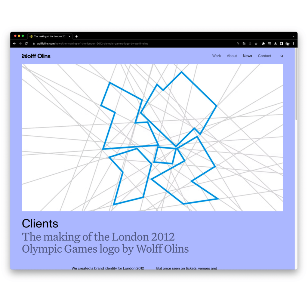
Wolf Olins, who became famous during the London Olympics, has grown into a leader in contemporary design. Watching the video released this time, I can imagine how much effort was put into it last time.
Visit our website to see videos of the iconic Wolf Olins' work.