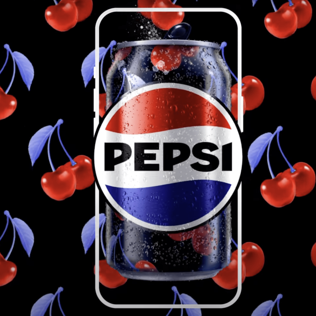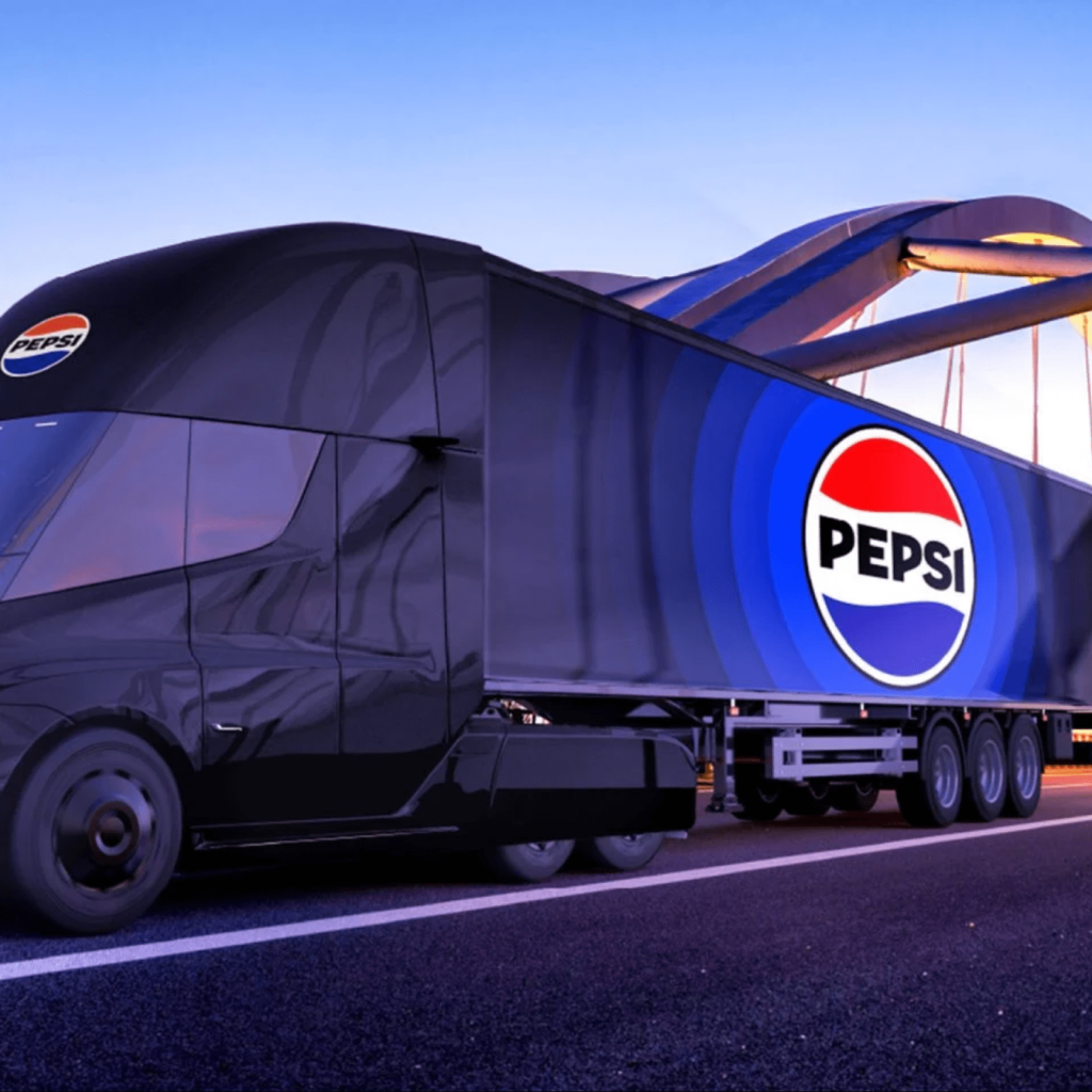

Pepsi rebranded after 14 years. As a challenge to become the first brand of zero-sugar beverages, a new brand will be applied from 2024, commemorating the brand's 125-year history.
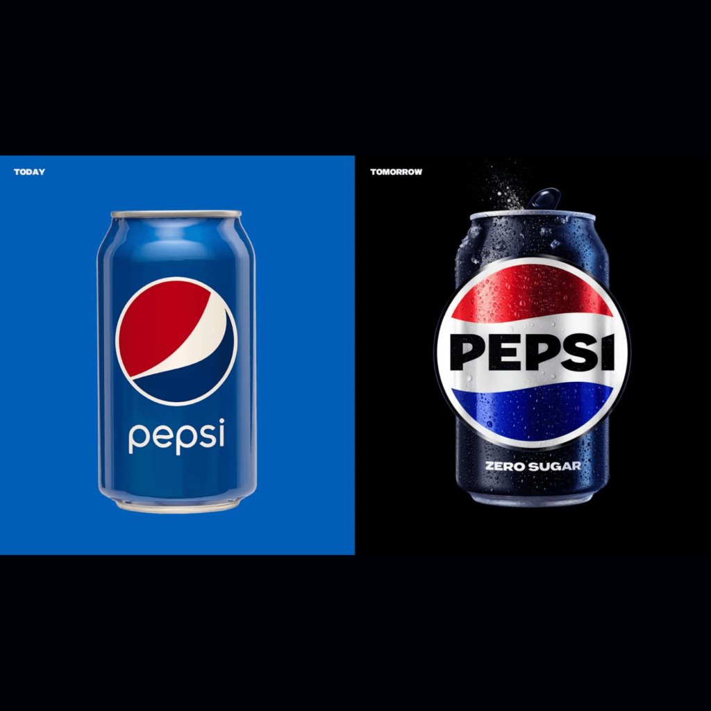
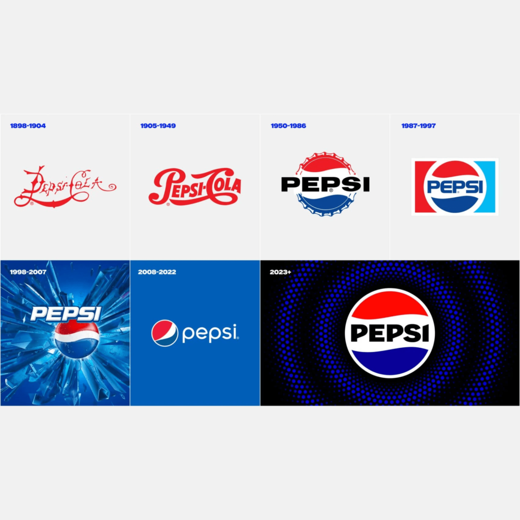
It expresses the future direction while maintaining the assets of Pepsi that have been built over a long time. Since the 2008 rebranding, the Pepsi wordmark has been outside of Pepsi's globe symbol. A solid, voluminous black typeface is centered. From a delicate and shy impression to a dignified and confident impression.
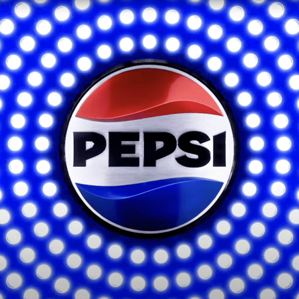

Black, which symbolizes Pepsi Zero Sugar, and electric blue, which is much darker than before, were used. It effectively expresses the will for zero sugar while adding a retro feel. Pulse movement expressed by combining colors broadens the identity. The joyous energy of music brings an evocative visual language from shelf to metaverse, moving between physical and virtual spaces, helping fans engage in any way they choose.
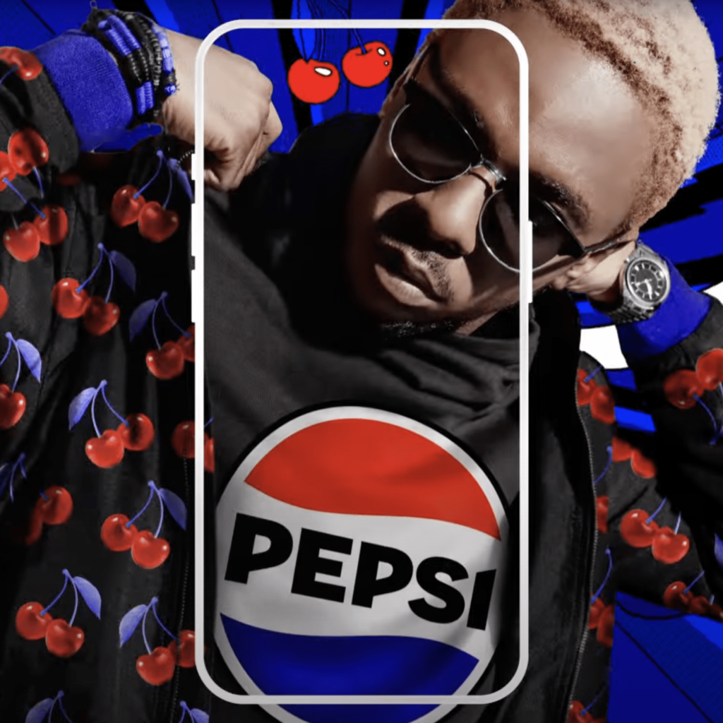

The world is currently at war with sugar. Many people do not want to eat sugar at all. A lot can change depending on who catches the change in this huge flow. Is it okay that Pepsi changes visual identities so often? I often thought, but this update is nice. We often get shunned by fans because we ignore our existing brand equity, but I think this change is clever. It seems that Pepsi learned a lot from the old Tropicana.

