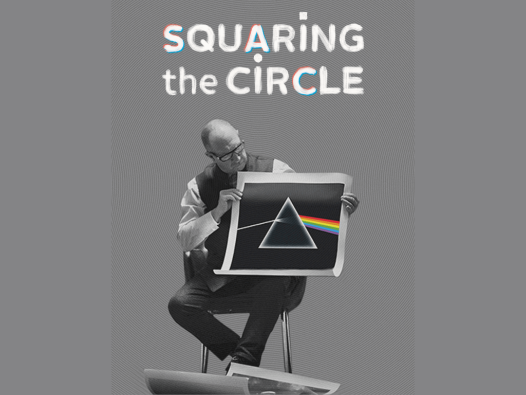
The documentary 'Squaring the Circle (The Story of Hipgnosis)' by the British design group 'Hipgnosis' has been released. Hipgnosis has been active for about 15 years since 1968 and has created album cover art for Pink Floyd's [The Dark Side of the Moon], Genesis, Black Sabbath, Led Zeppelin, and Paul McCartney, which are famous worldwide. It is released in arthouse theaters around the world, but not in Korea. You can watch it by streaming on iTunes. […]
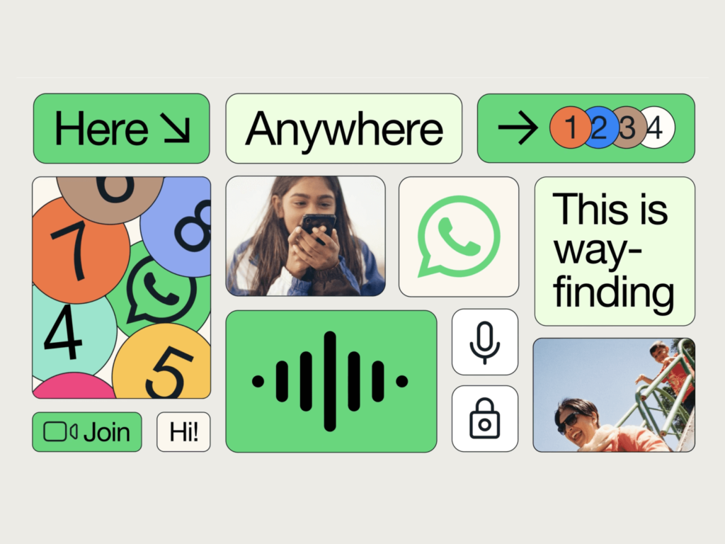
With over 2 billion users in over 180 countries, WhatsApp is one of the most popular messaging apps. While looking at recent brand campaigns in various countries, we noticed a big difference between the visual language of outdoor exposure and the visual language of digital products. Why is WhatsApp’s visual language so different? 👁️ Designer’s Eye Meta designed a design system with Koto at WhatsApp earlier this year. WhatsApp’s iconic […]
The Florida-based esports collective Misfits Gaming Group has rebranded as Misfits Gaming Group. The group has competed in popular gaming tournaments including League of Legends, Overwatch, Call of Duty, and Counter-Strike. They have a diverse background in gaming and media. The rebrand is one of the biggest changes since streamer, YouTuber, and content creator Karl Jacobs joined the company as owner and creative director in March. 👁️ Designer’s Eye Iconic […]
Nissan's luxury car brand Infiniti has rebranded in collaboration with Bruce Mau Design. While other car brands such as JLR have changed a lot recently, Infiniti's change has been particularly subtle. Infiniti's logo has changed four times in 30 years. This time, it's gotten closer to the logo that was first unveiled in 1989. 👁️ Designer's Eye The biggest change is the Intiite Road symbol that symbolizes Infiniti. The vanishing point that used to look confusing like Mt. Fuji extending from a vanishing point […]
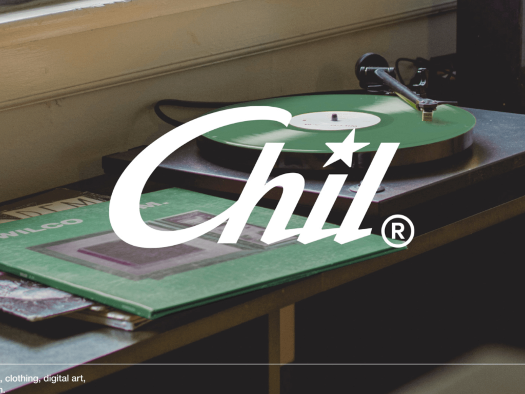
Project Chil is a collaboration between Chilsung and Studio April. It combines the first letters of CHILSUNG, "chil," with the word "chill," which carries various meanings, such as "to play" or "to relax." The brand has collaborated with various brands and artists, resulting in pop-ups, merchandise, videos, and music. Beginning with Benjamin Moore, the brand has since collaborated with Tamiya and LABO-H. 👁️ The wordmark, which captures the identity of Chilsung Cider and conveys it in a sophisticated way, is impressive. The graphic "star" […]
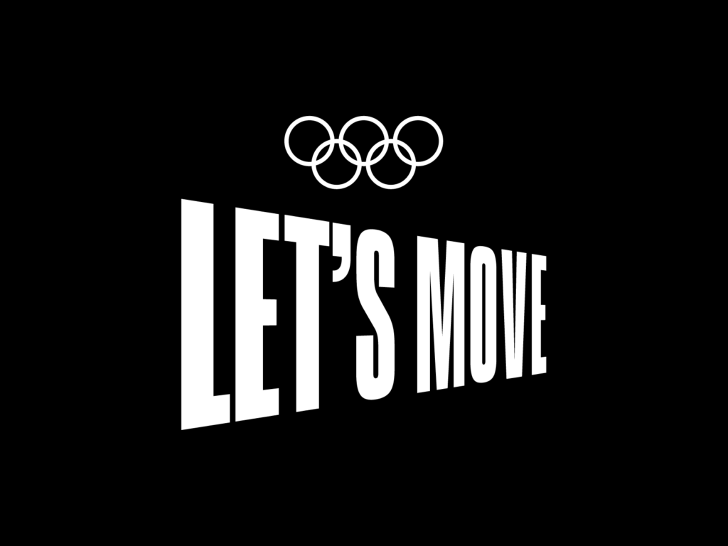
On June 23rd, the IOC will hold 'Olympic Day'. 'Olympic Day' is a day commemorating the creation of the International Olympic Committee at the Sorbonne in Paris by Baron Pierre de Coubertin on June 23, 1894. Every year on June 23rd, it gets people around the world moving. This project first started in 1947. Once you're invited, you'll be invited to join our daily 30-minute workout calendar. Famous Olympians such as Pau Gasol, Allison Felix, Logan Martin, PV Sindhu, and Yusra Mardini […] ]
The Class 101 brand design team has released pictograms expressing their core values. The pictograms expressing the core values shared with colleagues were expressed in the Olympics. The design is a metaphor for the Olympic events, where people with outstanding capabilities come together as a team to create new history. 👁️ Designer's Eye Class 101 is famous for its unique graphics. Not only the graphics used on products, but also the graphics used internally are excellent. This time, we wanted to make it possible for various people to share the same values […]
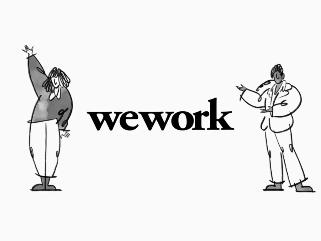
Global coworking space WeWork has refreshed its brand with creative brand agency Franklyn. The logo, colors, illustrations, and typography have all changed. Rather than completely rebrand, the company decided to update the brand to maintain a strong identity that has become a fixture in the coworking space space space. “As a WeWork member, I’ve had a magical experience in WeWork spaces,” says Franklyn co-founder Patrick Richardson. “WeWork blurs the lines between art and science, emotion and intellect. This duality is visually […]
Jaguar Land Rover has announced its new brand logo. It is part of the Reimagine strategy to become a zero-carbon company by 2039 to become a 'true modern luxury business' announced in 2021. Jaguar Land Rover, a combination of several brands, is changing to represent the whole as House of Brands. It will be mainly used to represent the company, and the iconic Jaguar and Land Rover logos will remain as before for each brand. 👁️ Designer's Eyes Front of Jaguar Land Rover […] ]
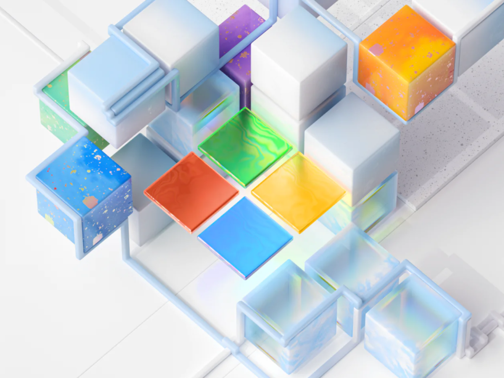
Microsoft has released Fluent 2. There are significant system and platform level changes, and we offer several kits for designers and developers to use. We provide Fluent 2 web, Fluent 2 iOS, and Fluent iconography, and Android is still in preparation. 👁️ Designer's eye Recently, the colorful artwork that Microsoft maintains consistently stands out. High-brightness gradation and glossy transparency combine to give a futuristic impression. Textured like recycled plastic […] ]
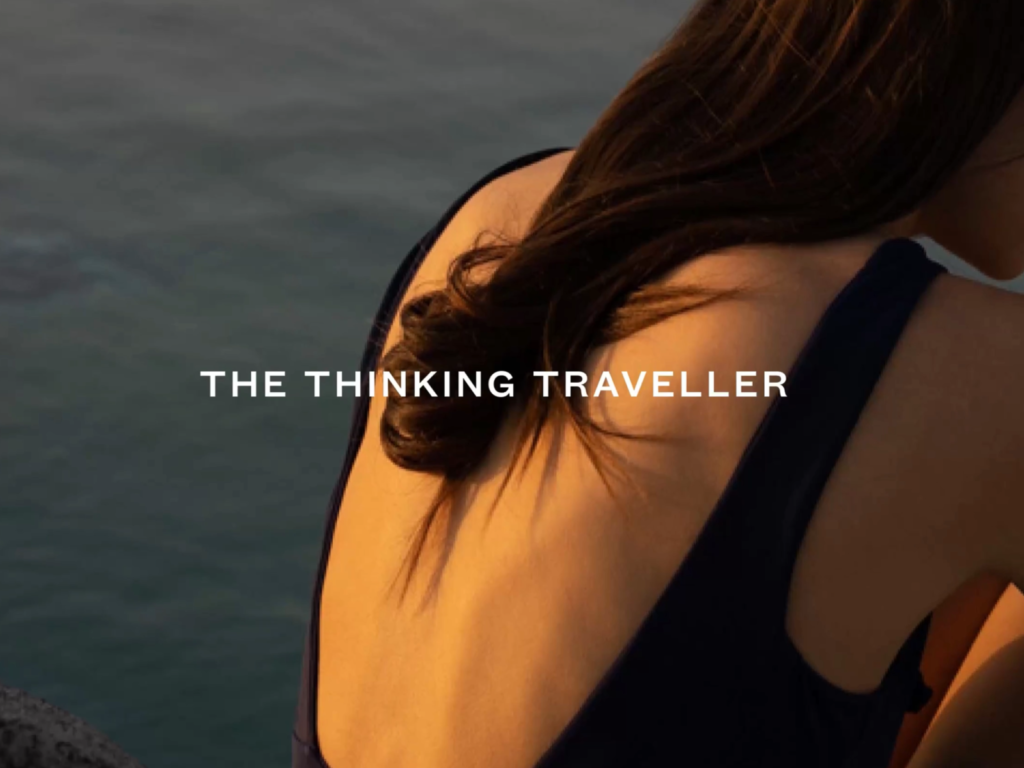
The Thinking Traveler, a service introducing attractive luxury villas, has rebranded with design studio Without. The rebranding included a variety of touchpoints including strategy, identity, and physical and virtual applications. The Thinking Traveler has been offering villa vacations for 20 years. Over the years, the villa rental business has grown and has seen many competitors. A new luxury branding was needed to provide its own unique value. 👁️ Designer’s Eye ‘Soulful […]
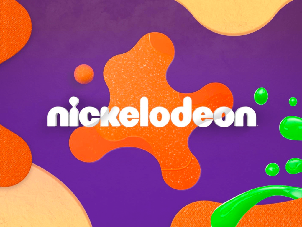
Nickelodeon has rebranded after 14 years. Nickelodeon is a children's TV channel. This time, it has reinterpreted the Splat logo that has been used since the 1980s. The rebrand will be launched in the UK in July and will be rolled out globally by the end of 2023. Nickelodeon launched the 'Portal to Fun' campaign, which started with the video 'Quartet'. Six different agencies, including Roger and CALLEN, participated in the campaign. Nickelodeon, which has various animations such as SpongeBob, Ninja Turtles, and Baby Shark, is a media […]