헤드스페이스가 리브랜딩 했습니다. 헤드스페이스는 10년 전 창립 이후 마음 챙김과 명상이라는 키워드로 많은 사람들의 사랑을 받은 서비스입니다. 개인 뿐만 아니라 수많은 기업과 협업하며 전 세계 1억 명이 넘는 사람이 사용하는 서비스가 되었습니다. 지난 2021년 정신 건강 서비스 진저와 합병 후 새로운 서비스 Headspace Care를 출시하면서 브랜드 재설계가 필요했습니다.
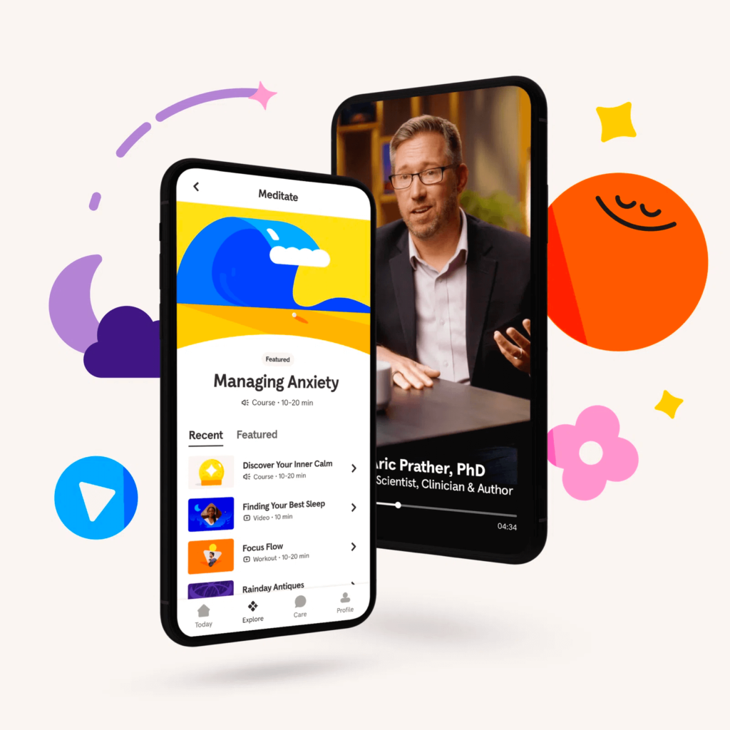
헤드스페이스 디자인 팀과 디자인 스튜디오 Italic Studio와 협업해 브랜드 시각 정체성을 재설계했습니다. 명상을 넘어 정신 건강을 해결하는 전문적인 페르소나를 표현했습니다. 개인 내면의 추상적인 감정과 정신은 일러스트레이션으로 표현하고 전문 서비스로서의 실제 세상에서의 상호작용을 사진으로 표현했습니다.
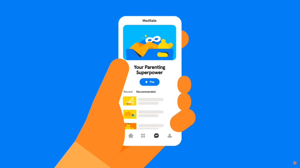
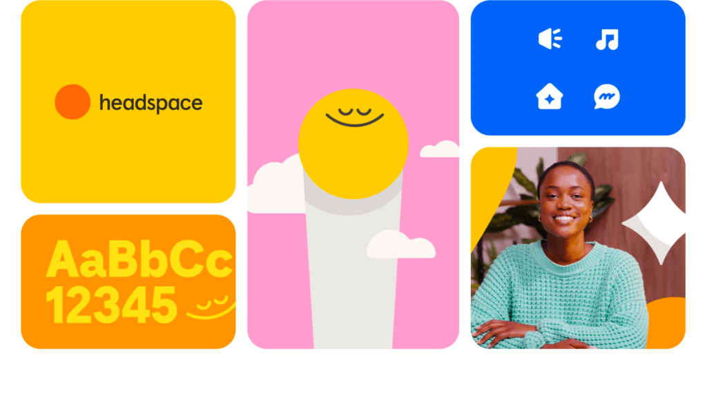
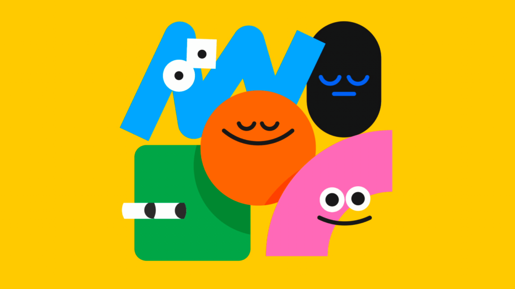
편안한 명상의 상태를 표현하는 오렌지 스마일리 뿐만 아니라 다양한 감정과 표정을 표현했습니다. 귀엽고 동글동글한 일러스트레이션은 심각한 정신 문제를 가볍게 묘사하는 것이 아니라 쉽게 다가가 치유할 수 있다는 인상을 주기 위해 노력했습니다. 헤드스페이스를 닮은 말랑한 색감과 부드러운 모션으로 편안하게 고민을 말할 수 있을 것 같은 인상을 전합니다.
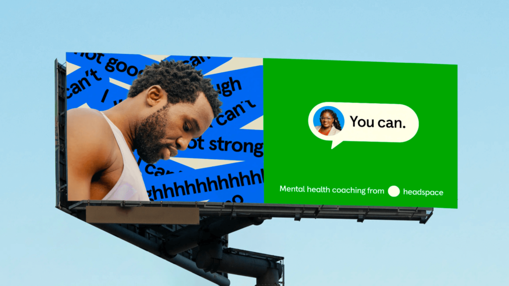
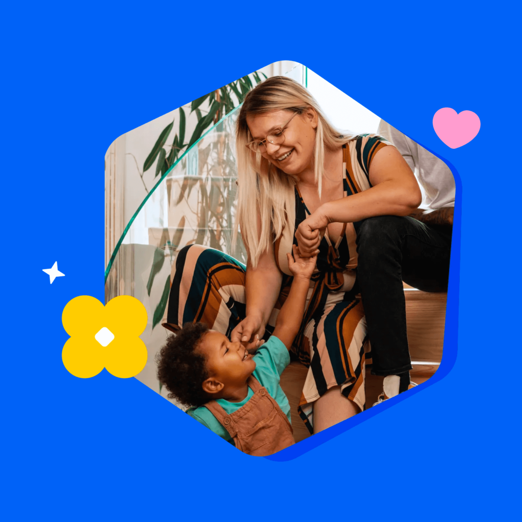
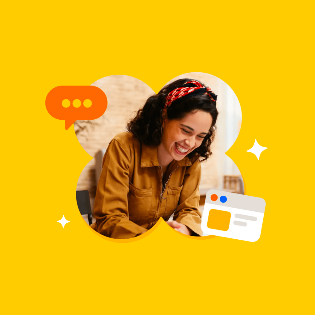
헤드스페이스에서 제공하는 EAP(Employee Assistance Program)와 1:1 코칭은 사람과 사람의 상호작용과 관계를 전문적으로 드러내는 것이 중요하기 때문에 사진을 많이 사용했습니다. 기계 너머에 어떤 사람이 나의 마음을 이해하고 함께 고민할지 상상할 수 있게 돕습니다.
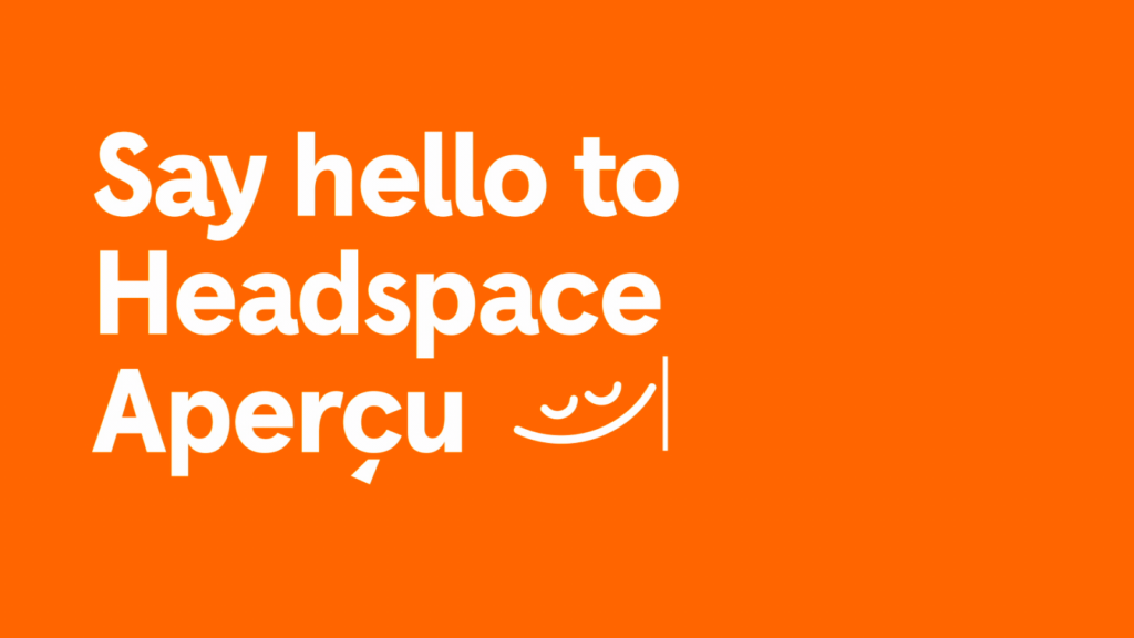
Colophon Foundry와 협업해 전용 서체도 개발했습니다. 유명한 Aperçu 서체를 기반으로 헤드스페이스에 알맞게 조정했습니다. 놀이부터 임상까지 유연하게 제공하는 인상을 담기 위해 장난스럽고 친근하지만 기능적으로 설계했습니다. 서체에 담긴 부드러운 곡선은 오렌지 스마일리로부터 가져왔습니다.

브랜드의 정체성을 지키면서 새로운 변화를 시각적으로 잘 풀어냈습니다. 개인 대상 서비스에서 전문성을 담은 변화의 좋은 사례 같네요. 사람들이 편안하게 접근할 수 있는 인상을 주는 브랜드에서 실질적인 문제를 해결해 줄 수 있겠다는 기대감이 잘 담겼습니다. 문제를 심각하게 부각해 불안하게 만들거나 딱딱하게 어려운 내용을 설명하지 않아서 더 좋네요.