
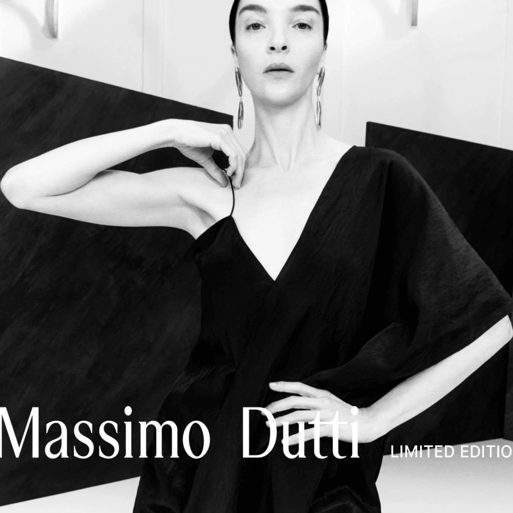
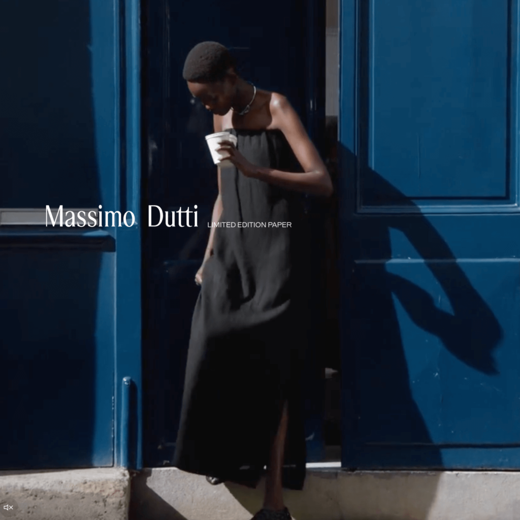
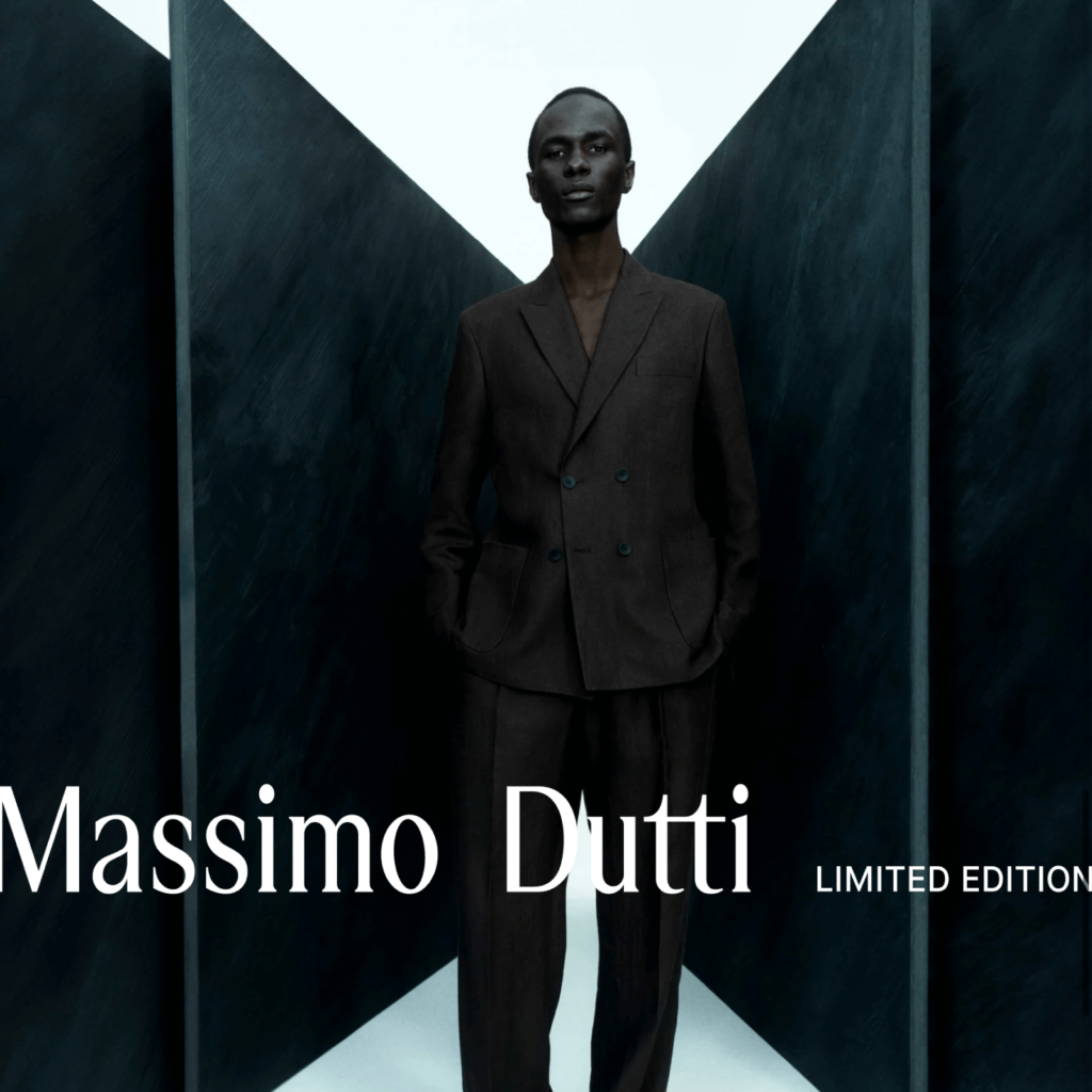
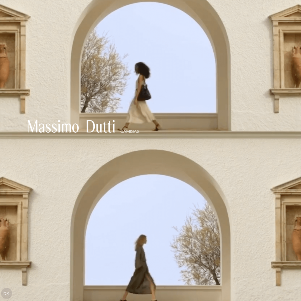
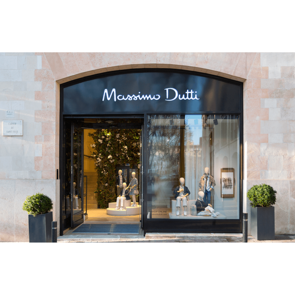
마시모 두띠(Massimo Dutti)가 새로운 로고를 공개했습니다. 마시모 두띠는 중산층을 위한 고급 브랜드로 우아한 실루엣과 차분한 컬러의 옷을 만듭니다. 고급스럽지만 과하게 드러내지 않는 ‘조용한 럭셔리(Quiet Luxury)’를 추구합니다.
모회사 인디텍스는 이러한 컨셉을 강화하기 위해 브랜드 포지셔닝을 수정하고 프리미엄 브랜드 특성을 부여하기 위해 로고를 바꿨습니다. 하지만 반응이 정말 좋지 않습니다. 리브랜딩에 부정적인 입장을 보이는 경향은 언제나 있지만 독창성과 미학 측면에서 좋은 평가를 찾기 힘듭니다.
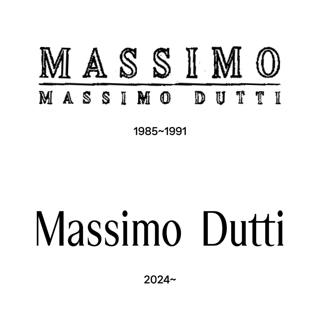
잉크가 느껴지는 멋진 워드마크는 1990년대 인디텍스에 인수된 시절부터 쭉 사용했습니다. 번짐이 느껴지는 자연스러운 서체로 로고의 첫 글자인 M과 D는 자연스러운 힘이 느껴집니다. 섬세하게 조정된 간격은 시선이 자연스럽게 흐르게 만듭니다. M과 D가 결합된 방패 상징은 고급 원단을 쓴다는 느낌을 더 강하게 전했습니다.

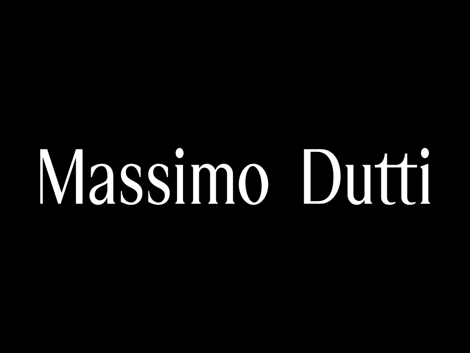
새로운 로고는 1985년 설립 초반의 로고에 가깝습니다. 가로획이 얇고 세로획이 굵어 기둥이 강조됩니다. 획의 끝도 위아래로 날카롭게 솟아 글자의 키가 더 커 보입니다. 읽기는 편해졌지만 그저 키가 큰 세리프의 평범한 인상의 서체입니다.
가장 불편한 것은 띄어쓰기입니다. 브랜드의 개성을 느끼기 전에 애매모호한 두 단어의 관계가 불편하게 느껴집니다. 사이가 너무 멀어 마시모와 두띠라는 두개의 브랜드로 나뉜 것 같이 보입니다.
필기체에서 정체로 바뀐 페라가모의 리브랜딩이 떠오릅니다. 그나마 장식이 없는 산세리프 서체로 바뀌지 않은 것을 다행이라고 생각해야할 것 같네요. 이전의 개성적인 필기체는 읽기 어려웠습니다. 하지만 그 어려움이 오히려 나와 브랜드 사이의 적절한 거리를 만들어줘서 더 고급스럽다는 느낌을 줬습니다. 독특한 형태 덕분에 굳이 텍스트로 인지하지 않더라도 브랜드를 식별하기 쉬웠죠.
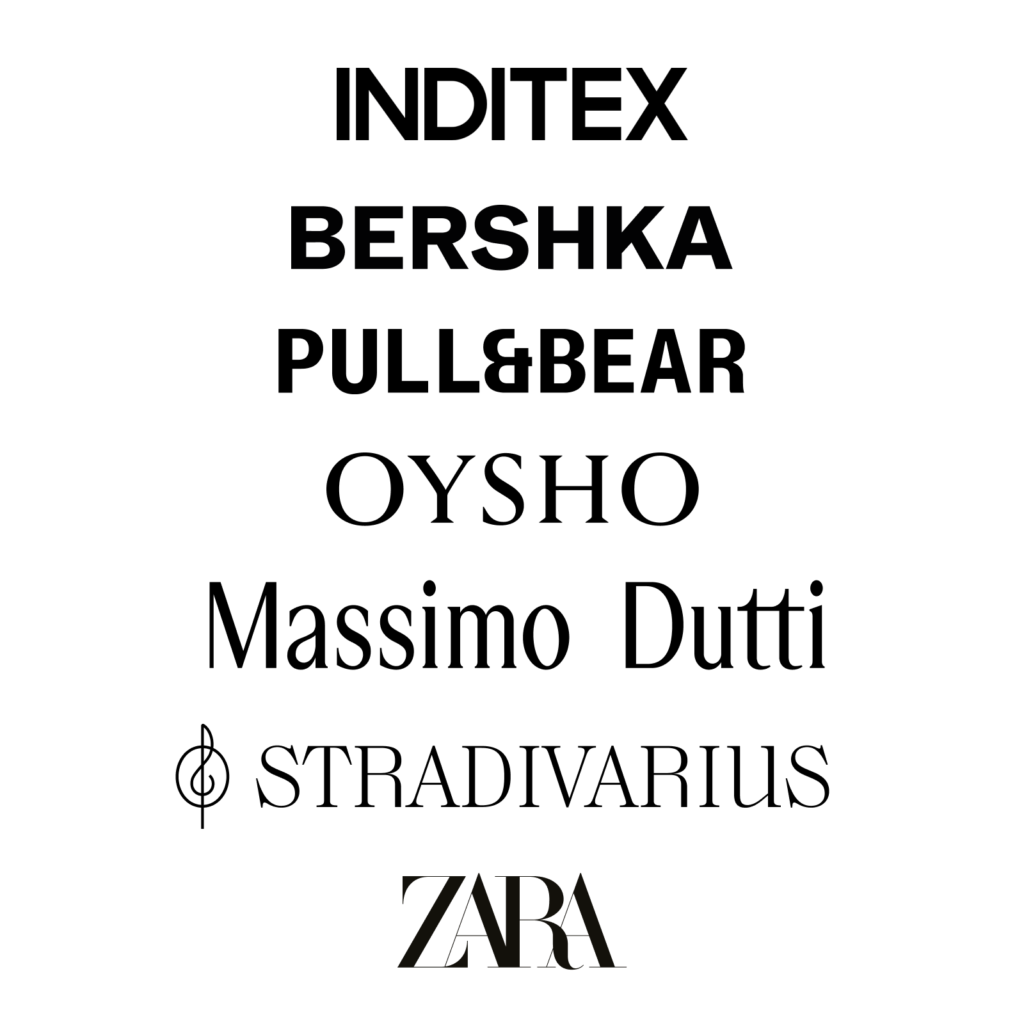
이번 마시모 두띠의 리브랜딩은 브랜드의 개성보다는 인디텍스의 브랜드 하우스를 강조하는 느낌입니다. 인디텍스는 정제된 서체에 약간의 기법을 가미한 방식으로 자사의 여러 브랜드를 정비해 왔습니다. 다만 마시모 두띠의 이번 로고는 개성적인 자라의 ‘겹침’이나 스트라디바리우스의 ‘선’과는 다르게 버슈카나 오쇼처럼 따분한 로고 같습니다. 특히 띄어쓰기 때문에 뭔가 잘못된다는 생각만 듭니다.