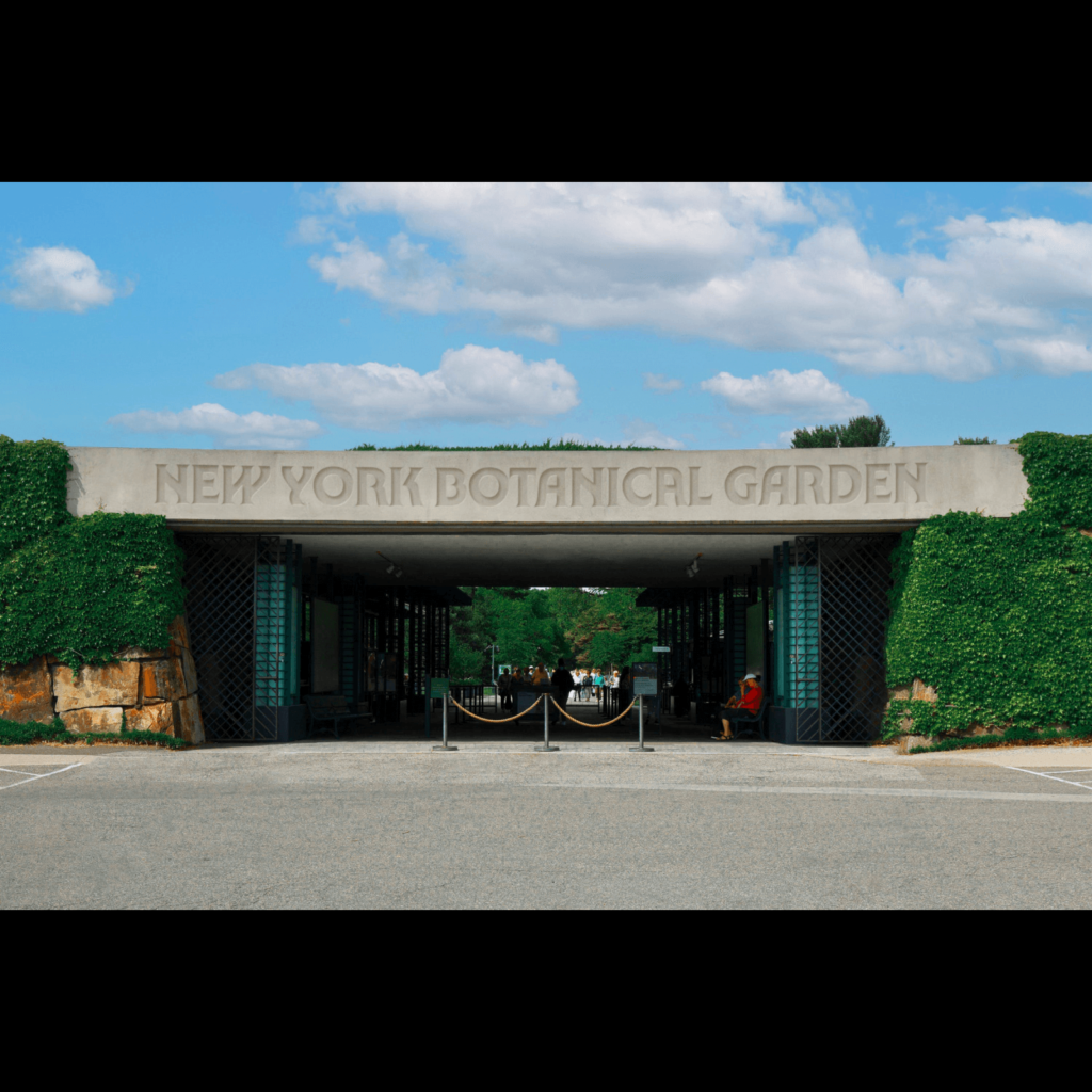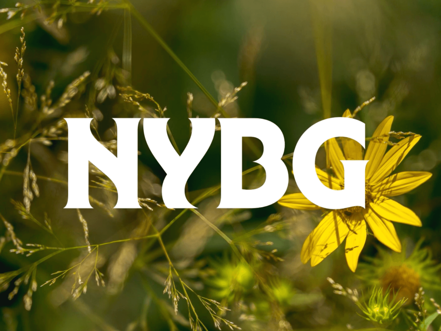

뉴욕 보태니컬 가든(NewYork Botanical Garden)이 Wolff Olins와 협업해 리브랜딩했습니다. NYBG(NewYork Botanical Garden)는 뉴욕 시의 브롱스 공원에 1891년에 만들어진 정원입니다. 이번 리브랜딩은 자연을 연구하고 보호하는 기관이자 방문객이 자연을 배우고 즐길 수 있는 NYBG의 역할을 반영하는 것이 목표입니다.
Wolff Olins의 수석 크리에이티브 디렉터 Jane Boynton은 “브롱스 공동체를 위한 봉사의 장소이기도 한 것을 포착하고 싶었습니다.” 라고 설명했습니다.

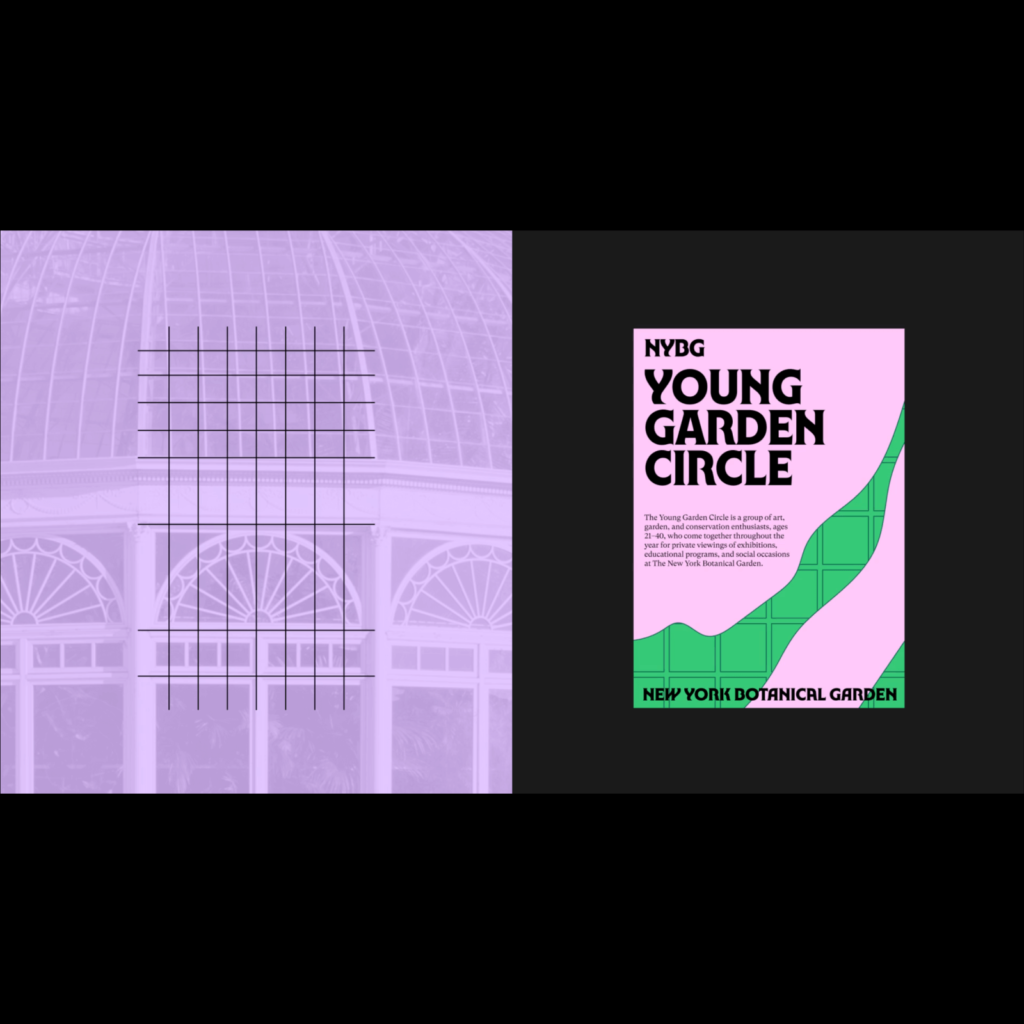
손으로 그린 독특한 서체 로고는 꽃, 벌, 나무 등 자연의 요소에서 발견할 수 있는 유기적 형태가 담겼습니다. 새로운 글꼴 NY Botanical Gothic은 1960년~70년대의 전통적인 서체에서 영감을 받았습니다. 뉴욕 양키스, 뉴요커, 뉴욕 타임스와 같은 다른 뉴욕의 아이콘에도 영감을 받았습니다. 보조 글꼴인 GT Super는 1970년대~80년대에 영감을 받았습니다.
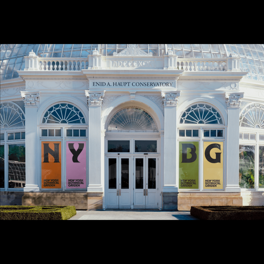
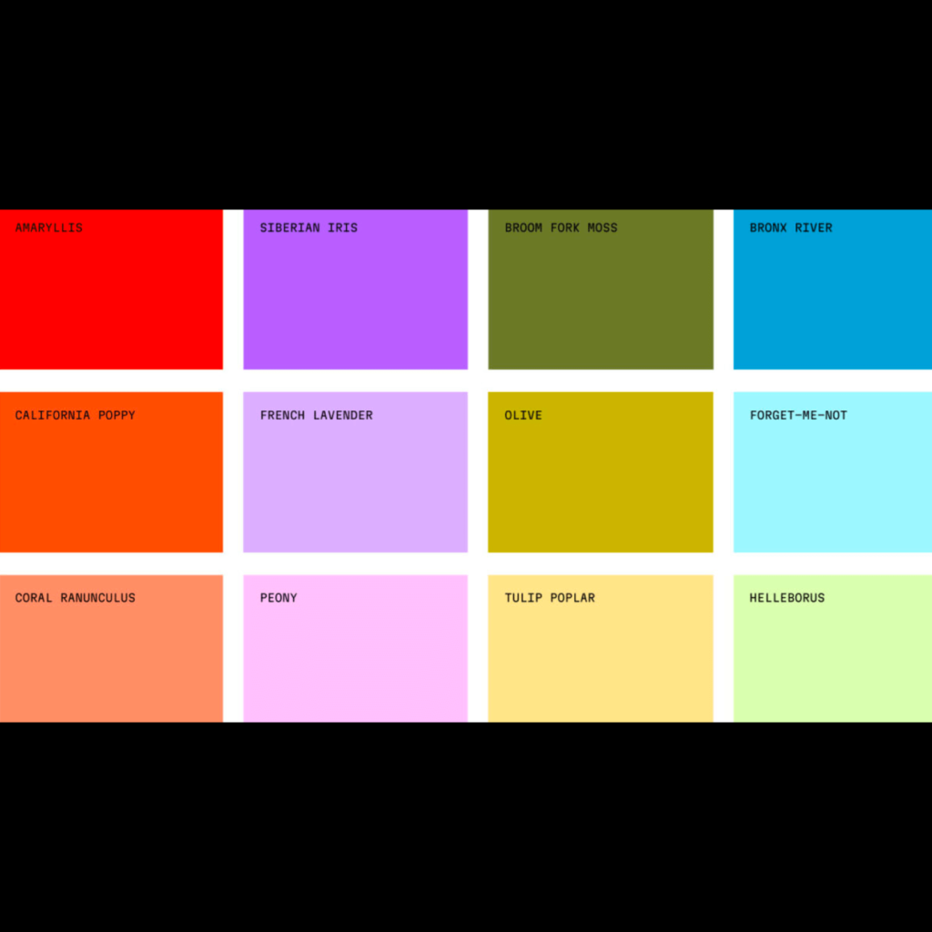
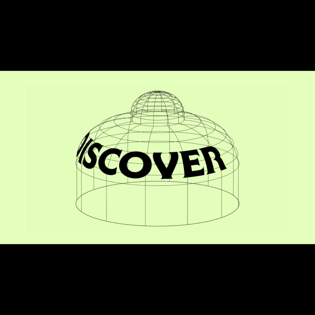
브랜드 색상은 밤나무, 버섯, 참나무 등 다양한 식물과 곰팡이의 이름은 붙였습니다. 푸른 브롱스 강의 색상도 담았습니다. 태양 아래에 빛을 쬐이는 식물의 모습처럼 자연의 관점에서 찍는 사진 스타일 가이드도 만들었습니다. NYBG를 상징하는 유리창 온실 Enid A. Haupt Conservatory 건물의 다양한 형태로부터 그리드 모티브를 따와 레이아웃에 적용했습니다.
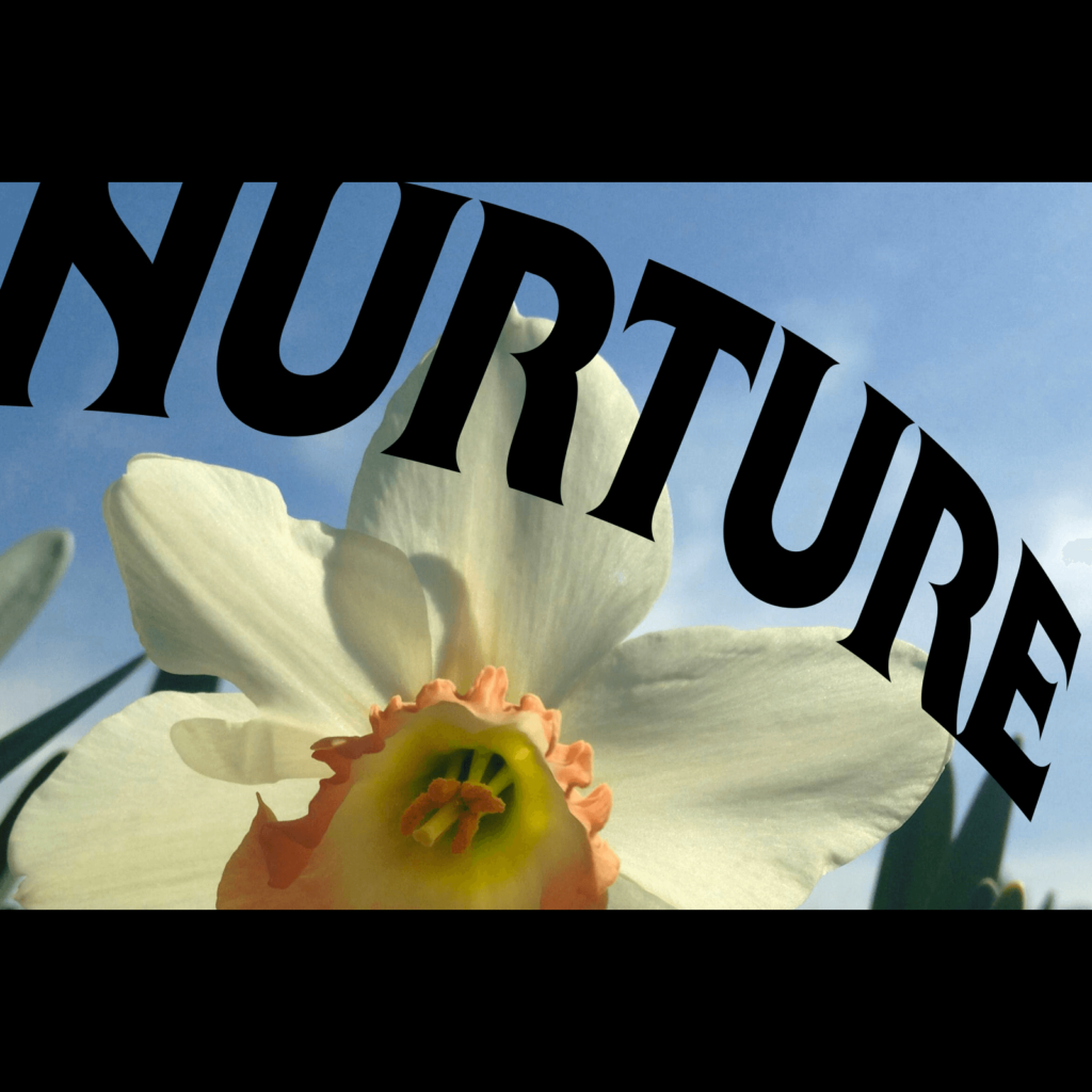
Do right by nature라는 모토를 바탕으로 자연을 중심에 두는 브랜딩입니다. 사람들이 관찰하는 식물 그 자체의 모습보다 식물이 담긴 그릇을 잘 표현한 사례입니다. 브랜드가 가진 역사와 지역 공동체의 이야기를 담으면서 자연에 관한 애정 어린 시선이 절묘하게 담겼습니다. Wolff Olins답게 군더더기 없는 세련된 그래픽으로 더할나위 없이 아름다운 시각 정체성까지 가졌네요.