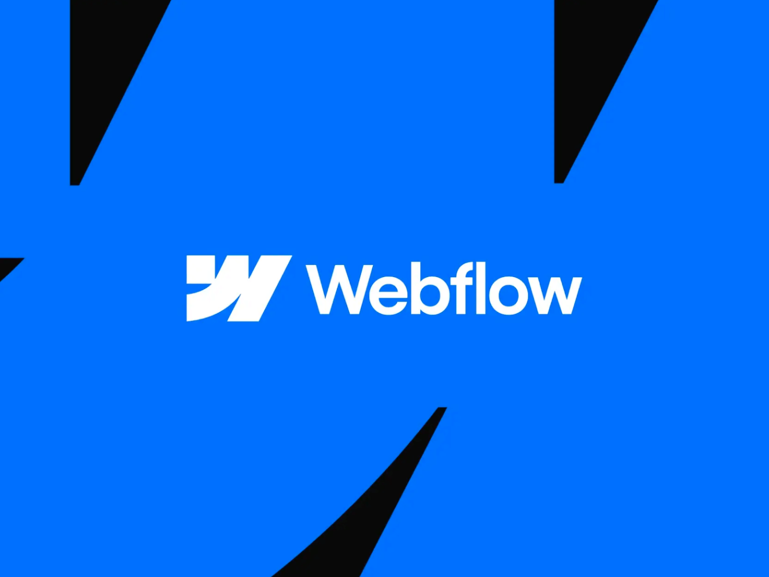

웹플로우 Webflow가 리브랜딩했습니다.
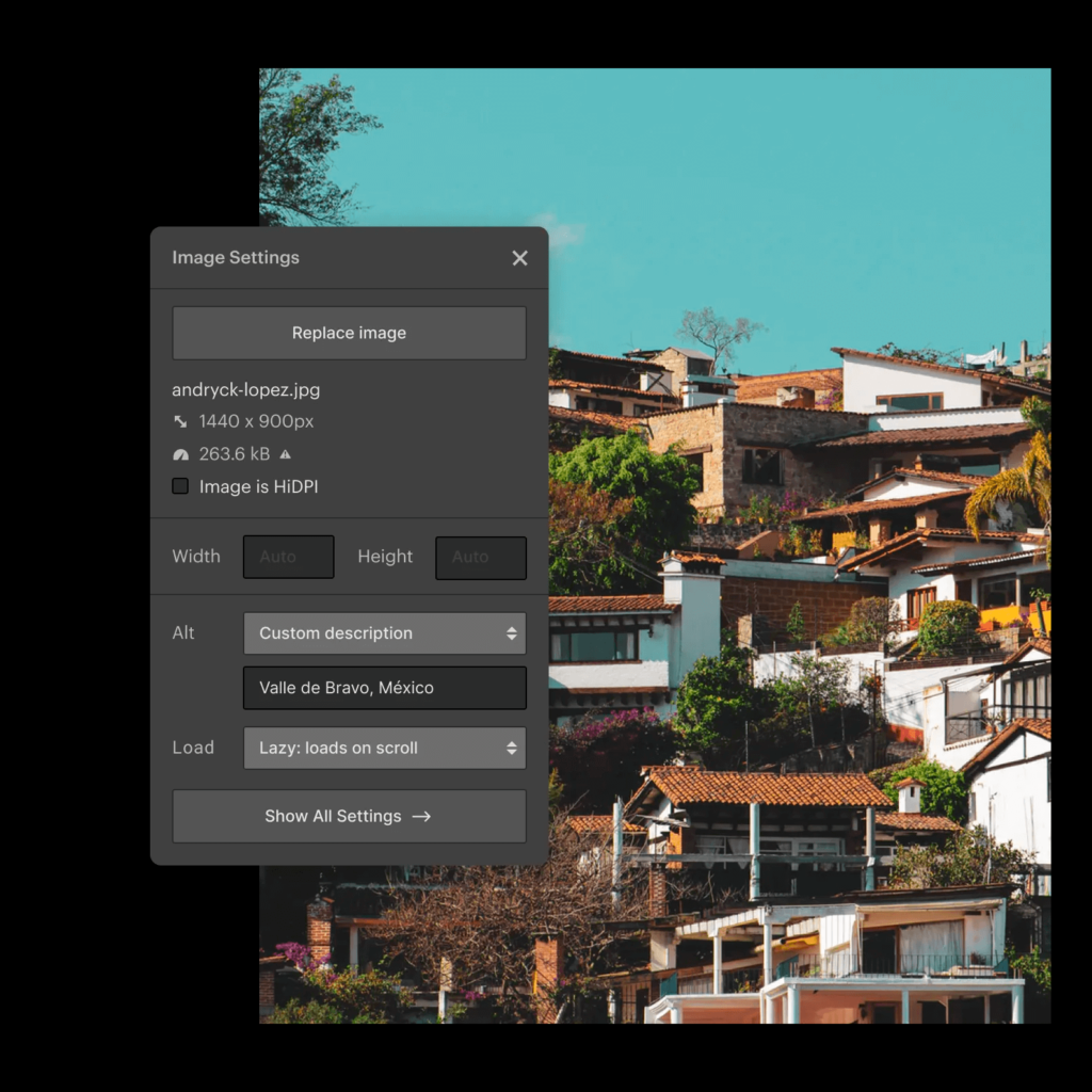
웹플로우는 샌프란시스코에 기반을 둔 미국 회사로 웹사이트 구축 및 호스팅을 위한 서비스입니다. 2013년 출시 이후 온라인 비주얼 편집기로 코드 없이 웹사이트를 만드는 것에 최적화된 서비스입니다.
지난 5일 웹플로우 컨퍼런스를 통해 다양한 변화를 공유하면서 이번 리브랜딩도 공유했습니다.

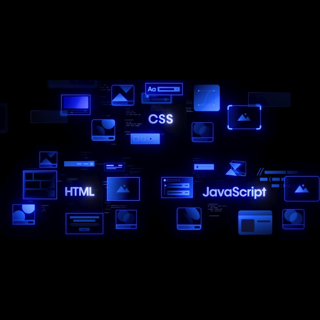
서비스 이름의 W를 해체해 웹의 기본 요소인 HTML, CSS, Javascript를 상징적으로 표현합니다. 이는 웹플로우 서비스를 이용해 누구나 개발 초능력을 가지는 것을 상징한다고 합니다. 새로운 로고는 내외부 모두에서 볼 수 있는 브랜드 아이덴티티를 선보일 예정이라고 합니다.
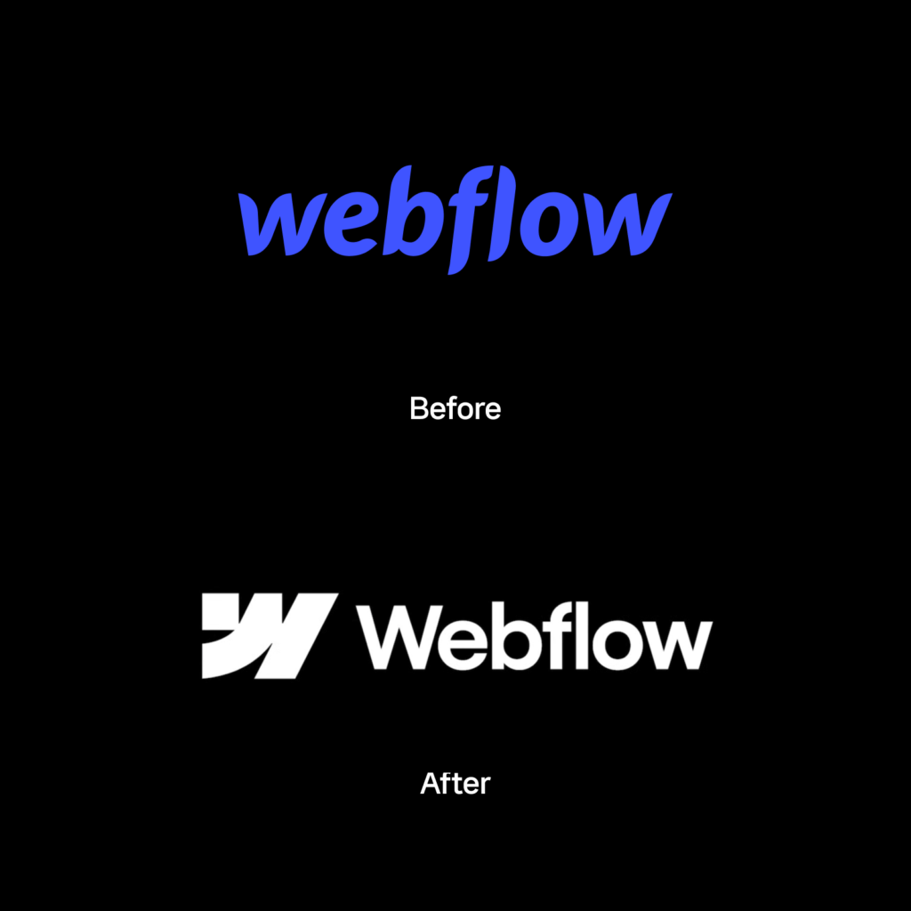
나뭇잎이 날라다니는 듯한 인상이었던 워드마크는 단단하고 기하학적인 산세리프 서체로 바뀌었습니다. 낱개의 글자가 필기체처럼 이어졌던 특성이 없어지고 폭이 좁은 서체로 바뀌었습니다. WF Visual Sans라는 새로운 전용 서체도 적용됩니다.
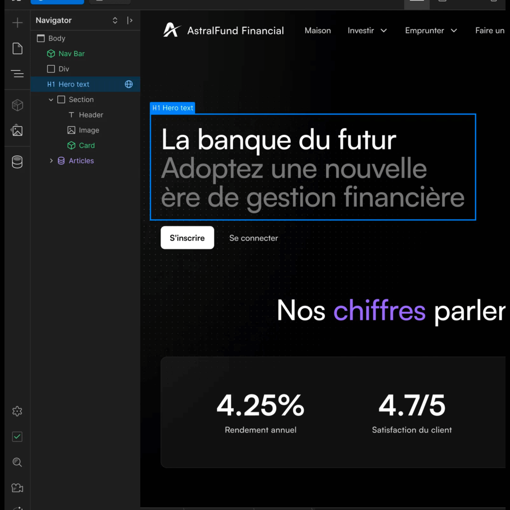
보라빛이 들던 색은 더 파란색에 가깝게 바뀌었습니다. 검은 배경에 파랑색을 사용하는 것이 주요 배색으로 보입니다. 기술 회사의 인상을 강화하기 위한 선택으로 보입니다.
그 동안 웹플로우는 프리랜서, 대행사, 스타트업 등 다양한 기업을 도왔고 디자이너, 마케터, 기업가 등 다양한 사람들을 연결했습니다. 이제 단순히 자사의 제품과 회사를 표현하는 것을 넘어 커뮤니티를 대표하겠다는 포부를 밝혔습니다.
비슷한 인상을 가진 기술 회사가 많다보니 아쉽다는 생각이 들었습니다. 바뀐 로고를 보았을 때 아틀라시안이 떠올랐습니다. 푸른 색과 기하학적인 형태가 겹쳐보였습니다. 기존의 요소가 완성도 있게 정돈된 느낌은 아니었지만 다른 곳에서 볼 수 없는 개성이 있었습니다. 웹플로우가 가진 정체성을 살렸으면 어땠을까 생각이 드네요.
다행히 웹플로우의 경쟁자는 피그마일 것입니다. 알록달록한 인상을 전하는 피그마와 뚜렷한 차이를 드러내 기억에 각인시키는 전략이라면 오히려 이 방향이 맞을 수 있겠다는 생각도 듭니다. 다만 프레이머와는 또 무엇이 다른지 의문이 떠오릅니다.