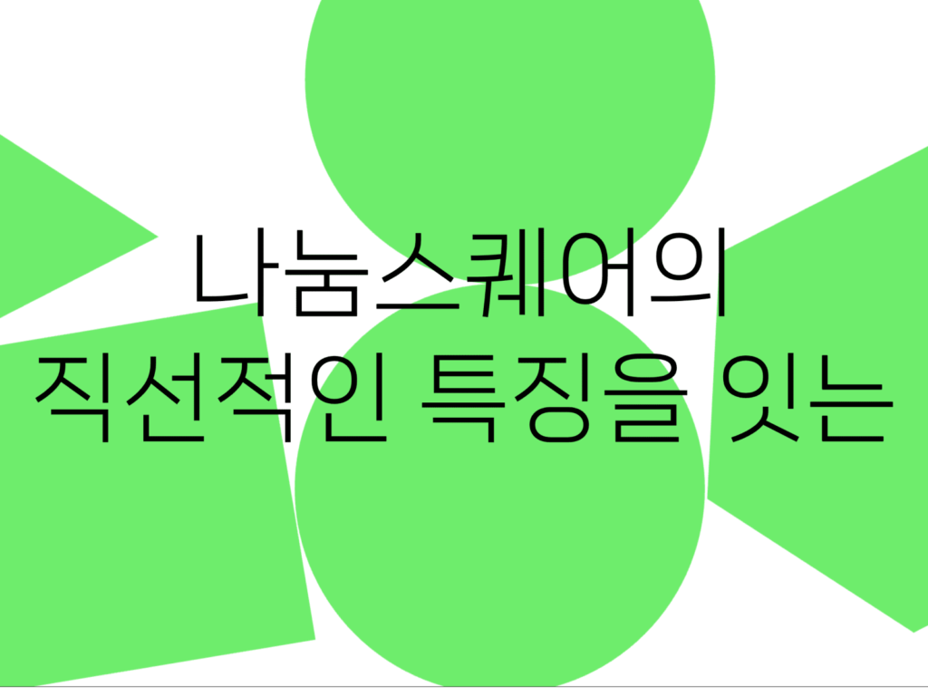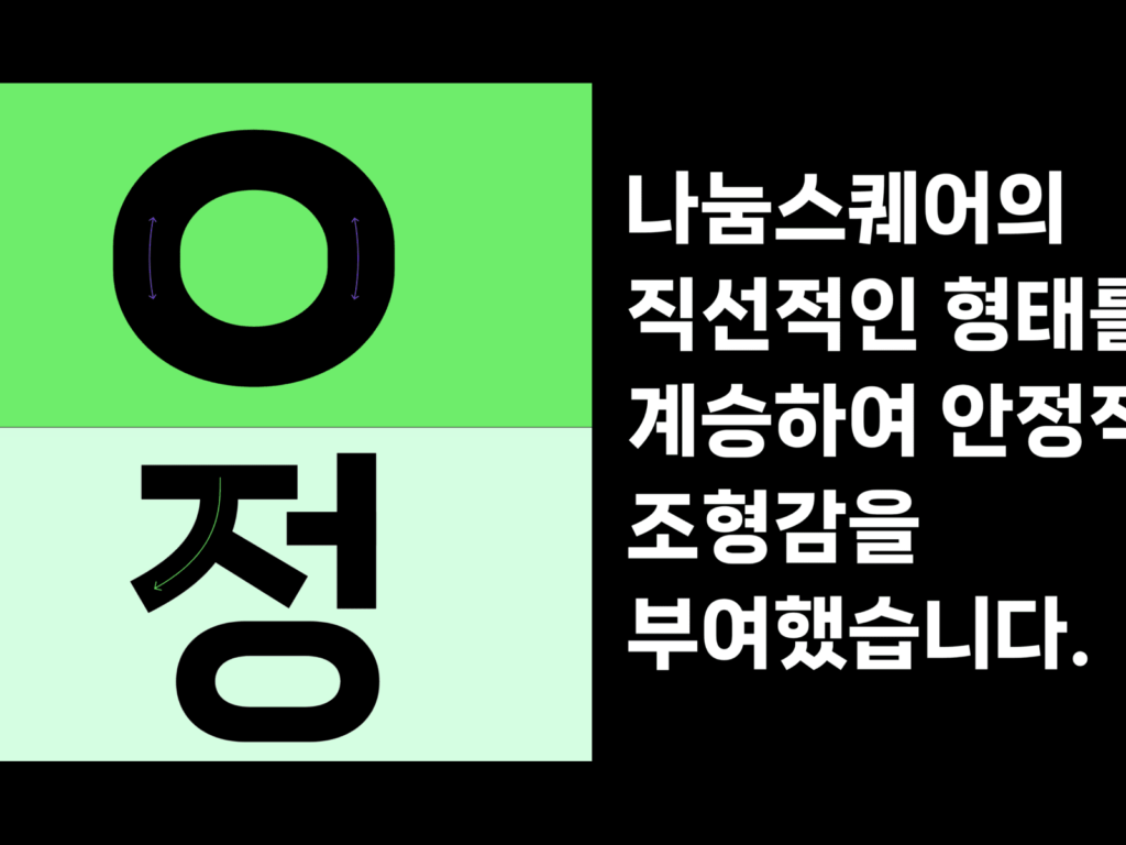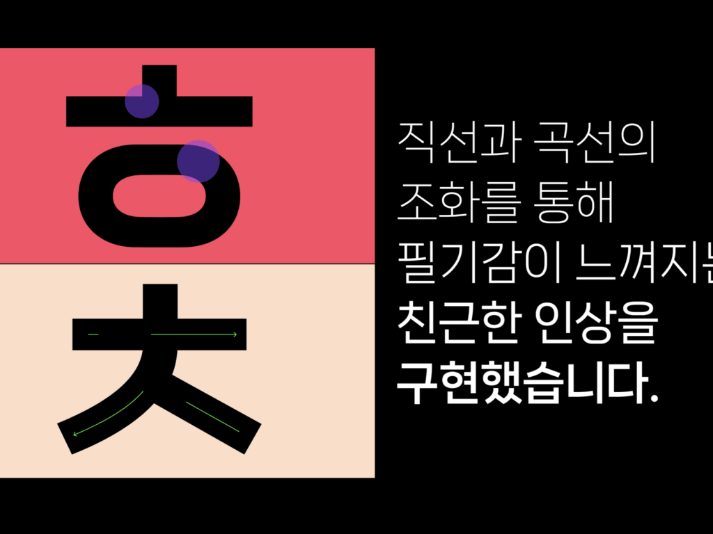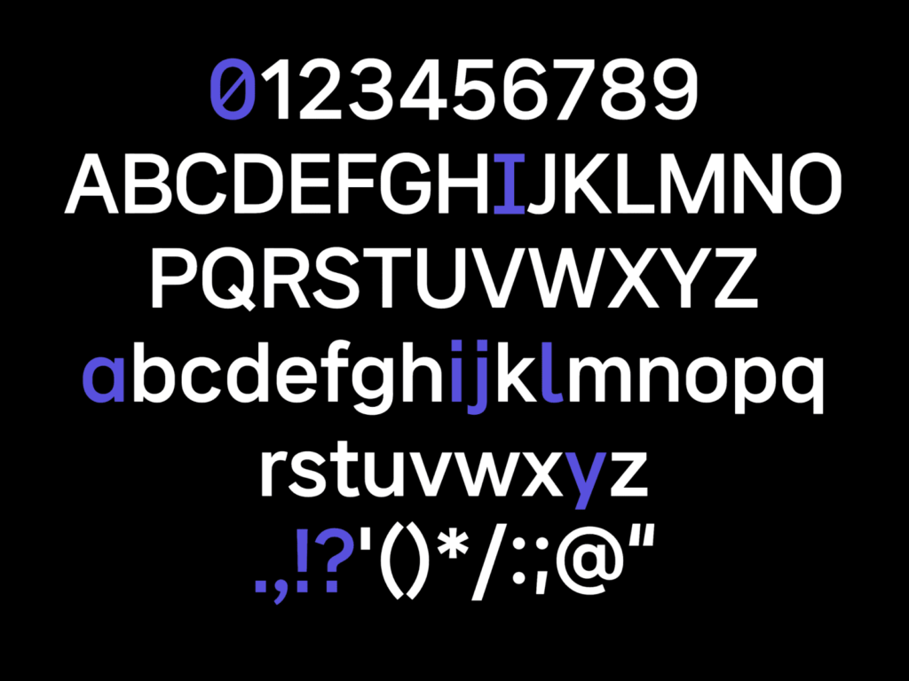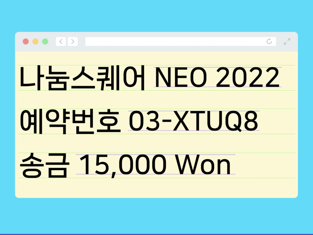

Naver announced Nanum Square Neo, a beautiful Korean font. The straight line characteristics of Nanum Square were expressed in succession. I adjusted the direction to fit the flow of writing by hand, and filled the space firmly while wide inside. The size and shape were also adjusted so that it would not be awkward when the sizes of Korean, English, and numbers were used together. The thickness can also be easily changed for use in various environments.
The Naver Hangul Hangeul Beautiful campaign contains the hope that there will be more thoughts and information expressed in Hangeul in the online world. Since 2008, starting with Nanum Gothic and Nanum Myeongjo, we have been announcing wonderful Hangeul projects on Hangeul Day every year.
Since the 16th of last month, we have been participating in the Hangeul First Meaning Campaign. It is said to be a campaign to revisit and preserve the original intention and history by reinterpreting King Sejong's heart when he invented Hangeul and his efforts to protect the Korean language and writing. It contains many stories about Hangeul, such as creation of Hangeul, Gagyanal, mechanization of Hangeul, horizontal writing, and spelling.
It is no exaggeration to say that it has the greatest influence on Korean design. It is Naver's new typeface. I'm glad that this is the next version of my personal favorite, Nanum Square. Surprisingly, there are not many sans-serif Korean fonts that give a neutral impression, but it seems like a good font that can be used in many places because it can be used in various environments and gives a solid and well-organized impression.
