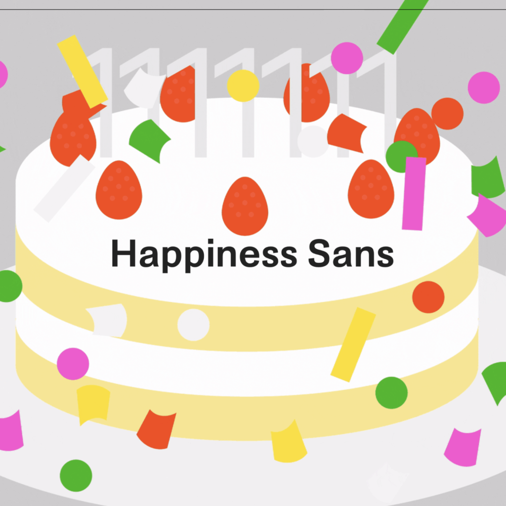
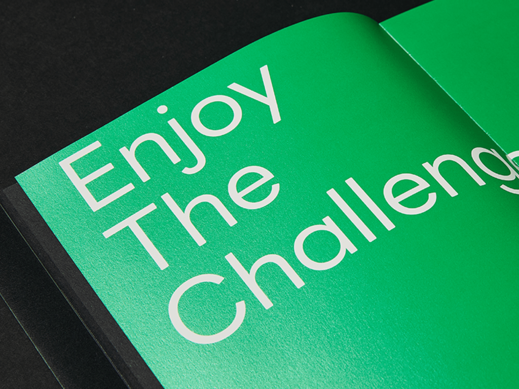
Hyundai Happiness Sans is the exclusive font of Hyundai Department Store. It was created to share the value of happiness in everyday life with the world, and anyone can use it freely for free. It is a wonderful font, as expected from Hyundai Department Store, which is serious about design. The light yet playful form gives a light accent when reading the letters, and it feels like humming. The gray and bright color palette that reminds us of Hyundai are exquisitely combined. When expressing happiness, the form can become simple, but Hyundai’s […]
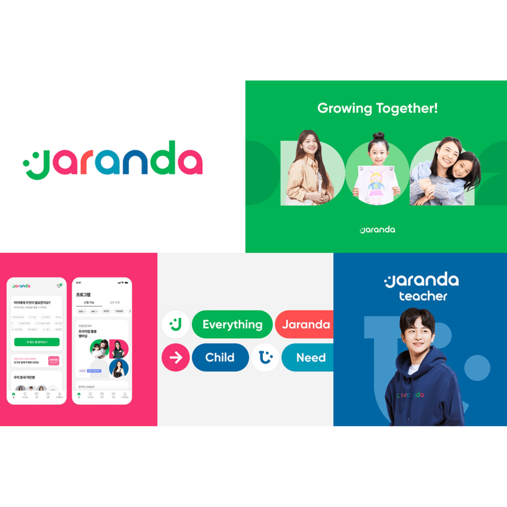
Kids edutech platform Jaranda has unveiled its new BI. The previous logo was a calligraphy handwritten by CEO Jang Seo-jeong’s child who received grape jelly. The new logo contains the joy of growth and the evolution into systematic professional services. It has changed from a logo full of joy with children to a logo expressing professional services that focus on parents and change the care experience. Jaranda has acquired the data-based parenting consulting company ‘Growing Mom’ to strengthen its expertise and established the ‘Child Growth Research Institute’. […]
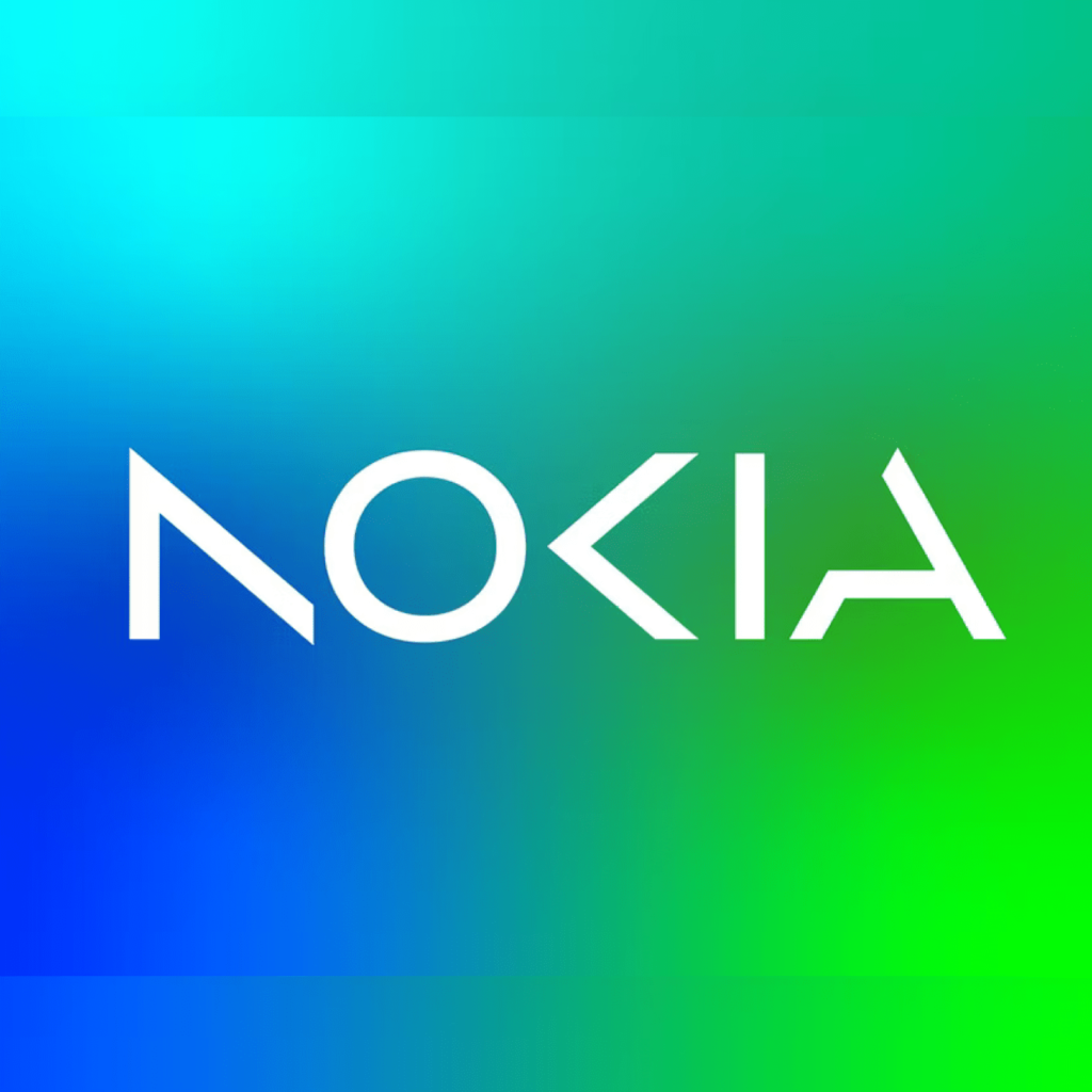
Nokia has unveiled a new brand identity, including its first logo in 60 years, at the Mobile World Congress in Barcelona. It worked with Lippincott, who has worked with Nokia for 15 years. It took on the bold challenge of transforming from a mobile phone company to a B2B technology company. Nokia now focuses on its business, which includes selling networking equipment and licensing many of its patents to mobile manufacturers. It is also aggressively moving into 5G, as equipment made by Chinese rival Huawei is banned. Nokia […]
Netflix has released a graphic toolkit created with Koto that conveys experiences across the entire product and brand inspired by the world of cinema. Consistency is important for Netflix, which is designed to be viewed continuously across a variety of screen sizes. To achieve this, Koto created new assets based on Netflix’s existing design assets. A set of icons that capture the widescreen motif of the cinema that is embedded in the wordmark and the cinematic palette hidden in the two-dum animation […]
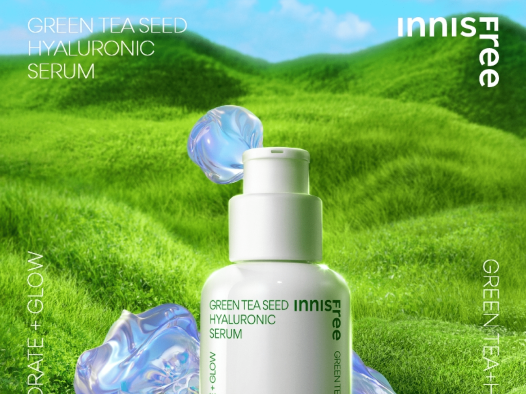
Innisfree has unveiled its new logo. We launched a new brand slogan, ‘Effective, Nature-Powered Skincare Discovered from the island.’ It is said that by mixing uppercase and lowercase letters of the alphabet, it contains an energetic and confident image and the value of respecting beauty. I recognize it as InnISFree, but the height of all letters is unified, which causes cognitive dissonance. I appears excessively small compared to n, S protrudes up and down from the center, and ree grows suddenly. Innisfree is based on Yeats’ poem “The […] ]
Buckingham Palace has unveiled the coronation logo for Charles III, featuring a crown composed of the national flowers of the four UK nations: the rose for England, the thistle for Scotland, the daffodil for Wales, and the shamrock for Northern Ireland. These four elements combine to create the Crown of St. Edward, created for Charles II in the 17th century and slated for the new monarch on May 6th. It will be used on banners, flags, and merchandise for the coronation ceremony at Westminster Abbey in London in May and for national celebrations.
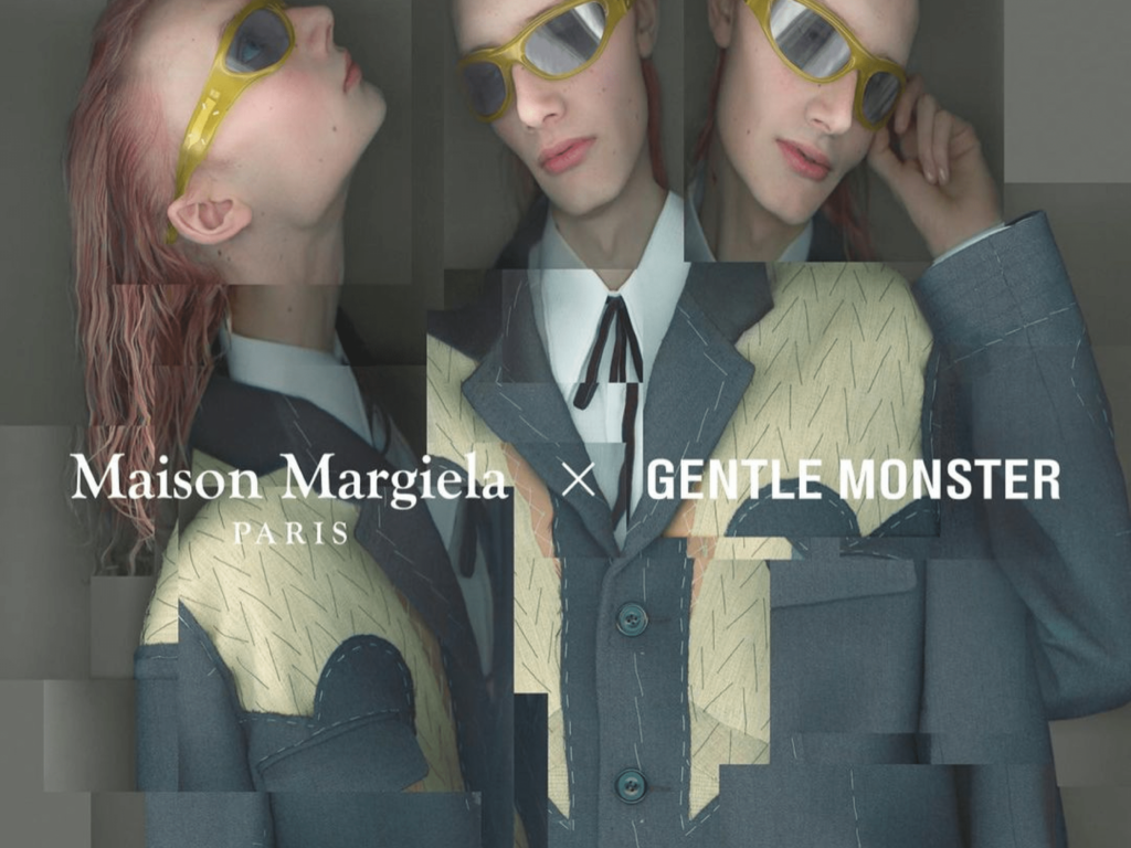
Maison Margiela has launched an eyewear collection in collaboration with Gentle Monster, co-designed by Creative Director John Galliano. Based on the concept of an artisan atelier crafting an haute couture collection, the collection presents 11 sunglasses and eyeglasses. The MM001 and MM002 sunglasses reinterpret the way they are worn, like a hairband or tiara. The MM003 sports a style that mixes disparate elements, while the MM004 and MM005 reinterpret the oval sunglass. The MM008 features a cat-eye frame. The MM006 and MM007 feature a Maison […]
Line Seed is a font for the global service line, and was created by Line Plus, Sandoll, and Dalton Mak. It is a simple and soft-looking font that supports Korean, Latin, Japanese, and Thai. The process by which different companies express a single identity is interesting. First, the completion of Latin was important in order to create a font that represents Line used in various countries. Sandoll, which creates excellent Korean fonts, collaborated with Dalton Mak for a long time […]
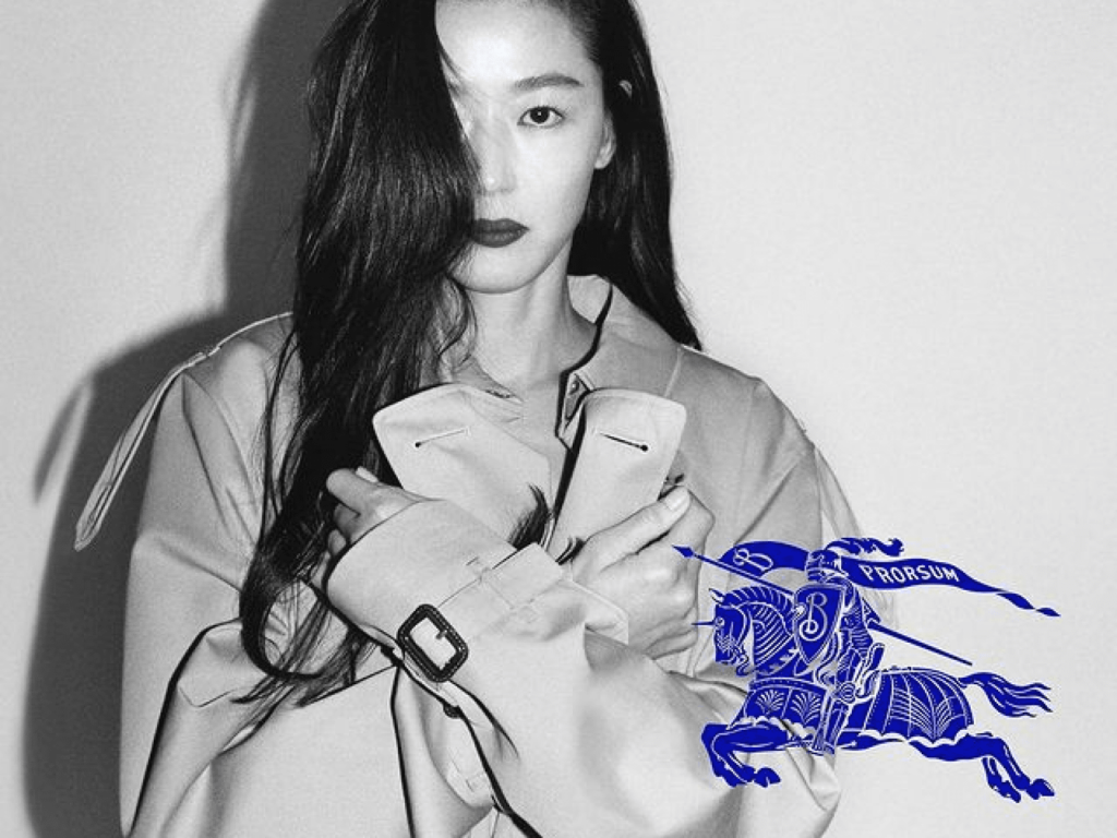
Creative director Daniel Lee has released Burberry's first campaign, 'an ode to everything British'. Various British celebrities wearing Burberry posted photos taken at London landmarks on Instagram. In 2018, Riccardo Tisci collaborated with Peter Saville to release a minimalist brand, but Daniel Lee thought it was important to emphasize Burberry's British heritage again. Instead of the existing logo's London and England, he emphasized Established 1956. […]
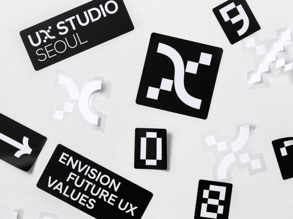
We collaborated with Studio.dd on the brand identity of Hyundai Motor Company's UX STUDIO Seoul. The "Product UX Management Office," which designs Hyundai Motor Company's mobility experience, has been renamed the "Holistic User Experience Group (HUX Group)." UX STUDIO is an offline platform operated by HUX Group, a collaborative space where research findings are used to present a vision for future mobility and concretize goals and possibilities. The UX STUDIO is designed to investigate and reflect user experience throughout the entire process, from concept to mass production.
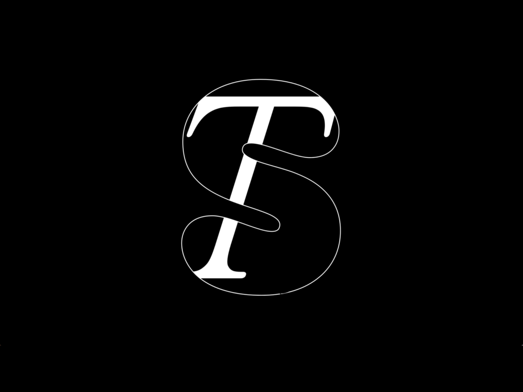
Typography Seoul carried out a rebranding with Manual Graphics. Typography Seoul is a family company of Yoon Design Group and has been published since 2011, claiming to be a ‘media specializing in type and typography.’ We highlight notable contemporary designs and designers. The homepage has been improved with a new logotype and symbol, and a unique design. We created an identity using typography and the first letters of Seoul, T and S. The shape of the slanted T inside the straight S is impressive. Elegantly shaped title font and naturally flowing text […] ]
Do you remember the Cultural Heritage Administration's 2023 Gyemyo Year's Greeting Card that was a hot topic in the New Year? I used to think that public institutions' designs were crude, but now there are many great works. The Gyeongsan pottery in the shape of a human face excavated from Sowol-ri, Gyeongsan, Gyeongbuk, is cute with a rabbit mask. The traditional and beautiful graphic work was done by Studio Snaebit. Snaebit is a combination of the words snake and rabbit, and it creates cute yet solid graphic designs centered on attractive illustrations using characters. Using the Najeonchilgi illustrations, […]