Bolt has unveiled a new identity in collaboration with Koto Studio. Bolt was founded in 2014 and launched Bolt, a one-click payment service, in 2016. It raised $355 million in Series D funding in 2022 and became a decacorn. Why the change? The original Bolt logo featured a blue lightning bolt and a sans-serif typeface. Koto’s creative director Arthur Foliard says that a monotonous wordmark and blue color don’t necessarily inspire trust […]
Idotype has rebranded. Idotype is a group that communicates in various ways so that more people can use fonts, the letters of the digital age, more conveniently and beautifully. They have rebranded their logo, symbol, wordmark, and homepage. Idotype stated, “Just as warp and weft are woven to make a piece of clothing, Idotype overlaps dots and lines to create fonts that are both useful and beautiful.” The combination of overlapping and pixels that can only be found in modern times is impressive. The unique […]
oduplo.studio is a Brazil-based design studio. They have designed for the Panama tattoo studio Wild Tattoo Society®, the Brazilian independent film production company 7MA Filmes, and the specialty coffee café Clave. They combine neutral colors and unique shapes in a fluid way. They especially use typography to convey the brand's impression. The wild and clear shapes leave a strong impression. See more and sources ODUPLOSTUDIO.COM Instagram / ODUPLO.STUDIO Similar articles Recent articles
Zigbang changed its logo after 10 years. It held a 'rebranding media day' and revealed its new CI. It overlaid an oval, meaning 'expansion', on the house icon that Zigbang focuses on, and contained its vision of 'infinitely expanding the housing experience'. It changed the Korean word 'Zigbang' to the English word 'zigbang' to emphasize its will to enter the global smart home market. It announced that it will focus on houses where people live, beyond the service of searching for houses. Starting with door locks and wall pads, it will introduce the Internet of Things (IoT) to create smart […]
On September 4, the official emblem of the Qatar World Cup was unveiled. The World Cup design was done by UN-LOCK Brand. The design combined the traditional image of the World Cup, the trophy shape, with the traditional winter clothing of the Middle East, the woolen shawl. The applied pattern is an element that shows the heritage of Qatar culture and symbolizes the first ever winter World Cup. In addition, the emblem, which is reminiscent of the number 8, represents the eight stadiums where the games will be held, and contains a message that unites the world. At the top […]
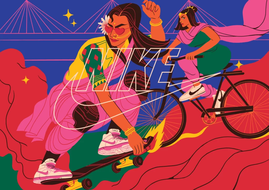
Boomranng Studio and Nike have come up with a captivating campaign. Nike's new personalization service is expressed in 20 illustrations. It captures the sounds, sights and feelings of Mumbai, the home of Boomranng Studio's founders. It expresses a sweet middle ground between tradition and modernity. It depicts Mumbai in a parallel world, not the present day. It expresses a new world where tradition and technology are combined in a retro-futuristic style. An optimistic future is powerfully captured in a maximalist style. See more […]
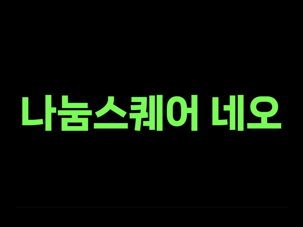
Naver has released a beautiful Hangul font, Nanum Square Neo. It continues the straight lines of Nanum Square. The direction has been adjusted to reflect the flow of handwriting, and the internal space is wide yet tightly filled. The size and shape have also been adjusted to ensure a comfortable mix of Hangul, English, and numbers. The font thickness can also be easily adjusted for use in a variety of environments. The Naver Hangul campaign aims to bring Hangul to life in the online world, expressing thoughts and ideas in Hangul […]
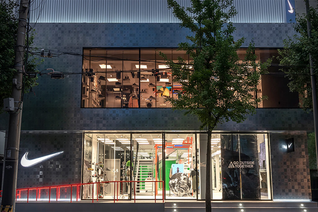
A store filled with Nike logos hand-drawn by people has opened in Hongdae. Nike is arguably the ultimate offline experience. It has designed various offline experiences around the world, including Nike Rise and House of Innovation. This time, it's proposing a new offline experience in Hongdae, connecting the offline experience with the online experience. In the content studio, you can adjust color and saturation and composite background footage for 30 minutes to create your own unique video. […]