Bolt가 Koto 스튜디오와 함께 협업해 새로운 아이덴티티를 공개했습니다. Bolt는 2014년 설립되어 2016년 Bolt라는 원클릭 결제를 제공하는 서비스를 런칭했습니다. 지난 22년 시리즈 D 펀딩에서 3억 5,500만 달러 투자를 유치하고 데카콘에 등극했습니다.


본래 볼트는 푸른 번개와 산 세리프 서체가 조합된 로고였습니다. Koto의 크리에이티브 디렉터 Arthur Foliard는 단조로운 워드마크와 푸른 색이 반드시 신뢰를 주는 것은 아니라고 생각했습니다.
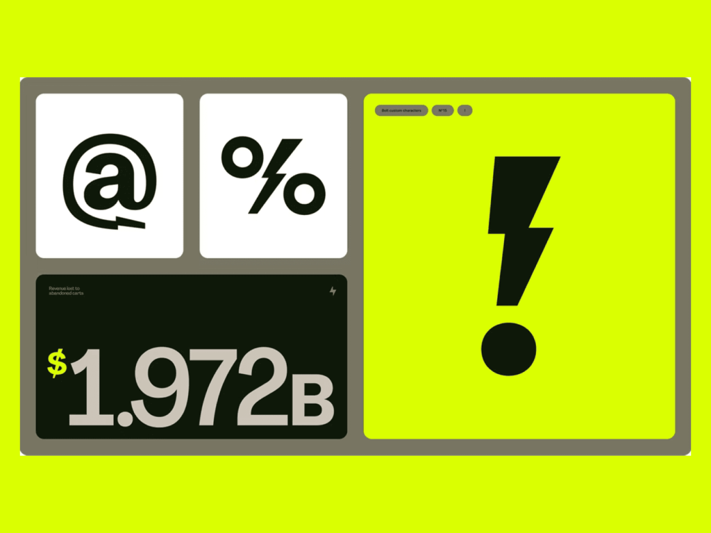
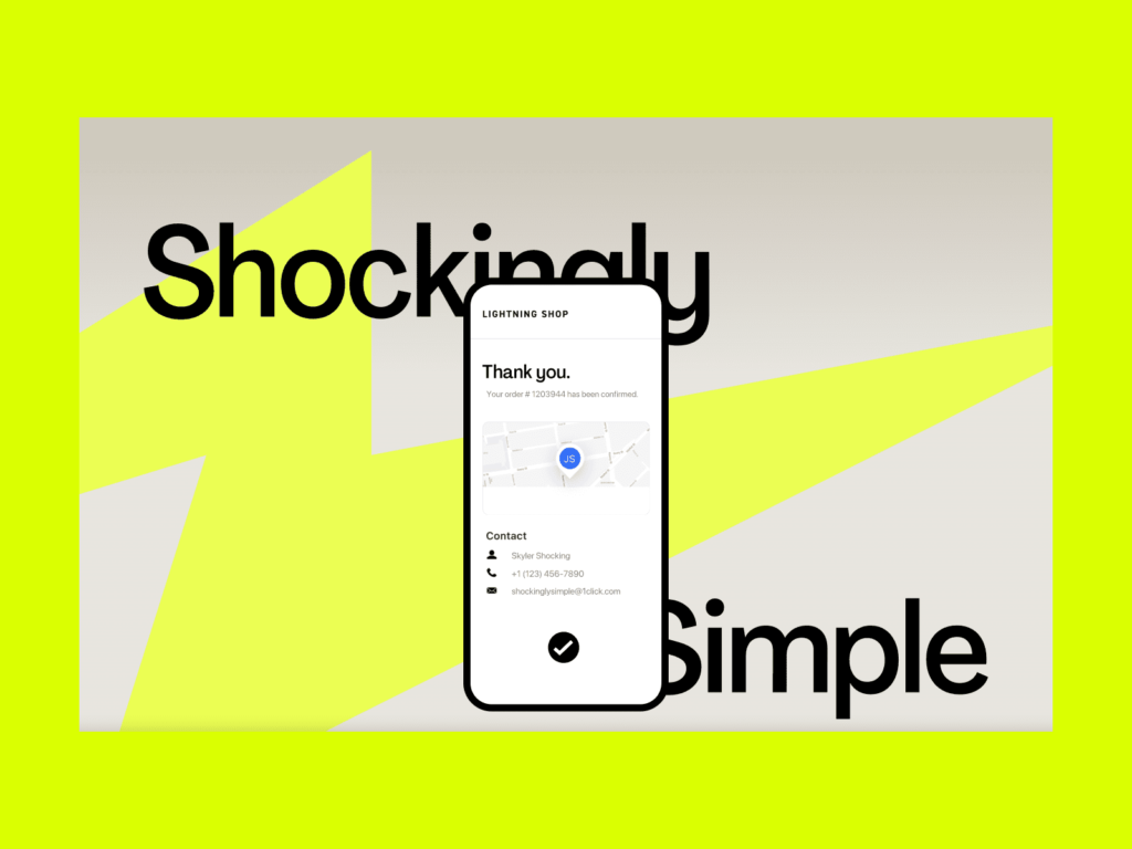
Koto는 에너지와 속도를 키워드로 직관적으로 시각 요소를 설계했습니다. 전기의 찌릿한 느낌을 형광색 팔레트와 과장된 사진, 일러스트레이션으로 표현했습니다. 정숙하고 무뚝뚝한 서체보다 활기차면서 너무 장난스럽지 않은 전용 서체를 사용했습니다. 기억에 남을 수 있는 번개 모양 시그니쳐를 활용했습니다.
Bolt라는 이름은 단순한 만큼 점유하려는 경쟁자가 많습니다. 동명의 택시 서비스 Bolt가 있으며 Bolt TV라는 스포츠 방송사도 있습니다. Volt라는 서비스까지 이름부터 표현까지 ‘전기’라는 키워드를 점유하기 위한 크리에이티브 전략이라는 생각이 듭니다.