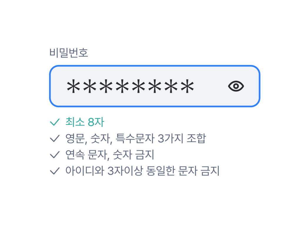
The US National Institute of Standards and Technology (NIST) has released new password management rules. NIST (National Institute of Standards and Technology) is an influential organization under the US Department of Commerce. It recommends that passwords be changed regularly or that they not be mixed with different character types. The rules that can be seen on many web services, such as 'Include at least one uppercase or lowercase English letter, number, or special character' and 'Change password after 90 days', are based on the guidelines released by NIST in 2007. However, individuals who use […]
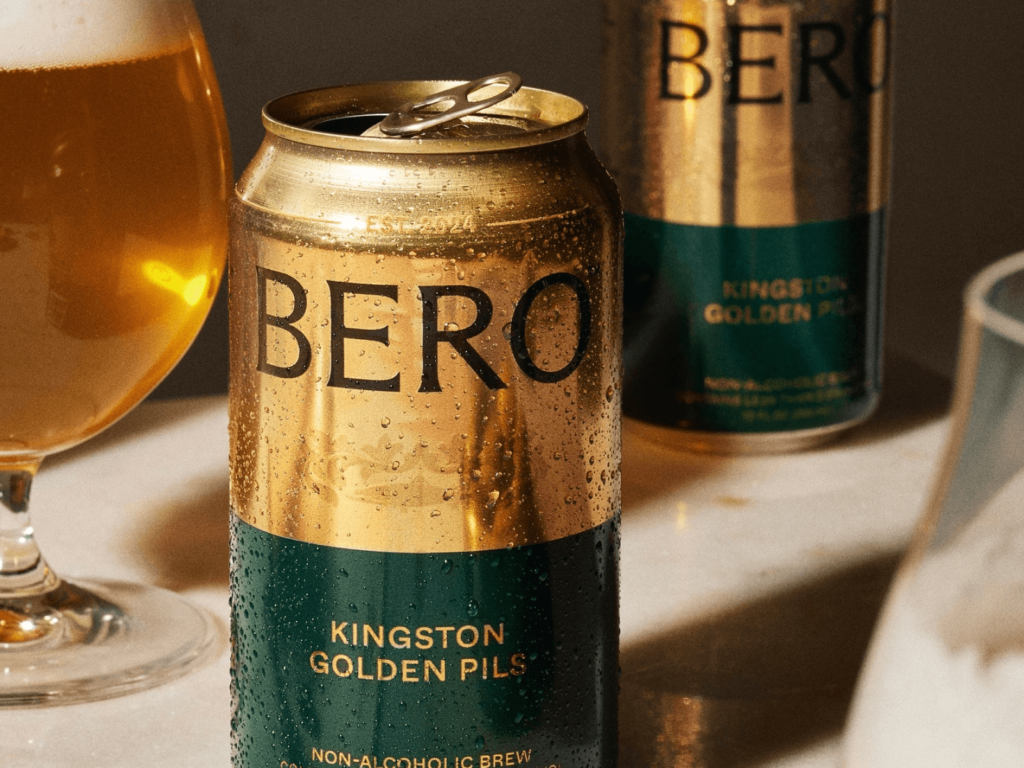
Tom Holland Launches Bero, a Non-Alcoholic Beer Brand Tom Holland quit drinking in 2022. While quitting, he relied on non-alcoholic beers, but he said it was hard to find a satisfying taste. In addition, the labels of non-alcoholic beers released by major beer brands were clearly blue, which made him stand out at drinking parties. So Tom Holland created a beer for people like him. With a shiny gold color and a traditional impression, it contains Pilsner, IPA, and Wheat […]
The image used by a fruit store in Naver Smart Store is causing a huge controversy. The store sells various fruits such as Shine Muscat, raspberries, and tangerines directly from the farm by connecting directly with the farm owner. Recently, many suspicions have been raised due to the awkwardness of the photo used on the product page. The photo used shows a finger that is strangely bent. The subject is uniformly lit, making it look like a wax sculpture. This is an AI-generated image […]
American fintech service Robinhood has rebranded in collaboration with New York-based design studio Porto Rocha. The company announced the change as it celebrates its 10th anniversary, from being a startup innovator to a financial platform for a new generation of investors. The wordmark has a higher contrast between strokes and thinner connections. Ink traps, which are spaces where letters bend, have been added to give the impression of printed letters a little bit of a mix. The new premium membership, Robinhood Gold, is entirely based on the serif typeface Martina […]
AfreecaTV has rebranded to SOOP. SOOP announced the reorganization on its official website on the 15th, and has reorganized the brand visual identity and UI/UX of the company and service. The new name, 'SOOP', means a space where content is communicated like a 'forest' ecosystem that encompasses all components. The name of the broadcaster 'BJ' who was active on AfreecaTV will be changed to 'streamer'. The broadcasting space 'broadcasting station' will be changed to 'channel'. The 'star balloon' used for paid sponsorship will maintain its name. The symbol of AfreecaTV […]
Adobe held Adobe Max 2024 in Miami Beach. More than 100 new features were added to many apps in Adobe Creative Cloud. Photoshop’s Remove tool now has a new feature called Distraction Removal. Remove distracting power lines and pedestrians from the background of your travel photos, and AI automatically fills in the gaps. Generative Fill and Generative Expand are powered by the latest Firefly image model, giving you more freedom to create images […]
Jongno-gu announced its new integrated brand, 'Jongno: The way of Seoul', at Gwanghwamun Square on the 11th. It contains the meaning that all roads in Seoul lead to Jongno. It aims to improve the symbol system of Jongno-gu and strengthen the city's competitiveness. In order to express new values, the meanings of resonance, openness, canvas, gateway, and platform were expressed in a modern way. It expanded from the physical 'Jong' to the conceptual 'Ro'. It became simpler than the previous version's descriptive illustrations. […]
Tesla has unveiled its autonomous taxi, the Cybercab. At the “We, Robot” event, the company also unveiled a prototype robotaxi, the Cybercab, and a prototype RoboVan that can carry up to 20 people. Tesla allowed attendees to drive around the Warner Bros. lot. The overall appearance is a combination of the Cybertruck and the Model 3. It looks like it was carved out of a large block of metal. Only the front and side windows, where people can see, are […]
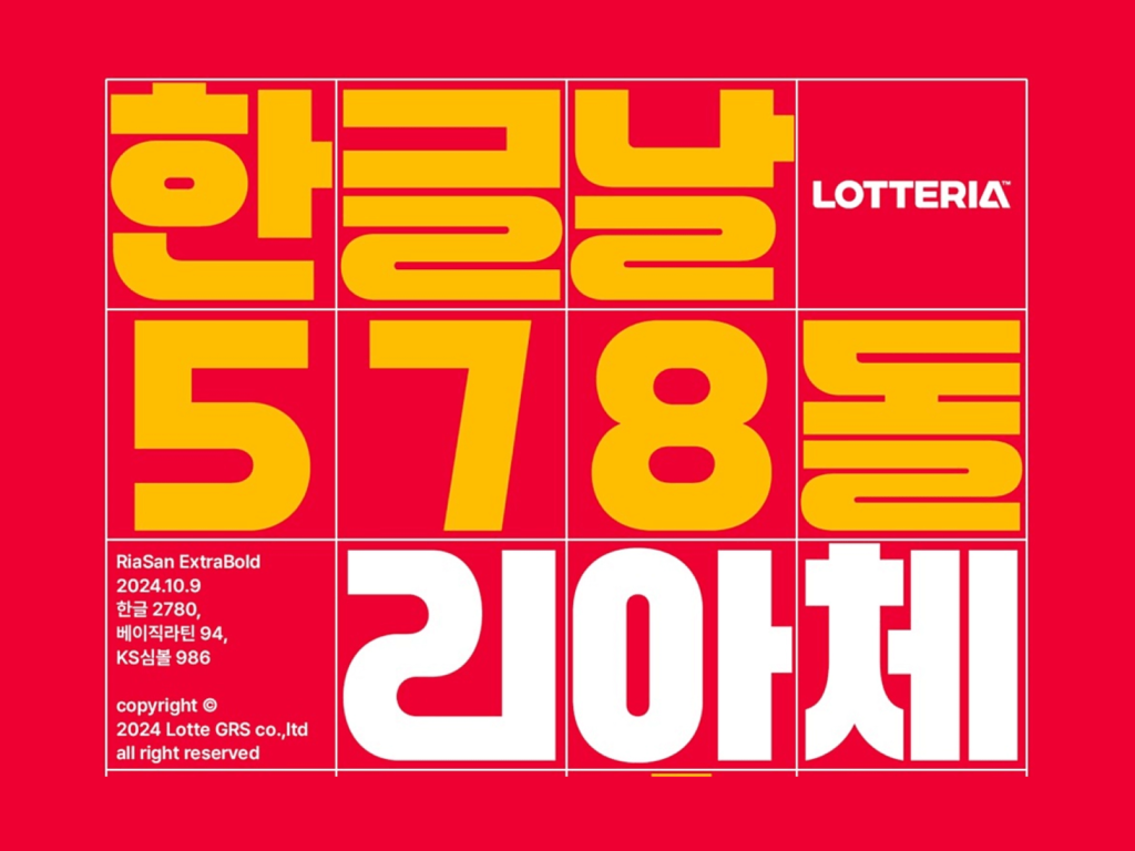
Lotteria has released 'Ria' to celebrate Hangul Day. It collaborated with Lotte GRS Design Center and Yoon Design's typography performance group, Odd Sangsang. Based on the successful launch of 'Choak Ddaenggyeo' and 'Ttak Jjakboche' last year, this time, it created a font to spread K-burgers around the world. It has a similar impression to the English version of the Lotteria logo that was newly revised last July. It was designed around straight lines and circles like Bauhaus' universal font. It is thick and fills up the square. Hangul with a consonant […]
Korean-language snacks are a hot topic. Korean-language snacks are biscuits made by broadcasters Tyler and Needy to commemorate the 577th anniversary of Hangeul Day on October 9th last year. The two wondered why there were alphabet snacks but no Korean-language snacks, so they decided to make them into snacks so that anyone could learn Korean in a friendly way. When they first launched, they learned how to bake and spent 14 to 18 hours a day for a month making snacks themselves, and they designed Korean-language cookies using 3D printing […]
The Korea Communications Commission has drawn its sword against Agoda. Last month, the Korea Communications Commission launched a fact-finding investigation into whether there were any damages to users in the payment and refund procedures. Agoda is a travel platform headquartered in Singapore that sells various travel products. Along with Booking.com, it is notorious for its design patterns that pressure users. The main issue this time is that it deceived consumers by exposing false information. You can find the phrase “free cancellation” in almost all areas of the service […]
Naver is changing the 'Shopping' tab of its mobile app to 'Naver Plus Store'. Naver Plus Store is aiming to open within the year, and users who have not updated their apps can use the existing Shopping tab until December. Naver Plus Store's key feature is to recommend products or benefits that are appropriate for the customer's context using AI technology. The addition of 'Naver Plus' to the name is presumed to be a strategy to reinforce the word 'Benefit'. It is similar to the purple used in the existing Naver Shopping, and is slightly brighter. […]