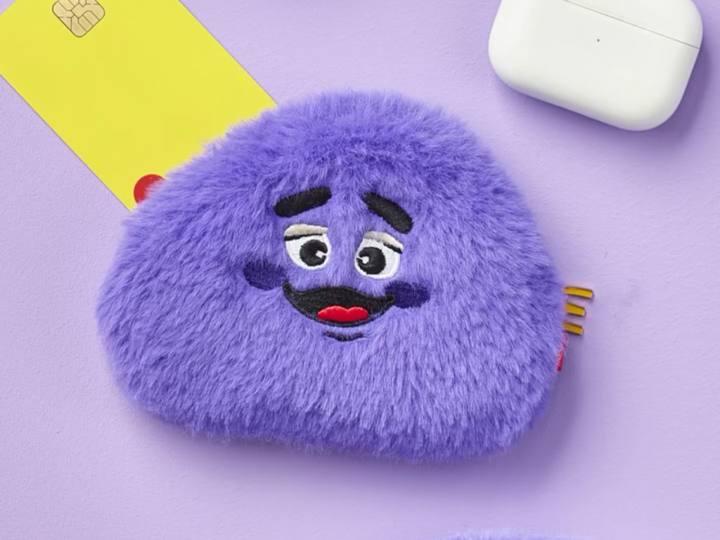
McDonald's has released Grimous Blueberry Shake and Coin Purse goods. Grimous is McDonald's representative character that first appeared in 1971. Recently, it has become a hot topic in the United States as its awkward shape and dull expression evoke nostalgia among Generation X and Millennials. The Grimous Coin Purse has an attractive unfocused look and a round surface. The packaging is designed like a 70s print. There is a strange madness in the behind-the-scenes of the advertisement shoot. Burger […]
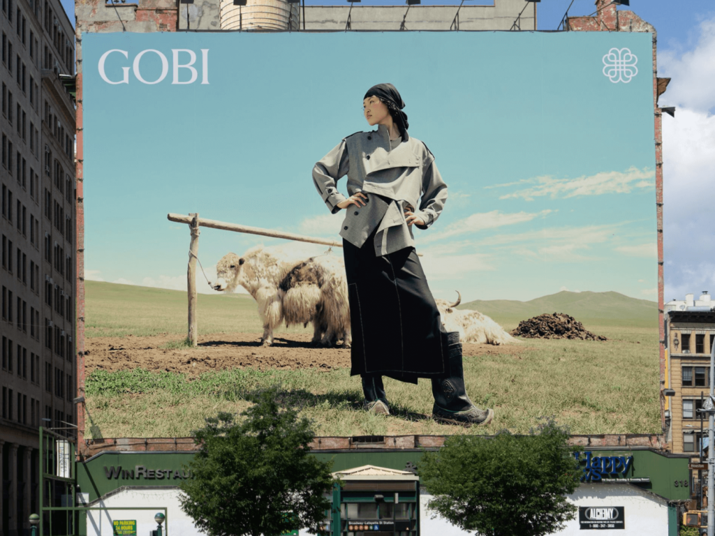
Cashmere brand Gobi rebranded with Mucho. Gobi is the largest cashmere brand in Mongolia, founded in 1981. All garments are produced in Mongolia by Mongolians. Everything from harvesting, processing, design, to distribution is done in Mongolia. The quality of Mongolian cashmere comes from the unique climate. In an environment where it is extremely hot in summer and extremely cold in winter, the goats shed their fur frequently and the fur is of high quality. After being privatized in 2007, official branches in Berlin and Düsseldorf […]
Chilsung Cider has been redesigned after 24 years. The visual identity of the brand logo and packaging, which were changed in 2000 to celebrate the 50th anniversary, has been modernized. The Lotte Chilsung Marketing Team, Clay, CFC, and Vcode collaborated to rebrand. Clay created the brand concept called 'Sense of Joy', and CFC was in charge of the brand identity and packaging design. The motion graphics were created by Vcode. The round gradient stars became pointed and contained seven stars, as the name 'Chilsung' suggests. The thin font became thicker and […]

Kleenex has collaborated with Turner Duckworth for a rebrand. They have unveiled a new visual identity to celebrate their 100th anniversary. Kleenex has grown significantly as a household goods brand since its establishment in 1924. In Korea, it is widely known as 'Kleenex', which was created by Yuhan Kimberly, a joint venture between Yuhan Corporation and Kimberly-Clark in 1970. This rebrand will be applied to Kleenex in the US, and it has not been disclosed whether it will be applied to Korea. Kleenex has lost consistency for a long time due to different logos and colors. The wordmark has been transformed into various forms depending on the region. Accordingly, Kleenex […]
Audio brand Bose has rebranded in collaboration with Studio Collins in the US. Founded in 1964 by Amar Bose, Bose has been making great audio products that have won the hearts of listeners around the world. As Bose approaches its 60th anniversary, it has decided to tell a story that will satisfy its loyal fans and attract new ones. The new tagline is 'Sound is Power'. The iconic Bose logo will remain. The Warsaw-based independent type foundry […]
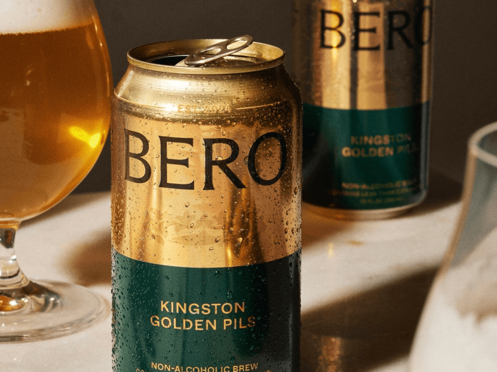
Tom Holland Launches Bero, a Non-Alcoholic Beer Brand Tom Holland quit drinking in 2022. While quitting, he relied on non-alcoholic beers, but he said it was hard to find a satisfying taste. In addition, the labels of non-alcoholic beers released by major beer brands were clearly blue, which made him stand out at drinking parties. So Tom Holland created a beer for people like him. With a shiny gold color and a traditional impression, it contains Pilsner, IPA, and Wheat […]
American fintech service Robinhood has rebranded in collaboration with New York-based design studio Porto Rocha. The company announced the change as it celebrates its 10th anniversary, from being a startup innovator to a financial platform for a new generation of investors. The wordmark has a higher contrast between strokes and thinner connections. Ink traps, which are spaces where letters bend, have been added to give the impression of printed letters a little bit of a mix. The new premium membership, Robinhood Gold, is entirely based on the serif typeface Martina […]

AfreecaTV has rebranded to SOOP. SOOP announced the reorganization on its official website on the 15th, and has reorganized the brand visual identity and UI/UX of the company and service. The new name, 'SOOP', means a space where content is communicated like a 'forest' ecosystem that encompasses all components. The name of the broadcaster 'BJ' who was active on AfreecaTV will be changed to 'streamer'. The broadcasting space 'broadcasting station' will be changed to 'channel'. The 'star balloon' used for paid sponsorship will maintain its name. The symbol of AfreecaTV […]

Jongno-gu announced its new integrated brand, 'Jongno: The way of Seoul', at Gwanghwamun Square on the 11th. It contains the meaning that all roads in Seoul lead to Jongno. It aims to improve the symbol system of Jongno-gu and strengthen the city's competitiveness. In order to express new values, the meanings of resonance, openness, canvas, gateway, and platform were expressed in a modern way. It expanded from the physical 'Jong' to the conceptual 'Ro'. It became simpler than the previous version's descriptive illustrations. […]
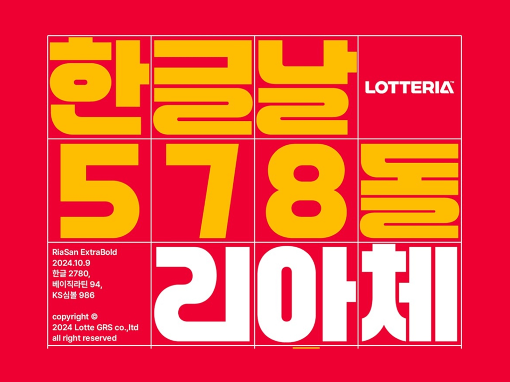
Lotteria has released 'Ria' to celebrate Hangul Day. It collaborated with Lotte GRS Design Center and Yoon Design's typography performance group, Odd Sangsang. Based on the successful launch of 'Choak Ddaenggyeo' and 'Ttak Jjakboche' last year, this time, it created a font to spread K-burgers around the world. It has a similar impression to the English version of the Lotteria logo that was newly revised last July. It was designed around straight lines and circles like Bauhaus' universal font. It is thick and fills up the square. Hangul with a consonant […]

The Brooklyn Museum has rebranded to celebrate its 200th anniversary, working with Brooklyn-based graphic design studio Other Means. “We needed a new brand that would be relevant to today’s needs, honor our rich history, and bring a tremendous amount of energy,” says Anne Pasternak, the museum’s Shelby White and Leon Levy Director. The Brooklyn Museum has always resisted convention, rethinking and transforming what it means to be a museum for the community. From Brooklyn’s first free library to an encyclopedic museum, the first […]

Aeromexico is facing criticism for its new Aztec eagle warrior logo. Celebrating its 90th anniversary, Aeromexico has unveiled a new brand strategy and visual identity, in collaboration with Mexican design agency Mucho. The rebrand, its first in 26 years, includes a corporate typeface developed in collaboration with Sharp Type, a new color scheme that introduces Mexican pink, and a visual information management system. The striped graphics from the 1968 Mexico City Olympics, designed by Lance Wyman, […]