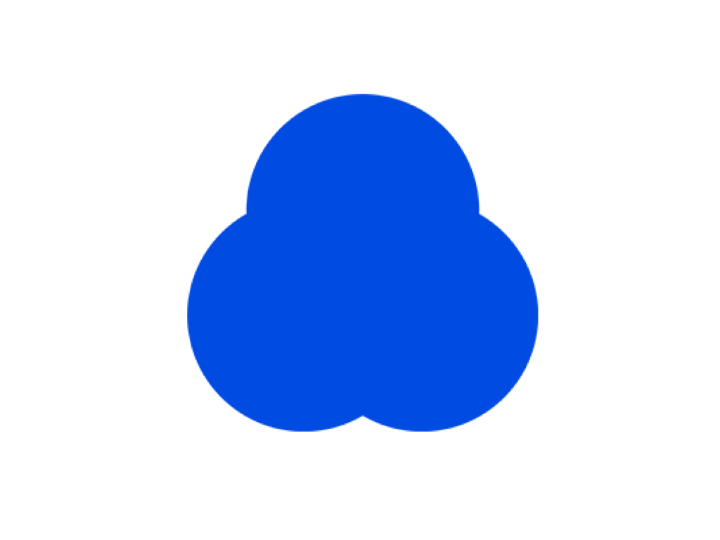
Cleantopia has rebranded. Cleantopia already carried out a major rebranding early last year to celebrate its 31st anniversary. Now, a little over a year later, the visual identity has completely changed to the point where the old brand is no longer recognizable. Based on the vision of ‘Cleantopia, the standard for laundry,’ the new logo symbolizes the best laundry service that you can trust in your daily life. The new symbol is a combination of three circles. Each circle represents ‘everyday,’ ‘trustworthy,’ […]
Super Matcha has collaborated with Workroom Press for a rebrand. Super Matcha is a brand that has been engraved in people’s minds through its sophisticated font and intense green color that is persistently repeated. Super Matcha did not think that there was a problem with the existing brand identity, so they decided to improve the weaknesses of the font. It is said that it took a whole year just to refine the existing logo. They also released improvement process notes that contain traces of their efforts. The value that Super Matcha pursues is SUPER, and the products or services that convey the value are […]
PayPal has collaborated with Pentagram to rebrand. PayPal has been a leading brand in the online payment market for 25 years and is a symbol of online payment. When you see the PayPal logo when making a payment on an unfamiliar website, you feel reassured. Pentagram has reduced the visual identity that symbolizes PayPal. Experts have been very divided about this. Some say that it is boring and obvious because it has changed to a flat and geometric font that follows the recent trend, while others say that PayPal needs […]
Figma has unveiled a new visual identity. Figma has exploded in popularity, becoming more than just a design tool for building products, it’s now the go-to tool for anyone who needs to design—developers, product managers, marketers, and more. Figma needed a new visual identity to change the perception of itself as a vector tool for building UIs. For this refresh, the Figma team took inspiration from playgrounds as a metaphor for the Figma Canvas, where people come together to create and experiment. […]
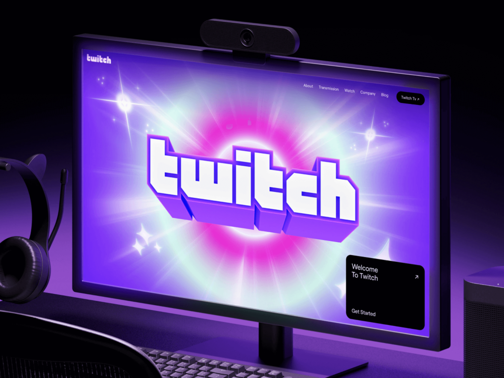
Twitch has partnered with design agency Porto Rocha to refresh its visual identity. Twitch rebranded in 2019 with a new, gaming-friendly style. The new visual identity has moved away from analog to hyper-digital 3D. Twitch’s signature pixelated wordmark has gone from a flat design to a glossy, plastic-like 3D shape. Instead of a flat, gradient-based black shadow, it will now pierce through the screen […]
Lotte Rental's car sharing subsidiary Green Car is changing to 'Lotte Rent-a-Car G Car'. It aims to be a premium brand and its slogan is 'We ready, You just Go' (We manage the car, just use it comfortably). It announced that it plans to increase awareness and reliability as a Lotte Rent-a-Car brand and has set the principle of making it easier to use safer and cleaner cars. It also introduced a monthly subscription service. G Car Pass 100 (weekdays) for weekday operation and […]
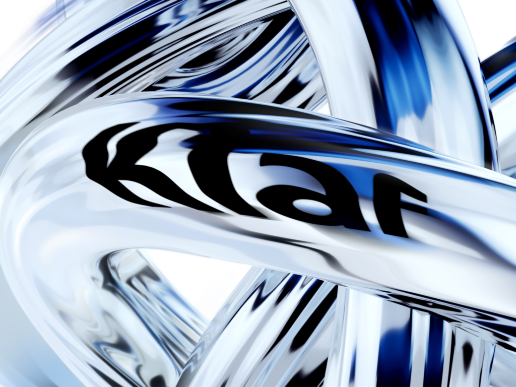
Kiaf Seoul 2024 is opening. Kiaf Seoul is Korea's first international art fair held in 2002 and has served as a bridge connecting Korea and the overseas art market for the past 20 years. With hundreds of galleries from around the world participating, the event attracted over 80,000 visitors last year. It is no exaggeration to say that you can see the flow of art. The visual identity of this exhibition was created in collaboration with Studio April. The main visual and […]
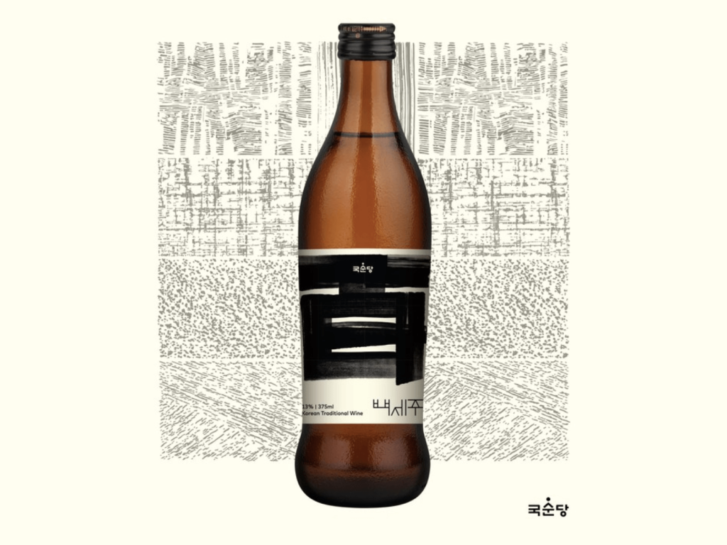
Kooksoondang has rebranded its Baekseju package. This is the first change in four years since its renewal in 2020. The concept is 'Baekseju, a fragrance that connects a hundred years', and it is explained that it contains the 32 years of history since its launch in 1992 and the taste that will continue for the next 100 years. The Chinese character 百 is placed in a large, powerful brush lettering on the front. It is a significant difference from the previous modern and thin impression. The transparent bottle has been changed to an opaque brown. The jars that make good liquor and the soil in nature […]
Mozilla, the developer of the browser Firefox, has changed its wordmark. Mozilla is an open source software development company founded in 1998 by former Netscape developers. It has created products such as Firefox, Thunderbird, and Bugzilla, and is famous for its Firefox brand design with LaMotion. The wordmark, created through an open design project in 2017 to receive feedback from the community, was a hot topic. London studio Johnson Banks received various opinions and borrowed ://, which stands for Internet protocol, […]
An archive book titled 'Our Typeface' has been published that covers the history of Hyundai Card's font, Youandi. Hyundai Card has taken action by emphasizing the importance of design more seriously than any other company. Hyundai Card's philosophy has had a great influence on the way the industry views design. The Hyundai Card plates and beautiful mobile applications, designed with a unique perspective, have given us the belief that Hyundai is different. From small posters to department stores, the sensitive designs have given us the belief that Hyundai does not do anything half-heartedly. […]
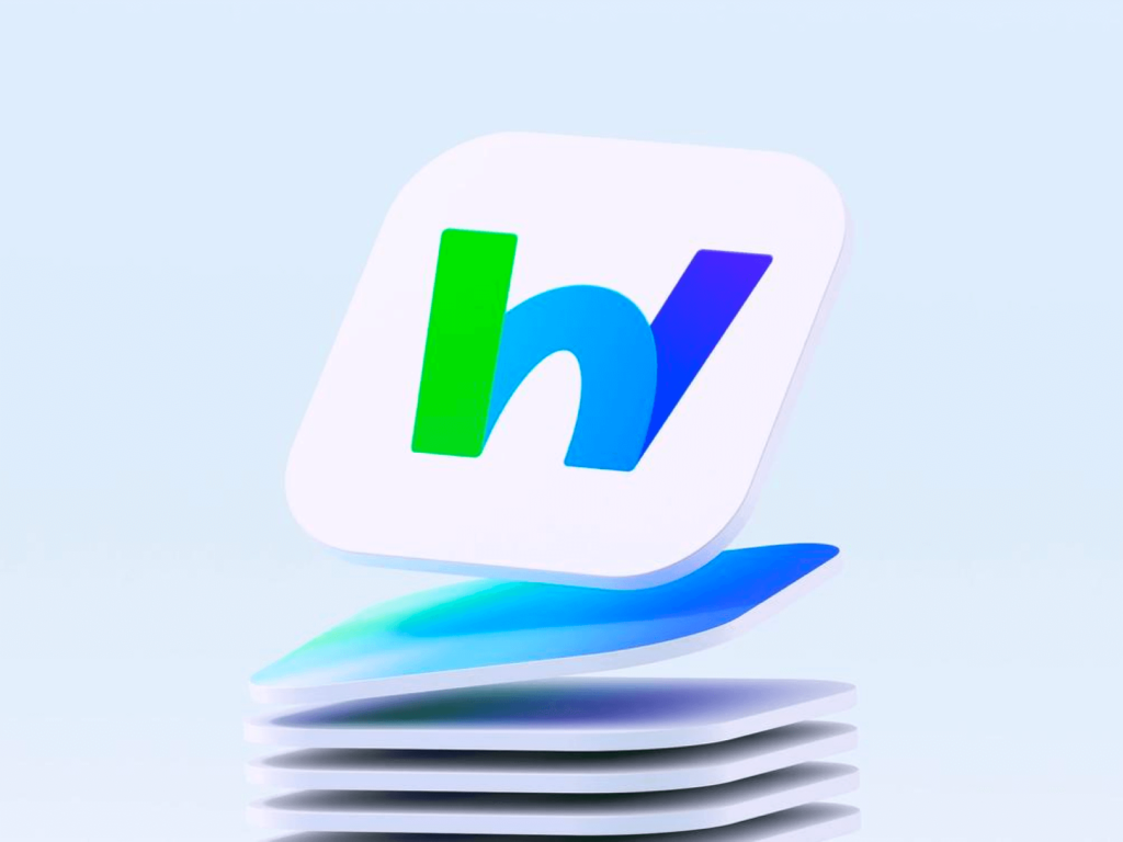
This is a rebranding of Naver's business collaboration platform, 'Naver Works'. BI was produced by the Naver Cloud Brand Design Team and the brand film was created in collaboration with the advertising agency 'Cosmic Ray'. Naver Works is an integrated business platform that includes functions necessary for business such as bulletin boards, video conferencing, payroll, approval, finance, and attendance, in addition to functions that can be used in existing Naver such as email and messages. The Naver Cloud Brand Design Team first focused on connection and growth […]
The Kit Kat logo has been redesigned. Instead of keeping it true to its past, the focus has been on giving it a modern feel with a retro style. They worked with New York-based design studio Sterling Brands. The typeface has been redesigned to a geometric, avant-garde style. The letter spacing has been tightened and the decorations have been reduced. The internal space has been filled out to create a single, solid 'K'. The inner shadow that represents the embossing has been replaced by a thick outer shadow. The subtle details have been omitted and […]