Kokuyo developed a new corporate identity centered around its in-house design organization, YOHAK. Taku Sasaki and Aki Kanai handled the art direction and design, while Shogo Kishino supervised the project. This rebranding, unveiled on October 2, 2025—the company's 120th anniversary—encapsulates the direction of the company to connect various businesses beyond stationery and furniture.
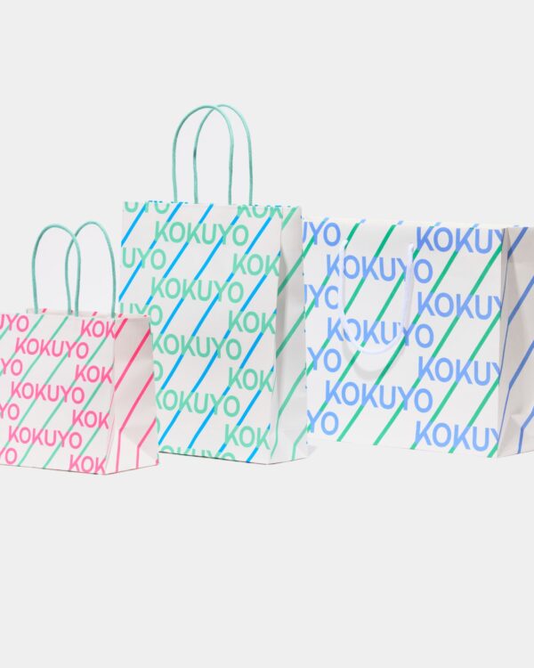
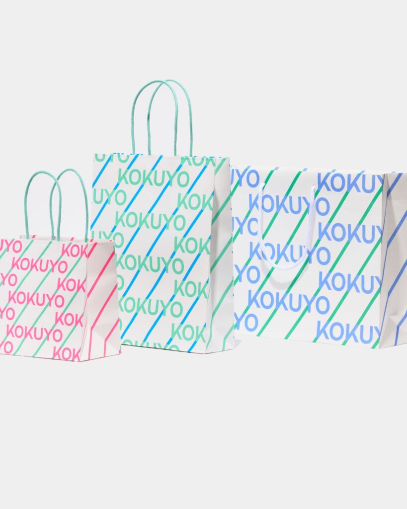
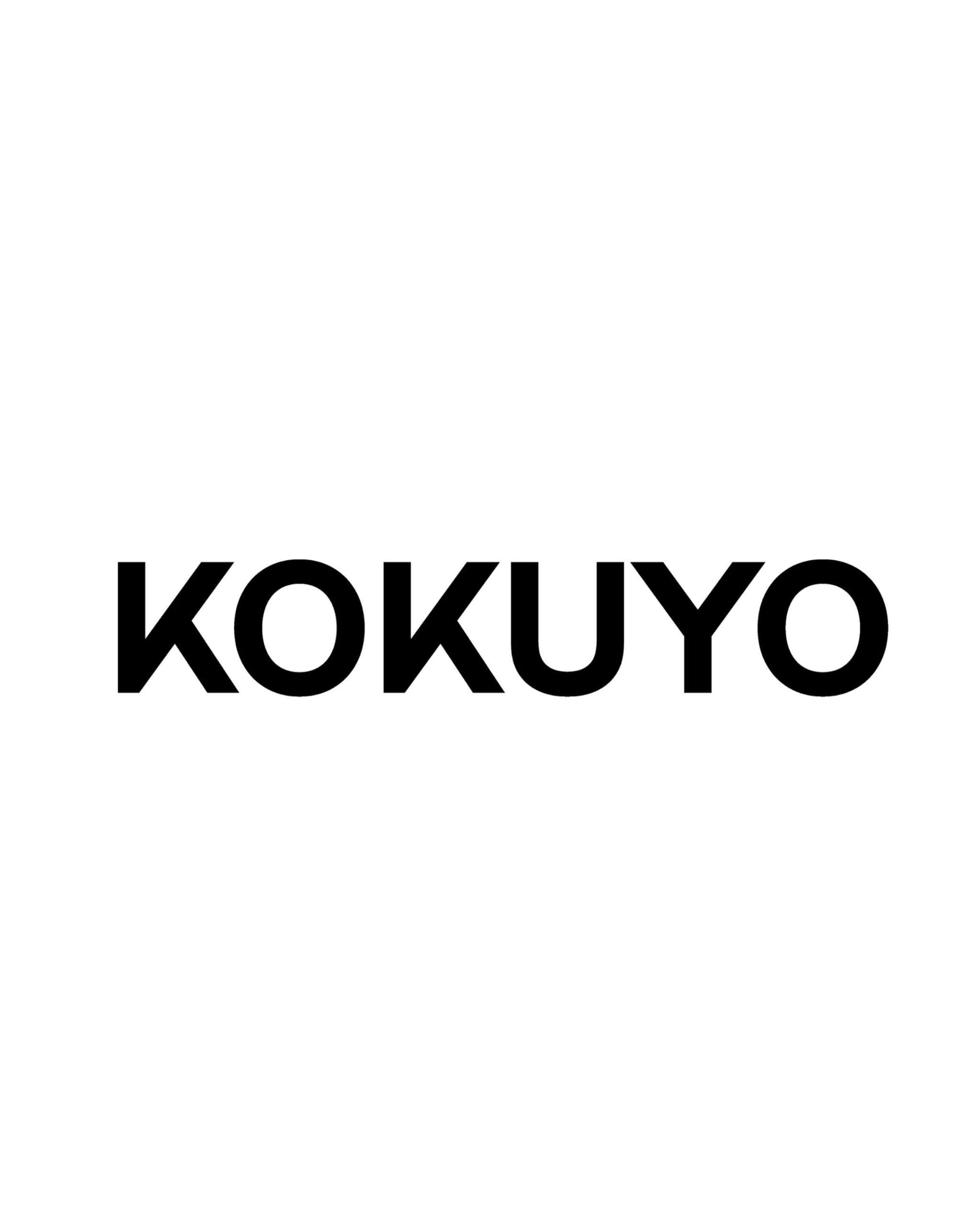
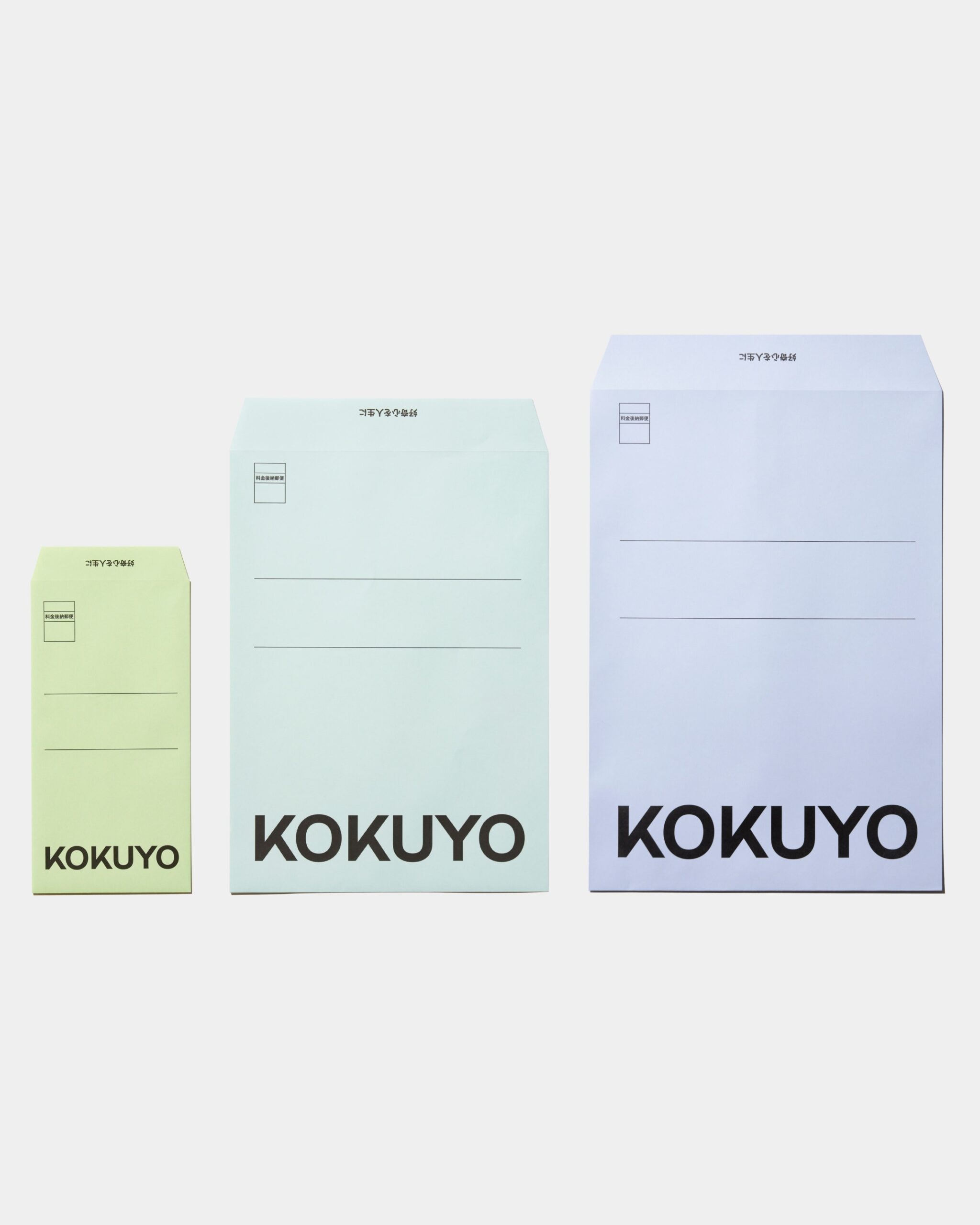
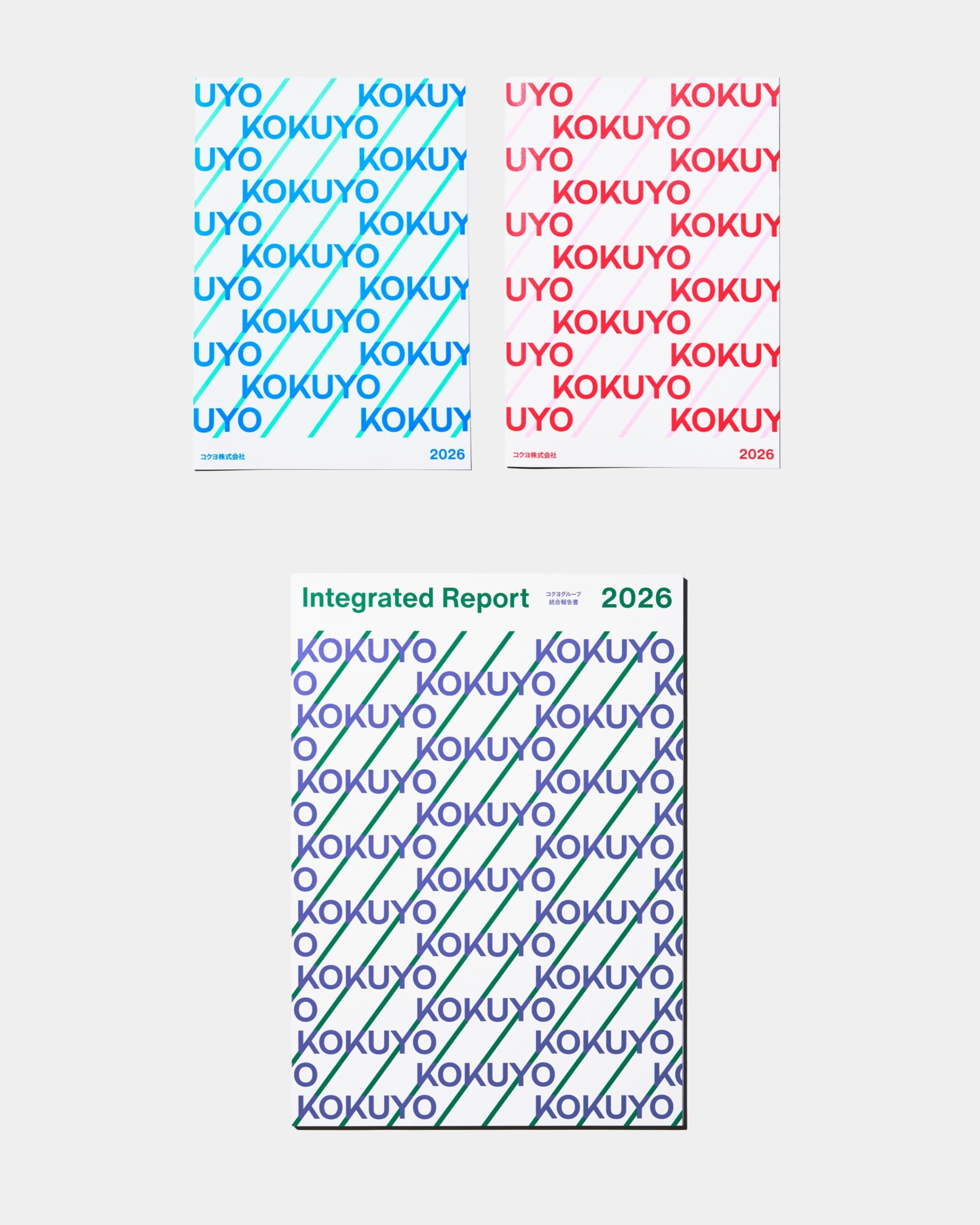
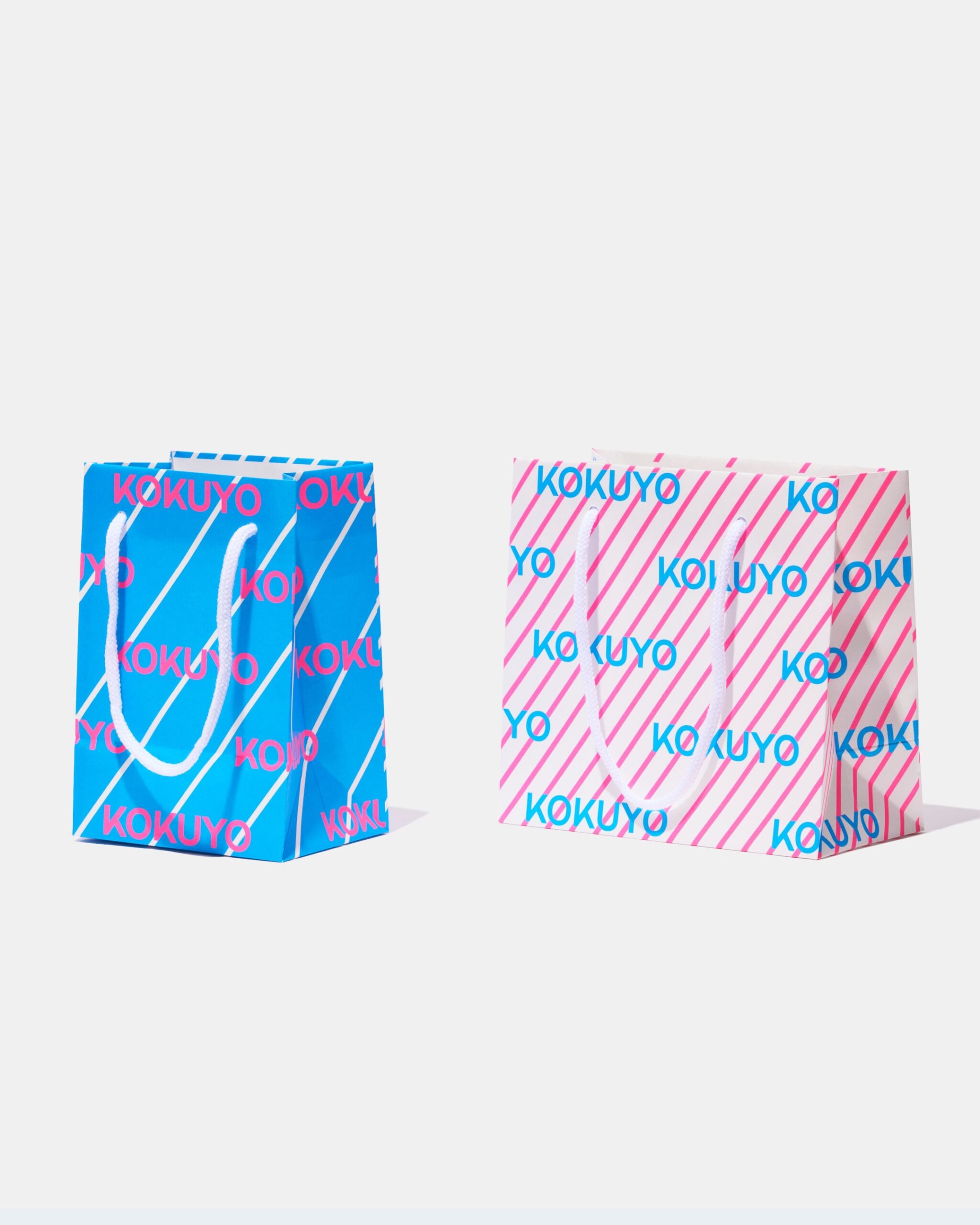
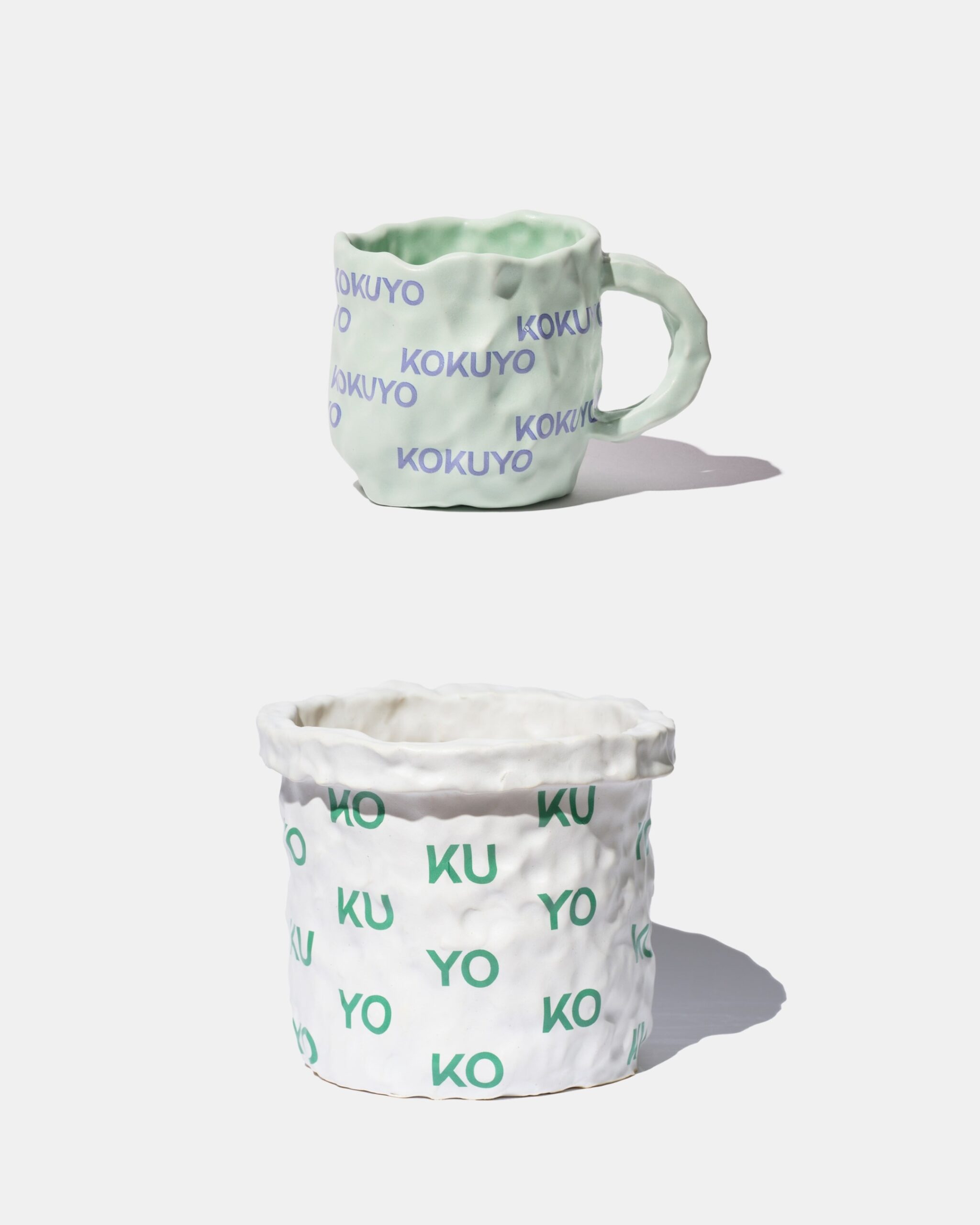
The new logo is composed of the six letters of the English name KOKUYO. The angles and thickness of the diagonal lines within the two Ks and Ys were matched. The repeating diagonal lines within the letters were extracted as independent graphic elements and used on business cards, shopping bags, envelopes, reports, and more. The logo was applied across various media by repeating it in large sizes, cropping it off-screen, and varying the spacing of the diagonal lines and color combinations.
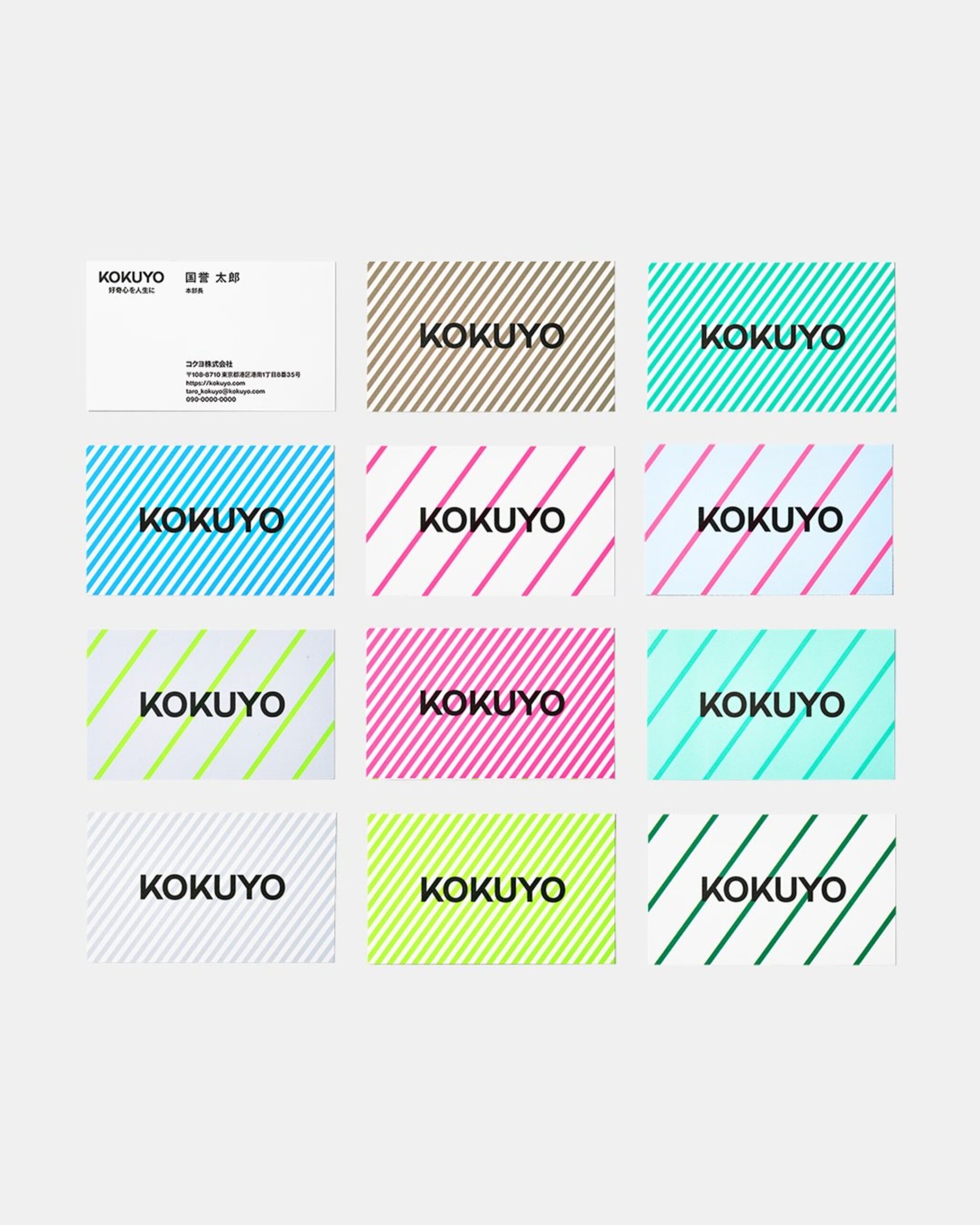
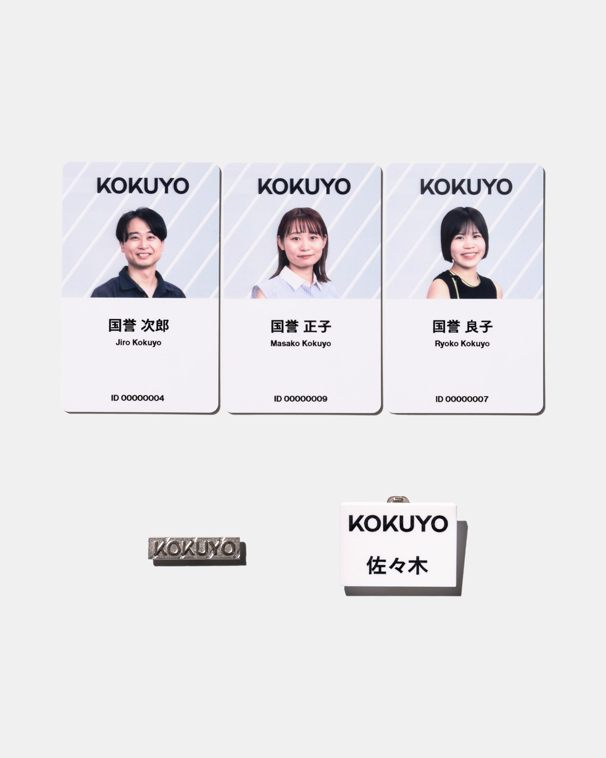
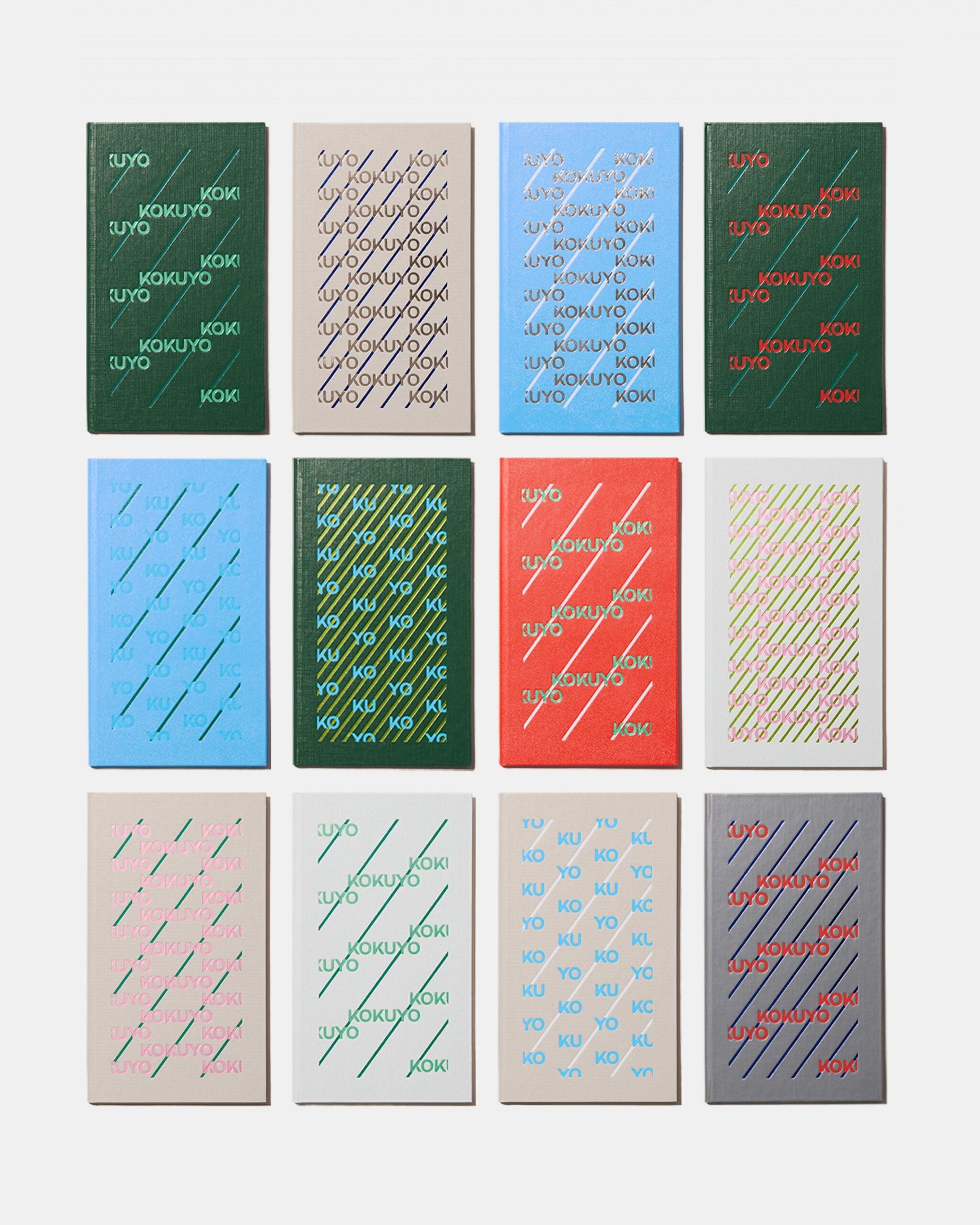
For business cards, the background color and stripe density were varied while maintaining the same logo. On shopping bags, the logo and diagonal lines were printed as a continuous pattern. Notebook covers combined different print colors based on the paper's color and texture. Even on small media like employee ID cards and badges, the same text and diagonal lines continue. It is a composition that unfolds a common form across multiple colors rather than fixing a single color.
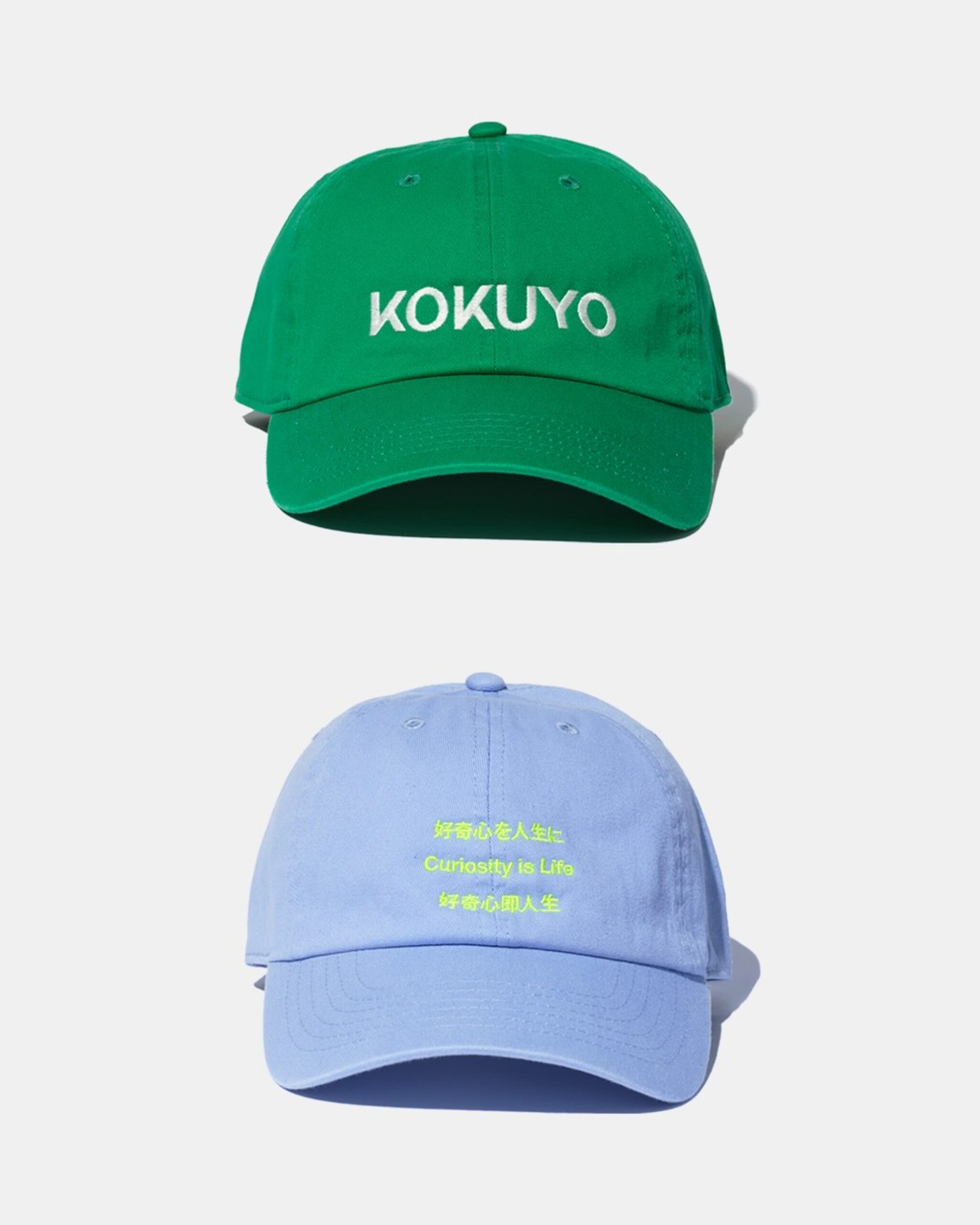
Kokuyo has also changed its corporate message to 'Curiosity is Life.' In Japanese, this phrase means incorporating curiosity into life. In accordance with its long-term vision 'CCC 2030,' the direction is to propose a society and lifestyle culture that fosters individual uniqueness. The new identity connects products, spaces, and corporate communication through a unified visual language.
See more and sources
https://www.kokuyo.com/news/release/20251002cs1/
https://yohak.kokuyo.com/project/graphic/kokuyo-ci.html