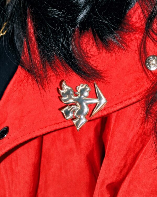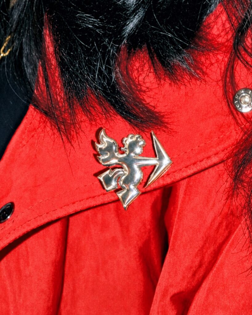
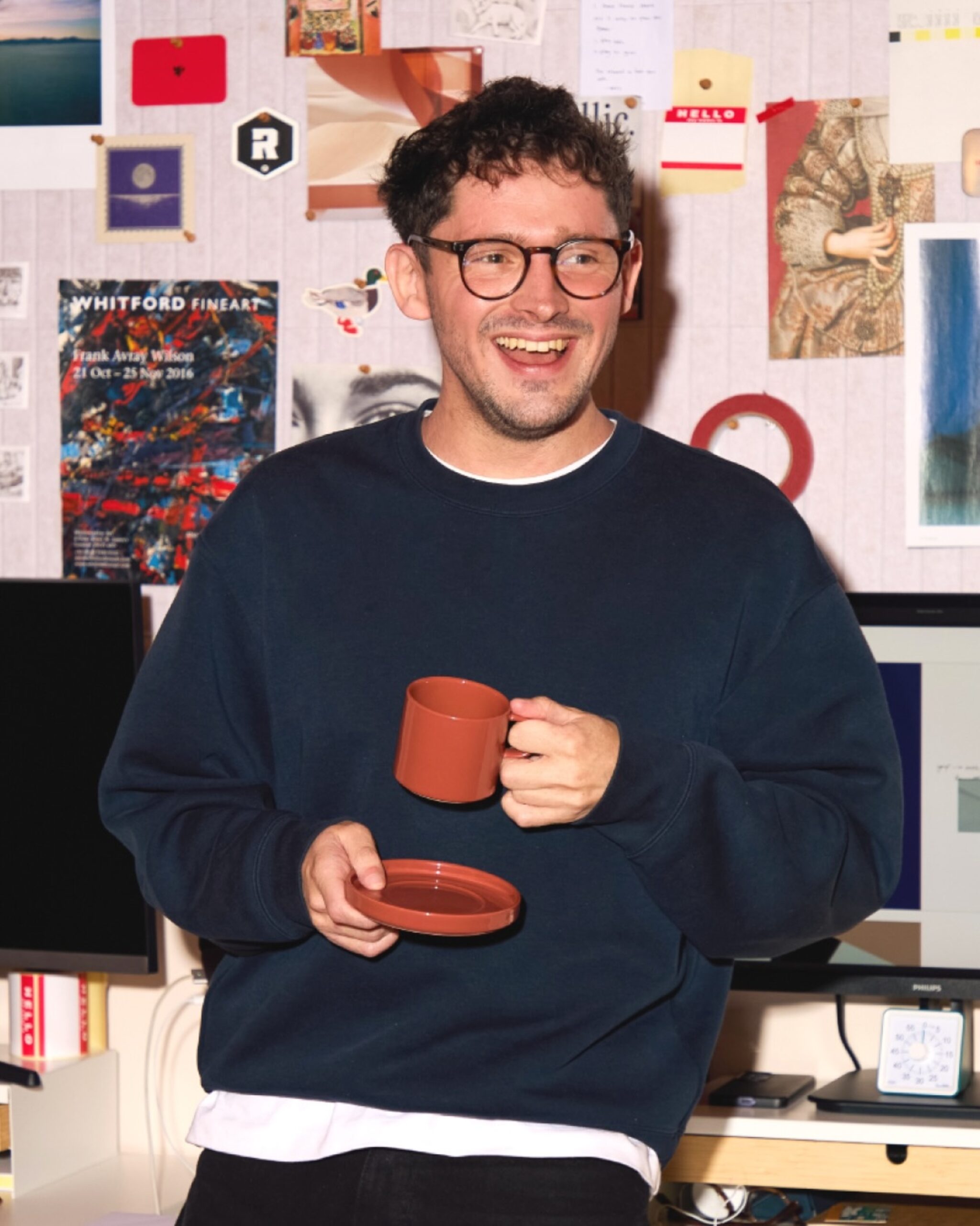
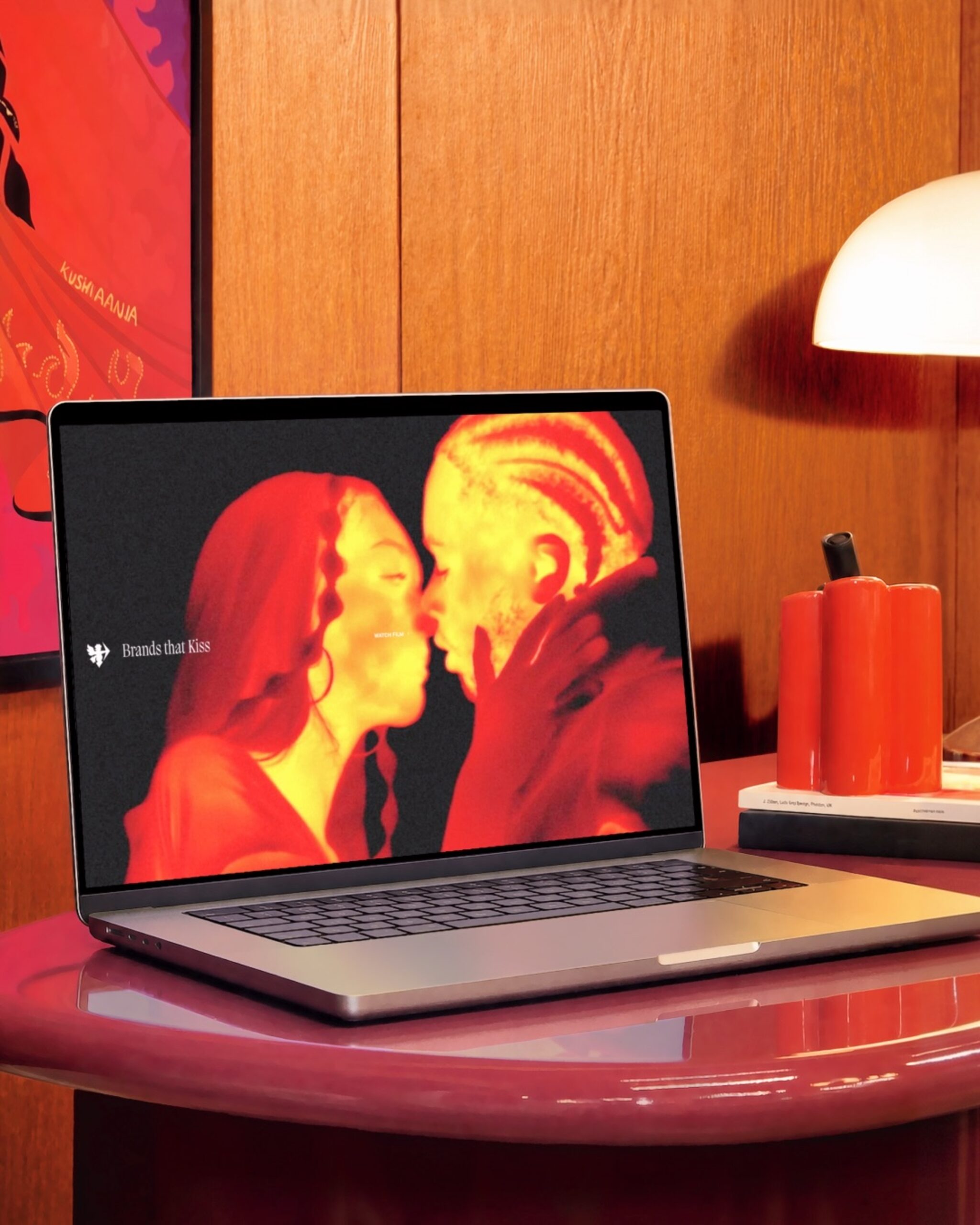
This is a rebranding created by the UK-based brand studio KISS in collaboration with its in-house design team. Co-founders Poonam Saini Kilb and Matt Kilb established the strategy, while the actual design was entrusted to the team. They summarized the attraction between the brand and people with the phrase "Brands that Kiss" and placed Cupid shooting an arrow of love at the visual center.
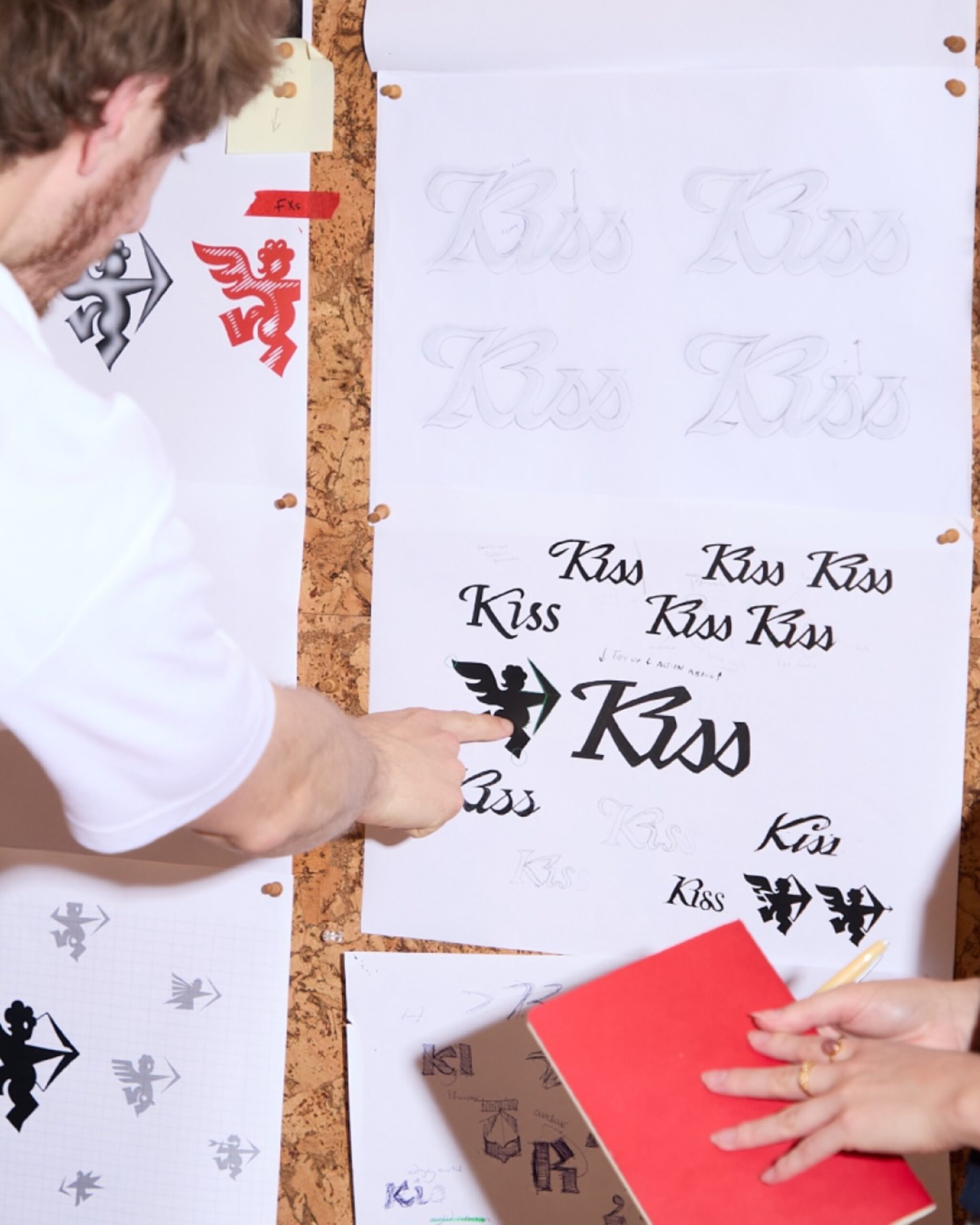
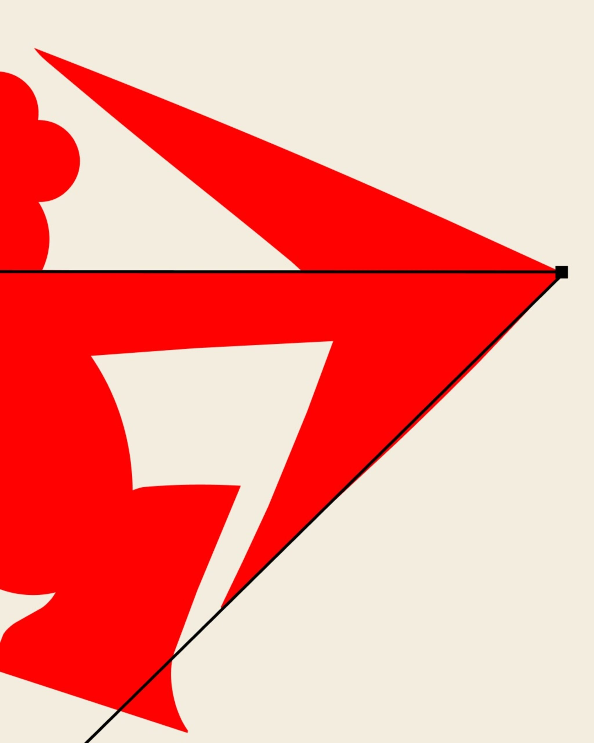
The mascot's name is 'Roger Bowman'. It is a Cupid with wings and a bow, refined starting from a basic geometric shape. Designer Alex Langcastle participated in the project, undergoing over 100 form experiments. The hand-drawn character leads to an animation by Marco Palmieri. The static symbol and the moving character are connected in the same form.
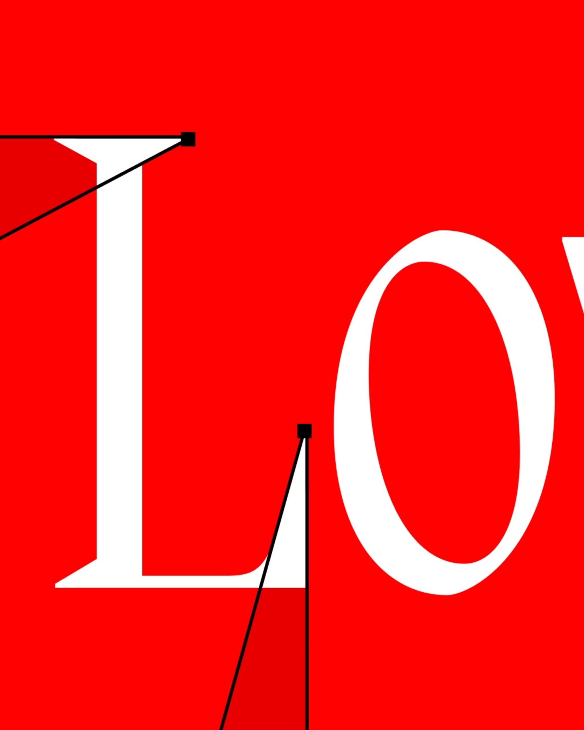
The cursive wordmark was completed by Design Director Alex Phipps over a period of about a month, through hand-drawing and printing. Instead of using an existing typeface, Cupid's sharp edges and curves were incorporated into the letters. The intersection of the K and i evokes a heart or a bow, while the horizontal line crossing the letters represents a drawn arrow. It is a method of incorporating the character's tools into the structure of the letters.
The graphic system was also structured based on the horizontal line of Cupid's arrow. KISS describes this line as a relationship connecting the studio and the client, and the company and the people. Red is used as the primary color, and the logo and character have been applied to the website, print materials, and clothing. Website production was handled by Boku Studio, while the 3D work was undertaken by @bens.work. The arrow and curves originating from a single Cupid extend into the logo, graphics, and movement.
See more and sources
https://www.instagram.com/kissbranding/p/DeRX9DgDLuN/
https://www.instagram.com/kissbranding/p/DeZyzC4DM2H/