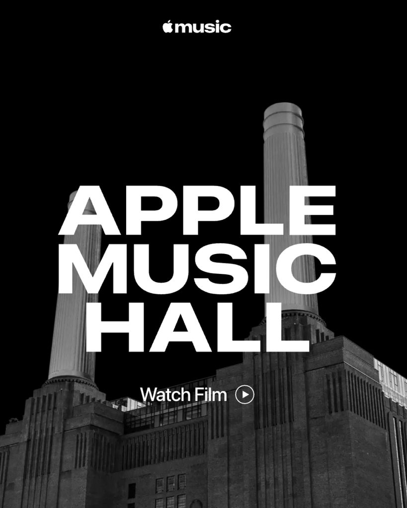
Apple has unveiled a new logo and typography for Apple Music. The new design was first applied to the website and promotional materials for the Apple Music Hall, which opened at the Battersea Power Station in London.
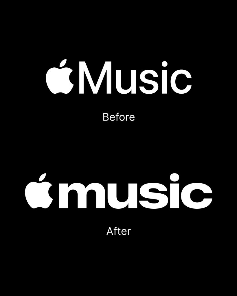
The previous logo placed 'Music,' starting with a capital M, next to the Apple symbol. It used Apple's system font, San Francisco, to match the form of other service logos. The new logo retains the Apple symbol while changing 'music' entirely to lowercase. The strokes of the letters have become thicker and narrower than before. Rounded curves and dense letter spacing have also been applied. In particular, the volume of 'm,' 'u,' and 's' has been increased to make them appear as a single mass.
The new typography was designed to be large enough for use on screens and in physical spaces. On the Apple Music Hall website, the logo occupies a large portion of the top of the screen. The same form was used for signage and videos outside the venue. Moving away from the small and neat existing wordmark, it created an impression closer to a music magazine masthead or album graphics.
Apple Music Hall was designed as a performance venue accommodating 600 people. It is equipped with a spatial sound system consisting of 48 speakers, a recording studio, a mixing studio, and multi-camera production facilities. Performances can be live-streamed worldwide via Apple Music. The new logo was used as a visual language to connect the performance venue with broadcast content, extending beyond the streaming app.
See more and sources