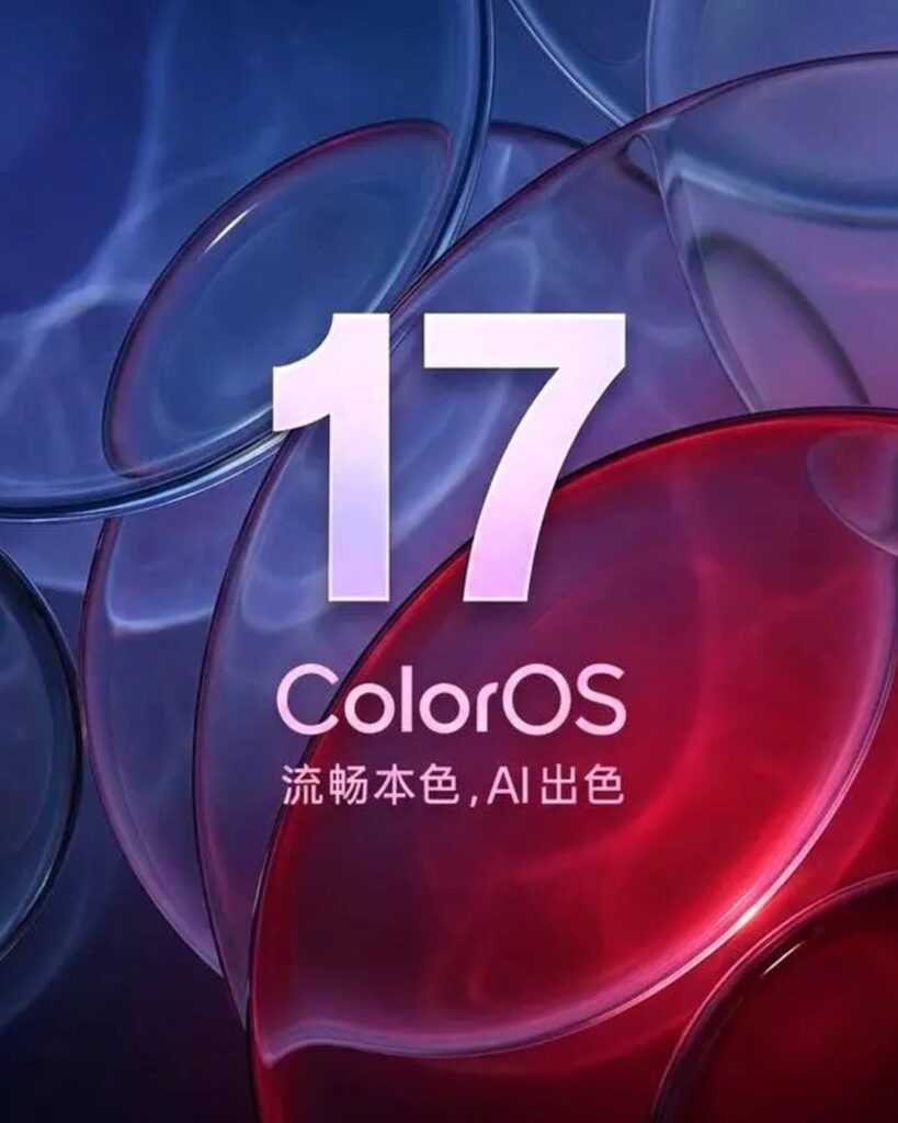
OPPO has partially unveiled the new design direction for ColorOS 17. The key element is 'Liquid Acrylic.' Simply put, instead of buttons, menus, and notification windows on the screen appearing like rigid panels, this design makes them look like translucent acrylic sheets or layers of glass. The background is subtly visible, and light and blur effects are applied together.
A new navigation bar was also unveiled. Rather than a bar fixed at the bottom of the screen like before, it resembles a small bar floating above the app screen. OPPO explained that this design will be applied to most default apps. Users will see similar menus and navigation methods rather than having to learn different operation methods for each app.
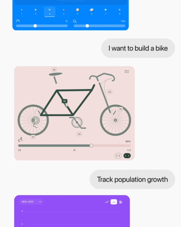
The animations also change. ColorOS 17 uses a motion effect called 'Fluid Fusion.' This method reduces the feeling of sudden transitions when swiping screens or opening menus, allowing one screen to move seamlessly into the next. Dragging with your finger slightly expands screen elements, and quickly swiping adds a press-and-return effect.
It was explained that this change is connected to the Liquid Acrylic style previously announced by OPPO. OPPO stated that it processes light refraction effects more smoothly than Apple's Liquid Glass, taking text readability and battery life into consideration. It is being discussed that ColorOS 17 may be unveiled alongside OPPO's next flagship Find X10 series.
From freelancer to head of design at a unicorn startup, I've been creating impact through brand and product design for over 18 years. Currently, as CEO and editor-in-chief of Design Compass, I research design that drives business impact.