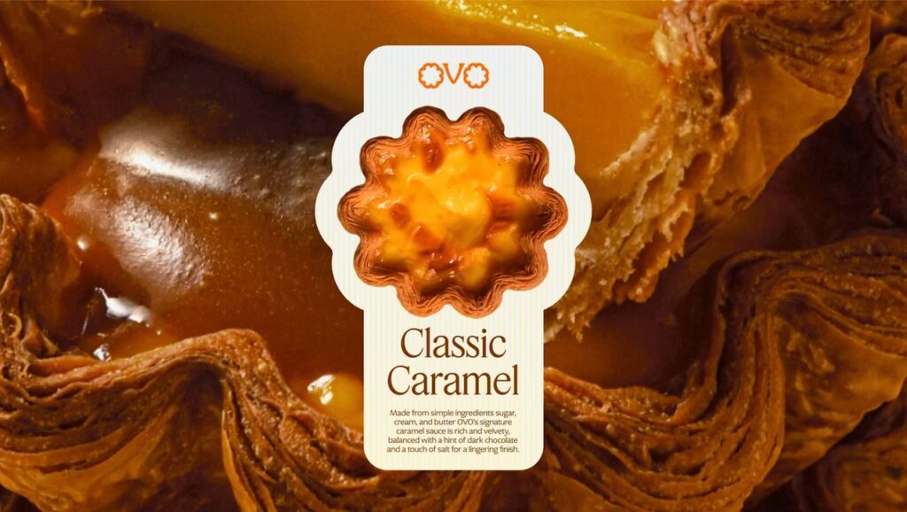
Egg tart brand OVO has unveiled a new brand identity and packaging system that translates the small joys of everyday life into a brand experience. This project was conducted by brand design studio The Lab and is characterized by expanding the form and production process of egg tarts into the brand's overall visual language.
OVO built its brand on the philosophy that even simple ingredients like eggs can be transformed into special experiences through creative interpretation. To visually convey this message, the logo takes its form from the wavy silhouette of a Portuguese egg tart. It was designed to evoke an egg tart at a glance while giving a simple and friendly impression.
The product's characteristics are reflected throughout the brand system. The packaging and graphics feature a layer pattern reminiscent of the crispy pastry layers of an egg tart, while the color palette is composed of warm and vibrant hues inspired by the process of baking to a golden brown in an oven. The typography also captures both a refined impression and a cheerful atmosphere, completing the brand's bright and energetic character.
This project goes beyond simply designing packaging; it is an example of connecting the product's physical properties and production process to the brand language. The logo, patterns, colors, and typography all function organically within a single narrative, demonstrating that even the smallest details can be extended into the brand experience.
From freelancer to head of design at a unicorn startup, I've been creating impact through brand and product design for over 18 years. Currently, as CEO and editor-in-chief of Design Compass, I research design that drives business impact.