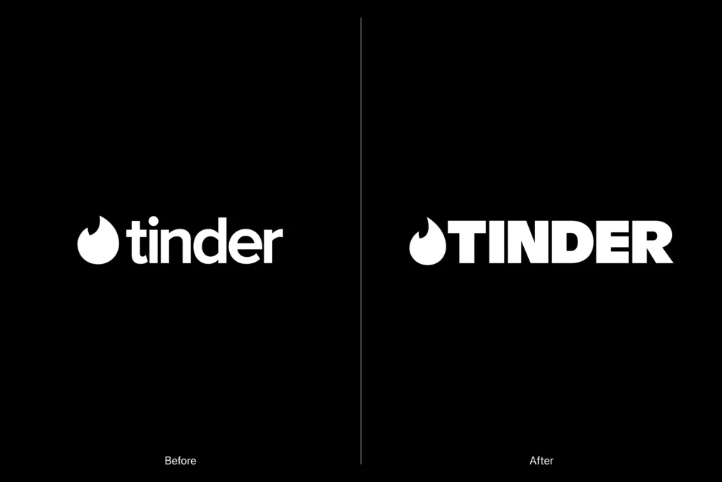
Tinder has unveiled its first major rebranding in about 10 years. The project was handled by design studio Porto Rocha and focused on presenting Tinder once again as an attractive dating platform to the new generation.
The core of the new brand is 'voice.' Porto Rocha established Tinder's language as that of a trusted dating columnist. It is a style that handles the complex emotions of dating by oscillating between humor and honesty, wit and empathy. To achieve this, a fictional persona named 'T' was created, and the brand tone was designed to resemble a character who is experienced yet learns and enjoys life alongside the user.
The visual identity has also been revamped. The existing flame symbol has been refined to be sleeker and sharper, and the wordmark has changed from a lowercase sans-serif to an uppercase logo. In addition, a new serif typeface has been added to give the brand a stronger sense of confidence and a declarative impression.
The color scheme has also been expanded. While maintaining the existing warm red, orange, and pink tones, blue and green hues have been added to capture the diverse emotions experienced during a dating experience. This is an attempt to express not only excitement and anticipation, but also the feelings that coexist within modern relationships, such as fatigue, confusion, and possibility.
Another key keyword in this rebranding is 'contradiction.' Porto Rocha viewed Gen Z as a generation that is tired of dating yet still expects possibilities, and who longs for traditional relationships while creating new rules. Tinder chose to embrace these contradictions as they are within the brand rather than simplifying them.
The way images are used has also changed. It has incorporated not only actual dating scenes but also animated footage, paintings, and visual materials resembling memes into the brand system. Instead of expressing love and connection solely through photos of two people together, it has expanded to scenes that allow users to interpret meaning for themselves, such as flowers, objects, and cultural images.
The 'swipe' gesture created by Tinder has also been reinterpreted. Rather than a simple act of flipping or consumption, it is expressed as a movement that reveals hidden images, typography, and possibilities. This visually emphasizes the anticipation and serendipity inherent in the dating app experience.